PlotSet LogoPlotSet

Blogs

Check out these data visualization examples to get inspired

How to Choose Chart Colors That Do the Legend's Job

Aug 11, 2026

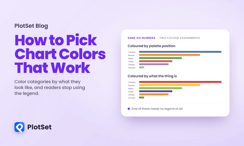
How to Choose Chart Colors That Do the Legend's Job

Every charting tool assigns colours the same way: by position. The first category gets the first colour in the palette, the second gets the second, and so on down the list. Nothing about the data enters into it.

Read more
Showing the People Behind the Data Doesn't Make Anyone Care More

Aug 10, 2026

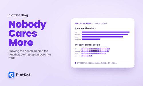
Showing the People Behind the Data Doesn't Make Anyone Care More

There is a piece of advice in data storytelling that nobody argues with. Do not show ten thousand deaths as a bar. Show ten thousand little human figures, so the reader remembers these are people. The technique has a name, anthropographics, and it has been recommended in conference talks, style guides and nonprofit design decks for a decade.

Read more
The Gap in Your Data Is a Design Decision

Aug 5, 2026

The Gap in Your Data Is a Design Decision

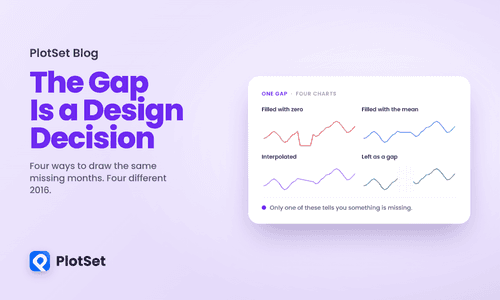
Open a spreadsheet, delete one cell in the middle of a column, and chart what is left. Something still gets drawn. The line breaks, or it stretches straight across the hole, or the bar disappears, or a zero appears where no measurement exists. Whatever happens, a decision was made about how to represent an absence, and you did not make it. Your tool did, silently, before you looked.

Read more
Thirteen Datasets, Identical Statistics, Wildly Different Truths

Aug 4, 2026

Thirteen Datasets, Identical Statistics, Wildly Different Truths

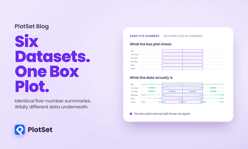
Everyone in data visualization knows the dinosaur. A dataset whose mean, standard deviation and correlation look utterly ordinary, and whose scatterplot is a picture of a Tyrannosaurus. It is a great demonstration and it has been told so many times that it has stopped doing any work.

Read more
The Readers Who Get Nothing From Your Chart

Aug 3, 2026

The Readers Who Get Nothing From Your Chart

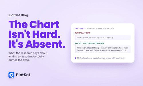
Most advice about charts assumes a reader who can see the chart. Contrast, layout, colour, labelling: all of it is about making a visible thing easier to interpret. For a blind reader using a screen reader, none of that applies, because the chart is not difficult. It is missing. Where you see a line and a downturn and a recovery, they get a filename read aloud, or silence.

Read more
Shrinking a Chart Changes What It Says

Aug 2, 2026

Shrinking a Chart Changes What It Says

Responsive design arrived in data visualization as a layout problem. Squeeze the axes, rotate the labels, drop a legend, ship it. The chart got smaller, the content stayed the same, and the job was a media query.

Read more
The Science of When to Animate a Chart

Aug 1, 2026

The Science of When to Animate a Chart

There are two confident positions on animated charts and both are wrong. One says animation is decoration, a gimmick for people who cannot make a point with a static image. The other treats motion as self-evidently engaging and reaches for it by default. Neither camp seems to have read the research, which is unusual in being specific enough to settle the argument, and specific enough to embarrass both sides.

Read more
How to Show Uncertainty Without Losing the Reader

Jul 29, 2026

How to Show Uncertainty Without Losing the Reader

Here is a question with a number attached. You are in Midtown Manhattan and you need to be on the Upper East Side. How long does the taxi take? I have the answer, from 8,762 real trips between those two zones in January 2024. The average is 13.2 minutes. If I follow the convention of my field and put an error bar on that average, using the 95% confidence interval the way thousands of published charts do, here is what I am telling you.

Read more
There Are Only Four Ways to Tell a Data Story

Jul 28, 2026

There Are Only Four Ways to Tell a Data Story

Most advice about data storytelling is atmospheric. Find the narrative. Take the reader on a journey. Make it flow. None of it tells you what to actually build on Monday, which is why the same three failures keep shipping: the chart post that dumps a filterable table on a reader who wanted a sentence, the dashboard nobody can summarise, and the expensive interactive that everybody praised and nobody used.

Read more
Your Scatterplot Is Hiding Half Its Data

Jul 27, 2026

Your Scatterplot Is Hiding Half Its Data

Below is a scatterplot of New York City yellow taxi trips from January 2024, fare against distance. It is real data, straight from the city's own records. I cropped the axes to trips of 0 to 20 miles and 0 to 90 dollars, which holds 2,836,835 of the month's 2,964,624 records, or 95.7 percent of them, and keeps the file's nonsense out of the frame: one trip is logged at 312,722 miles, another at minus 899 dollars. Inside that window, nothing has been done to the data but draw a dot for each trip.

Read more
Twelve Lines Is Not a Chart, It's a Warning

Jul 26, 2026

Twelve Lines Is Not a Chart, It's a Warning

This is the most common way a real chart fails, and it has nothing to do with the famous sins of deception. Nobody truncated an axis or inverted a scale here. The data is honest. The chart is simply overloaded, and overload is its own kind of lie: it presents information while quietly making that information impossible to read.

Read more
People Remember Your Title, Not Your Chart

Jul 25, 2026

People Remember Your Title, Not Your Chart

Most people who share a news story never open it. When researchers matched 2.8 million shared links against the clicks they actually generated, 59 percent of the links were never clicked at all. A separate study of 35 million Facebook posts found that about three quarters of news-link shares were made without the sharer opening the article first. The headline did the work. The article was scenery.

Read more