Feb 9, 2026
How AI is Reshaping Data Analytics in 2025
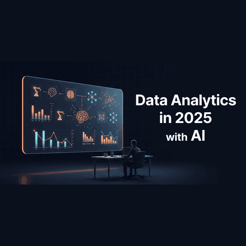
AI is fundamentally altering data analytics in 2025. Uptake in sectors like technology and healthcare shows sharp, quantifiable gains. Editorial, data-driven view.
Read more
Check out these data visualization examples to get inspired
Feb 9, 2026
AI is fundamentally altering data analytics in 2025. Uptake in sectors like technology and healthcare shows sharp, quantifiable gains. Editorial, data-driven view.
Nov 3, 2025
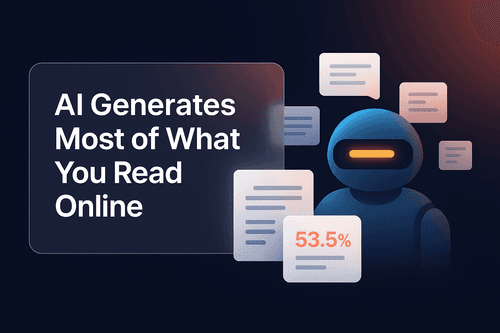
Discover how AI now creates over half of all online content and see the shift through a powerful animated data visualization built in PlotSet Plus. Learn what this means for content creators, data storytelling, and the future of human vs. machine-generated writing.

Nov 5, 2025
It's the first company in history to do that. In fact, it added about $300 billion in a day. What happened? Let dig a little. Nvidia announced a $1 billion investment in Nokia to help build AI powered telecommunications infrastructure. The partnership aims to digitalise the global network backbone, embedding AI into 5G and 6G systems that connect the world.

Nov 3, 2025
You know those viral videos where lines race across the screen, competing for the top spot while the numbers tick up dramatically? The ones that get millions of views on LinkedIn. The ones people actually watch until the end. The ones that turn boring growth metrics into edge-of-your-seat drama. Yeah, those. You can make them now.

Oct 29, 2025
Most charts are ugly. You know it. I know it. That boring blue bar chart in every presentation? The pie chart that makes people’s eyes glaze over? The line graph that looks like it was made in 1995 with that paperclip helper from Microsoft Excel? Data visualization should make people stop and stare. It should make them lean in, ask questions, share it with others. Instead, we’re stuck in a world of corporate templates that suck the life out of every number. That’s why we built PlotSet.

Oct 1, 2025
Remember when we thought AI would revolutionize everything? Well, the revolution is here, and it looks suspiciously like spell check with a college degree. A groundbreaking NBER study analyzing 1.5 million ChatGPT conversations just revealed how 700 million weekly users actually spend their time with the world’s most advanced AI.

Sep 30, 2025
The chart that took me from unknown to viral is now available to everyone. No code required.

Sep 30, 2025
France’s debt burden has reached breaking point. Debt now stands at 116 per cent of GDP, while Germany sits at just under 64 per cent. The gap between Europe’s two largest economies has never been wider, and the bond market is beginning to make France pay for it.

Sep 30, 2025
In my first newsletter, I'm defending the humble bar chart whilst admitting why I can't beat it. From William Playfair's revolutionary rectangles in 1786 to the racing bar chart wars that got Reddit so wound up they banned them entirely. Why does a 250-year-old static chart still rule our data-obsessed world? And why do we keep trying to fix something that isn't broken? Read why the bar chart is King - even when kings learn to dance.

Sep 23, 2025
Creating insightful data visualizations has never been easier, thanks to AI-powered tools like PlotSet. Whether you're an analyst, marketer, or student, generating charts from simple prompts saves time and eliminates the need for complex software. In this blog, we'll showcase ten creative and impactful prompts you can use to demonstrate the power of PlotSet's AI-driven charting capabilities.

Dec 5, 2024
Finding the perfect dataset for a compelling chart or visualization can often feel like looking for a needle in a haystack. You might spend hours combing through databases, verifying sources, and piecing everything together - all before you even begin visualizing. What if this entire process could be simplified to a single prompt? Enter "Prompt to Data," PlotSet's groundbreaking feature designed to revolutionize the way you create visualizations.

Dec 5, 2024
Colors are more than aesthetic choices; they are strategic tools in data visualization. They guide attention, communicate meaning, and evoke emotions. Misusing colors can confuse viewers or misrepresent your data, while using them effectively can transform your visualizations into compelling stories. Let's dive into the psychology of color and learn how to harness it for your charts.