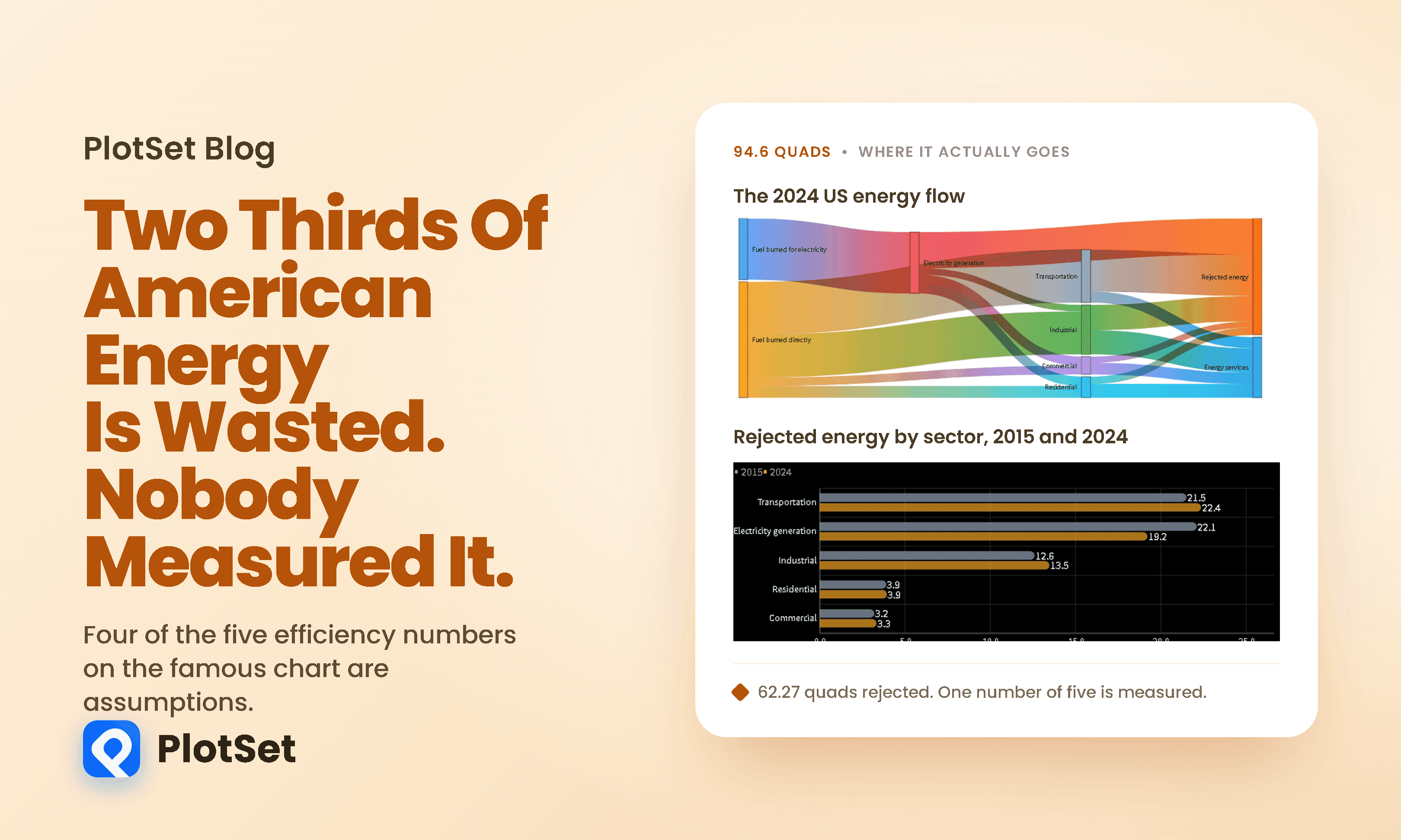
Every year Lawrence Livermore National Laboratory publishes one of the most widely reproduced charts in energy. It is a Sankey diagram of the entire United States energy system, and its headline is arresting: of the 94.6 quadrillion BTU the country consumed in 2024, 62.27 quads, or 65.8 percent, is rejected energy. Energy that never reached a useful end and left mostly as heat.
Here is that flow.
The number gets quoted constantly, usually as evidence that the American economy is squandering most of the energy it buys. That reading is roughly right and the chart is honestly footnoted. But almost nobody who repeats the figure has read the footnote, and the footnote changes what the number is.
Four of the five numbers were never measured
The chart divides the country into five places where energy is used, and applies an efficiency to each. Here is where each of those efficiencies comes from.
Lawrence Livermore says so plainly, in a footnote on the chart itself:
End use efficiency is estimated as 65% for the residential sector, 65% for the commercial sector, 49% for the industrial sector, and 21% for the transportation sector.
Estimated. Only the power sector figure is derived from data, and Lawrence Livermore describes exactly how: retail electricity delivered, divided by the primary energy that went in.
For the other four, rejected energy is consumption multiplied by a constant. Within any one edition of the chart it is not a finding about how efficiently America uses energy. It is the same consumption figure you already had, scaled.
Those constants are not arbitrary. They are considered estimates, and the industrial one was revised in 2017 on the back of a DOE study of manufacturing. But between revisions they do not move, and that has a consequence worth following.
You can see the consequence in the chart's own history
If four sectors carry a fixed efficiency, their waste can only move when their consumption moves. That is exactly what the record shows.
Between 2015 and 2024, American energy consumption barely moved: 94.3 quads to 94.6. The waste share fell, but only from 67.1 percent to 65.8. Almost all of that improvement came from one place. Electricity generation efficiency rose from 36.5 to 41.4 percent and its rejected energy fell by 2.89 quads.
Meanwhile transportation rejected more energy in 2024 than in 2015, and so did industry. Not because anything got worse, but because consumption rose against constants that had not changed since 2017.
There is a genuine finding buried in that chart, and it is the crossover. Transportation has overtaken electricity generation as the largest single source of rejected energy in the United States. In 2015 the power sector threw away more than cars did. In 2024 it does not.
That one survives the objection this article is making. If transportation's number is an assumption times consumption, is the crossover just an artefact of a frozen constant meeting a falling measured one? No. For transportation to fall back below electricity generation, you would have to believe American transport is 32.1 percent efficient, half again as efficient as the most generous figure anyone applies to a fleet still dominated by internal combustion.
What drove the power sector's improvement is not mysterious either.
How much does the assumption matter? Ask 2017.
We do not have to imagine this. Lawrence Livermore has revised these constants twice, and the footnotes record it.
Until the 2016 data year the chart assumed the industrial sector was 80 percent efficient. Then the March 2017 edition changed it to 49 percent, with a note explaining why: it "was updated in 2017 to reflect DOE's analysis of manufacturing." An earlier revision, in 2012, had moved residential and commercial from 80 to 65 percent and transportation from 25 to 21.
Nothing about American factories changed on the day that footnote was rewritten. The number did.
Apply the old constant to today's data and industrial rejected energy falls from 13.46 quads to 5.28. That single revision is worth 8.18 quads, which is 2.8 times the entire fall in power sector waste delivered by retiring half the American coal fleet between 2015 and 2024.
Run the whole 2024 energy system through each vintage of assumptions and the headline moves like this.
Same fuel, same year, a thirteen point spread. Under the constants LLNL used in 2011, the 2024 American economy would be described as 52.7 percent wasteful. Under the constants it uses now, 65.8 percent.
This is not a case of Lawrence Livermore hiding anything. They printed the revision in the footnote and explained its basis. It is a case of a number that gets quoted as a fact about physics being, in large part, a fact about analysis.
It also answers the obvious objection, which is that the constants might simply be right. The 2017 industrial revision was grounded in DOE's analysis of manufacturing, so it is better than what preceded it. That is the point. It was an improvement, and improving it moved the national headline by nearly three times what a decade of coal retirement did.
The part that would be waste anyway
There is a second problem with the way this chart gets quoted, and it runs in the opposite direction. Not all rejected energy is recoverable, and treating the grey block as a pot of squandered fuel is wrong.
The second law of thermodynamics puts a ceiling on any heat engine. A plant running steam at 300 degrees Celsius and rejecting heat to a 27 degree condenser cannot exceed about 47.6 percent efficiency no matter how well it is built. Not because engineers are lazy, but because that is what heat does.
Real plants sit where you would expect given that ceiling.
So part of the 62 quads was never available. What makes the rest interesting is that the ceiling only binds if you are burning something. The way out of a thermodynamic limit is not a better engine, it is not needing the engine.
That is why electrification moves this chart so violently. The Department of Energy puts an electric drivetrain at 65 to 69 percent of the electricity it draws reaching the wheels, and 87 to 91 percent once regenerative braking is counted, against roughly a fifth for a petrol engine.
One caveat that most write-ups drop, and it matters. Those electric figures are plug to wheel and leave out the power station. Put the generator back in and an electric car on a gas-heavy grid runs at roughly 37 to 39 percent well to wheel, against about 16 to 25 percent for petrol once refining and distribution are counted. Still a large win. Not the four-fold one the drivetrain numbers imply on their own.
What this chart is good for
It would be easy to finish by dismissing the diagram, and that would be wrong. Two defences are worth making.
The first is that Lawrence Livermore documents the assumption. It is printed on the chart. Every problem in this article comes from the figure being repeated without its footnote, which is a failure of the retelling rather than of the chart.
The second is that the assumption is not arbitrary. Twenty one percent for transportation is a reasonable central estimate for a fleet dominated by internal combustion. The issue is not that it is wrong, it is that it is fixed, so it cannot register the thing it would most want to register. As electric vehicles take share, the real efficiency of American transportation is rising. A constant cannot show that. The chart will keep reporting transportation at 21 percent efficient until somebody changes the number by hand.
To be fair about the size of that: on a generous reading of the current electric share of transport energy service, the true aggregate figure today is perhaps 21.3 to 21.5 percent rather than 21. That is worth about 0.14 quads, which is small. The assumption is not yet wrong. It is simply fixed, and the 2017 industrial revision shows what happens when a fixed constant is finally caught up.
There is also a criticism that cuts the other way. The analyst Michael Barnard argues the chart understates fossil waste, because energy spent extracting, refining and distributing fuel is not broken out, which he puts at roughly 11 percent. That is one analyst's estimate rather than a finding, but it makes the point that the boundary you draw decides the answer you get.
So the honest reading of the headline is narrower than the one in circulation. About two thirds of American primary energy does not reach a useful end. Roughly a third of that total is genuinely constrained by thermodynamics. And the precision of the figure is an artefact: the second decimal place belongs to a constant somebody chose.
A note on where these numbers came from
Lawrence Livermore publishes no machine-readable version of this chart. There is no CSV, no spreadsheet and no data table, and the PDF text is vector-outlined, so text extraction returns nothing at all. The Sankey image is the data product.
Every LLNL figure in this article was therefore read off a 200 dpi render of the chart and then checked by confirming that every node balances: the nine source boxes sum to 94.60, the four service flows to 32.34, the five rejected flows to 62.27, and 62.27 plus 32.34 returns the 94.6 headline. The 2015 chart has a visible label error, printing 24 in the industrial box where its own outflows sum to 24.7, and we used the figure that balances.
The power plant efficiencies come from the Energy Information Administration's Electric Power Annual, which does publish its data.
Why we built it in PlotSet
This piece needed a Sankey to be the hero and then needed to get out of its way, which is an awkward combination. A flow diagram is very good at one thing, showing where a total goes, and very bad at almost everything else. It cannot show you that two of its numbers are assumptions, it cannot show a sensitivity test, and it cannot show a crossover between two sectors over nine years. The bars and the table do that.
So the useful thing was having the Sankey sit in the same catalogue as the grouped bars, the column chart and the sortable table, all reading from CSVs we built from the same source. The argument here is not the flow diagram. The argument is the flow diagram next to a table that says four of its five numbers were estimated.
One honest note about the tool, since this article is about disclosure. The Sankey renders correctly only on a light background. On our usual black canvas it draws the nodes and silently omits every connecting ribbon, which is why this is the one chart on the page with a white background rather than a stylistic choice.
What we would not claim is that we have a better number than Lawrence Livermore. We do not. We have their number, their footnote, and a sensitivity test showing how much the footnote is carrying.
You can build your own version of any chart here at plotset.com.
References
- Lawrence Livermore National Laboratory. Energy Flow Charts. The source of the 2024 and 2015 US energy Sankey diagrams and every quad figure attributed to LLNL in this article.
- Lawrence Livermore National Laboratory. United States Energy Consumption in 2024. The 2024 chart itself, including the footnote stating the assumed end use efficiencies.
- US Energy Information Administration. State Energy Data System. The underlying consumption data LLNL builds the flow chart from.
- US Energy Information Administration. Electric Power Annual. Fleet average heat rates and thermal efficiencies by plant type for 2024.
- US Energy Information Administration. Monthly Energy Review. Primary energy consumption by source and sector, and the conversion losses that are actually measured.
- Energy Policy. Cullen and Allwood, The efficient use of energy: tracing the global flow of energy from fuel to service, Energy Policy 38(1). The peer reviewed critique of national energy flow diagrams as a class.
- US Department of Energy and EPA. Where the Energy Goes: Electric Cars. The plug to wheel breakdown for electric drivetrains, including charging and accessory losses.
- US Department of Energy and EPA. Where the Energy Goes: Gasoline Vehicles. The comparable breakdown for internal combustion, and the share reaching the wheels.
- OpenStax. College Physics, Carnot's Perfect Heat Engine. The second law ceiling and the worked power plant example.
- Lawrence Livermore National Laboratory. Science and Technology Review. A. J. Simon's account of what the flow charts are intended to show.
- US Energy Information Administration. Units and calculators explained. The quad and British thermal unit definitions used throughout.
- International Energy Agency. World Energy Balances. The international comparison for national energy accounting conventions.