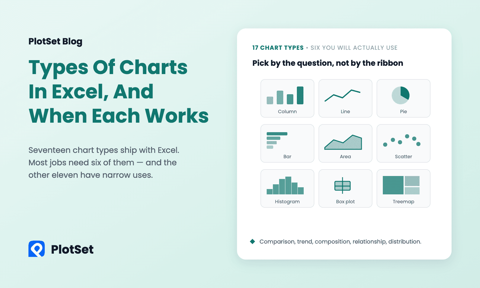
Open Insert → Charts → See All Charts in Excel and the dialog lists seventeen categories. Under those sit another twenty-odd variants — doughnut hides under Pie, bubble under X Y (Scatter), Pareto under Histogram, and every one of them has a 3-D version nobody should use.
Most work needs six of them. The other eleven are not filler, but each has a narrow job, and using one outside that job is how a chart ends up decorative. Here is the whole list, grouped by the question the chart answers rather than by where it sits in the ribbon.
Comparing amounts across categories
Column and Bar. The same chart rotated. Column for a handful of categories or for time on the horizontal axis; bar when the labels are long or there are more than about eight of them, because horizontal labels stay readable. Both start at zero, always — the length of the bar is the number, so truncating the axis is not a style choice, it is a lie. Sort by value unless the categories have a natural order.
Radar. Several measures for one or two items, arranged in a circle. It reads well for a profile — a product scored on six attributes — and badly for anything else. Area on a radar chart is not proportional to the values, which is why three overlapping series turn into a mess.
Best first choice: bar chart.
Showing change over time
Line. The default and usually the right answer. One line per series, time on the horizontal axis, and up to about five series before the chart needs splitting. Watch the axis: a line chart may start above zero, but say so.
Area. A line chart with the space underneath filled. Use it for one series where the magnitude matters, or stacked for parts of a total. Never overlap two unstacked areas — the one in front hides the one behind.
Stock. Open-high-low-close, in four rigid layouts that require the columns in a specific order. If you are not charting prices, this is not your chart.
Best first choice: line chart.
Showing composition — parts of a whole
Pie and Doughnut. Fine for two or three slices where one obviously dominates. Beyond that, angles are hard to compare and the labels crowd the edge. The honest test: if you need the percentages printed on the slices for the chart to be readable, the chart is not doing the work — a sorted bar chart is.
Stacked column or bar. Composition across several categories at once. The bottom segment is easy to compare because it shares a baseline; every segment above it is not. Put the series you actually care about at the bottom.
Treemap. Nested rectangles sized by value. It handles a hierarchy with many small parts — budget by department and team — far better than a pie, and it is a genuine improvement Excel gained in 2016.
Sunburst. The same hierarchy drawn as concentric rings. It looks striking and reads worse than a treemap for anything past two levels.
Waterfall. How a starting number became an ending number: opening balance, the ups and downs that moved it, closing balance. It is the right chart for a variance walk or a profit bridge, and it needs one column flagged as a total for each subtotal bar, which Excel handles through Format Data Point → Set as total.
Funnel. Stages that only ever shrink: leads, qualified, demo, closed. It is a stacked bar with a specific story, and it is misleading if the stages are not genuinely sequential.
Best first choice: pie chart for two or three slices, a stacked bar for anything more.
Showing a relationship between two numbers
X Y (Scatter). Two numeric columns, one point per row. The only chart in this list where both axes are real number lines, which is exactly why people reach for a line chart by mistake and get evenly spaced categories instead.
Bubble. A scatter with a third variable driving the size of each marker. Size is judged badly by eye, so keep it as a rough magnitude, not a precise reading.
Best first choice: scatter plot.
Showing a distribution
Histogram. One numeric column, binned into intervals, bars touching. It answers "what does the spread look like" — the question an average quietly hides. Set the bin width yourself; the automatic one is a starting point.
Pareto. A histogram sorted descending with a cumulative percentage line. Useful for "which few causes account for most of the problem", useless if the categories are not causes of the same thing.
Box & Whisker. Five-number summaries side by side, so you can compare a dozen groups at once. It cannot show a two-peaked distribution — that is what the histogram is for.
The remaining specialists
Map (filled map). Shades countries, states or counties by value. It needs recognizable place names and an internet connection, since Excel resolves the geography online, and it only draws filled regions — no symbols, no bubbles, no county-level control worth the name.
Surface. A 3-D response surface over two variables. Genuinely useful in a handful of engineering cases and almost nowhere else.
Combo. Not a chart type: a way of mixing two, usually columns plus a line on a secondary axis. It is the correct answer for "revenue and margin percentage on one chart", and it is also the fastest way to imply a relationship that is not there, because two axes can be scaled to make anything look correlated.
The six that do most of the work
| Question | Chart |
|---|---|
| Which is biggest? | Bar or column |
| What changed over time? | Line |
| What are the parts of the total? | Stacked bar (pie only for two or three) |
| Do these two numbers move together? | Scatter |
| What does the spread look like? | Histogram |
| How do these groups compare? | Box & whisker |
If you are unsure, Insert → Recommended Charts reads your selection and suggests a few. It is better than it used to be, and it is still biased toward whatever fits the shape of your range rather than the question you are asking — treat it as a shortcut, not an adviser.
When the chart has to leave the workbook
All seventeen are built for looking at data at your desk. Once a chart has to go into a post, a report or a dashboard, Excel gives you a picture: a static image with Office's styling on it that has to be remade by hand every time a number changes.
If that is where your chart is going, build it somewhere designed for publishing. PlotSet's chart maker covers all of the types above and a few Excel does not have — sankey diagrams, bump charts, animated bar chart races, choropleth maps down to county level — with your fonts and colors, tooltips on every value, and an embed snippet instead of a screenshot.
FAQ
How many chart types does Excel have? Seventeen categories appear in the All Charts tab of Microsoft 365 Excel — Column, Line, Pie, Bar, Area, X Y (Scatter), Map, Stock, Surface, Radar, Treemap, Sunburst, Histogram, Box & Whisker, Waterfall, Funnel and Combo — with around fifty variants beneath them once you count doughnut, bubble, Pareto, stacked versions and the 3-D options.
What is the most used chart type in Excel? Column and bar charts, followed by line charts. Together they cover the two most common questions in business data: which category is biggest, and what has changed over time.
Which chart types were added most recently? Treemap, Sunburst, Histogram, Pareto, Box & Whisker and Waterfall arrived in Excel 2016. Funnel and the Map chart came with Excel 2019 and Microsoft 365. Older versions will not show them.
When should I not use a pie chart? Whenever you have more than three slices, whenever the slices are close in size, and whenever you need the reader to compare across two pies. A sorted bar chart answers the same question and can be read at a glance.
Why does my Excel map chart not work? Map charts resolve place names through an online service, so they need an internet connection and names Excel recognizes. Ambiguous names — a city that exists in four countries, a county name shared across states — fail or map to the wrong place. Adding a column with the country or state usually fixes it.