Jun 13, 2026
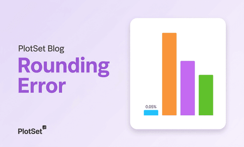
The $80 Billion World Cup Is a Rounding Error
How the 2026 World Cup's $80 billion headline shrinks to 0.05% of US GDP — and why a number without a denominator can fool almost everyone.
Read more
Check out these data visualization examples to get inspired
Jun 13, 2026
How the 2026 World Cup's $80 billion headline shrinks to 0.05% of US GDP — and why a number without a denominator can fool almost everyone.

Feb 25, 2026
How Heatmaps Quietly Distort Perception, and Decision-Making Color is not cosmetic in data visualization. It is a cognitive encoding system. When that system is poorly designed, it does not merely reduce clarity. It alters interpretation, sometimes materially. Heatmaps are widely used in epidemiology, financial dashboards, climate science, urban analytics, and medical imaging. They compress multidimensional information into color gradients that appear quantitative and precise.

Feb 23, 2026
Pie charts aren't just an aesthetic choice; they are a lower-fidelity perceptual instrument because human brains struggle to decode angles and areas accurately. In high-stakes decision environments where a 2% difference in market share matters, that extra perceptual "noise" becomes a measurable risk factor for misinterpretation and ultimately, for marginal capital misallocation.

Feb 17, 2026
In the summer of 1990, just weeks before the Gulf War, traders at a London hedge fund watched gold prices surge 12% in a single fortnight. The spike foreshadowed a conflict that would reshape the Middle East, disrupt oil markets, and send shockwaves through global finance. That moment was not an anomaly. Decades of historical data show gold frequently anticipates war, quietly reflecting market anxiety before diplomats or generals take action.

Feb 15, 2026
In 1980, an estimated 553,569 people died by suicide worldwide. In 2023, the number reached 767,616. The surface reading suggests steady deterioration. More deaths. More despair. That interpretation is wrong.

Feb 12, 2026
From sterile surgical instruments to lightweight aircraft components, from food preservation to digital infrastructure, plastic has enabled longevity, affordability, and safety at a scale no other material has matched. In 1950, the world produced two million tonnes of plastic. Today, annual production exceeds 450 million tonnes. In just seventy years, output has increased nearly 230-fold. In the last two decades alone, it has doubled.
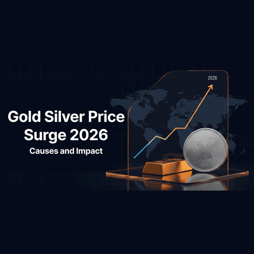
Feb 9, 2026
Discover the key factors behind the gold silver price surge 2026, including central bank gold buying, physical silver shortages, and the effects on global markets. Learn what drove the rally, the role of the silver squeeze, and what investors should watch for in the future.
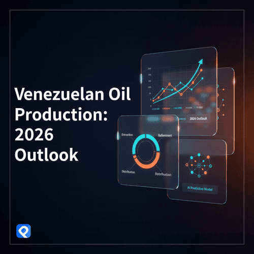
Jan 8, 2026
Discover the future of Venezuelan oil production in 2026. Explore Venezuela's oil reserves, PDVSA, US sanctions, international partnerships, and the geopolitics shaping the country's energy sector and global markets.

Nov 3, 2025
You know those viral videos where lines race across the screen, competing for the top spot while the numbers tick up dramatically? The ones that get millions of views on LinkedIn. The ones people actually watch until the end. The ones that turn boring growth metrics into edge-of-your-seat drama. Yeah, those. You can make them now.

Oct 29, 2025
Most charts are ugly. You know it. I know it. That boring blue bar chart in every presentation? The pie chart that makes people’s eyes glaze over? The line graph that looks like it was made in 1995 with that paperclip helper from Microsoft Excel? Data visualization should make people stop and stare. It should make them lean in, ask questions, share it with others. Instead, we’re stuck in a world of corporate templates that suck the life out of every number. That’s why we built PlotSet.

Oct 1, 2025
Remember when we thought AI would revolutionize everything? Well, the revolution is here, and it looks suspiciously like spell check with a college degree. A groundbreaking NBER study analyzing 1.5 million ChatGPT conversations just revealed how 700 million weekly users actually spend their time with the world’s most advanced AI.

Sep 30, 2025
France’s debt burden has reached breaking point. Debt now stands at 116 per cent of GDP, while Germany sits at just under 64 per cent. The gap between Europe’s two largest economies has never been wider, and the bond market is beginning to make France pay for it.