Every chart on this blog sits on a black background. Dark mode charts were a taste decision here, made early and never tested, so this piece is us checking our own homework in public.
The reading research is not encouraging. Since the 1980s, studies have found that dark text on a light background beats the reverse for proofreading and for visual acuity. If you have seen a designer argue against dark mode, that is the literature they are citing.
So we asked the colour question instead. Not by testing readers, which is a different and harder thing, but by computing whether standard chart palettes are even visible against each ground. On that measure the answer inverts.
Ninety-four percent against forty-five
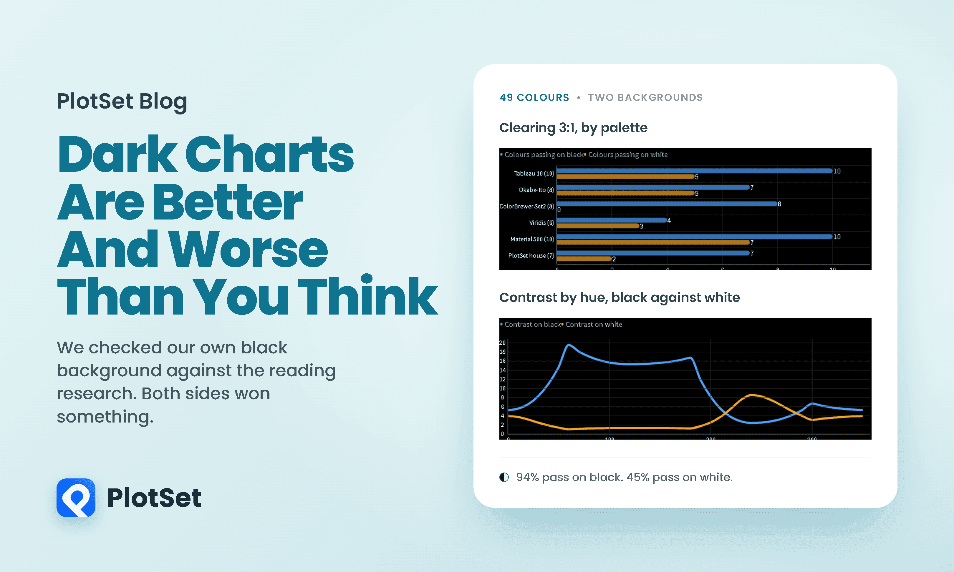
Take six palettes that working analysts actually use, put every colour in each of them against a black background and then a white one, and count how many clear the contrast threshold that accessibility guidance sets for chart marks. That threshold is 3:1, from WCAG success criterion 1.4.11, and it is lower than the 4.5:1 people usually quote because that number is for body text.
Across all 58 colours, 93 percent clear 3:1 on black and 43 percent on white. Our own house palette, the one these charts are drawn in, is 7 out of 7 on black and 2 out of 7 on white.
Two things that number does not mean. WCAG 1.4.11 asks a mark to reach 3:1 against its background, not against the other marks, so a palette can pass all eight and still be hard to tell apart. And the criterion only covers marks a reader needs in order to understand the graphic. What we counted is whether a colour is visible against its ground, which is a floor, not a guarantee of a readable chart.
That is not a fact about taste. It is a fact about arithmetic, and the arithmetic is worth understanding because it explains something you have probably noticed without being able to name.
Why dark backgrounds have more room
Contrast against black is driven by how much light a colour emits. Contrast against white is driven by how much it withholds. Those are not symmetric, because most saturated colours are fairly bright.
Yellow reaches 19.56:1 on black and 1.07:1 on white, which is to say it is spectacular on one and invisible on the other. Blue is the reverse at 2.44:1 and 8.59:1. Across the full circle, 29 of 36 hues reach higher contrast on black, and the best case on black is more than double the best case on white.
The practical consequence is a constraint on how much of your palette you are allowed to use.
On a white background you have to darken a colour before it is legible, and darkening it drains the saturation out of it. On black you can leave it vivid. This is why dark dashboards look more saturated than light ones. It is not a stylistic preference, it is the only part of the scale that was available.
Now the part that goes the other way
None of the above is about reading. It is about coloured shapes against a ground. The moment a chart asks you to read a word, the evidence turns around.
The polarity literature is genuinely solid. Buchner and Baumgartner found dark-on-light better for proofreading across three experiments. Piepenbrock and colleagues measured the mechanism directly with an eye tracker: reading a light screen, the pupil sat at 2.09 mm; reading a dark one, 3.65 mm. A smaller pupil gives a greater depth of field, which is the same reason a camera stopped down has more in focus. The optimum for the human eye is about 2.4 mm, and a light background lands you near it.
The size of the effect on the screen itself is easy to underrate. The illuminance reaching the reader's eye was 118.4 lux from the light display and 2.7 lux from the dark one, a forty-four fold difference produced by nothing but the page.
Two qualifications matter enormously, and most write-ups skip both.
The first is that it may not be polarity at all. When Buchner, Mayr and Brandt matched the two displays for overall luminance while holding contrast constant, the advantage went away. What the field may really have measured is that brighter screens are easier to read small text on, and light screens are brighter almost by definition. That is a different claim with different remedies.
The second is scope. Every study named so far measured proofreading, or acuity with a Landolt C, or lexical decision on single words. None of them measured a chart.
Somebody has now. While and Sarvghad put the question directly to 134 people at IEEE VIS in 2024, half of them under 60 and half over, reading bar charts, line charts and scatterplots in both polarities. Their result is the most useful thing in this article and it is not a win for either side.
Neither polarity won. Which one helped varied person by person, with each benefiting comparable proportions of participants, and the effect did not noticeably change with age. The size of it was not trivial either: switching polarity moved task time about as much as switching chart type did, an average difference of around 36 percent.
And one finding deserves its own sentence. The polarity that made someone faster was often not the one they preferred. People do not reliably know which mode is helping them.
Who this actually costs
Start with the part that applies to everyone. The visual system is not symmetric about light and dark. Kremkow and colleagues showed that the neurons carrying dark features respond roughly in proportion to contrast, while the neurons carrying light features saturate. Light shapes on a dark ground are therefore slightly blurrier for every viewer, with or without a refractive error, and nobody can opt out of that.
Then there is a group for whom light-on-dark is widely believed to be harder still, on an optical account that is plausible and, as we will get to, unmeasured. A dark screen dilates the pupil, light then enters through a wider ring of the cornea and lens, and optical aberrations scale steeply with pupil diameter. In an eye whose curvature differs by meridian, those extra peripheral rays land at different depths, and light text appears to bloom.
Designers call that halation. It is worth knowing that this is not a clinical term. The vision science name for the percept is the irradiation illusion, described by Galileo and later Helmholtz.
The condition underneath it is ordinary.
In the United States, NHANES puts astigmatism of one dioptre or more at 36.2 percent of adults over 20, rising to 50.1 percent past 60. Globally it is the most common refractive error there is, ahead of both short and long sight.
Two things need saying plainly here, because this is where the internet gets careless.
Dark mode does not cause astigmatism. It removes the pupil constriction that a bright screen was supplying, which had been quietly masking an aberration that was already there.
And nobody has measured it. For all that this explanation is repeated, we could not find a published study that tested reading performance in astigmatic readers by polarity. The optics are plausible and the prediction is clear. It has not been run.
There is also a group for whom the sign appears to flip. Legge and colleagues found that readers with cloudy ocular media, including cataract, read faster with light text on a dark ground. A clouded lens scatters light forward, so a large bright field becomes a source of veiling glare rather than helpful illumination. Readers with central-vision loss were unaffected by polarity either way.
That study is worth its caveats. It ran in 1985 on cathode ray tubes, with six low-vision observers, and the polarity literature cited above criticises it by name for exactly that: sample sizes small enough that detecting a real difference would be unlikely either way. It is a signpost, not a settled result.
Dark mode is therefore not simply an accessibility failure or an accessibility win. The costs and benefits land on different people, and for the largest group affected the evidence is optical reasoning rather than measurement.
A claim we expected to make, and could not
We assumed this article would include a section on the standard contrast formula being wrong for dark backgrounds. It is a fashionable criticism with a real basis: WCAG 2.x divides the lighter colour by the darker one, so it returns the same number no matter which is the background. It cannot tell light-on-dark from dark-on-light. The proposed replacement, APCA, is polarity-aware.
So we implemented APCA from its published constants, checked it against its own reference values, and tested whether it would actually change which colours we picked.
For the colours you draw data with, the two metrics agree. The criticism, whatever its merits, would not have moved a single line in our palette. That section died.
But it only died for saturated colour. Run the same comparison on grey, and the two metrics part company completely, which matters because grey is what axis labels, gridlines and annotations are made of.
Take the grey #767676. On white it scores 4.54:1. On black it scores 4.62:1, so the standard says it got very slightly better. APCA scores the same two cases at +71.6 and -30.1, which is the difference between comfortable body text and something you would struggle with.
So the honest position is narrower than the fashionable one and more useful. The metric is fine for your data colours. It is the label grey you should not trust it on.
What dark mode charts are actually made of
Put the two halves together and the answer stops being about dark mode at all.
A chart is not a picture and it is not a page of text. It is both, layered: coloured marks that carry the data, and words that make the marks mean something. A dark background helps the first and hurts the second. Whichever you choose, you are choosing which half to favour.
That reframing has a few practical consequences.
Do not invert a light palette to make a dark one. The colours that worked on white are the darkened, desaturated ones, and they are exactly the colours with no headroom left on black. Material Design's own guidance is to move to a lighter tone of the same hue rather than reuse the mid tone, because saturated colours "can visually vibrate against dark surfaces". Rebuild the palette against the ground you are using.
Treat labels differently from marks. Your data colours are probably fine on black. Your grey text probably is not, and the standard contrast checker will not warn you. Push label grey lighter than the number tells you to.
Do not use pure black. Material's dark surface is #121212, not #000000, which softens the luminance step that drives the blooming.
And offer both. This is the recommendation that follows from the evidence rather than from taste. Astigmatism is common and rises with age; cataract pushes the other way; the reading advantage of light backgrounds may really be an advantage of brighter ones. No single choice serves all of that. A toggle does.
On battery, which is the argument people reach for last: dark mode on an OLED screen saves 3 to 9 percent of total phone power at the 30 to 50 percent brightness that indoor auto-brightness actually uses, rising to 39 to 47 percent only at full brightness. Google's widely quoted 60 percent figure was measured at 100 percent brightness. On an LCD, where the backlight runs regardless, it saves essentially nothing.
What we are doing about it
We are not going to pretend this audit vindicated us. Here is our own palette, checked.
Seven out of seven on black, two out of seven on white. It was built for this blog's background and would need rebuilding, not inverting, for a light one. Our label greys are the part we had least evidence for and are the part the standard checker is least reliable about.
What the audit does support is the choice of a dark canvas for charts whose job is colour, which is most of them. The marks have more room, the palette can stay vivid, and the threshold that matters for chart marks is 3:1 rather than 4.5:1.
What it does not support is treating that as settled. The entire polarity literature is about text. The astigmatism mechanism is plausible and unmeasured. And the one study that has put the question directly to chart readers found that neither polarity wins, that which one helps is individual, and that people often prefer the mode that is not helping them. That is a poor foundation for a house style and a good one for a setting.
If you build charts in PlotSet, the useful thing is that the canvas is a parameter rather than a house style, so the same data can be rendered both ways and checked rather than argued about. The version of this article we would most like to read is the one where somebody runs the experiment properly.
You can build your own version of any chart here at plotset.com.
References
- Ergonomics. Buchner and Baumgartner, Text background polarity affects performance irrespective of ambient illumination and colour contrast, Ergonomics 50(7). The foundational proofreading result favouring dark text on light.
- Ergonomics. Buchner, Mayr and Brandt, The advantage of positive text background polarity is due to high display luminance, Ergonomics 52(7). The study showing the polarity advantage disappears when displays are matched for luminance.
- Ergonomics. Piepenbrock, Mayr and Buchner, Smaller pupil size and better proofreading performance with positive than with negative polarity displays, Ergonomics 57(11). The measured pupil diameters of 2.09 and 3.65 millimetres and the accompanying performance effects.
- Ergonomics. Piepenbrock, Mayr, Mund and Buchner, Positive display polarity is advantageous for both younger and older adults, Ergonomics 56(7). The age comparison, including the much smaller acuity advantage for older readers.
- Human Factors. Piepenbrock, Mayr and Buchner, Positive display polarity is particularly advantageous for small character sizes, Human Factors 56(5). The character size moderator.
- PNAS. Kremkow and colleagues, Neuronal nonlinearity explains greater visual spatial resolution for darks than lights, PNAS 111(8). The ON and OFF pathway asymmetry that makes light features blurrier for every viewer.
- Vision Research. Legge, Rubin, Pelli and Schleske, Psychophysics of reading, Vision Research 25(2). The finding, from six low-vision observers on cathode ray tubes in 1985, that readers with cloudy ocular media read faster with light text on a dark background.
- IEEE VIS 2024. While and Sarvghad, Dark Mode or Light Mode? Exploring the Impact of Contrast Polarity on Visualization Performance Between Age Groups, IEEE VIS 2024. The only study to put the polarity question directly to chart readers, with 134 participants across three chart types.
- Journal of Current Ophthalmology. Hashemi and colleagues, Global and regional estimates of prevalence of refractive errors, Journal of Current Ophthalmology 30(1). The global pooled astigmatism prevalence of 40.4 percent in adults.
- Archives of Ophthalmology. Vitale, Ellwein, Cotch, Ferris and Sperduto, Prevalence of refractive error in the United States, Archives of Ophthalmology 126(8). The NHANES figures of 36.2 percent overall and 50.1 percent past 60.
- European Eye Epidemiology Consortium. Prevalence of refractive error in Europe. The pooled prevalence by five year age band across 61,946 participants.
- W3C. Understanding Success Criterion 1.4.11 Non-text Contrast. The 3:1 threshold that applies to chart marks, and the limits of what it requires.
- W3C. Understanding Success Criterion 1.4.3 Contrast (Minimum). The 4.5:1 text threshold and the relative luminance formula.
- W3C WCAG working group. Contrast Ratio Math and Related Visual Issues, issue 695. The origin of the criticism that the WCAG 2.x formula is symmetric and mis-handles dark backgrounds.
- Myndex. APCA the Accessible Perceptual Contrast Algorithm. The proposed polarity-aware replacement, its constants and its reference values.
- ACM MobiSys. Dash and Hu, How much battery does dark mode save?, MobiSys 2021. The per-frame OLED power measurements at realistic brightness levels.
- Material Design. Dark theme. The guidance against saturated colours on dark surfaces and the recommended dark surface value.