PlotSet LogoPlotSet

Blogs

Check out these data visualization examples to get inspired

Master PlotSet in 5 Minutes

Oct 29, 2025

Master PlotSet in 5 Minutes

Most charts are ugly. You know it. I know it. That boring blue bar chart in every presentation? The pie chart that makes people’s eyes glaze over? The line graph that looks like it was made in 1995 with that paperclip helper from Microsoft Excel? Data visualization should make people stop and stare. It should make them lean in, ask questions, share it with others. Instead, we’re stuck in a world of corporate templates that suck the life out of every number. That’s why we built PlotSet.

Read more
ChatGPT Has 700 Million Users. Most Use It to Polish Emails

Oct 1, 2025

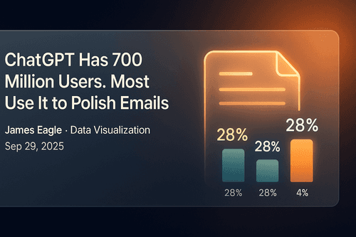
ChatGPT Has 700 Million Users. Most Use It to Polish Emails

Remember when we thought AI would revolutionize everything? Well, the revolution is here, and it looks suspiciously like spell check with a college degree. A groundbreaking NBER study analyzing 1.5 million ChatGPT conversations just revealed how 700 million weekly users actually spend their time with the world’s most advanced AI.

Read more
Animated charts made me famous. Now they’re yours

Sep 30, 2025

Animated charts made me famous. Now they’re yours

The chart that took me from unknown to viral is now available to everyone. No code required.

Read more
France Shows the Limits of Eternal Borrowing

Sep 30, 2025

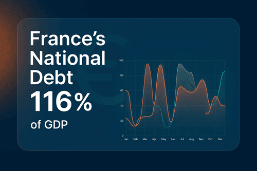
France Shows the Limits of Eternal Borrowing

France’s debt burden has reached breaking point. Debt now stands at 116 per cent of GDP, while Germany sits at just under 64 per cent. The gap between Europe’s two largest economies has never been wider, and the bond market is beginning to make France pay for it.

Read more
Why bar charts still rule

Sep 30, 2025

Why bar charts still rule

In my first newsletter, I'm defending the humble bar chart whilst admitting why I can't beat it. From William Playfair's revolutionary rectangles in 1786 to the racing bar chart wars that got Reddit so wound up they banned them entirely. Why does a 250-year-old static chart still rule our data-obsessed world? And why do we keep trying to fix something that isn't broken? Read why the bar chart is King - even when kings learn to dance.

Read more
10 Prompts for Stunning AI-Generated Charts Using Prompt To Data

Sep 23, 2025

10 Prompts for Stunning AI-Generated Charts Using Prompt To Data

Creating insightful data visualizations has never been easier, thanks to AI-powered tools like PlotSet. Whether you're an analyst, marketer, or student, generating charts from simple prompts saves time and eliminates the need for complex software. In this blog, we'll showcase ten creative and impactful prompts you can use to demonstrate the power of PlotSet's AI-driven charting capabilities.

Read more
Introducing the "Prompt to Data" Feature

Dec 5, 2024

Introducing the "Prompt to Data" Feature

Finding the perfect dataset for a compelling chart or visualization can often feel like looking for a needle in a haystack. You might spend hours combing through databases, verifying sources, and piecing everything together - all before you even begin visualizing. What if this entire process could be simplified to a single prompt? Enter "Prompt to Data," PlotSet's groundbreaking feature designed to revolutionize the way you create visualizations.

Read more
The Psychology of Color in Data Visualization

Dec 5, 2024

The Psychology of Color in Data Visualization

Colors are more than aesthetic choices; they are strategic tools in data visualization. They guide attention, communicate meaning, and evoke emotions. Misusing colors can confuse viewers or misrepresent your data, while using them effectively can transform your visualizations into compelling stories. Let's dive into the psychology of color and learn how to harness it for your charts.

Read more
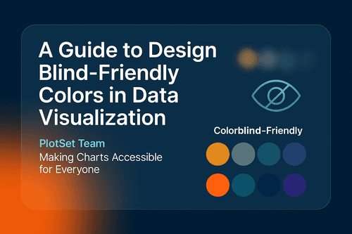
A Guide to Design Blind-Friendly Colors in Data Visualization

Dec 4, 2024

A Guide to Design Blind-Friendly Colors in Data Visualization

Data visualization is one of the most powerful tools for storytelling, but what happens when your carefully crafted charts become inaccessible to a significant portion of your audience? Approximately 1 in 12 men and 1 in 200 women globally have some form of color vision deficiency (CVD). Millions of people might struggle to interpret visuals if they’re not designed with accessibility in mind.

Read more
Easily Edit Your Visuals With PlotSet Figma Plugin

Nov 30, 2024

Easily Edit Your Visuals With PlotSet Figma Plugin

Learn how features like SVG export help you create sharp, scalable charts that fit perfectly into your designs. Say goodbye to blurry images and complicated workflows! With PlotSet, you can design professional visuals quickly and easily.

Read more
How to Use ChatGPT Prompts to Improve Your Data Visualization

Oct 21, 2023

How to Use ChatGPT Prompts to Improve Your Data Visualization

Learn how to enhance your data visualization skills using ChatGPT prompts. Improve your understanding and presentation of data.

Read more
Mapping Lexical Distances Between Europe's Languages: A Heatmap Visualization Exploration

Oct 18, 2023

Mapping Lexical Distances Between Europe's Languages: A Heatmap Visualization Exploration

Delve into the intricate web of European languages through a compelling heatmap visualization and uncover the lexical distances between them.

Read more