
Sep 27, 2023
Creating a Force-directed Circle Packing (R&D Expenditure)
Discover the process of developing a force-directed circle packing for your data with our comprehensive guide. Enhance your data visualization skills today.
Read more
Check out these data visualization examples to get inspired
Sep 27, 2023
Discover the process of developing a force-directed circle packing for your data with our comprehensive guide. Enhance your data visualization skills today.

Sep 27, 2023
Discover the art of crafting a stunning Spiral Bubble for your data with our comprehensive guide. Elevate your presentations today.

Sep 27, 2023
Discover the process of creating a Circle packing to showcase sunlight intensity. Gain valuable insights and knowledge with our step-by-step guide.

Sep 27, 2023
Learn how to design a Voronoi Treemap for NBA Championships with this informative blog post. Perfect for data visualization enthusiasts.

Oct 14, 2023
Find out how to set up the 'Pie' Settings in Pie Charts and Donut Charts.

Sep 27, 2023
Learn how to create a treemap with categories on Big Pharma. Follow the steps and master the technique.

Oct 14, 2023
Discover the process of forking a shared chart with our comprehensive guide.

Sep 27, 2023
Discover the process of generating a heatmap list to showcase your categorical data, specifically the most polluted cities.
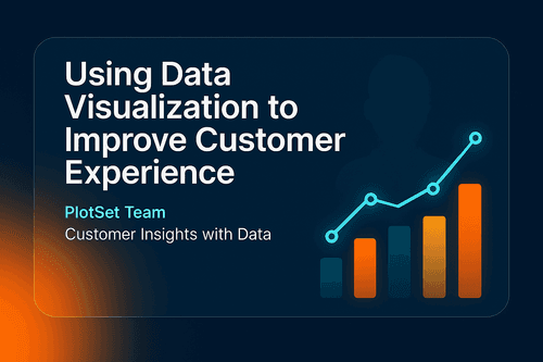
Sep 12, 2023
Discover the significance of data visualization in gaining valuable customer insights. Enhance your business strategies with effective data representation.
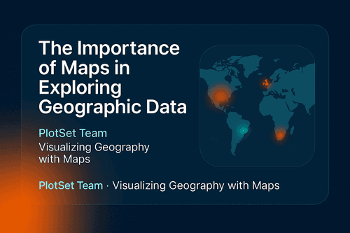
Sep 12, 2023
Explore geographic data with ease using interactive maps. Discover insights and trends with our informative blog.

Oct 14, 2023
Discover the intricacies of designing a Column Chart with the help of the Columns Settings. Enhance your data visualization skills today.
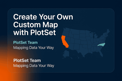
Sep 27, 2023
Learn how to create a detailed USA map using the PlotSet template with our comprehensive guide. Perfect for data visualization and presentations.