Why AI-Powered Charting Matters
Traditional chart creation often involves wrangling data in spreadsheets or learning advanced visualization tools. With PlotSet, all you need is a clear idea of what you want, expressed as a simple prompt. The AI takes care of the rest, generating professional-quality charts in seconds. Here are ten examples to inspire you.
1. Sales Growth Analysis
Prompt: "Show the monthly sales growth for Microsoft from January 2020 to December 2023." Use Case: Perfect for showcasing business performance over time, this visualization helps identify trends and anomalies in sales data. AI Output: A clean line chart with annotations marking key growth periods, such as post-product launches or marketing campaigns.

2. Climate Change Data
Prompt: "Show the average temperatures for the last 10 years." Use Case: Ideal for presenting scientific data, this chart provides a comprehensive view of regional temperature changes over decades.

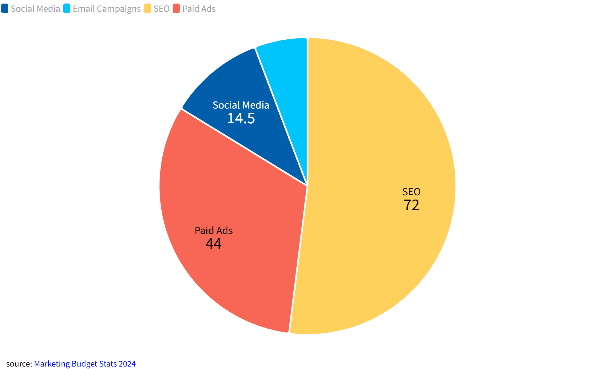
3. Marketing Budget Allocation
Prompt: “Show the percentage of a $1,000,000 marketing budget spent on social media, email campaigns, SEO, and paid ads.”
Use Case: Helps marketers quickly visualize budget allocation for better planning and decision-making.
AI Output: A pie chart with clear labels and percentage breakdowns for each channel.
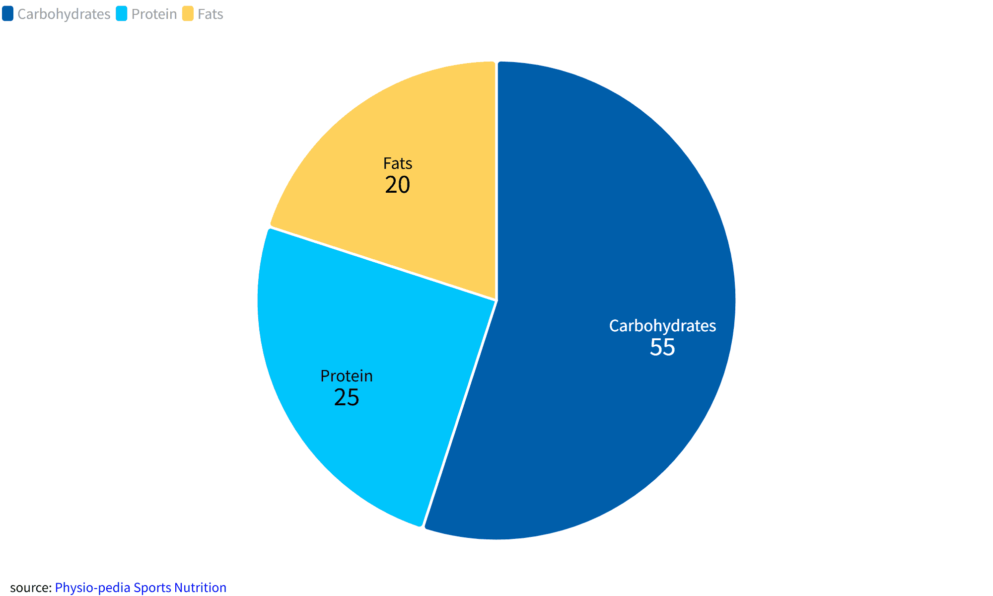
4. Health and Fitness Tracker
Prompt: “Show calorie intake distribution (protein, carbs, fats) for a fitness enthusiast over a week in percentage.”
Use Case: Fitness enthusiasts can visualize their dietary balance, helping them make informed nutritional decisions.
AI Output: A colorful pie chart with clear labels for each macronutrient category.
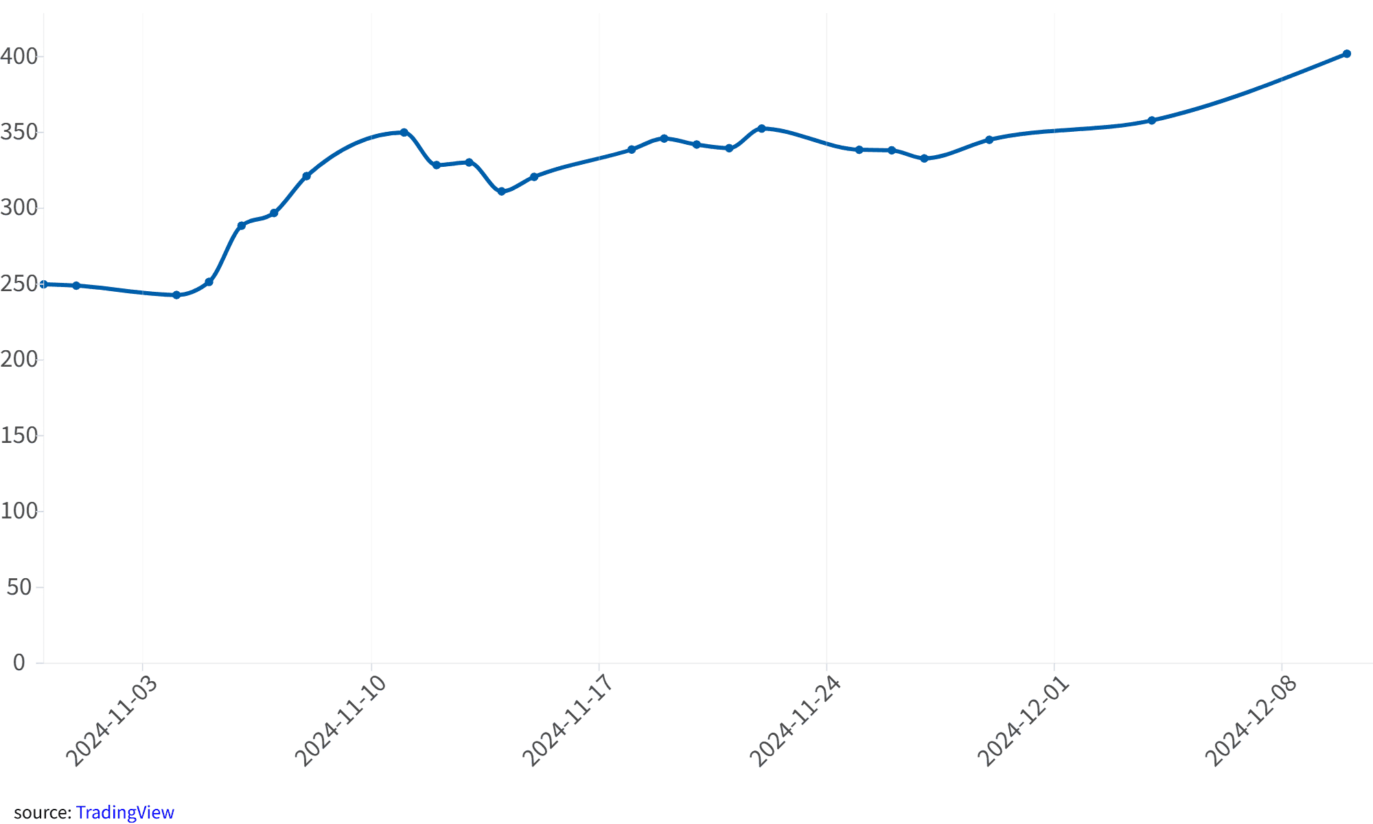
5. Stock Market Trends
Prompt: “Show Tesla’s stock closing prices over the last 30 days.”
Use Case: Financial analysts can use this chart to quickly assess market trends and make investment decisions.
AI Output: A detailed line chart showing daily closing prices for Tesla’s stock.
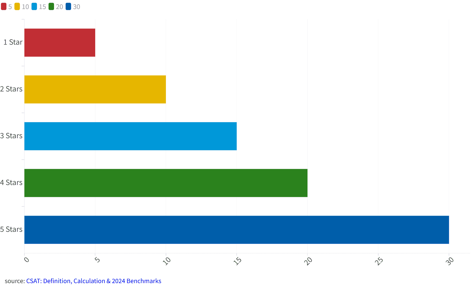
6. Survey Results Summary
Prompt: “Show customer satisfaction ratings (1–5 stars) for a product, with the average rating clearly displayed.”
Use Case: Businesses can use this chart to understand customer feedback at a glance.
AI Output: A bar chart with a distinct marker for the average rating, making trends easy to spot.
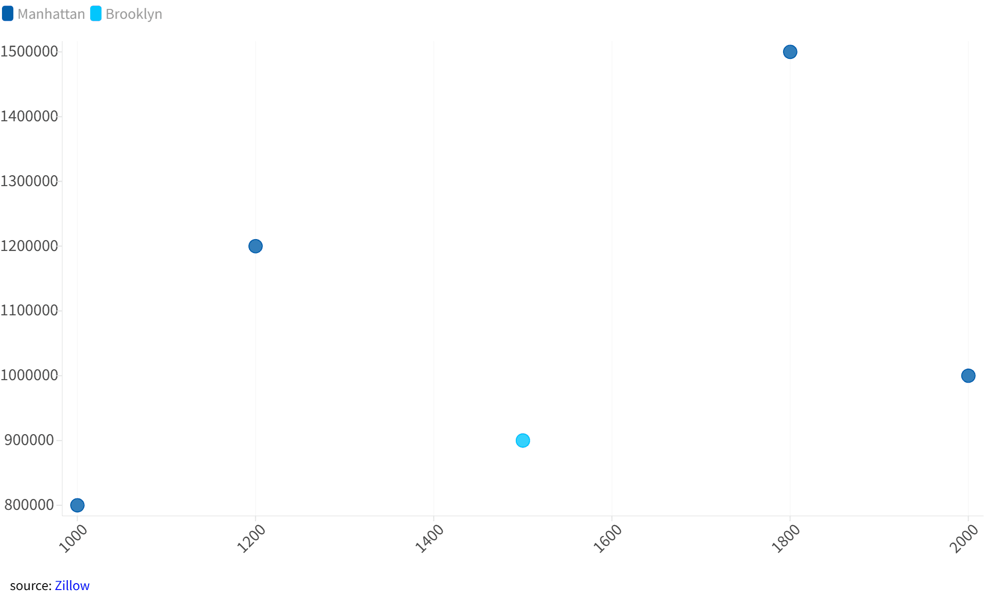
7. Real Estate Price Comparison
Prompt: “Create a scatter plot comparing square footage and price for houses sold in New York City in 2023, with data clusters highlighted.”
Use Case: Real estate professionals can identify pricing patterns and outliers in the market.
AI Output: A scatter plot with highlighted clusters, revealing pricing trends in different neighborhoods.
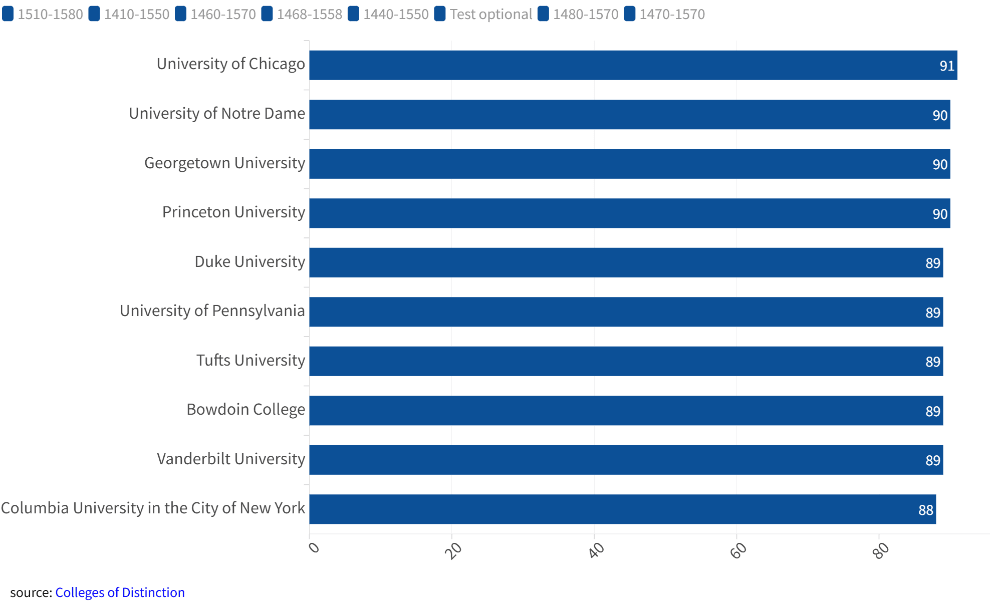
8. Education Statistics
Prompt: “Compare graduation rates across 10 universities in 2022.”
Use Case: Educators and policymakers can use this chart to compare academic outcomes across institutions.
AI Output: A horizontal bar chart with university names and graduation rates neatly displayed.
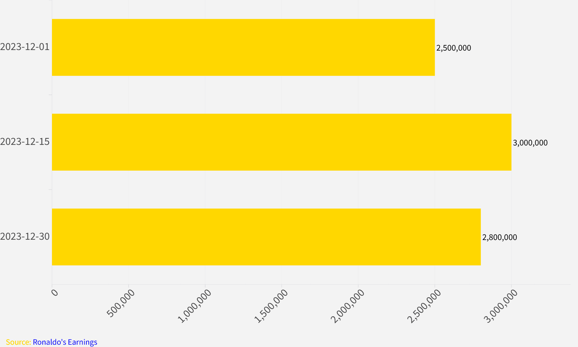
9. Social Media Engagement
Prompt: “Generate a bar chart showing the number of likes, comments, and shares for each three Instagram posts of Cristiano Ronaldo in December 2023.”
Use Case: Marketers can use this chart to compare engagement metrics and understand audience preferences.
AI Output: A bar chart with clear labels for likes, comments, and shares for each post.
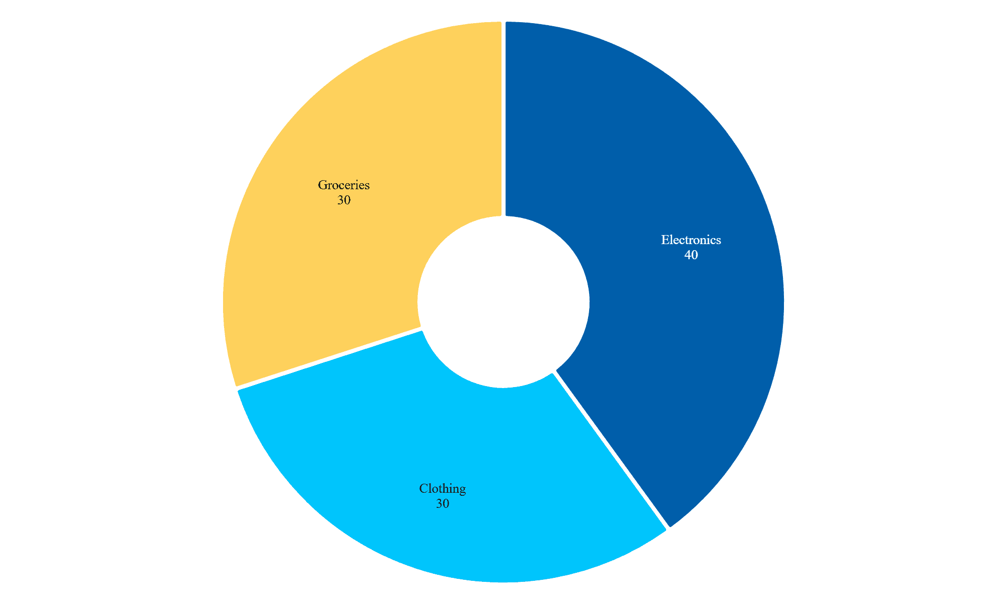
10. Product Sales Breakdown
Prompt: “Generate a donut Chart showing the sales share of three product categories: electronics, clothing, and groceries, for a retail store in 2023.”
Use Case: Helps businesses quickly visualize which product categories contribute the most to overall revenue.
AI Output: A simple donut Chart with sales shares clearly labeled for each category.
Tips for Writing Effective Prompts
- Be Specific: Clearly describe the data and type of chart you need.
- Include Context: Mention key elements like time periods, categories, or annotations.
- Request Customizations: Add details like colors, labels, or data highlights for a tailored result.
Conclusion
AI-powered tools like PlotSet are revolutionizing data visualization. By leveraging simple prompts, you can create professional-quality charts in seconds, saving time and improving decision-making. Try these prompts today and see how PlotSet can transform the way you visualize data.
If you haven’t tried PlotSet yet, sign up now and start creating stunning charts effortlessly.