
Sep 3, 2026
Types of Charts in Excel (and When Each One Works)
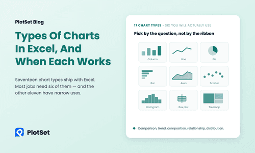
Types of charts in Excel explained: all 17 chart categories grouped by the question they answer, the six that do most of the work, and when each misleads.
Leia mais
Confira estes exemplos de visualização de dados para se inspirar
Sep 3, 2026
Types of charts in Excel explained: all 17 chart categories grouped by the question they answer, the six that do most of the work, and when each misleads.
Sep 3, 2026
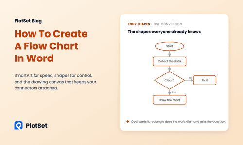
How to create a flow chart in Word with SmartArt or shapes: the four standard shapes, the canvas that keeps arrows attached, and when a sankey fits better.
Sep 3, 2026
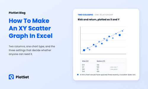
How to make an XY graph in Excel: lay out two numeric columns, insert a scatter chart, fix the axes, add a trendline with R², and skip the Line-chart trap.
Aug 29, 2026
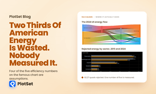
Every year Lawrence Livermore National Laboratory publishes one of the most widely reproduced charts in energy. It is a Sankey diagram of the entire United States energy system, and its headline is arresting: of the 94.6 quadrillion BTU the country consumed in 2024, 62.27 quads, or 65.8 percent, is rejected energy. Energy that never reached a useful end and left mostly as heat.
Aug 27, 2026
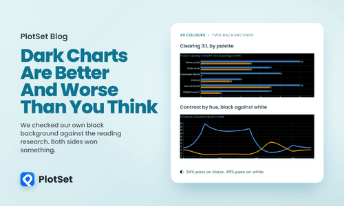
The reading research is not encouraging. Since the 1980s, studies have found that dark text on a light background beats the reverse for proofreading and for visual acuity. If you have seen a designer argue against dark mode, that is the literature they are citing.
Aug 23, 2026
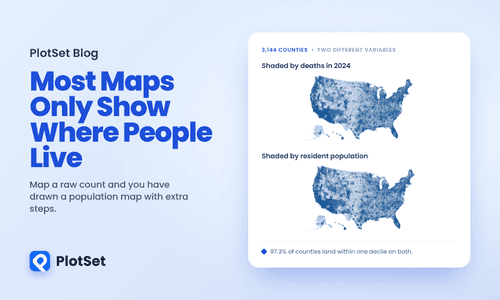
Here is a choropleth map of every death recorded in the United States in 2024, county by county. There were 3,086,925 of them across 3,144 counties, and each county is shaded by how many it recorded.
Aug 14, 2026
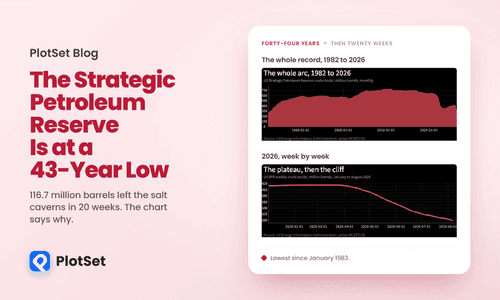
For six straight weeks in early 2026, the United States strategic petroleum reserve did not move. Week after week the Energy Information Administration published the same figure to within a rounding error, about 415.4 million barrels, while a war closed the most important oil passage on earth. Then in the week ending 27 March it fell, and it has fallen every week since.
Aug 11, 2026
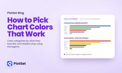
Every charting tool assigns colours the same way: by position. The first category gets the first colour in the palette, the second gets the second, and so on down the list. Nothing about the data enters into it.
Aug 10, 2026
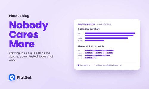
There is a piece of advice in data storytelling that nobody argues with. Do not show ten thousand deaths as a bar. Show ten thousand little human figures, so the reader remembers these are people. The technique has a name, anthropographics, and it has been recommended in conference talks, style guides and nonprofit design decks for a decade.
Aug 5, 2026
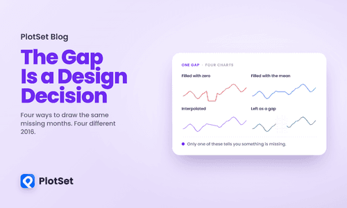
Open a spreadsheet, delete one cell in the middle of a column, and chart what is left. Something still gets drawn. The line breaks, or it stretches straight across the hole, or the bar disappears, or a zero appears where no measurement exists. Whatever happens, a decision was made about how to represent an absence, and you did not make it. Your tool did, silently, before you looked.
Aug 4, 2026
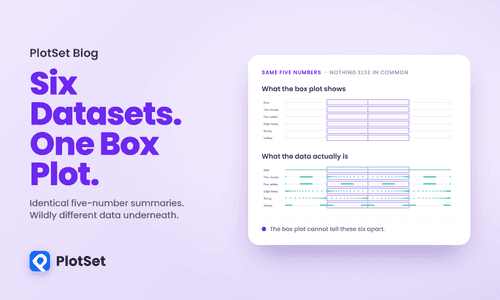
Everyone in data visualization knows the dinosaur. A dataset whose mean, standard deviation and correlation look utterly ordinary, and whose scatterplot is a picture of a Tyrannosaurus. It is a great demonstration and it has been told so many times that it has stopped doing any work.
Aug 3, 2026
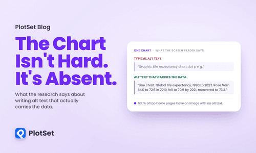
Most advice about charts assumes a reader who can see the chart. Contrast, layout, colour, labelling: all of it is about making a visible thing easier to interpret. For a blind reader using a screen reader, none of that applies, because the chart is not difficult. It is missing. Where you see a line and a downturn and a recovery, they get a filename read aloud, or silence.