Everyone in data visualization knows the dinosaur. A dataset whose mean, standard deviation and correlation look utterly ordinary, and whose scatterplot is a picture of a Tyrannosaurus. It is a great demonstration and it has been told so many times that it has stopped doing any work.
It is also the weaker half of the paper it comes from.
The stronger half is one paragraph on page four, and it is about the box plot. Not a chart anyone is misusing. Not a chart with a silly shape hiding in it. A summary chart, doing exactly the job it was designed for, on data that looks entirely reasonable, and still collapsing six different distributions into a single identical picture.
Start with the box plot
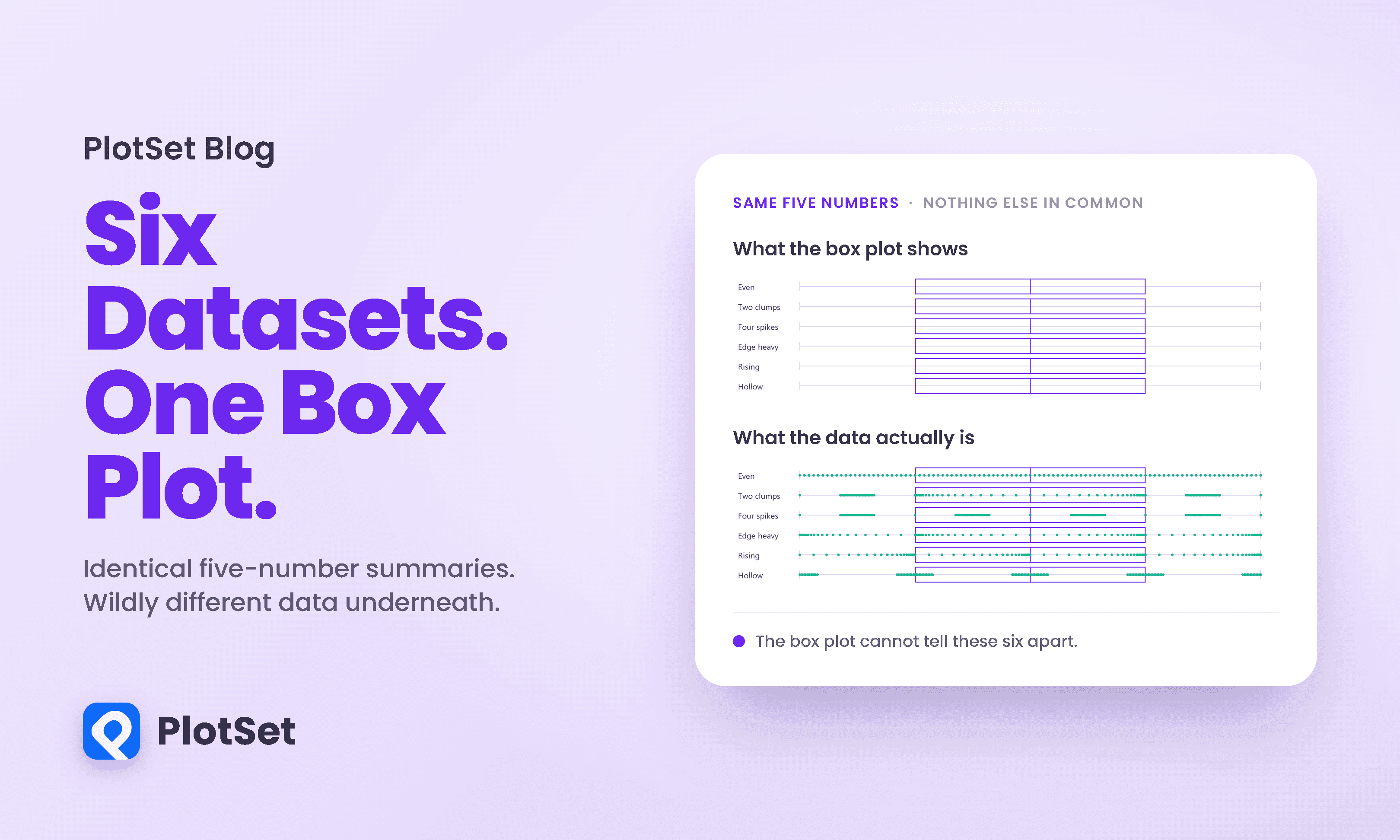
Here are six datasets. I built them for this article, and I will show you exactly how in a moment. Every one has the same minimum, the same lower quartile, the same median, the same upper quartile and the same maximum.
A box plot draws exactly those five numbers, plus fences at 1.5 times the interquartile range. None of these six datasets has a single point beyond a fence, so there are no outlier marks either. Every mark a box plot can draw is therefore identical across all six.
Which means a box plot of these six datasets is six copies of the same drawing. That is not a criticism of anyone's technique. It is arithmetic.
Now here is the same six with their raw points laid over the boxes.
One dataset is evenly spread. One is two tight clumps with a hollow middle. One is four separate spikes. One is pressed against the edges of every band. One leans upward throughout. One is riddled with gaps. Strip the points away and a box plot reports all six as the same data.
Stripped of the boxes entirely, the point clouds are not even close.
Why this is easier than it looks
Justin Matejka and George Fitzmaurice's paper is about simulated annealing, and the scatterplot half genuinely needs it. The box plot half does not, and understanding why tells you what a box plot is actually promising.
A five-number summary pins five values. It also, by definition, puts exactly a quarter of the observations into each of the four bands those values create. So the counts per band are not free. What is completely free is where inside each band the points sit.
That single degree of freedom is the whole vulnerability. I fixed the five anchors, then placed the interior points of each band wherever I liked. No search, no annealing, no tolerance. The five-number summaries above are identical because they were constructed to be, exactly, in a few lines of code.
It is worth being clear about what that does and does not show. My six are a construction, built to make a point, and so are the paper's. Neither is evidence that real datasets routinely collide this way. What they show is that the box plot cannot rule the collision out, which is a claim about the chart rather than about the world.
The paper's own version, and the number that should worry you
Matejka and Fitzmaurice did the same thing, harder. Their Figure 9 caption reads: "Six data distributions, each with the same 1st quartile, median, and 3rd quartile values, as well as equal locations for points 1.5 IQR from the 1st and 3rd quartiles. Each dataset produces an identical boxplot." They start from a normal distribution and push the data left, right, to the edges, and to arbitrary points along the range.
A note on counting, since I got this wrong myself before checking. The paper shows six panels. The data file released with it contains five groups of 2,484 points, so the numbers below are computed on five. Their five agree to about two decimal places rather than exactly, and they are not built from a single algebraic trick, which makes them a fairer test than mine.
Their five do not share a mean. They do not share a standard deviation. Means run from -1.18 to 1.17 and standard deviations from 3.84 to 4.98. Nothing in the box plot's vocabulary can see any of that.
Here is the sharpest way I found to put it. Take each distribution and count how many of its 2,484 observations sit within one unit of its own median.
Four of the five have between 457 and 577 observations crowded around the median. The fifth has nine. That is a sixty-four fold difference in how densely the data sits around the exact line a box plot draws through all five of them, inside the exact same box.
The shapes those five distributions actually have look like this.
Now the dinosaur
With that established, the famous half lands differently.
The released Datasaurus Dozen holds 13 datasets of 142 points each: Cairo's hand-drawn dinosaur plus the 12 that Matejka and Fitzmaurice generated from it. Every one shares the same summary signature, and the numbers are worth printing because almost every retelling gets the last digit wrong.
Truncated at two decimal places, all 13 datasets report a mean x of 54.26, a mean y of 47.83, a sample standard deviation of 16.76 and 26.93, and a Pearson correlation of -0.06. One signature, thirteen datasets.
Recompute the same thing with ordinary rounding instead of truncation and you get eight different signatures. Mean x splits between 54.26 and 54.27, the correlation between -0.06 and -0.07. Nothing about the data changed; the last digit is doing what last digits do. I mention it because I generated exactly that broken table while writing this piece, and a table that visibly contradicts its own headline is a bad look in an article about checking your numbers.
The method behind the 12 is also usually described wrongly. It is not a random walk that keeps the statistics still. The algorithm nudges one or more points a small random distance, keeps the nudge if it moves the data closer to a target shape, and, under a simulated annealing schedule that cools from 0.4 to 0.01, sometimes keeps a nudge that does not, so the search can climb out of local optima. A move is only accepted if the summary statistics still match the seed to two decimal places. Their first example ran for 200,000 iterations, about ten minutes on a laptop.
What to actually do
The lesson usually drawn from the dinosaur is "always plot your data." That is right and it is not enough, because the box plot is plotting your data. It is a plot, drawn correctly, from the real numbers, and it still shows you nothing that distinguishes 577 from 9.
The useful version is narrower. A chart shows you what it encodes and nothing else. A box plot encodes five numbers and a fence rule, so it can answer questions about position and spread and it cannot answer questions about shape. If you need to know whether your data is bimodal, whether it has a gap, whether it clusters near the middle or hugs the edges, a box plot is not a weak tool for that job. It is the wrong tool, and adding more box plots will not help.
So, concretely. Use a box plot when you are comparing position and spread across many groups and you already know the shapes are unremarkable. When the number of observations is small enough, show the points, because a beeswarm answers everything a box plot answers and shows the shape too. When it is not, put a histogram or a density curve beside the box rather than instead of it. And check for multimodality deliberately, because it is the failure mode a box plot is structurally incapable of reporting.
Building this in PlotSet
Every chart in this article is a PlotSet embed, and the sequence is the argument: a table that shows six identical summaries, a box plot that shows why that matters, a beeswarm that shows what was lost, a bar chart that puts a number on it, a line chart of the real distributions, and a scatterplot for the dinosaur. Six chart types, because six different questions.
That is the practical reason a chart library with range matters, and it is the reason we build PlotSet the way we do. If your tool makes box plots easy and beeswarms hard, you will ship box plots, and the shape of your data will quietly stop being something you look at. The friction of switching chart type is not a small inconvenience. It decides which questions get asked.
What we are not going to tell you is that any tool prevents the problem in this article. Nothing does. A summary is a summary in every piece of software ever written, and the collision here is arithmetic, not a rendering bug. What a good tool can do is make the second chart cheap enough that you always draw it.
References
- ACM CHI. Same Stats, Different Graphs. Matejka & Fitzmaurice, CHI 2017, 1290-1294 — https://www.research.autodesk.com/publications/same-stats-different-graphs/
- Autodesk Research. Same Stats, Different Graphs, supplementary data — https://www.autodeskresearch.com/publications/samestats
- The American Statistician. Graphs in Statistical Analysis. Anscombe, 27(1):17-21, 1973 — https://www.jstor.org/stable/2682899
- The Functional Art. Download the Datasaurus. Cairo, 2016 — http://www.thefunctionalart.com/2016/08/download-datasaurus-never-trust-summary.html
- CRAN. datasauRus. Locke & D'Agostino McGowan — https://cran.r-project.org/package=datasauRus
- Addison-Wesley. Exploratory Data Analysis. Tukey, 1977 — https://archive.org/details/exploratorydataa0000tuke
- Nature Methods. Bar charts and box plots. Streit & Gehlenborg, 11:117, 2014 — https://www.nature.com/articles/nmeth.2807
- Nature Methods. Visualizing samples with box plots. Krzywinski & Altman, 11:119-120, 2014 — https://www.nature.com/articles/nmeth.2813
- PLOS Biology. Beyond Bar and Line Graphs. Weissgerber et al., 13(4), 2015 — https://journals.plos.org/plosbiology/article?id=10.1371/journal.pbio.1002128
- had.co.nz. 40 years of boxplots. Wickham & Stryjewski, 2011 — https://vita.had.co.nz/papers/boxplots.pdf
- The American Statistician. Violin Plots. Hintze & Nelson, 52(2):181-184, 1998 — https://www.jstor.org/stable/2685478
- The American Statistician. Generating Data with Identical Statistics but Dissimilar Graphics. Chatterjee & Firat, 61(3):248-254, 2007 — https://www.tandfonline.com/doi/abs/10.1198/000313007X220057
- Journal of Computational and Graphical Statistics. Visual Scalability. Eick & Karr, 11(1):22-43, 2002 — https://www.tandfonline.com/doi/abs/10.1198/1061860021711
- TidyTuesday. The Datasaurus Dozen data files — https://github.com/rfordatascience/tidytuesday/tree/master/data/2020/2020-10-13