Most people who share a news story never open it. When researchers matched 2.8 million shared links against the clicks they actually generated, 59 percent of the links were never clicked at all. A separate study of 35 million Facebook posts found that about three quarters of news-link shares were made without the sharer opening the article first. The headline did the work. The article was scenery.
Charts have the same problem, and almost nobody designs for it. We agonize over the axis scale, the color ramp, the gridline weight, the exact shade of the fifth category. Then a reader spends two seconds with the result, walks away, and keeps one thing: the sentence at the top. The chart title is the headline of your chart, and a decade of eye-tracking and memory research says it is the part your reader is most likely to look at, most likely to remember, and most likely to repeat to someone else. Everything else is the article nobody clicked.
The eye goes to the title first
Start with attention, because attention comes before memory. In a controlled eye-tracking study at MIT, participants viewed hundreds of real visualizations while their gaze was recorded. Across every type of chart, the single element that drew the most looking was the title. Split by context, the chart below counts how often readers even looked at it.
Averaged over all charts, the title was fixated in 59 percent of cases. In infographics it climbed to 80 percent. Placement mattered too: a title sitting at the top of the frame pulled 76 percent of readers, against 63 percent for one tucked at the bottom, and government charts with a top title reached 85 percent. One caveat worth keeping honest: this is attention, not comprehension. People look at the title first, but their longer, more effortful gazes settle on the data itself. Reading a chart is a loop between the words and the marks. The title is simply where the loop begins, and where a distracted reader often stops.
A week later, the title is what survives
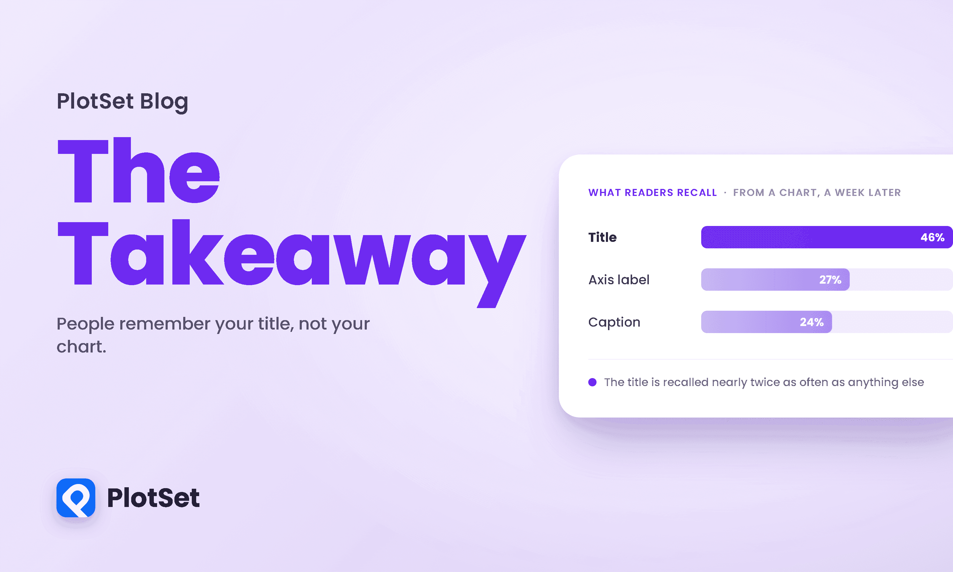
Attention is fleeting. Memory is what you are really fighting for, and the gap between the two is where most charts are lost. In the recall phase of the same MIT project, people were shown a visualization, then later asked to describe it from memory in their own words. Researchers coded which element each description drew on. Coded by source, the figure ranks each element by how often people reached for it.
Overall, the title showed up in 46 percent of recalled descriptions, nearly double the rate of axis labels or captions. In infographics the title reached 72 percent. The one honest exception in the data is news graphics, where a strong caption or annotation paragraph edged out the title. That exception is a clue, not a contradiction: what wins is text that carries a message. When the caption does the interpretive work, the caption is remembered. When the title does it, the title is. The reader keeps whatever sentence told them what to think.
A title is a memory, not a label
Here is the part that should change how you work. A message-bearing title does something larger than get itself quoted. It makes the whole chart stick better. In the recall study, coders scored each description for quality on a zero-to-three scale, and then compared charts that had a given feature against charts that lacked it. The gap it opens, in the figure below, is wide.
Charts with a title were recalled at 1.90 out of 3, against 1.30 for charts without one. A human figure or pictogram, redundant labeling, and a message restated in both words and picture all pushed in the same direction. The common thread is redundancy: when the point is encoded more than one way, at least one copy survives the trip into memory. A chart title written as a full thought is the cheapest redundancy you can buy. It costs one line, and of every feature the researchers tested, a title lifted recall quality the most, more than a picture, more than labeled values.
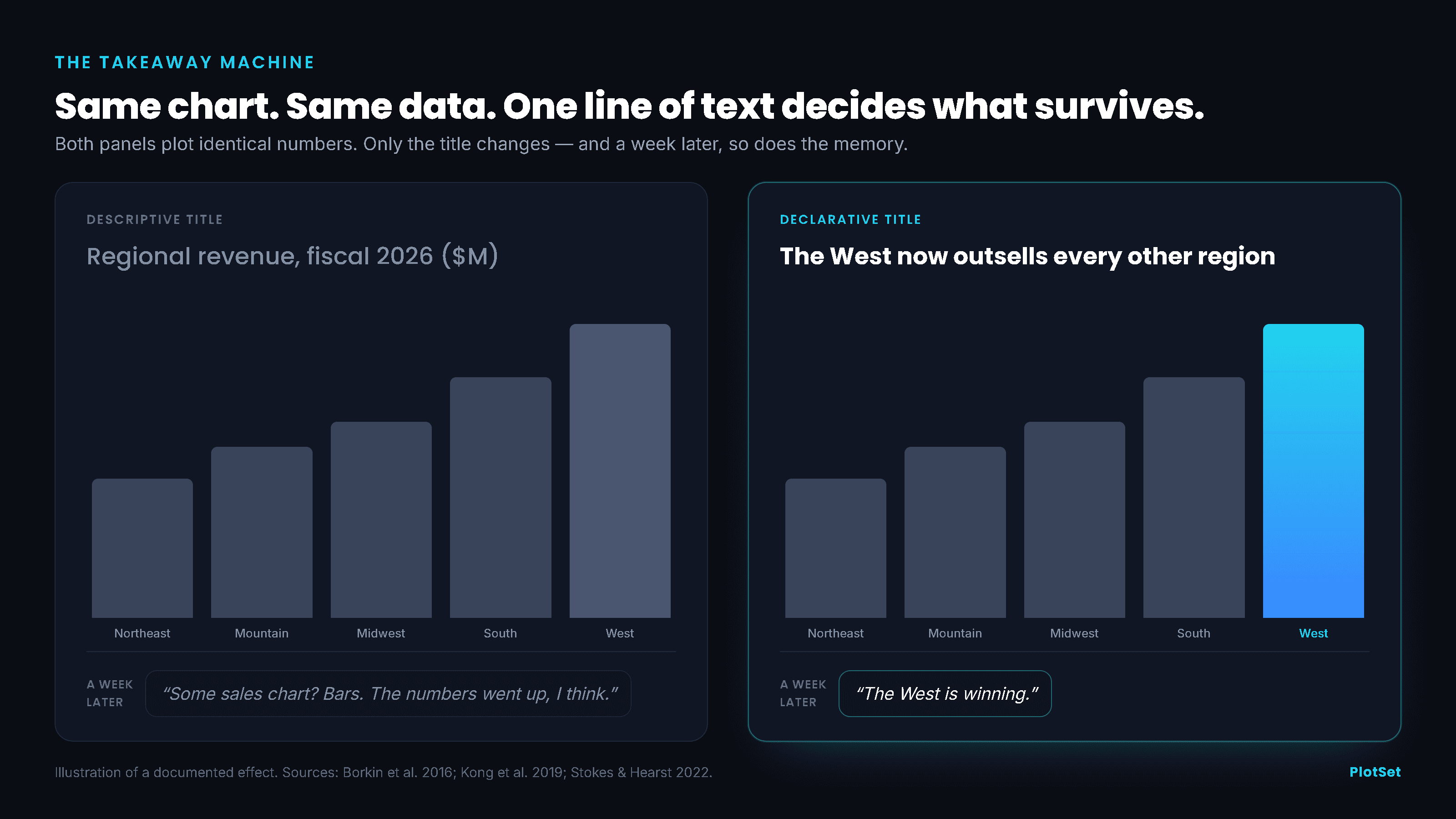
To see why the wording matters so much, look at the same chart twice, with only the title changed.
When the title and the chart disagree, the title wins
If a title merely reinforced the data, none of this would be dangerous. The uncomfortable finding is that the title can overrule the data. In a study of title-visualization misalignment, researchers showed people charts where the headline said something the plotted numbers did not support, then asked what the chart was about. Pull the title and the data apart, and the chart below tracks which one readers kept.
Across the mismatched cases, readers recalled the title's message about twice as often as the data's, 33 percent against 17 percent. When the title actively contradicted the chart, people still walked away carrying the words, not the picture. A companion study went further and swapped slanted titles onto the same underlying graphic. Swap the slant, and the remembered message swaps with it; the bars below make the reversal plain.
The recalled message flipped with the title. Under a supporting headline, 52 readers remembered a supporting point and only 13 an opposing one; reverse the headline and the majority flips the other way, 25 recalling an opposing point against 11 supporting. About 77 percent of the recalled messages matched the title's slant, well above the roughly 65 percent that readers lean toward on their own. And they did not feel handled: in the misalignment study, 72 to 89 percent rated the charts as neutral and impartial, whatever the title claimed. The title had moved them, and they never saw the wheel turn.
Two honest limits belong here. These experiments used just two charts on genuinely controversial subjects, and they measured what people recalled as the message, not whether their underlying opinions changed. You should not read this as proof that a headline can rewrite anyone's beliefs. You should read it as proof that the chart title is the part of your graphic doing the talking, so it had better say something true.
Spend the title on the takeaway
If the title is going to be remembered and repeated regardless, you are past the question of whether to write a strong one. The only real question is which sentence to spend that power on. Research on the semantic levels of chart text offers a clean ladder, from text that names the axes up to text that explains why the pattern matters.
The bottom rung is where most charts live: a descriptive label like "Regional revenue, fiscal 2026." It names what the chart is and stops there. Tested directly, that kind of axis-only caption had no measurable effect on what readers took away, statistically indistinguishable from having no caption at all. It occupies the most valuable pixels on the page and spends them on a filename. Climb one rung and a title can carry a statistic, which readers adopt as their takeaway 1.6 to 2.0 times more often. Higher still sits the trend, the pattern in the data, which is the takeaway most readers reach on their own and the natural home for a title. At the top is external context, the reason the pattern matters, which in testing was the single strongest text lever, making a given takeaway up to 6.2 times more likely to become the reader's own. The one caution: that top figure came from a design that also carried more text overall, so treat 6.2 times as the ceiling of the effect rather than a precise coefficient.
The practical rule is short. Do not title a chart with what it is. Title it with what it says.
Make the chart worth recognizing, too
The words carry the message, but the picture is what a reader recognizes when they see it again, and here the research is bracing for anyone who worships minimalism. The first MIT study measured whether people could recognize a visualization they had seen before, and ranked chart types by how memorable they were. Ranked from most to least memorable, the table below holds an awkward surprise.
The pattern is almost perverse. The most memorable formats, grids and matrices, tree and network diagrams, were also the rarest. The workhorses that fill most reports, the bars and lines, sat at the very bottom for memorability, and even the humble table landed only in the forgettable middle. That does not mean you should abandon a bar chart when a bar chart is the honest choice. It means a common format is starting from a memorability deficit, and needs its title to do more of the lifting. The design choices inside the frame matter too, and the figure below upends the usual advice about them.
A human-recognizable pictogram was the strongest single factor, lifting the recognition score from 1.14 to 1.93. More color, higher visual density, and heavier styling all helped as well. This is the finding people love to misquote, so read the axis label carefully: it measures recognition, whether you can tell you have seen an image before, not comprehension, whether you understood or can use it. Denser, busier charts are easier to spot in a lineup and often slower to read. None of this is a license to bury your data in decoration. A memorable image and an accurate one are not enemies, and a distinctive visual gives the title something to attach to.
How to write a chart title
Put the pieces together and a short discipline falls out. Write the title last, once you know what the chart actually shows, and write it as the sentence you would say out loud if a colleague asked what the point was. State the trend as a claim a reader can carry, and where you can, add the context that says why it matters. Keep the axis description for the subtitle, where it belongs. Then read your title alone, with the chart covered, and ask whether it still tells the truth. Because that is how your reader will meet it, and a chart title is a promise the picture underneath has to keep.
Attention studies, recognition tests, and recall experiments rarely line up as neatly as they do on this question. The most-looked-at, best-remembered, most-repeated element of a chart is the one many of us treat as an afterthought. People will remember your title. The only choice you get is what it says.
References
- IEEE TVCG. Beyond Memorability: Visualization Recognition and Recall. Borkin et al., 2016. Title fixated 59% overall / 80% in infographics, recalled 46–72%, recall quality 1.90 with a title vs 1.30 without.
- IEEE TVCG. What Makes a Visualization Memorable? Borkin et al., 2013. Chart-type memorability ranking; recognition effects of pictograms, color, density, styling.
- ACM CHI 2018. Frames and Slants in Titles of Visualizations on Controversial Topics. Kong, Liu, Karahalios. Slanted titles flipped the recalled message; 77% matched the title's slant.
- ACM CHI 2019. Trust and Recall across Title-Visualization Misalignment. Kong, Liu, Karahalios. Readers recalled the title's message ~2× the data's; 72–89% rated slanted charts neutral.
- IEEE VIS 2022. Striking a Balance: Reader Takeaways when Integrating Text and Charts. Stokes et al. External context is the strongest text lever, up to ~6.2×.
- ACM CHI 2021. Towards Understanding How Readers Integrate Charts and Captions. Kim, Setlur, Agrawala. Descriptive axis-only captions had no measurable effect on takeaway.
- IEEE TVCG. Accessible Visualization via Natural Language Descriptions: A Four-Level Model. Lundgard & Satyanarayan, 2021. The L1–L4 semantic-content model.
- ACM SIGMETRICS 2016. Social Clicks: What and Who Gets Read on Twitter? Gabielkov et al. 59% of shared links were never clicked.
- Nature Human Behaviour. Sharing without clicking on news in social media. 2024. ~75% of Facebook news-link shares made without a click.
- American Press Institute, Media Insight Project. How Americans get their news. 2014. ~60% read little beyond headlines.
- ACM CHI 2010. Useful Junk? Visual Embellishment on Comprehension and Memorability. Bateman et al. Embellished charts recalled better after 2–3 weeks (small samples).
- IEEE TVCG. The Curse of Knowledge in Visual Data Communication. Xiong, van Weelden, Franconeri, 2019. Authors overestimate what naive readers see.
- MIT MASSVIS. Eye Fixation Metrics for Large Scale Analysis of Information Visualizations. Bylinskii et al. The eye-tracking + memorability corpus.
- IEEE TVCG. Declutter and Focus: Empirically Evaluating Design Guidelines. Ajani et al., 2021. Annotations direct attention and the takeaway.
- Storytelling with Data. On takeaway titles. Knaflic. Writing active, takeaway titles over descriptive labels.
- Publications Office of the EU. Data Visualisation Guide. Guidelines on titles and annotations.