
Sample CSV
| Warehouse | FulfillmentHours |
|---|---|
| Chicago | 4.2 |
| Chicago | 4.8 |
| Chicago | 3.9 |
| Chicago | 9.1 |
| Chicago | 4.5 |
| Chicago | 4.1 |
| Dallas | 6.0 |
| Dallas | 6.3 |
| Dallas | 5.8 |
| Dallas | 6.1 |
| Dallas | 12.4 |
| Dallas | 6.5 |
| Reno | 3.0 |
| Reno | 3.2 |
| Reno | 2.9 |
| Reno | 3.4 |
| Reno | 3.1 |
| Reno | 7.8 |
A step by step walkthrough for turning raw, row-level data into a published violin plot in PlotSet, including the bandwidth setting that decides whether the shape is real.
About 9 minutesThis guide covers how to create a violin plot in PlotSet, starting from a spreadsheet of individual observations and ending with a published chart you can embed or export. It is not five clicks: the one setting that actually matters, bandwidth, has no correct default, so you will nudge it and look at the result rather than accept whatever PlotSet picks first.
Nine minutes, roughly, if your data is already one row per observation with a group column and a value column. Pulling that from a report that only has group averages adds five more, because you'll need to go back to the source and get the underlying rows. A violin built from averages isn't a violin, it's a flat line pretending to be one.
Two columns, one row per observation: a group label first, a numeric value second. Raw values, not pre-aggregated averages, one header row.
| Warehouse | FulfillmentHours |
|---|---|
| Chicago | 4.2 |
| Chicago | 4.8 |
| Chicago | 3.9 |
| Chicago | 9.1 |
| Chicago | 4.5 |
| Chicago | 4.1 |
| Dallas | 6.0 |
| Dallas | 6.3 |
| Dallas | 5.8 |
| Dallas | 6.1 |
| Dallas | 12.4 |
| Dallas | 6.5 |
| Reno | 3.0 |
| Reno | 3.2 |
| Reno | 2.9 |
| Reno | 3.4 |
| Reno | 3.1 |
| Reno | 7.8 |
Every observation needs its own row. If your source file already has one row per group with an average fulfillment time, there is nothing left to draw a density from: go back and pull the order-level data instead.
Keep the group column as text. A warehouse code like "04" will still group correctly, but check the axis order once it is uploaded in case it got sorted numerically instead of the way you intended.
A blank cell in the value column is dropped from that group's density rather than treated as zero, which is the right behavior but can explain a row count that does not match your source file.
Uneven group sizes are fine. Chicago having forty rows and Reno having twelve does not break anything here, unlike some chart types that expect equal counts.
The exact click path in PlotSet, from a blank template to a finished chart.
From the PlotSet dashboard, start a new project and choose the Violin Plot template. It loads with sample data already in place, so you can see the two-column shape PlotSet expects before you touch your own file.

Put the group label in the first column and the raw numeric value in the second, one row per observation. If your export is a pivot table with an average per group, that is the wrong shape: pull the underlying rows from wherever the pivot came from.
Use the data panel to import a CSV or .xlsx file, paste rows directly from a spreadsheet, or connect a Google Sheet if the underlying numbers change regularly. PlotSet reads the first row as headers automatically.

Confirm which column feeds the category axis and which feeds the density curve. This is usually right on the first try when your headers say what they mean, but double-check it if your sheet carries extra columns PlotSet had to guess between.

Move the bandwidth slider up and down before settling on a value. Too high and two real peaks merge into one soft hump; too low and the curve gets bumpy from noise alone. Keep whichever shape survives a small nudge in both directions.
Switch the group order from alphabetical to sorted by median value. Reno, Chicago, Dallas in that order tells the reader something; Chicago, Dallas, Reno alphabetically does not.
Enable the inner box or median marker so a reader who wants the exact number does not have to eyeball the widest point of the curve. One color per group is standard; save a second, contrasting color for a group you specifically want to call out.
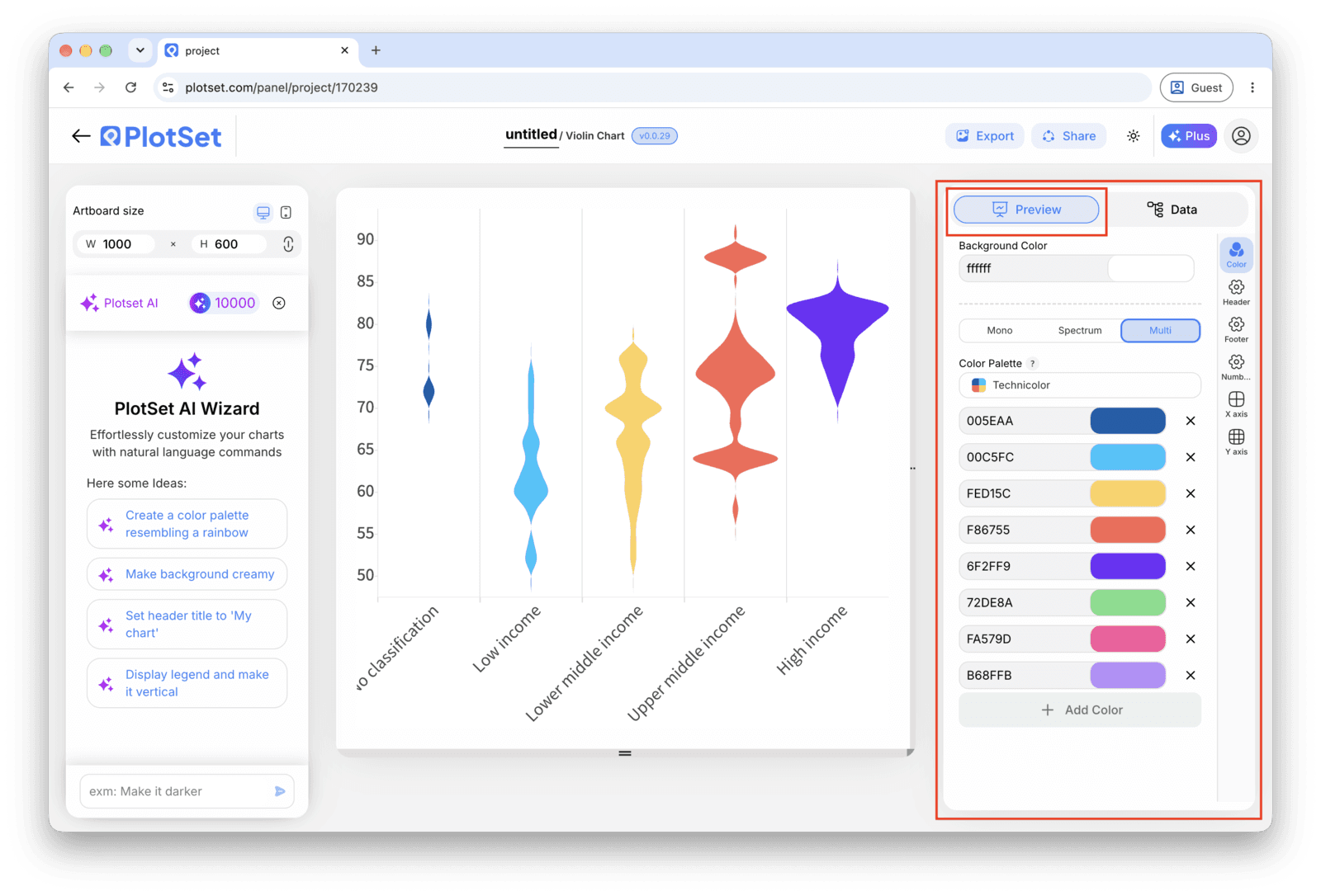
Publish for a live, interactive chart with a tooltip on every group, grab the embed code to drop it into a page, or export a PNG, SVG or PDF if you need a static image for a deck.
Start from the Violin Plot template with sample data already loaded, then swap in your own.
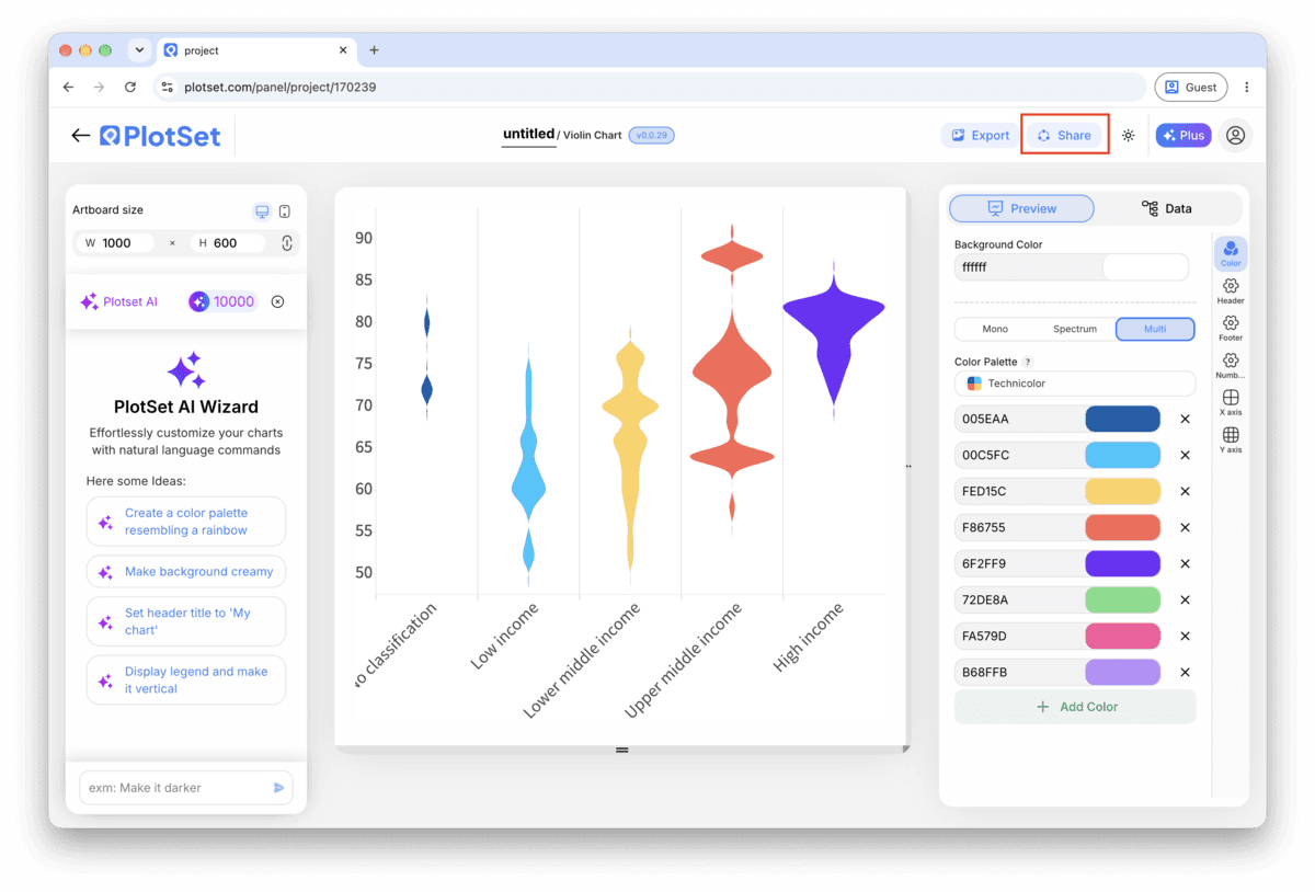
Open the templateThe last stretch is the same for every chart type: Share turns the chart into a live public link and an embed code, Export writes it out as a static file.
Activating the embed code and public link publishes the chart. The link is safe to send to anyone, and the embed code drops into any page as an iframe that keeps the hover tooltips and the interactivity. Edit the chart later and hit Recreate to push those changes out to both.

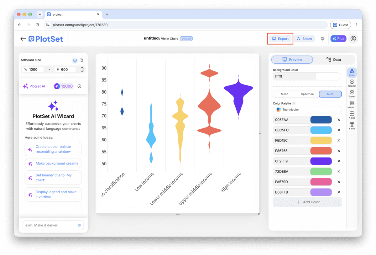
Export writes a static copy at whatever size you need. SVG stays sharp at any scale and can still be edited in a design tool; PNG and JPG are the safe choices for slides and documents. The scale multiplier is what gets you a crisp image on a retina screen.

If your value column cannot go below zero, hours worked, order counts, percentages, turn on trimming so the density stops at the observed minimum instead of smoothing past it into negative territory that cannot exist.
A bare outline looks cleaner in a screenshot but leaves the reader guessing at the median. The inner box costs almost nothing visually and answers the first question anyone asks about a distribution: where is the middle.
Color coding every violin a different hue implies the groups are categorically different in some way beyond the axis label. A single color, or a light gradient across an ordered axis, keeps the reader's attention on shape rather than on a legend.
A violin squeezed into a narrow column looks noisier than the same data drawn wide, because horizontal detail gets compressed along with the shape. Give the chart more width first, then revisit the bandwidth: you may not need to smooth as hard as you thought.
This is almost always pre-aggregated data: one row per group with an average, instead of one row per observation. Check your source file for the raw rows the average was calculated from and upload those instead.
The bandwidth is probably set too high for the amount of data you have, smoothing away the real differences between groups. Lower it step by step until the shapes diverge, then stop at the point where they stop changing.
Kernel density smoothing does not know your values are bounded, so it draws density past the edge unless told otherwise. Turn on trimming to the observed range, or note in a caption that the tails past the boundary are a smoothing artifact.
Not sure the Violin Plot is the right choice? See what it is, when to use it and when not to.
Aim for at least fifty observations per group before trusting the shape, and a few hundred before it is genuinely stable. PlotSet will still draw a violin from fewer rows, but the curve mostly reflects the bandwidth setting rather than the data at that size.
Free to start with 300+ templates. No credit card required.