
Sample CSV
| Warehouse | DeliveryDays |
|---|---|
| Chicago | 2 |
| Chicago | 3 |
| Chicago | 2 |
| Chicago | 4 |
| Chicago | 3 |
| Chicago | 9 |
| Denver | 4 |
| Denver | 5 |
| Denver | 4 |
| Denver | 6 |
| Denver | 5 |
| Denver | 4 |
| Atlanta | 3 |
| Atlanta | 3 |
| Atlanta | 4 |
| Atlanta | 3 |
| Atlanta | 11 |
| Atlanta | 4 |
A step by step walkthrough for turning a spreadsheet of raw observations into a published box plot in PlotSet, from shaping the rows to exporting or embedding the finished chart.
About 8 minutesRaw rows in, ranked boxes out: that is how to create a box plot in PlotSet, ending with a published, interactive chart with outliers labelled on purpose and a caption that states what the whiskers mean. Not a demo with placeholder numbers: your own groups and your own observations, run through the same click path a real PlotSet chart takes from upload to publish.
If your spreadsheet already has one row per observation, a group label and a number, this takes about eight minutes. Add ten more if your source is a report someone already summarized into averages or quartiles: you will need to go back for the underlying rows, because a box plot built from a summary is not a box plot, it is a shape drawn to look like one.
One row per observation, not per group: a group label in the first column, a single number in the second. No pre-calculated quartiles, medians or five-number summaries. PlotSet computes those from the raw rows, so feeding it a summary skips the part that makes the chart honest.
| Warehouse | DeliveryDays |
|---|---|
| Chicago | 2 |
| Chicago | 3 |
| Chicago | 2 |
| Chicago | 4 |
| Chicago | 3 |
| Chicago | 9 |
| Denver | 4 |
| Denver | 5 |
| Denver | 4 |
| Denver | 6 |
| Denver | 5 |
| Denver | 4 |
| Atlanta | 3 |
| Atlanta | 3 |
| Atlanta | 4 |
| Atlanta | 3 |
| Atlanta | 11 |
| Atlanta | 4 |
Do not upload a table of quartiles or medians as if it were your data. PlotSet needs the individual observations to compute the five-number summary itself; handing it a summary of a summary produces a median that is wrong more often than it is right.
Keep group labels spelled and capitalized the same way across every row. "Chicago" and "chicago " with a trailing space read as two different groups and split into two boxes.
Give each group enough rows to mean something. A box built from three or four values implies a precision the data does not have; aim for at least ten observations per group where you can.
Extra columns beyond the group and value pair are ignored, so it is fine to keep a date or an ID column in the sheet for your own reference.
The exact click path in PlotSet, from a blank template to a finished chart.
From the PlotSet dashboard, start a new project and choose the Box Plot template (vertical by default, with a horizontal version available for long group names). It loads with sample data already in place, so you can see the raw, one-row-per-observation shape PlotSet expects before you touch your own file.

Put the group label in the first column and one numeric value in the second, one row per observation. If your source is a pivot table that already shows averages or quartiles per group, go back to the underlying data: that is the input this chart needs, not the summary someone else built from it.
Use the data panel to import a CSV or .xlsx file, paste rows directly from a spreadsheet, or connect a Google Sheet if you want the chart to refresh when new observations come in. PlotSet reads the first row as headers automatically.

Confirm which column feeds the group axis and which one holds the numeric value PlotSet will summarize into quartiles. This is usually correct on its own when your headers are clear, so check it manually only if your sheet carries extra columns that could confuse the guess.

Switch the default sort away from alphabetical and order the groups by median instead, ascending or descending depending on the story. Once the boxes are ordered by median, the comparison you built the chart for is visible without the reader having to scan for it.
Leave the individual points beyond the whiskers turned on and label the ones worth naming. If a group is carrying more outliers than the rest, that is usually a finding, not noise to switch off before anyone notices it.
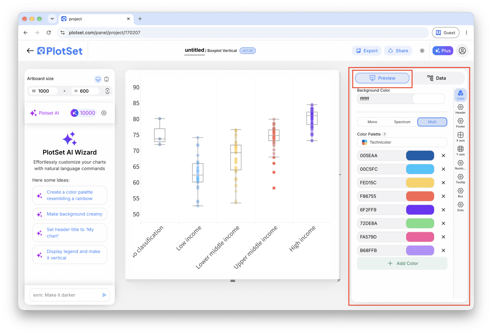
PlotSet's default draws whiskers to 1.5 times the interquartile range, which covers most cases. If you switch it to min and max instead, say so in a caption: the two conventions look the same on the chart and mean different things.
Publish for a live, interactive chart whose tooltip shows the full five-number summary on hover, grab the embed code to drop it into a page, or export a PNG, SVG or PDF if you need a static image for a deck or a report.
Start from the Box Plot template with sample data already loaded, then swap in your own.
Open the templateThe last stretch is the same for every chart type: Share turns the chart into a live public link and an embed code, Export writes it out as a static file.
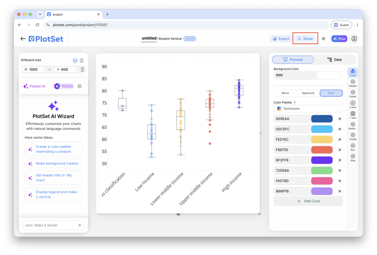
Activating the embed code and public link publishes the chart. The link is safe to send to anyone, and the embed code drops into any page as an iframe that keeps the hover tooltips and the interactivity. Edit the chart later and hit Recreate to push those changes out to both.

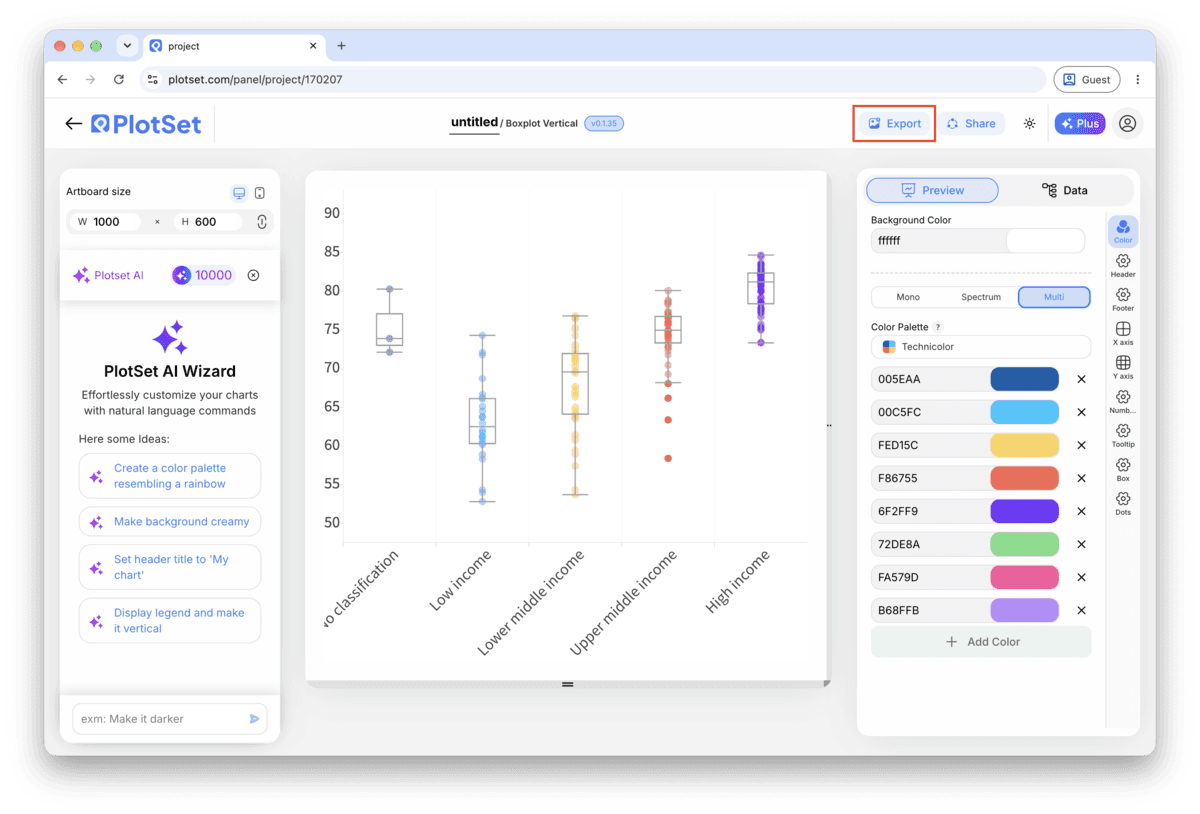
Export writes a static copy at whatever size you need. SVG stays sharp at any scale and can still be edited in a design tool; PNG and JPG are the safe choices for slides and documents. The scale multiplier is what gets you a crisp image on a retina screen.

A box drawn to 1.5 times the IQR and one drawn to the minimum and maximum look identical but tell different stories about how extreme the outliers are. One sentence in the caption settles it for the reader instead of leaving them to guess.
Unlike a bar chart, a box plot is not encoding a length from a baseline, it is showing where a distribution sits. Forcing the axis to zero on a chart of, say, delivery days in the single digits just compresses every box into a sliver near the top.
A handful of distributions read easily side by side; past roughly fifteen, the boxes get thin and the comparison stops working. Filter to the groups the story actually needs and mention in the caption that it is a subset.
An outlier is usually the most informative point on the chart, not an error. Name the specific one that matters (a date, a location, an ID) rather than hiding it to make the chart look tidier.
This is what happens when the sheet holds pre-calculated quartiles or averages instead of raw observations. PlotSet needs the individual values to compute a five-number summary; go back to the source data and upload the actual rows, one per observation.
Check the raw values for that group for a data entry slip, a value in the wrong unit, or simply too few rows. A group with four or five observations produces a box that reacts wildly to a single unusual value.
This means the sort setting is still on its default. Open the sort control in the chart settings and switch it from group name to the median of the value column.
Not sure the Box Plot is the right choice? See what it is, when to use it and when not to.
Raw observations, not a summary: one row per data point, a group label in the first column and a single number in the second. PlotSet calculates the quartiles, median and outliers itself from those rows, so a table of pre-computed statistics will not work as the input.
Free to start with 300+ templates. No credit card required.