PlotSet LogoPlotSet

How to Create a Scatter Plot

A step by step walkthrough for plotting two numeric columns from your own spreadsheet in PlotSet, grouping the points by category, and publishing, embedding or exporting the result.

About 7 minutes

This guide covers how to create a scatter plot in PlotSet from your own numbers, not a demo dataset: two numeric columns bound to X and Y, an optional category column colouring the points into groups, and axes and labels that actually say what the numbers mean. By the end you will have gone through the same click path a published PlotSet chart takes, from a raw spreadsheet to something you can embed or drop into a deck.

Seven minutes covers it when your sheet already has two clean numeric columns, most of that spent on labelling and styling rather than wrestling the data itself. Pulling numbers out of a wider report, or cleaning up a category column for grouping, adds another five to ten.

The data you need

One row per record, with two numeric columns for the axes plus an optional label column and an optional category column for colour grouping. Just one header row, no merged cells.

Sample CSV
CampaignChannelSpendRevenue
Spring LaunchPaid Search420018900
Summer SalePaid Search610024300
Back to SchoolPaid Social380011200
Holiday PushPaid Social720019800
Retargeting Q1Email12009800
Newsletter PromoEmail9006200
Influencer CollabPaid Social540015100
Display RetargetPaid Search260010400
Notes

Both axis columns need to be numbers, not text that merely looks numeric. A currency symbol or a thousands separator left in as text will stop the column from binding to an axis, so strip formatting before uploading.

The label column (here, Campaign) is optional but worth keeping: it is what shows up in the tooltip and in any point labels you turn on later, instead of a bare coordinate.

The category column (here, Channel) is optional too. Skip it for a plain single-colour scatter plot, or keep it if you want the points grouped and coloured by that channel, region or segment.

One row per record, not per aggregate. If your source is already a pivot table of averages, decide whether you actually want the underlying rows plotted or a smaller, pre-aggregated table instead.


The steps

The exact click path in PlotSet, from a blank template to a finished chart.

  1. 01

    Open the scatter plot template

    From the PlotSet dashboard, start a new project and choose the Scatter Plot template. It loads as a scatter plot with groups and comes with sample data already bound, so you can see the exact column layout it expects before touching your own file.

    PlotSet's template picker: chart categories listed down the left, the Bar Charts grid open, and the Bar Chart template card showing its Select button.
    Every guide starts here. Pick the category, then the template: it is the same grid whichever chart type you are after.
  2. 02

    Shape your sheet into the right columns

    Put your two numeric measures in their own columns, add a label column if you want readable tooltips, and add a category column only if you plan to colour the points by group. Drop any subtotal or average row before uploading.

  3. 03

    Bring in your file or link a sheet

    Import a CSV or .xlsx file from the data panel, paste rows straight from a spreadsheet, or connect a Google Sheet if you want later edits to flow through without a re-upload. PlotSet reads the first row as headers automatically.

    The PlotSet editor's data view: a spreadsheet grid with Name, Value and Region columns filled with Canadian province figures, beside the Data panel offering CSV upload, Magic Import and Google Sheet sync.
    The data view, shown here on a bar chart project. Upload a CSV, lift the numbers out of an image with Magic Import, or sync a Google Sheet. The panel is identical for every chart type.
  4. 04

    Map the X and Y columns

    Assign one numeric column to the X axis and the other to Y. PlotSet usually guesses correctly when your headers are clear, but check the mapping manually if your sheet carries extra numeric columns it might have picked the wrong one from.

    The PlotSet data panel with the column bindings highlighted: Label/time mapped to column A, Values to column B and Filter/color to column C, with the Auto Binding button below.
    Bindings decide which column becomes the label, which supplies the values and which drives the colour. Auto Binding guesses them from your headers, so check it rather than assume it.
  5. 05

    Turn on grouping by category

    If you included a category column, bind it to colour so each group gets its own shade and its own entry in the legend. Skip this step entirely for a single-series scatter plot: one colour is correct when there is nothing to group.

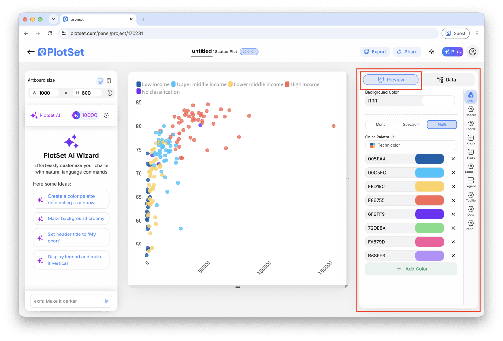
    The PlotSet editor on the Preview tab: a finished Scatter Plot on the canvas, with the settings panel outlined in red down the right-hand side.
    The Preview tab for a Scatter Plot. Every styling control lives in the outlined panel, each on its own tab: appearance, header, footer and the options specific to this chart type.
  6. 06

    Label the axes and the outliers

    Name both axes with real units, not just the column header. Turn on point labels for the handful of records that matter, usually the outliers, and leave the rest to the hover tooltip so the chart does not turn into a wall of text.

  7. 07

    Adjust point size, opacity and the trend line

    Reduce mark size or add transparency if points are stacking into a solid blob. Only turn on the fitted trend line once you have actually looked at the shape of the cloud, since a straight line through a curved or clustered relationship reports a pattern that is not there.

  8. 08

    Publish the chart, or export it as an image

    Publish for a live interactive chart with hover tooltips and a shareable link, copy the embed code to drop it into a page, or export a PNG, SVG or PDF if you need a static image for a deck or report.

Start from the Scatter Plot template with sample data already loaded, then swap in your own.

Open the template

Publish, embed or export it

The last stretch is the same for every chart type: Share turns the chart into a live public link and an embed code, Export writes it out as a static file.

Share: public link and embed code

Activating the embed code and public link publishes the chart. The link is safe to send to anyone, and the embed code drops into any page as an iframe that keeps the hover tooltips and the interactivity. Edit the chart later and hit Recreate to push those changes out to both.

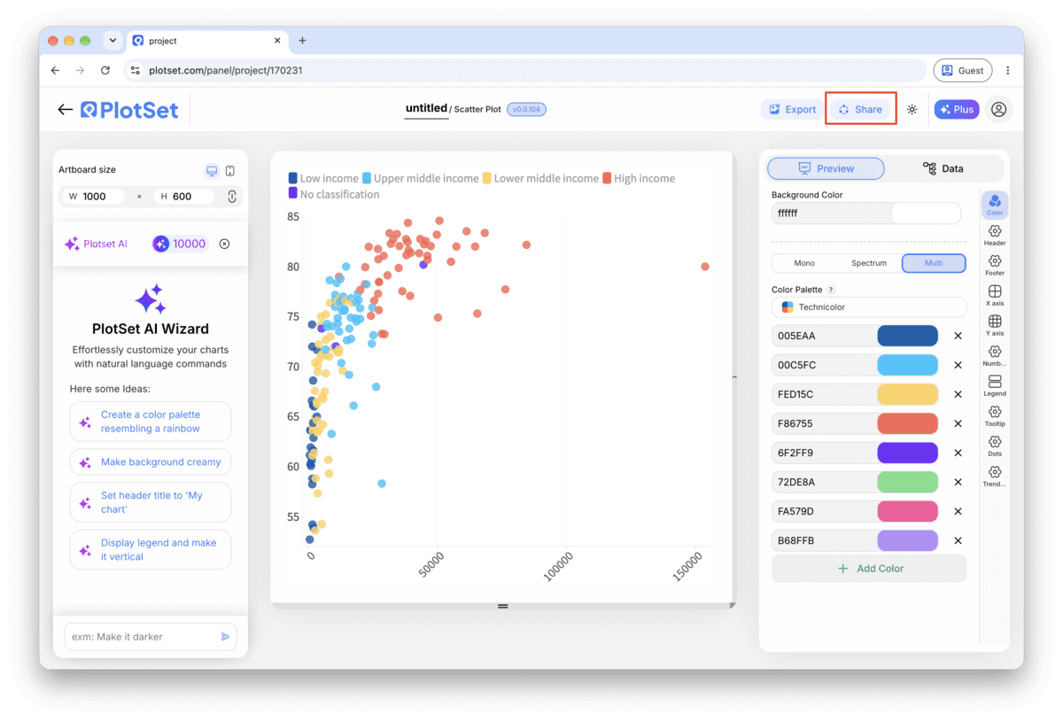
The PlotSet editor toolbar with the Share button highlighted, sitting next to the Export button.
Share is how a finished chart becomes a public link and an embed code.
PlotSet's Share dialog: the toggle activating the embed code and public link, buttons for Link, Embed, Facebook, Reddit, Twitter, LinkedIn and Email, and the public chart link with a Copy button.
Switch on the embed code and public link, then copy the link or take the iframe. Recreate pushes later edits out to everyone already holding it.

Export: SVG, PNG or JPG

Export writes a static copy at whatever size you need. SVG stays sharp at any scale and can still be edited in a design tool; PNG and JPG are the safe choices for slides and documents. The scale multiplier is what gets you a crisp image on a retina screen.

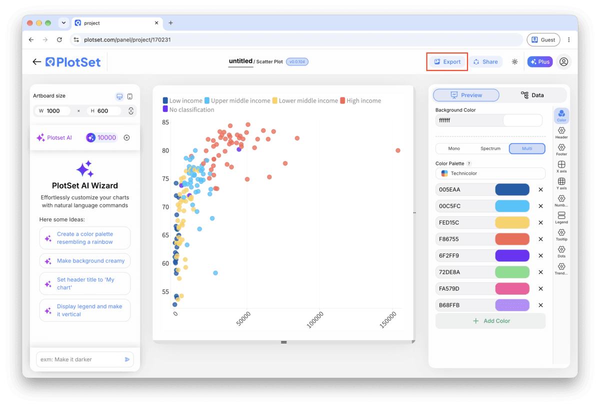
The PlotSet editor toolbar with the Export button highlighted.
Export is the route to a static file for a slide or a report.
PlotSet's Export chart dialog: a 2x scale selector, width and height fields set to 1000 by 600, and the open format menu listing SVG, PNG and JPG.
SVG stays sharp at any size and stays editable in a design tool; PNG and JPG are the safe picks for a deck. Set the scale before you export so the image is crisp on a retina screen.

Styling tips for a Scatter Plot

Cap grouping at six or seven colours

Past that, the legend and the eye both lose track of which shade is which. If your category column has more groups than that, filter to the ones that matter for the story or fall back to a single colour and call out one group with a label instead.

Fight overplotting before you fight the layout

If the cloud reads as one dark shape, the fix is almost never a bigger chart. Drop the mark opacity to around 50 to 70 percent, or shrink the point size, so overlapping records show up as darker patches instead of one flat blob.

Let the axis range reflect the real spread

Do not zoom the axis in to make a weak relationship look tighter. Start from the full range of your data and only narrow it if you are explicitly calling out a subset, with a caption saying so.

Label outliers by hand, not by category

The point worth a label is usually the one that breaks the pattern, not every point in a given group. Turn on manual point labels and pick the two or three records that carry the story, leaving the rest to the tooltip.

Common mistakes when making a Scatter Plot

Every point comes out the same colour despite mapping a category

This usually means the category column was read as a number rather than text, so PlotSet tried to bind it to size or a colour scale instead of discrete groups. Check the column type in the data panel and force it to text if a category name looks like a code or an ID.

The chart is a solid blob with no visible pattern

This is overplotting: too many points landing on top of each other at the resolution you are viewing. Lower the mark opacity, shrink the point size, or filter to a date range or subset before assuming the two variables have no relationship at all.

The trend line does not match what the cloud actually looks like

A linear trend line forces a straight line through data that might be curved, clustered into two groups, or dominated by one outlier. Turn the trend line off, look at the raw shape of the points, and only re-enable it if a straight line is genuinely the right summary.

Learn more about the Scatter Plot

Not sure the Scatter Plot is the right choice? See what it is, when to use it and when not to.

About the Scatter Plot

Scatter Plot: common questions

Two numeric columns, one per axis, with one header row. A label column and a category column are optional additions that drive the tooltip text and the colour grouping. CSV and .xlsx both work, and a pasted range from any spreadsheet tool is fine too.

Make your Scatter Plot now

Free to start with 300+ templates. No credit card required.