PlotSet LogoPlotSet

How to Create a Timeline

A step by step walkthrough for turning a list of dated events into a published timeline in PlotSet, from shaping the sheet to exporting or embedding the finished chart.

About 7 minutes

This walkthrough covers how to create a timeline in PlotSet out of a sequence of dated events, each carrying a title and just enough context that a reader gets the story without pinging you for the slide deck behind it. Your own milestones go through the same click path a published PlotSet chart takes, from upload to publish, not a demo running on placeholder dates.

Seven minutes is enough once your events already have clean dates and short titles. Still deciding what precision to date things at, or pulling dates out of a spreadsheet that stored them as text, adds another five. Treat the seven minutes below as the target and the rest as buffer.

The data you need

Four columns, one row per event: a date, a short title, an optional note, an optional image URL. Only the date and title are required, and one header row.

Sample CSV
DateTitleNoteImage
1961-05-25Kennedy commits to the MoonKennedy tells Congress the US will land a man on the Moon before the decade is out
1966-02-03Luna 9 soft-landsFirst spacecraft to land softly on the Moon
1967-01-27Apollo 1 fireCabin fire during a launch rehearsal kills the three man crew
1968-12-21Apollo 8 launchesFirst crewed mission to leave low Earth orbit and circle the Moon
1969-07-20Apollo 11 landsArmstrong and Aldrin land in the Sea of Tranquilityhttps://example.com/images/apollo-11.jpg
1970-04-11Apollo 13 launchesOxygen tank explosion forces the crew to abort the Moon landing
1972-12-14Apollo 17 endsLast crewed Moon landing mission. Cernan is the last to walk on the Moon
Notes

Keep date precision consistent across every row: all years, or all full dates. PlotSet renders whatever precision you give it, so a chart mixing "1969" with "1969-07-20" reads as sloppy rather than intentional.

Rows do not need to already be in date order before you upload. PlotSet sorts events chronologically once the date column is mapped, so paste them in whatever order your source document used.

The note column is for a sentence or two. Anything longer gets clipped inside the marker card, so put the extra detail in a linked document and use the note for the one line that actually matters.

Image URLs need to be public and stay live. A link into a personal drive folder or a private channel shows a broken image icon on the published chart instead of the picture.

The steps

The exact click path in PlotSet, from a blank template to a finished chart.

  1. 01

    Open the Timeline template

    From the PlotSet dashboard, start a new project and choose the Timeline template. It loads with a handful of sample events already bound to a date, a title, a note and an image, so you can see the exact column shape before you touch your own file.

    PlotSet's template picker: chart categories listed down the left, the Bar Charts grid open, and the Bar Chart template card showing its Select button.
    Every guide starts here. Pick the category, then the template: it is the same grid whichever chart type you are after.
  2. 02

    Shape your sheet into four columns

    Date first, then a short title, then an optional note, then an optional image URL, one row per event. Only the date and title columns are required. If your source is a project doc or a wiki page, pull just those four things out rather than dragging in every field you have.

  3. 03

    Get your events into PlotSet

    Import a CSV or .xlsx file from the data panel, paste rows straight from a spreadsheet, or connect a Google Sheet if you expect to add events later without a re-upload. PlotSet reads the first row as headers automatically.

    The PlotSet editor's data view: a spreadsheet grid with Name, Value and Region columns filled with Canadian province figures, beside the Data panel offering CSV upload, Magic Import and Google Sheet sync.
    The data view, shown here on a bar chart project. Upload a CSV, lift the numbers out of an image with Magic Import, or sync a Google Sheet. The panel is identical for every chart type.
  4. 04

    Map the date, title, note and image columns

    Confirm which column feeds each part of the marker. This is usually automatic when your headers are named clearly, but check it manually if your sheet carries extra columns PlotSet might have guessed wrong on.

    The PlotSet data panel with the column bindings highlighted: Label/time mapped to column A, Values to column B and Filter/color to column C, with the Auto Binding button below.
    Bindings decide which column becomes the label, which supplies the values and which drives the colour. Auto Binding guesses them from your headers, so check it rather than assume it.
  5. 05

    Check the order and trim to the events that matter

    PlotSet sorts events chronologically once they are mapped, so scan the result for anything that landed in the wrong place, usually a date typed in an inconsistent format. This is also the point to cut anything that does not change the story. Five to twenty events is the range that stays readable.

  6. 06

    Style the spine and markers

    Set the spine to horizontal or vertical depending on where the chart will live, then size the markers: larger for the two or three events that carry the story, default size for the rest. Leave the alternating left-right layout off unless the events are dense enough that labels start to overlap.

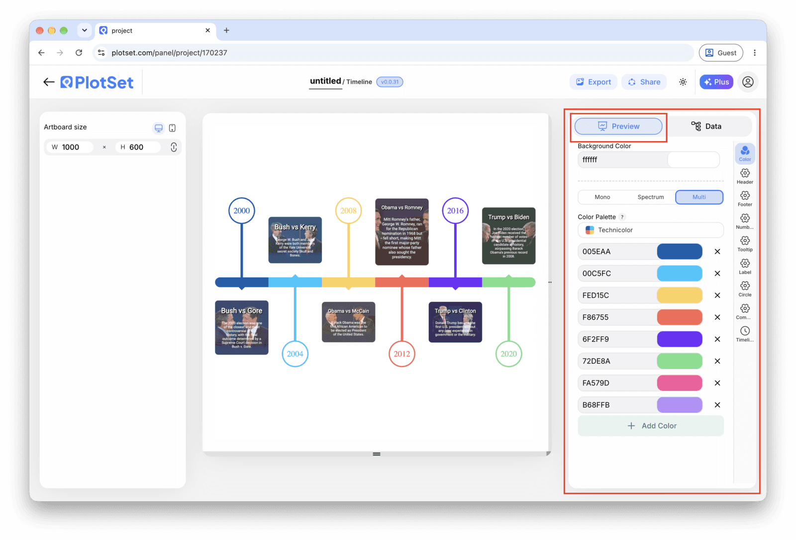
    The PlotSet editor on the Preview tab: a finished Timeline on the canvas, with the settings panel outlined in red down the right-hand side.
    The Preview tab for a Timeline. Every styling control lives in the outlined panel, each on its own tab: appearance, header, footer and the options specific to this chart type.
  7. 07

    Write the titles like headlines

    Lead each title with what changed, not the date, since the date is already on the axis right next to it. Save the note for the sentence a reader would want if they stopped to read, and leave it blank on rows where there is nothing worth adding.

  8. 08

    Publish, embed or export the timeline

    Publish for a live, interactive timeline where each marker opens its note and image on click, grab the embed code to drop it into a page, or export a PNG, SVG or PDF if you need a static version for a deck or a report.

Start from the Timeline template with sample data already loaded, then swap in your own.

Open the template

Publish, embed or export it

The last stretch is the same for every chart type: Share turns the chart into a live public link and an embed code, Export writes it out as a static file.

Share: public link and embed code

Activating the embed code and public link publishes the chart. The link is safe to send to anyone, and the embed code drops into any page as an iframe that keeps the hover tooltips and the interactivity. Edit the chart later and hit Recreate to push those changes out to both.

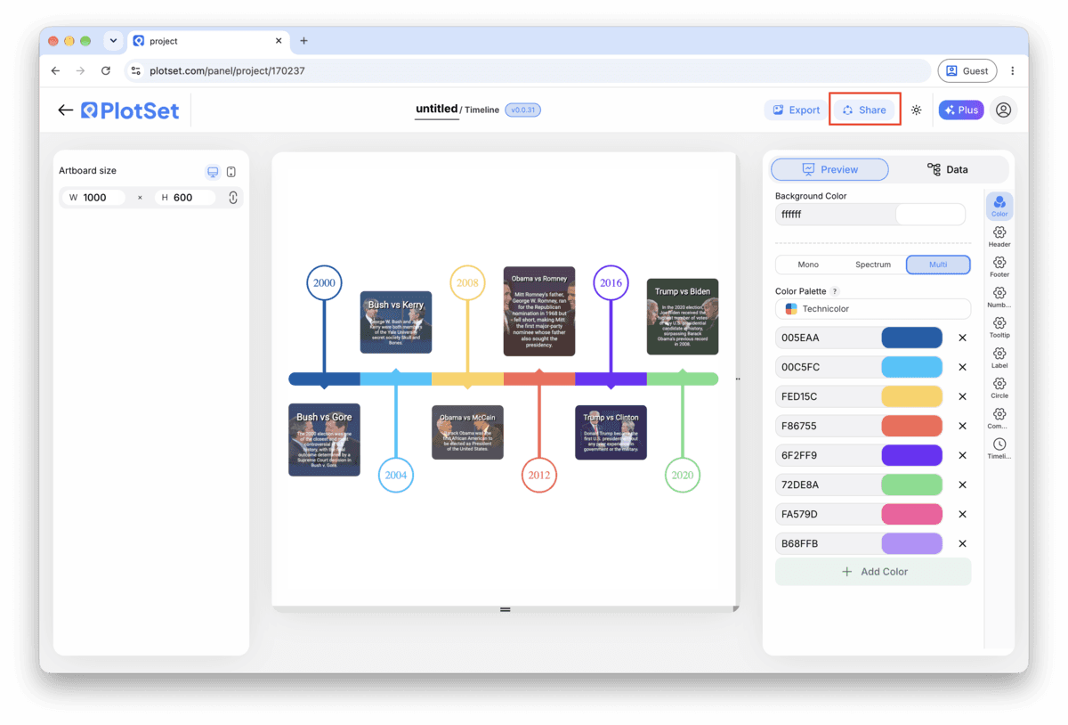
The PlotSet editor toolbar with the Share button highlighted, sitting next to the Export button.
Share is how a finished chart becomes a public link and an embed code.
PlotSet's Share dialog: the toggle activating the embed code and public link, buttons for Link, Embed, Facebook, Reddit, Twitter, LinkedIn and Email, and the public chart link with a Copy button.
Switch on the embed code and public link, then copy the link or take the iframe. Recreate pushes later edits out to everyone already holding it.

Export: SVG, PNG or JPG

Export writes a static copy at whatever size you need. SVG stays sharp at any scale and can still be edited in a design tool; PNG and JPG are the safe choices for slides and documents. The scale multiplier is what gets you a crisp image on a retina screen.

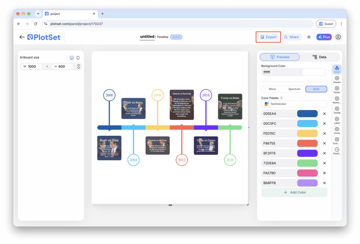
The PlotSet editor toolbar with the Export button highlighted.
Export is the route to a static file for a slide or a report.
PlotSet's Export chart dialog: a 2x scale selector, width and height fields set to 1000 by 600, and the open format menu listing SVG, PNG and JPG.
SVG stays sharp at any size and stays editable in a design tool; PNG and JPG are the safe picks for a deck. Set the scale before you export so the image is crisp on a retina screen.

Styling tips for a Timeline

Keep the layout single sided under ten events

The alternating left-right layout earns its place once markers start crowding a single line, but for a short timeline it just adds movement the reader has to track. Turn it on only once labels are genuinely colliding.

Size markers by importance, not decoration

Set a larger marker for the two or three events that actually carry the story and leave the rest at the default size. A reader picks up the hierarchy before they have read a single title.

Save images for the moment they add information

An image on every marker inflates every card to the same height and turns a quick scan into a scroll. Attach one where a photo genuinely tells the reader something the title cannot (a product shot, a diagram, a screenshot) and leave the rest blank.

Match the date format to your actual precision

If your rows are years, set the chart's date format to show years only instead of defaulting to a full date. A timeline that displays a fabricated month and day for an event you only know happened sometime in 1969 is claiming a precision you do not have.

Common mistakes when making a Timeline

Two events land on top of each other

This usually means two rows share the same date, or dates close enough together that the markers overlap and the labels collide. Check the data table for duplicate or near-duplicate dates and either merge them into one event or correct the date if the sources actually disagree.

An event goes missing from the chart

A blank cell in the date column gets skipped rather than flagged, so the row disappears with no error. Scroll through PlotSet's data table and check that every row has a date before assuming your sheet uploaded in full.

A title gets cut off mid word

This means the title is running longer than the marker card has room for, not that anything broke. Shorten it to something closer to a headline and move the rest of the sentence into the note field, which has more room to work with.

Learn more about the Timeline

Not sure the Timeline is the right choice? See what it is, when to use it and when not to.

About the Timeline

Timeline: common questions

Four columns with one header row: a date, a short title, and two optional columns, a note and an image URL. Only the date and title are required. CSV and .xlsx both work, and a pasted range from any spreadsheet tool is fine too, as long as the date column parses as an actual date rather than text.

Make your Timeline now

Free to start with 300+ templates. No credit card required.