PlotSet LogoPlotSet

How to Create a Gantt Chart

A step by step walkthrough for turning a task list into a published Gantt chart in PlotSet, from shaping the sheet to exporting or embedding the finished timeline.

About 8 minutes

A task list with a start date and an end date on every row is the raw material, and how to create a Gantt chart in PlotSet from it is what this guide walks through: one bar per task, coloured by phase, finishing in a published timeline ready to embed or hand to a client. Not a demo dataset, your own project going through the same click path a real PlotSet chart takes from upload to publish.

If your task list already has clean start and end dates, this takes about eight minutes. Add another ten if you're still pulling dates out of a project management tool's export or fixing a column that stored dates as text instead of real dates. Budget the eight minutes below and treat the rest as buffer.

The data you need

Five columns, one row per task: task name, start date, end date, owner, and phase. Dates in ISO format (YYYY-MM-DD), one header row, no merged cells.

Sample CSV
TaskStartEndOwnerPhase
Discovery interviews2026-01-052026-01-16PriyaDiscovery
Content audit2026-01-122026-01-23MarcusDiscovery
Wireframes2026-01-192026-02-06PriyaDesign
Visual design2026-02-022026-02-20SanaDesign
Frontend build2026-02-162026-03-20DiegoBuild
CMS integration2026-03-022026-03-27MarcusBuild
QA and content freeze2026-03-232026-04-03SanaQA
Launch2026-04-062026-04-10DiegoLaunch
Notes

Write dates in ISO format: 2026-01-05, not 1/5/26. PlotSet parses ISO dates the same way every time, while a locale ambiguous date can silently land on the wrong day.

Task name goes in its own column and stays short. It sits in a fixed row margin on the chart, so a long name gets cut off. Put the extra detail in a note elsewhere and let the tooltip carry it.

Owner and phase are optional but do real work: owner becomes the label written inside each bar, phase becomes the bar colour and the legend. Skip either and PlotSet just draws plain, uncoloured bars.

One row per task, no merged cells, no blank spacer rows between phases. A blank row uploads as an empty task with no dates, and PlotSet has nowhere to place it on the timeline.

The steps

The exact click path in PlotSet, from a blank template to a finished chart.

  1. 01

    Open the Gantt chart template

    From the PlotSet dashboard, start a new project and choose the Gantt Chart template, listed under Timeline. It loads with a sample project already in place (five tasks with dates, owners and phases) so you can see the exact column shape before swapping in your own.

    PlotSet's template picker: chart categories listed down the left, the Bar Charts grid open, and the Bar Chart template card showing its Select button.
    Every guide starts here. Pick the category, then the template: it is the same grid whichever chart type you are after.
  2. 02

    Lay your tasks out in five columns

    Task name, start date, end date, owner, phase: one row per task. If your source is an export from a project management tool, strip out any status or ID columns you don't need. PlotSet only reads the five above.

  3. 03

    Write every date in ISO format

    Convert start and end dates to YYYY-MM-DD before you upload. If your spreadsheet still shows 04/27/2026, check what the column is actually storing: one formatted as text uploads as text, and PlotSet won't read it as a date.

  4. 04

    Upload the file or connect a sheet

    Import CSV or Excel from the data panel, paste rows directly from a spreadsheet, or connect a Google Sheet so the timeline can be refreshed later without a re-upload.

    The PlotSet editor's data view: a spreadsheet grid with Name, Value and Region columns filled with Canadian province figures, beside the Data panel offering CSV upload, Magic Import and Google Sheet sync.
    The data view, shown here on a bar chart project. Upload a CSV, lift the numbers out of an image with Magic Import, or sync a Google Sheet. The panel is identical for every chart type.
  5. 05

    Bind Start, End, Y axis, Labels and Category

    Start and End take the two date columns. Y axis takes the task name, which labels each row. Labels takes the text written inside the bar, usually the owner. Category takes the phase, which colours the bars and builds the legend.

    The PlotSet data panel with the column bindings highlighted: Label/time mapped to column A, Values to column B and Filter/color to column C, with the Auto Binding button below.
    Bindings decide which column becomes the label, which supplies the values and which drives the colour. Auto Binding guesses them from your headers, so check it rather than assume it.
  6. 06

    Sort tasks by start date

    Order the rows by start date, either in the source sheet or in PlotSet's data table, so the chart cascades top to bottom in the order the work actually happens. A Gantt chart sorted alphabetically hides the one thing it's good at showing.

  7. 07

    Set the axis interval to match the plan's length

    A project spanning a few months reads well with week or month ticks; a multi year roadmap wants quarters. Open the axis settings and pick the interval that fits, or the labels will crowd into each other.

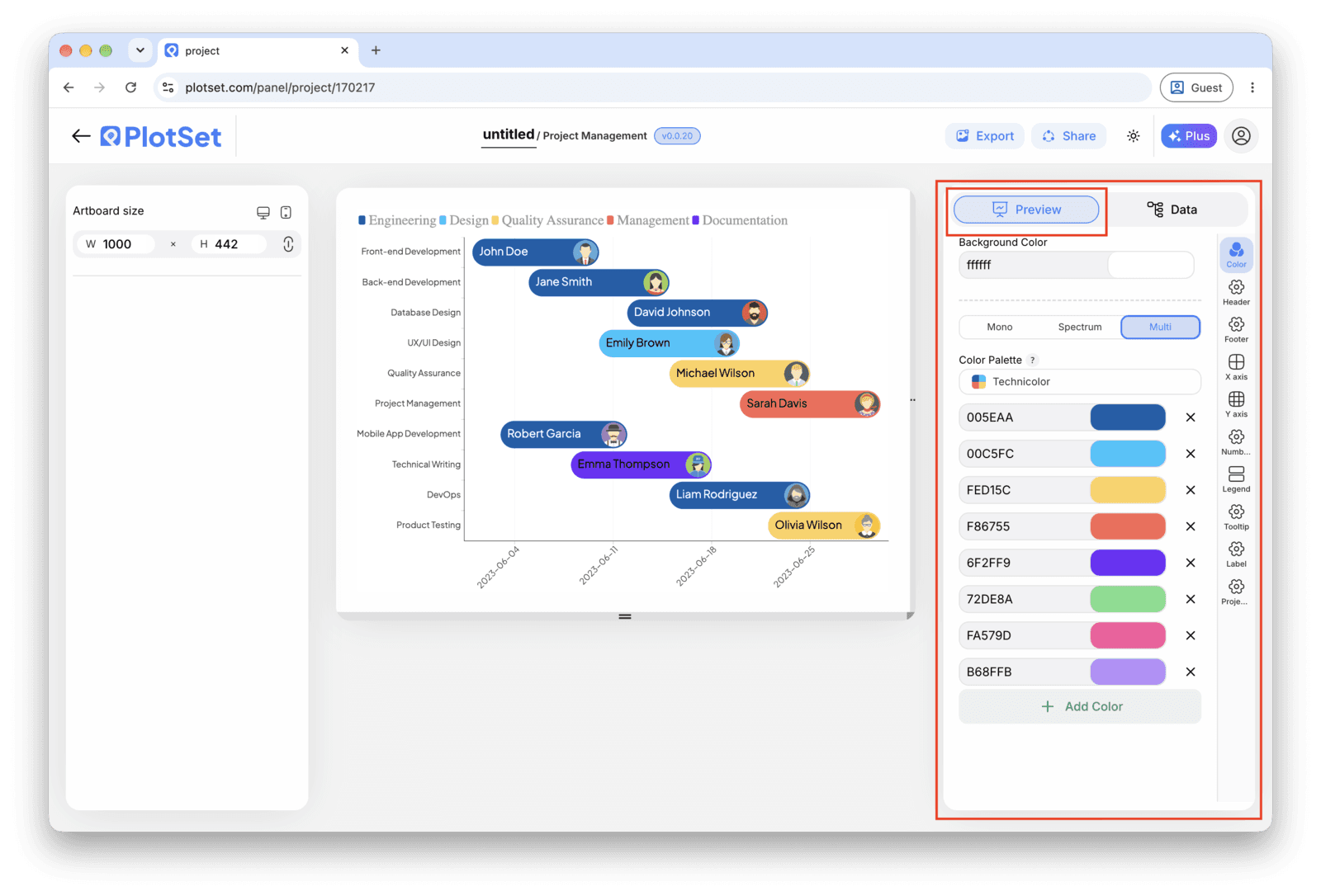
    The PlotSet editor on the Preview tab: a finished Gantt Chart on the canvas, with the settings panel outlined in red down the right-hand side.
    The Preview tab for a Gantt Chart. Every styling control lives in the outlined panel, each on its own tab: appearance, header, footer and the options specific to this chart type.
  8. 08

    Publish, embed or export the timeline

    Publish for a live timeline with a tooltip on every bar and a shareable link, grab the embed code for a status page or wiki, or export a PNG, SVG or PDF for a deck.

Start from the Gantt Chart template with sample data already loaded, then swap in your own.

Open the template

Publish, embed or export it

The last stretch is the same for every chart type: Share turns the chart into a live public link and an embed code, Export writes it out as a static file.

Share: public link and embed code

Activating the embed code and public link publishes the chart. The link is safe to send to anyone, and the embed code drops into any page as an iframe that keeps the hover tooltips and the interactivity. Edit the chart later and hit Recreate to push those changes out to both.

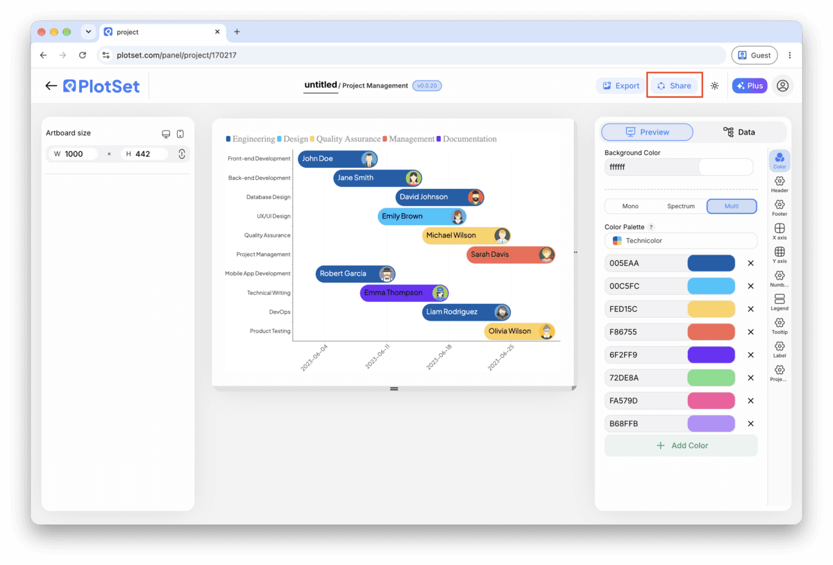
The PlotSet editor toolbar with the Share button highlighted, sitting next to the Export button.
Share is how a finished chart becomes a public link and an embed code.
PlotSet's Share dialog: the toggle activating the embed code and public link, buttons for Link, Embed, Facebook, Reddit, Twitter, LinkedIn and Email, and the public chart link with a Copy button.
Switch on the embed code and public link, then copy the link or take the iframe. Recreate pushes later edits out to everyone already holding it.

Export: SVG, PNG or JPG

Export writes a static copy at whatever size you need. SVG stays sharp at any scale and can still be edited in a design tool; PNG and JPG are the safe choices for slides and documents. The scale multiplier is what gets you a crisp image on a retina screen.

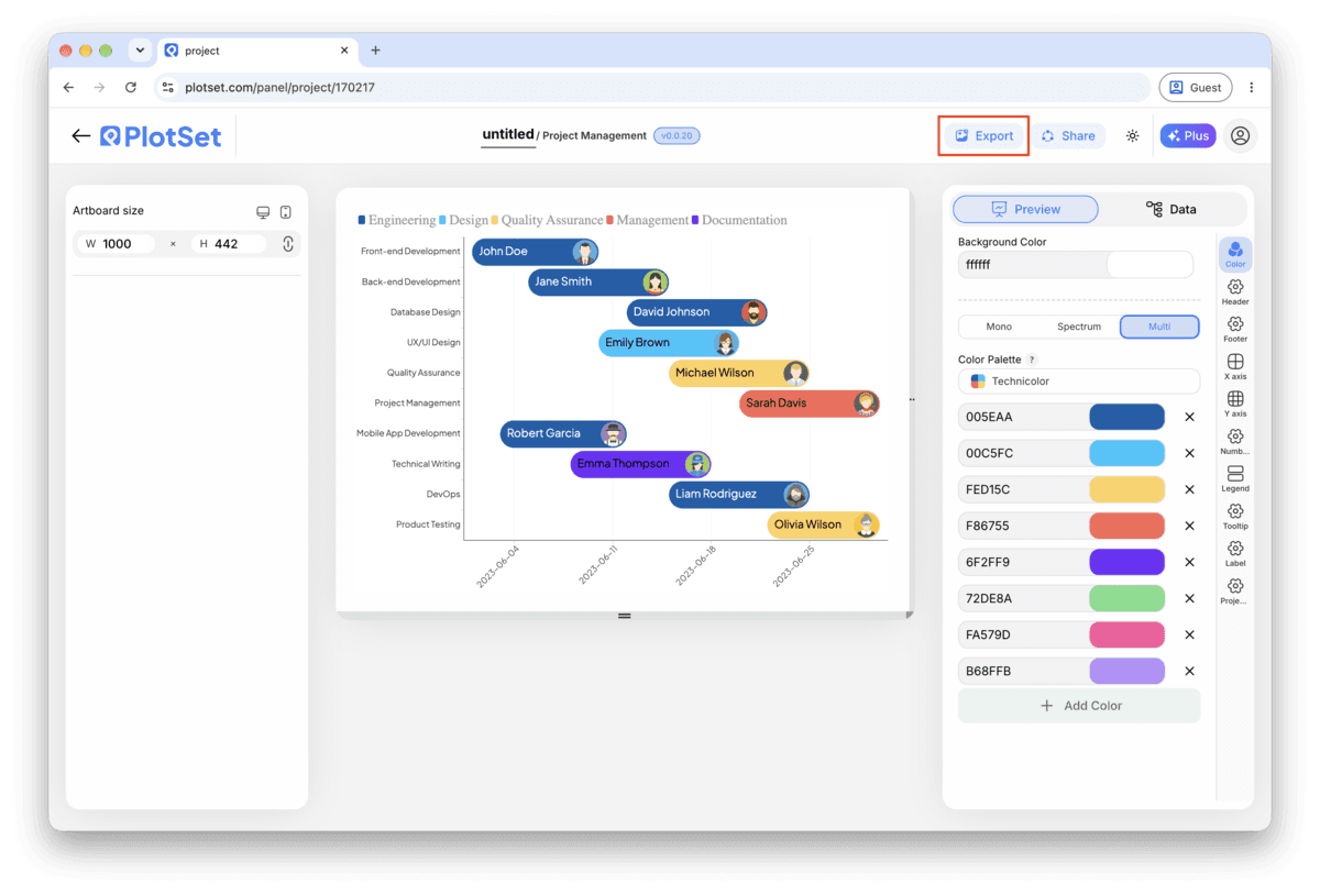
The PlotSet editor toolbar with the Export button highlighted.
Export is the route to a static file for a slide or a report.
PlotSet's Export chart dialog: a 2x scale selector, width and height fields set to 1000 by 600, and the open format menu listing SVG, PNG and JPG.
SVG stays sharp at any size and stays editable in a design tool; PNG and JPG are the safe picks for a deck. Set the scale before you export so the image is crisp on a retina screen.

Styling tips for a Gantt Chart

Colour by phase, not by owner

Category drives one colour scheme. Bind it to phase and everyone sees the project's structure at a glance. If owner also needs to be visible, put it in the bar label instead of fighting for a second colour dimension.

Keep task names to a few words

The row label sits in a fixed margin on the left. A short name like "Frontend build" reads fine; a full sentence gets truncated. Save the detail for the tooltip, which shows the whole row on hover.

Order rows by start date, not by phase or owner

The cascade down the chart is what makes a Gantt chart readable in two seconds. Grouping by phase or owner instead breaks that cascade and turns the chart back into a list with bars attached.

Match the axis interval to the plan's span

Day ticks on a two year roadmap are unreadable; month ticks on a three week sprint hide all the detail. Set the interval once you know how long the whole plan runs, not before.

Common mistakes when making a Gantt Chart

All the bars start on the same day

This usually means Start and End are mapped to the same column, or the date column uploaded as text instead of a real date. Check the column bindings first, then confirm the dates are in ISO format (YYYY-MM-DD) in the source sheet.

The rows don't cascade, they look scattered

The task rows are probably still in their original spreadsheet order rather than sorted by start date. Sort the source sheet, or the data table inside PlotSet, by the start date column and check again.

Task names are cut off in the row labels

The label margin has a fixed width and doesn't wrap. Shorten the task names in the source column and move any extra detail into a separate note; the tooltip already shows the full row on hover.

Learn more about the Gantt Chart

Not sure the Gantt Chart is the right choice? See what it is, when to use it and when not to.

About the Gantt Chart

Gantt Chart: common questions

Lay your data out one task per row: task name, start date, end date, owner and phase, with dates in ISO format (YYYY-MM-DD). Upload the file, bind Start and End to the date columns and Y axis to the task name, and PlotSet draws one bar per task on a shared calendar.

Make your Gantt Chart now

Free to start with 300+ templates. No credit card required.