| Region | Manager | Revenue | Growth | Last Updated |
|---|---|---|---|---|
| North America | Jordan Lee | 1284000 | 0.062 | 2024-01-15 |
| Europe | Priya Shah | 942000 | -0.014 | 2024-01-15 |
| Asia Pacific | Wei Zhang | 1103000 | 0.081 | 2024-01-15 |
| Latin America | Carla Nunez | 412000 | 0.033 | 2024-01-15 |
| Middle East & Africa | Omar Farouk | 298000 | -0.02 | 2024-01-15 |
How to Create a Data Table
A step by step walkthrough for turning a spreadsheet into a searchable, sortable data table in PlotSet, from setting column types to publishing or embedding the finished table.
About 8 minutesA data table only earns the name if readers can actually search and sort it, not just stare at a screenshot of a spreadsheet. Here is how to create a data table in PlotSet that does both, built straight from your own rows and columns: every column has the right type set (so a currency column sorts as a currency, not as text), the header stays put while the body scrolls, and the finished table is ready to publish, embed or export.
Eight minutes is what it takes once your sheet already has clean headers and consistent column types. Pulling columns out of a wider report, or fixing a date column that got saved as plain text somewhere along the way, adds another ten. The steps below assume a real, slightly messy source file, not a tidy demo.
The data you need
One row per record, one header row, and one consistent data type per column: text, number, currency, percentage or date. Mixed types in a single column are the main thing to clean up before uploading.
Give every column a plain, short header. PlotSet uses the header row as the column label, so "Q1 Rev (USD)" becomes the label a reader sees at the top of that column.
Keep one data type per column all the way down. If a currency column has "1284000" in most rows and "$1.28M" typed into one cell by hand, that column stops sorting correctly.
Dates read best in a consistent format such as YYYY-MM-DD. A spreadsheet that silently mixes 1/15/2024 and 15-Jan-24 in the same column will not sort as dates in PlotSet either.
Leave blank cells blank rather than typing "N/A" or "-" into a numeric or date column. Text placeholders in an otherwise numeric column break sorting for that whole column.
The steps
The exact click path in PlotSet, from a blank template to a finished chart.
- 01
Open the Table template
From the PlotSet dashboard, start a new project and choose the Table template. It loads with sample rows already in place so you can see how search, sort and column types behave before you touch your own file.

Every guide starts here. Pick the category, then the template: it is the same grid whichever chart type you are after. - 02
Shape your sheet into clean columns
One row per record, one header row, no merged cells and no subtotal rows mixed into the data. If your source is a pivot table or an export with a totals row at the bottom, delete that row before uploading.
- 03
Import your file or connect a sheet
Import a CSV or .xlsx file from the data panel, paste rows straight from a spreadsheet, or connect a Google Sheet if you want the table to reflect edits later without a re-upload.

The data view, shown here on a bar chart project. Upload a CSV, lift the numbers out of an image with Magic Import, or sync a Google Sheet. The panel is identical for every chart type. - 04
Set each column's type
Go through the columns one at a time and confirm text, number, currency, percentage or date. This single step decides whether sorting a column does something sensible or sorts "100" ahead of "9" the way a text sort would.

Bindings decide which column becomes the label, which supplies the values and which drives the colour. Auto Binding guesses them from your headers, so check it rather than assume it. - 05
Cut the columns you do not need and pick a default sort
Every extra column costs horizontal space on a phone, so drop anything that does not answer the question the table exists to answer. Then choose which column the table sorts by on load, usually the one a reader is most likely to rank by first.
- 06
Turn on search and freeze the header
Enable the search box so readers can jump straight to their row instead of scanning the whole table, and keep the header row frozen so column names stay visible as the body scrolls.
- 07
Style the rows
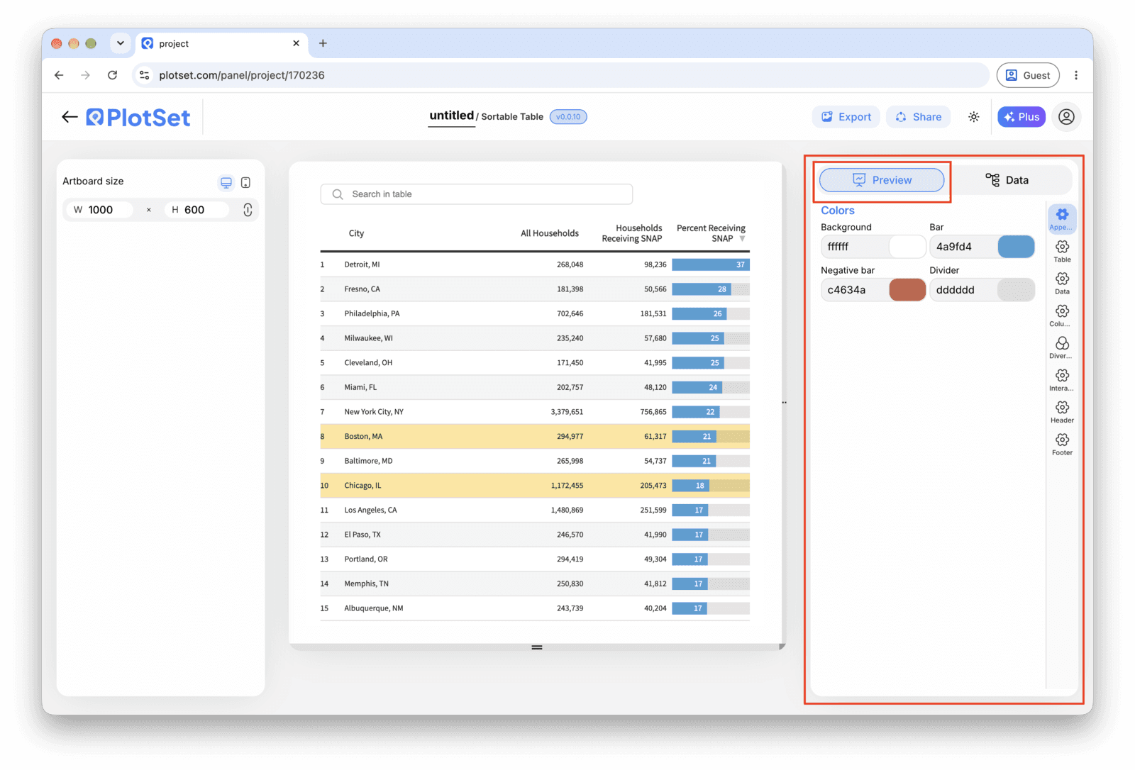
Turn on row striping or hover highlighting so the eye can track a line across a wide table, right-align numeric columns so digits line up by place value, and add an in-cell bar to one numeric column if you want a magnitude comparison without giving up the printed number.

The Preview tab for a Table. Every styling control lives in the outlined panel, each on its own tab: appearance, header, footer and the options specific to this chart type. - 08
Make it live: publish, embed or export
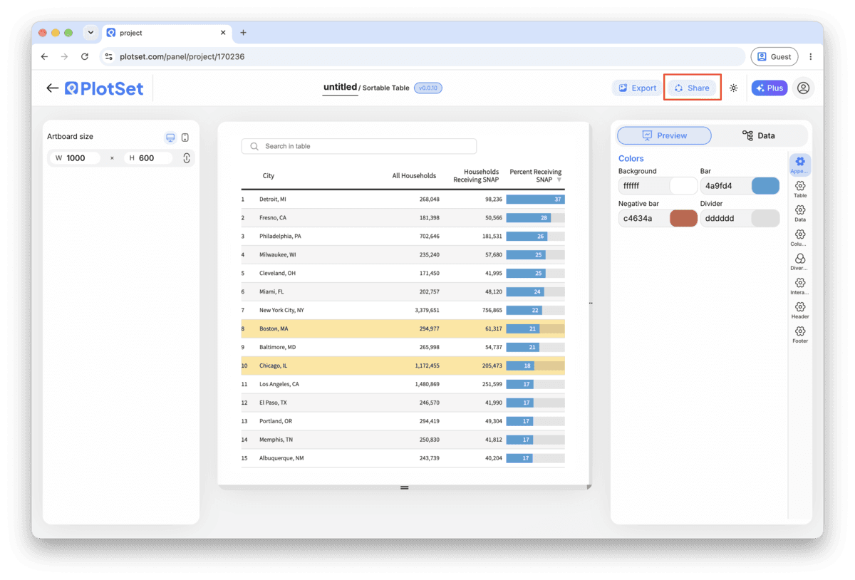
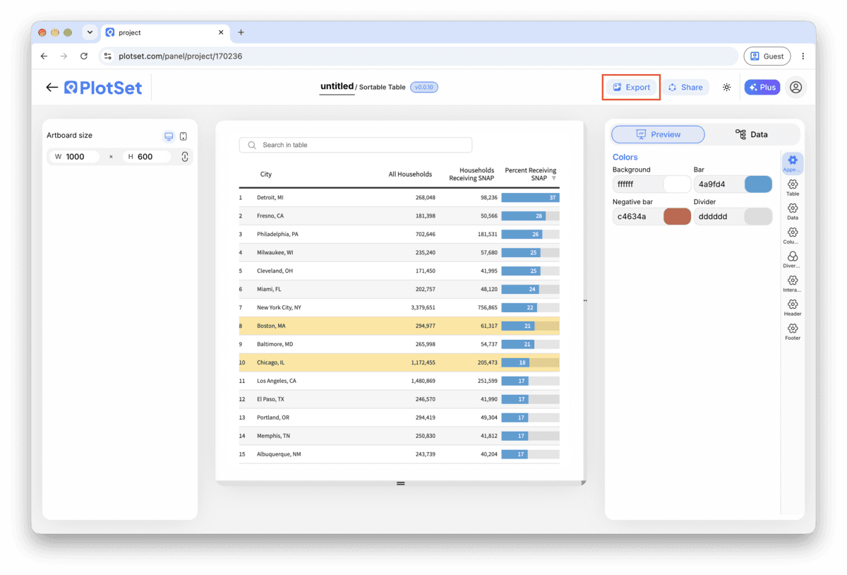
Publish for a live table with working search and sort and a shareable link, grab the embed code to drop it into a page, or export a PNG, SVG or PDF if you need a static image for a report.
Start from the Table template with sample data already loaded, then swap in your own.
Open the templateStyling tips for a Table
Set column types before you style anything
Sorting, alignment and number formatting all follow from the column type, so fixing it after you have already styled the table means redoing that styling. Do this step first, every time.
Freeze the header on anything past about fifteen rows
Past fifteen rows a reader loses track of which column they are looking at once the header scrolls out of view. Freezing it costs nothing and fixes that immediately.
Use an in-cell bar instead of a second chart
If one numeric column is the one readers want to compare at a glance, add a bar inside that cell rather than building a separate bar chart next to the table. It keeps the exact number and the shape of the comparison in one place.
Keep the column count to what the question needs
A table with ten columns reads fine on a laptop and becomes an unreadable strip on a phone. Decide what the table is for, publish only those columns, and leave the rest in the source spreadsheet.
Common mistakes when making a Table
A numeric column sorts alphabetically instead of by value
This means the column type is still set to text, so "100" sorts before "20" the way a dictionary would order them. Open the column settings and set that column to Number or Currency, then re-check the sort.
A date column shows a raw string instead of a formatted date
This happens when dates were typed inconsistently in the source sheet (one row as 1/15/2024, another as 15-Jan-2024), so PlotSet cannot read the whole column as one type. Standardize the format in your spreadsheet to YYYY-MM-DD and re-upload.
The table looks fine on desktop but overflows sideways on a phone
This is almost always too many columns rather than a settings problem. Go back to the column list and remove anything that is not answering the question the table exists for, rather than shrinking font size to compensate.
Learn more about the Table
Not sure the Table is the right choice? See what it is, when to use it and when not to.
Table: common questions
One header row and one row per record, with each column holding a single consistent type: text, number, currency, percentage or date. Mixed types within one column, such as numbers and the occasional "N/A", are the most common reason a table does not sort correctly after upload.
Make your Table now
Free to start with 300+ templates. No credit card required.