
Sample CSV
| City | MedianIncome | MedianRent | Population |
|---|---|---|---|
| Austin | 71576 | 1450 | 978908 |
| Denver | 77127 | 1650 | 715522 |
| Columbus | 58575 | 1150 | 905748 |
| Raleigh | 67266 | 1300 | 474069 |
| Tampa | 58922 | 1500 | 398173 |
| Boise | 66979 | 1350 | 235684 |
A step by step walkthrough for turning a spreadsheet into a published bubble chart in PlotSet, from shaping three numeric columns to tuning the size scale and publishing.
About 9 minutesFour columns, one chart: how to create a bubble chart in PlotSet starts with a spreadsheet that has a label, two numeric axis columns and a size value. You will end up with a published chart where the bubbles are scaled by area, not radius, carry a size legend the reader can actually use, and still hold together once a handful of records turn out much bigger than the rest.
Budget about nine minutes if your data is already four clean columns. The part people spend extra time on is tuning the size scale so the biggest bubble does not swallow the smallest ones, so treat that as a bit of trial and error rather than a setting you flip once and forget.
Four columns, one row per entity: a label, two numeric axis columns, then a numeric size column. No merged cells, one header row.
| City | MedianIncome | MedianRent | Population |
|---|---|---|---|
| Austin | 71576 | 1450 | 978908 |
| Denver | 77127 | 1650 | 715522 |
| Columbus | 58575 | 1150 | 905748 |
| Raleigh | 67266 | 1300 | 474069 |
| Tampa | 58922 | 1500 | 398173 |
| Boise | 66979 | 1350 | 235684 |
All three numeric columns need to be plain numbers. A percentage stored as text with a percent sign, or an income figure stored with commas as text, will not map to an axis or to size.
The size column needs an amount, not a category. If your source data only has a bucket like small, medium or large, you need a real count or figure behind it before a bubble chart can size anything off it.
Zero and negative values break the size encoding. Area cannot represent a negative number, so filter those rows out or move that variable to colour instead.
Keep the entity count in the tens, not the hundreds. The example above has six rows for clarity; the sweet spot for a real chart is roughly ten to sixty before bubbles start stacking on top of each other.
The exact click path in PlotSet, from a blank template to a finished chart.
From the PlotSet dashboard, start a new project and choose the Bubble Chart template. It loads with sample data already mapped to X, Y, size and label, so you can see the four column shape PlotSet expects before touching your own file.

Put a label in the first column, then your two axis numbers, then the size value, one row per entity. If your source is a report with subtotal rows or merged header cells, flatten it first: the upload should be four plain columns and nothing else.
Use the data panel to import a CSV or .xlsx file, paste rows straight from a spreadsheet, or connect a Google Sheet so the chart can pick up later edits without a re-upload. PlotSet reads the first row as headers automatically.

Confirm which column feeds each axis and which one drives bubble size. PlotSet usually guesses correctly when your headers are clear, but check it by hand if your sheet carries extra columns it might have picked over the ones you actually meant.

Adjust the minimum and maximum bubble size until the largest entity reads clearly bigger without hiding its neighbours underneath it. Confirm scaling is set to area, not radius, and turn on the size legend so the reader gets two or three reference bubbles with real numbers attached.
Add direct labels to the handful of bubbles that carry the story and leave the rest to hover tooltips. Labelling every bubble on a chart with more than a dozen entities just creates clutter. If you have a category column, turn on colour by group to separate the bubbles visually.
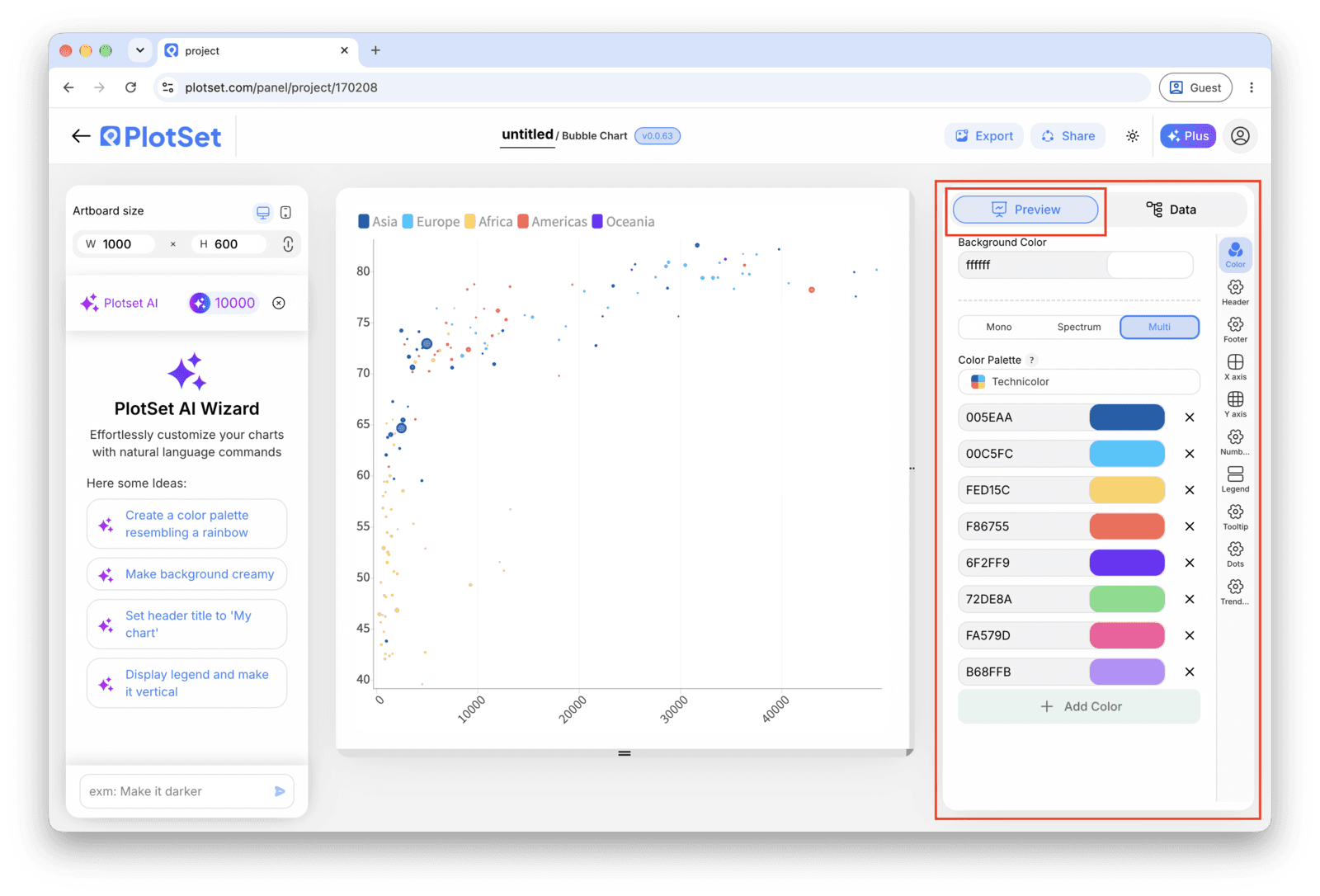
Publish for a live, interactive chart with hover tooltips and a shareable link, grab the embed code for a page, or export a PNG, SVG or PDF when you need a static image for a deck.
Start from the Bubble Chart template with sample data already loaded, then swap in your own.
Open the templateThe last stretch is the same for every chart type: Share turns the chart into a live public link and an embed code, Export writes it out as a static file.
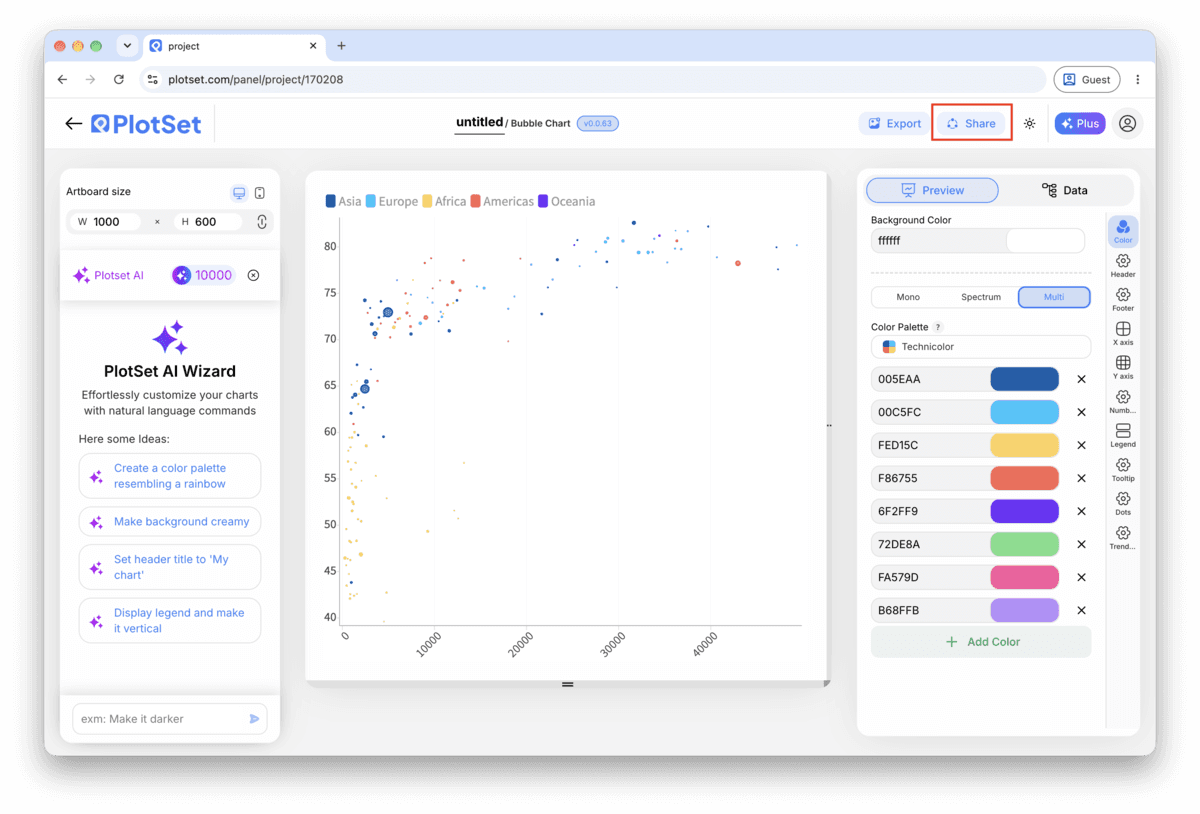
Activating the embed code and public link publishes the chart. The link is safe to send to anyone, and the embed code drops into any page as an iframe that keeps the hover tooltips and the interactivity. Edit the chart later and hit Recreate to push those changes out to both.

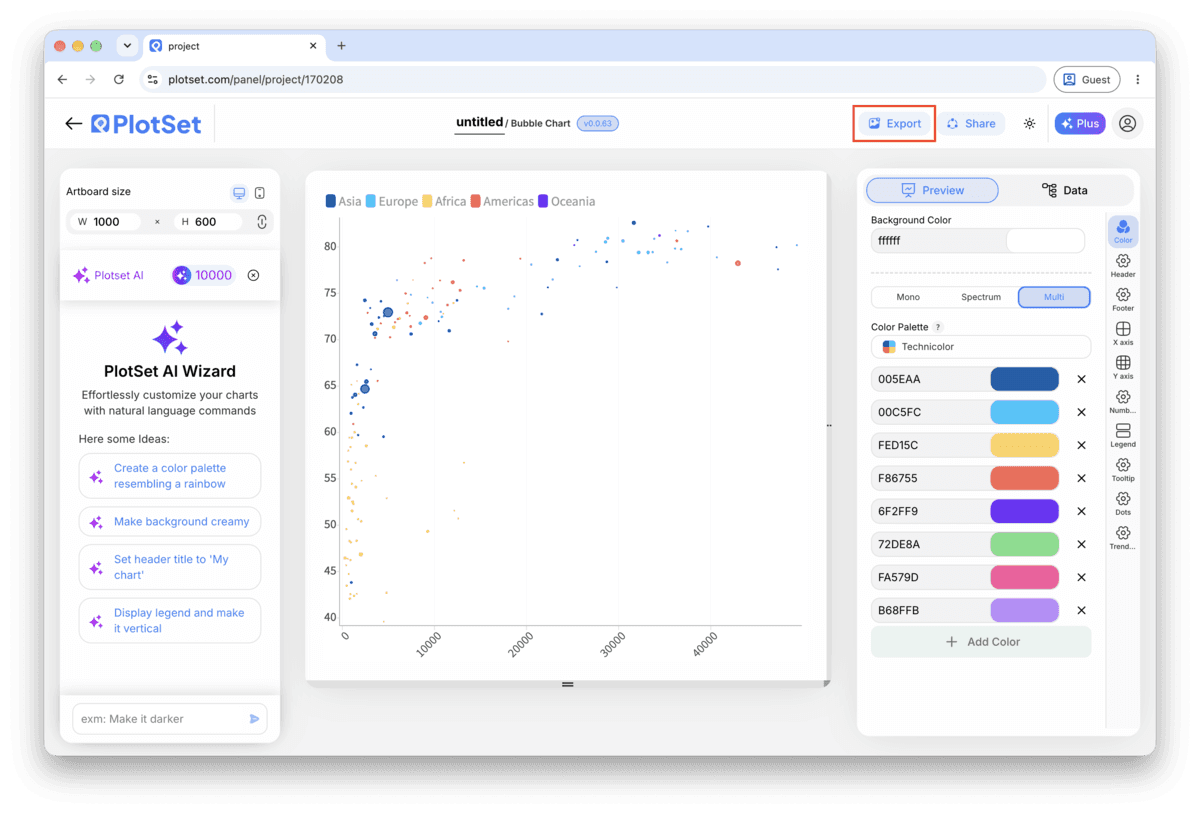
Export writes a static copy at whatever size you need. SVG stays sharp at any scale and can still be edited in a design tool; PNG and JPG are the safe choices for slides and documents. The scale multiplier is what gets you a crisp image on a retina screen.

Radius scaling makes a bubble twice as wide look four times as big, which misleads the reader every time. PlotSet defaults to area scaling for bubble charts, but if you have adjusted the size settings by hand, check the scale mode again before publishing.
Send the largest bubbles to the back of the stack and lower the fill opacity a notch, so a big bubble does not fully hide a smaller one sitting underneath it. This matters most once your dataset passes twenty or so entities.
Two or three reference bubbles with values attached turn the size encoding from decoration into information. Without a legend, a reader can tell one bubble is bigger than another but has no way to say by how much.
If one record is a thousand times the size of the rest, pull it into its own callout or filter it out and say so in a caption. Otherwise every other bubble on the chart shrinks down to a dot next to it.
This is almost always an outlier in the size column, sometimes a totals row that snuck in with the real data. Sort the size column in PlotSet's data table, find the record that dwarfs the rest, and either filter it out or cap the maximum size in the scale settings.
Check that the size column is actually mapped to a numeric field and not to the label or a category column by mistake. It also happens when the values in that column are stored as text with commas or a currency symbol, since PlotSet cannot size marks off text.
This shows up once a chart has more than about fifteen bubbles with direct labels turned on. Turn off labels for anything but the handful of bubbles the chart is actually about, and let the rest surface their identity in the tooltip on hover.
Not sure the Bubble Chart is the right choice? See what it is, when to use it and when not to.
Four columns: a label for each entity, two numeric columns for the X and Y position, and a third numeric column for bubble size. A category column is optional and adds colour grouping. All three numeric columns need to be plain numbers, not text with symbols or commas, or PlotSet cannot map them.
Free to start with 300+ templates. No credit card required.