
Sample CSV
| Country | Life Expectancy 2000 | Life Expectancy 2023 |
|---|---|---|
| Japan | 81.2 | 84.1 |
| United States | 76.6 | 79.3 |
| Brazil | 70.1 | 75.6 |
| Russia | 65.5 | 72.7 |
| India | 62.6 | 70.8 |
| Nigeria | 46.8 | 62.6 |
A step by step walkthrough for turning two columns of before and after numbers into a published dumbbell chart in PlotSet, from shaping the sheet to exporting or embedding the result.
About 7 minutesTwo dots per category, joined by a line: that is how to create a dumbbell chart from your own spreadsheet, sorted by the size of the change and coloured so a reader can tell which dot is which, and either embedded on a page or exported as an image. Not a demo with placeholder rows, your own categories and your own two numbers, run through the same click path a published PlotSet chart takes.
If your data is already three columns, category and two values, this takes about seven minutes. Add a few more if your numbers are currently spread across two separate rows per category (a long format export) rather than sitting side by side, since that is the one reshape a dumbbell chart actually forces on you before it will draw a connector at all.
Three columns, one row per category: the category name, the first value, the second value. No separate rows for each value, one header row, and the two value column headers become the legend labels for the two dots.
| Country | Life Expectancy 2000 | Life Expectancy 2023 |
|---|---|---|
| Japan | 81.2 | 84.1 |
| United States | 76.6 | 79.3 |
| Brazil | 70.1 | 75.6 |
| Russia | 65.5 | 72.7 |
| India | 62.6 | 70.8 |
| Nigeria | 46.8 | 62.6 |
Both values live on the same row. If your export has one row per country per year, a long or tidy format, pivot it into wide format first: one row per country, one column per year. PlotSet cannot pair rows across a stacked layout on its own.
Name the two value columns clearly, for example the actual years or state names rather than "Value 1" and "Value 2". PlotSet uses those header names for the dot legend, and vague headers make a vague legend.
Keep both value columns numeric. If either one has a stray unit, a percent sign or a currency symbol typed into the cell, PlotSet reads it as text and drops the row from the chart instead of plotting it.
A blank cell in either value column means that category has no second dot to connect. Fill it in with the real number or remove the row rather than leaving a half-drawn pair.
The exact click path in PlotSet, from a blank template to a finished chart.
From the PlotSet dashboard, start a new project and choose the Dumbbell Chart template, listed under connected dots. It loads with sample data already bound so you can see the exact three column layout before touching your own file.

One row per category, with both numbers on that same row. If you exported from a database or a BI tool, check now whether it came out long (one row per category per period) and pivot it wide before moving on.
Import a CSV or .xlsx file from the data panel, paste rows straight from a spreadsheet, or connect a Google Sheet so the chart can be refreshed later without a re-upload. PlotSet reads the first row as your column headers.

Confirm which column feeds the category axis and which two feed the pair of dots. This is usually correct automatically when your headers are clear; check it by hand if your sheet carries extra columns PlotSet had to guess between.

Switch the sort from alphabetical to sort by difference, descending. This is the step that actually makes the chart useful: it turns a list of categories into a ranking of where the change was biggest, which is usually the real question your reader has.
Give the first value and the second value clearly different colours, since telling the pair apart is the first thing a reader needs to do. If some categories rose while others fell, colour the connector by direction too, or a mixed chart reads as if everything moved the same way.
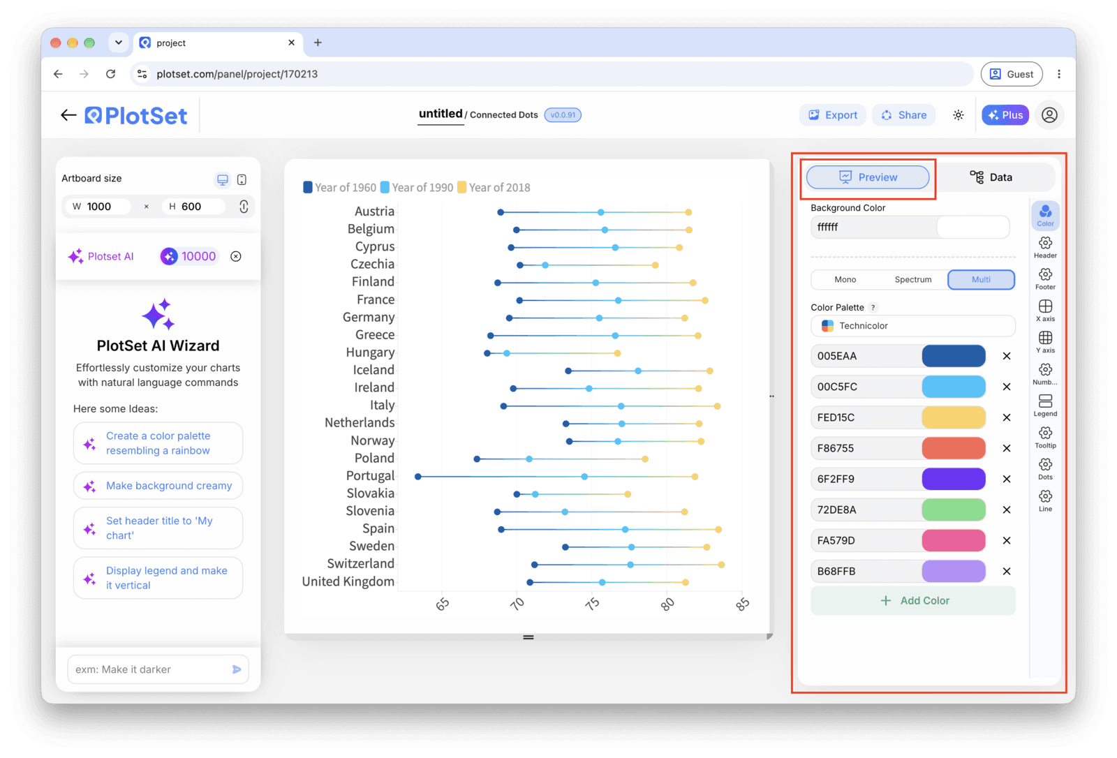
Turn on the difference label at the end of each connector so the exact change is readable without measuring. The value axis does not need to start at zero here, dots encode position rather than length, so you can trim it to the actual range of your data to make small gaps in large numbers visible.
Publish for a live, interactive chart where hovering a pair shows both values and the difference, grab the embed code for a page, or export a PNG, SVG or PDF if you need a static image for a deck.
Start from the Dumbbell Chart template with sample data already loaded, then swap in your own.
Open the templateThe last stretch is the same for every chart type: Share turns the chart into a live public link and an embed code, Export writes it out as a static file.
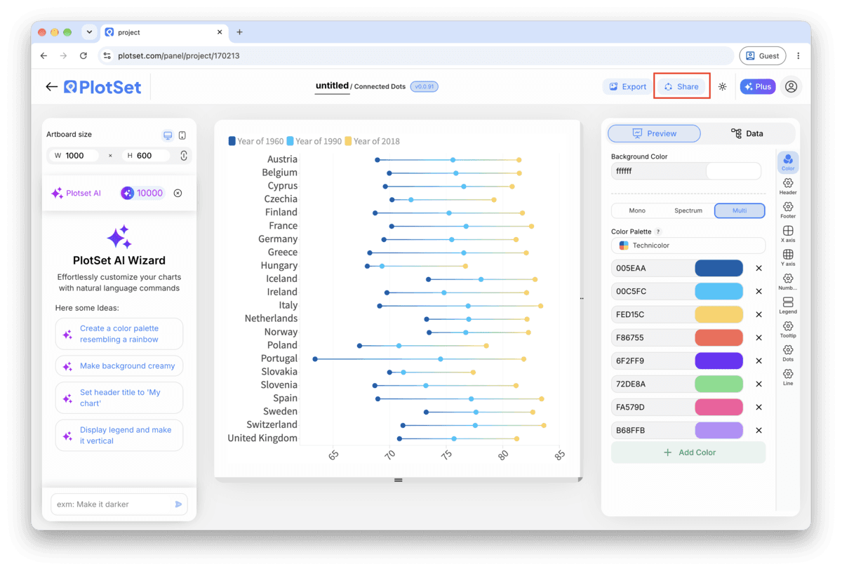
Activating the embed code and public link publishes the chart. The link is safe to send to anyone, and the embed code drops into any page as an iframe that keeps the hover tooltips and the interactivity. Edit the chart later and hit Recreate to push those changes out to both.

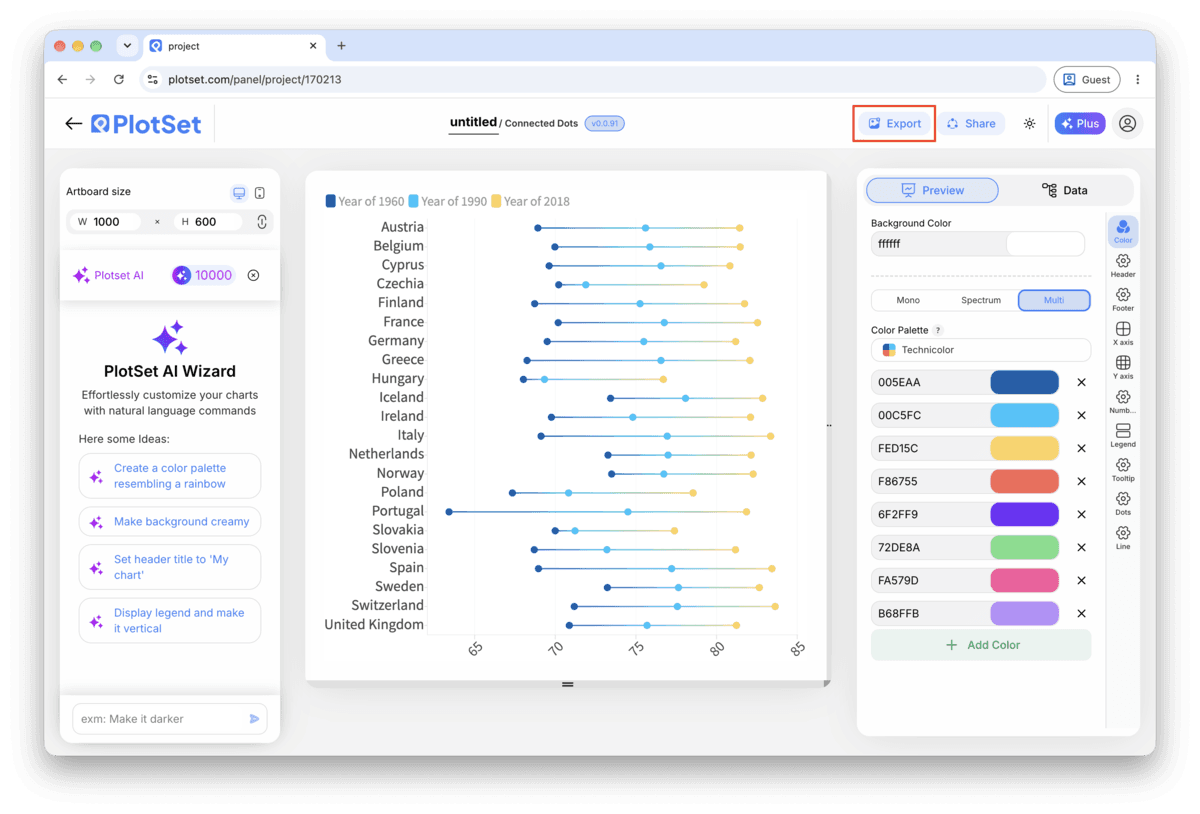
Export writes a static copy at whatever size you need. SVG stays sharp at any scale and can still be edited in a design tool; PNG and JPG are the safe choices for slides and documents. The scale multiplier is what gets you a crisp image on a retina screen.

A legend tells the reader which colour is which, but putting the actual value names, for example the two years, next to the top pair of dots means most readers never have to look for the legend at all.
If some categories increased and others decreased, use one colour for connectors that went up and a second for connectors that went down. Otherwise a reader assumes every pair moved the same way, and about half the chart gets misread.
Starting the value axis near your lowest value rather than at zero is normal for a dumbbell chart and makes small differences legible. If the range is genuinely tight, add a line in the caption noting the axis does not start at zero, since a reader skimming fast can otherwise misjudge scale.
A dumbbell chart holds far more rows than a grouped bar chart before it gets unreadable, but past roughly thirty pairs the connectors start to blur together. Filter to the categories with the largest gaps and note in the title that it is a subset.
This almost always means the second value column came in as text rather than a number, often from a stray percent sign or currency symbol in a cell. Check the column's data type in PlotSet's data table and clean the raw values in your source sheet.
PlotSet defaulted the two value columns to a single series colour. Open the styling panel and assign the first and second value distinct colours, since a single colour turns the chart into an unlabelled range instead of a comparison.
The source data is in long format, one row per category per value, instead of wide format with both values on the same row. Pivot the sheet so each category appears exactly once with two value columns, then re-upload.
Not sure the Dumbbell Chart is the right choice? See what it is, when to use it and when not to.
Three columns and one header row: the category name, then two numeric value columns on the same row, such as a 2000 figure and a 2023 figure for each country. Long format data with a separate row per value needs to be pivoted wide first.
Free to start with 300+ templates. No credit card required.