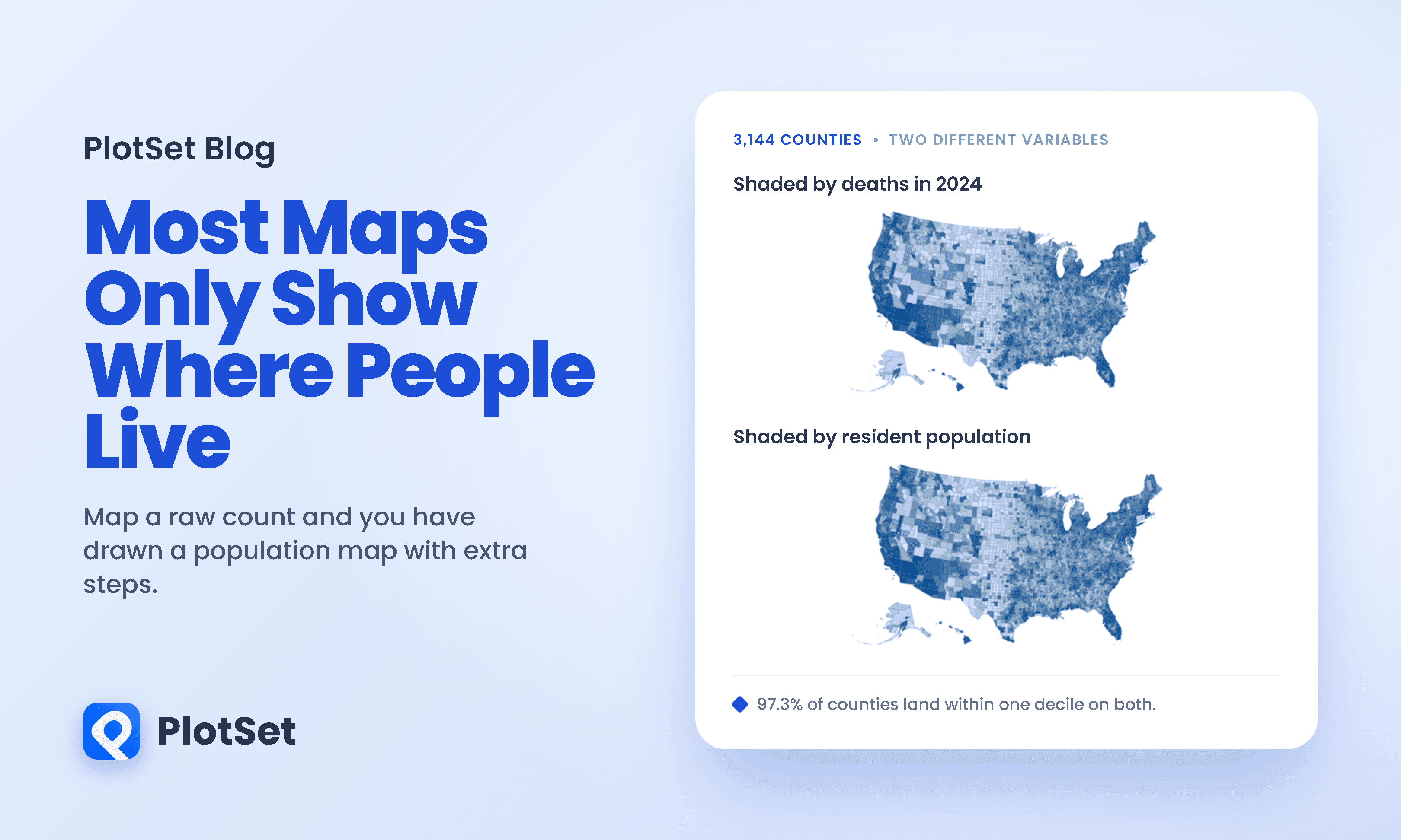
Here is a choropleth map of every death recorded in the United States in 2024, county by county. There were 3,086,925 of them across 3,144 counties, and each county is shaded by how many it recorded.
Now here is a map of where people live.
They are the same map. Not similar, the same: deaths and population correlate at r = 0.9827, and 97.3 percent of counties fall within one decile of each other on the two maps. Nearly two thirds land in the identical decile.
For scale, two rankings with nothing to do with each other would put 10 percent of counties in the same decile and 28 percent within one. These maps agree at 64 percent and 97 percent.
This is the oldest error in thematic cartography and it is still everywhere. A choropleth map shades each area by a value, so if the value is a raw count, the shading tracks how many people are available to be counted. Deaths, crimes, cases, jobs, votes, store locations: map the count and you have drawn a population map with extra steps.
The fix is famous and it takes one division. What is not famous is what the division does next.
Divide by population and the map changes its mind
This is a different country. The dark band runs through Appalachia and the rural South, with West Virginia and Arkansas the darkest states by median county rank, and reaches west into Oklahoma. The mountain west goes pale, and so does the ring of counties around every large city. The northern plains, which were the palest thing on the count map because almost nobody lives there, come out somewhere in the middle here.
The reversal is arithmetic with a cause. Population and death rate correlate negatively, at a rank correlation of -0.4296, against +0.9808 for population and the raw count. Big counties are young counties, because that is where people move for work, so dividing by population does not merely rescale the map. It inverts it.
This has already been measured, on a real map, during a real emergency
None of the above is hypothetical. From mid-March to mid-May 2020 the Georgia Department of Public Health published county-level COVID maps shaded by raw case counts, which put the darkness over metropolitan Atlanta. At the time the virus was spreading fastest in rural southwest Georgia, where an outbreak had been traced to a funeral in Albany. On a per-capita map, much of rural Georgia was darker than Atlanta.
Engel, Rodden and Tabellini then ran the experiment. They showed 1,751 representative Georgia residents one map or the other at random and asked whether the virus was mostly an urban problem, mostly rural, or both.
Among those shown the raw count map, 53.2 percent said the virus was mostly or somewhat an urban problem. Among those shown the rate map, 44.5 percent did. Controlling for individual characteristics and comparing people within the same county, the effect of seeing the rate map instead was close to nine percentage points, with p below 0.001. The authors note that this is comparable in size to the effect of gender or party identification, which were two of the strongest predictors of pandemic attitudes at the time.
A choice about whether to divide by population moved public understanding of who was at risk about as much as partisanship did.
Most people stop here, satisfied. The count map was wrong, the rate map is right, lesson learned. The rest of this piece is about why the rate map is the harder problem.
The county with the highest death rate in America has forty-eight residents
Loving County, Texas, recorded two deaths in 2024 out of 48 residents. That is 4,167 deaths per 100,000, comfortably the worst rate in the United States and roughly four and a half times the national figure of 9.076 per 1,000.
A third death would have taken it to 6,250. A single funeral, in one county, moves a number on a national map by more than 2,000 per 100,000.
That span is a factor of about 18,500, which is exactly the ratio of the two populations, 890,119 against 48. That identity is the whole problem in one column. A rate is a count divided by a denominator, and when the denominator is small the rate stops measuring the world and starts measuring the last coin flip.
This is not a curiosity confined to the smallest county in Texas. Of the 100 counties with the highest death rates in the country, 96 have populations below the national median of 26,122 people. Their median population is 5,411.
The low tail does not mirror this, and the difference matters more than it looks. Only 44 of the 100 lowest-rate counties are below the median size, and their median population is 54,940, more than twice the national middle. Pure chance is symmetric: if noise were the whole story, small counties would crowd both ends of the table equally. They do not. That asymmetry is the clearest evidence in this data that something real is also going on, and the obvious candidate is age. Small rural counties are old, and old populations die at higher rates whatever the sample size.
How much of the map is just luck
The honest way to ask this is to build a country where the answer is known. So we gave all 3,144 counties the identical national risk of 9.076 deaths per 1,000, drew each county's deaths at random from that single rate, and measured how far the resulting rates spread apart. Any spread that appears is pure chance, because by construction there is nothing else left in the model.
One assumption is worth naming before the result. Every death here is counted, not sampled, so there is no survey error in this data at all. What the simulation models is the year-to-year randomness in who happens to die, treated as a Poisson process, which is the standard model for counted events and the one the suppression rules below are built on.
In counties under a thousand people, chance alone reproduces 52 percent of the spread that is really there, which is 27 percent of the variance. In counties above half a million it reproduces 6 percent of the spread and essentially none of the variance.
What does not follow is that the rest is identical across the range. Subtract the chance component and the remaining spread still falls, from about 7.7 to 1.8 deaths per 1,000. Small counties genuinely differ from each other more than large ones do, mostly because a county of 900 people can have an age profile no city can. Both parts shrink as counties get bigger. The chance part shrinks faster, in the way Abraham de Moivre described in the eighteenth century: variability falls with the square root of the count, so quartering it costs you sixteen times the population.
Howard Wainer called this the most dangerous equation. His distinction is between equations that are dangerous because you know them and equations that are dangerous because you do not, and he puts de Moivre's at the top of the second list on three grounds: how long ignorance of it has been causing confusion, how many fields it reaches, and how expensive the consequences get. His demonstration is worth repeating because it is unimprovable. Take the US counties with the lowest age-standardised death rates from kidney and ureter cancer, and they are, in his words, "very rural, midwestern, southern, and western counties." Take the counties with the highest rates and the description is word for word the same. Plot one map on top of the other and the shaded counties sit side by side.
The test the map cannot run
Chance and signal are hard to tell apart in a single year. They are easy to tell apart across four.
A real difference should persist. Noise should not. So we took each county's own death rate in 2021, 2022, 2023 and 2024 and measured how far it swings. These four-year figures are the Census Bureau's own published rates, which divide by an average population for the year rather than by the July estimate used in the arithmetic above, so in the very smallest counties the two differ by about a percent. Loving County is 41.67 per 1,000 on our division and 42.55 on theirs.
Sixty-two percent, against about fifteen percent in the largest counties.
That floor of about fifteen is not noise, and it is worth understanding before reading anything into the top of the ladder. The national death rate fell 12.3 percent across this window as the pandemic receded, from 10.354 per 1,000 in 2021 to 9.076 in 2024, which on its own moves every county by about 13 percent. In the largest counties that is essentially the whole bar. What is left above it is county-specific, and in the smallest counties it is most of the bar.
A single summary number still hides the useful part, which is that both kinds of county are sitting in the same dark band on the map, and the map cannot tell you which is which.
Greeley County, Kansas, has 1,152 residents and posted 23.5, 22.3, 23.3 and 23.2 deaths per 1,000 in four consecutive years. Owsley County, Kentucky, is just as steady. Those are real. A small county can genuinely be an old county, and neither number moves.
The other two are where it gets interesting, because the obvious reading of them is wrong.
Loving County looks like the wildest series on the chart: 48.8, then 58.3, then 64.5, then 42.6. Its actual death counts across those four years were three, three, three and two. Nothing about dying in Loving County changed at all. What changed was the denominator. The Census Bureau's population estimate for the county fell from 56 to 46 between 2021 and 2023, a drop of 17.9 percent, and that alone drove the rate up by a third. In a county of 48 people both halves of the fraction are unstable, and the bottom half is not even a count. It is an estimate produced by a model.
Motley County is the opposite, and it is the one this article got wrong on the first pass. Its series reads like noise: 23.4, 32.3, 21.4, 13.7. But its counts were 25, 34, 22 and 14, and that is the only one of the four that fails a formal test of constant risk. Compare each county's four-year counts against what a fixed underlying risk would produce and Loving, Greeley and Owsley all sit comfortably inside chance, at p values of 0.96, 0.99 and 0.97. Motley comes out at p = 0.040, the one county of the four where something plausibly did change.
Motley is also the county the map has changed its mind about, and it did not do so quietly. It ranked 23rd in the country in 2021, third in 2022, 24th in 2023, and then 1,013th of 3,144 in 2024. Three years in the darkest band on any map anyone would have drawn, then a mid-tone. Its population slipped 5.5 percent across the same period, so a little of that is the denominator too.
So the county whose line looks most alarming has the steadiest deaths, and the county that looks like ordinary scatter is the one where the deaths actually moved. Neither fact is visible on a map of a single year, and neither was visible to us until we lined up four.
Two different errors, both pointing the same way
There is a second reason rural America darkens on a crude rate map, and it has nothing to do with noise.
Every rate in this article is a crude death rate. It has not been age-standardised. Rural counties are older than urban ones, and old people die more, so part of that dark band is simply an accurate reading of who lives there. Age standardisation exists to remove exactly this, and it is a fix for a different disease: it corrects bias from population composition, while shrinkage and thresholds correct variance from small numbers. Neither one does the other's job.
The National Center for Health Statistics illustrates how far apart the two are. Between 1979 and 1995 the American crude death rate rose from 852.2 to 880.0 per 100,000, while the age-adjusted rate fell from 577.0 to 503.9. Same deaths, same country, opposite directions, and no sampling noise anywhere near it.
For a county choropleth the unlucky part is that both errors push the same way. Rural counties are simultaneously small, which makes their rates noisy, and old, which makes their crude rates genuinely high. The map darkens rural America twice and shows you one colour.
A choropleth map gives its worst data the most room
The third problem is geometric. A choropleth map encodes value in colour but weights it by land area, and land area has almost nothing to do with population.
It helps to know how lopsided American counties are to begin with. The median county holds 26,122 people, 737 of them hold fewer than 10,000, and 36 hold fewer than a thousand.
The hundred counties with the most land take 31.6 percent of the map and hold 6.0 percent of the people. The hundred counties with the most people take 4.1 percent of the map and hold 42.3 percent.
Put those together with everything above and the arithmetic is unkind. The counties whose rates are least reliable are the counties with the most territory, so the map allocates its largest, boldest shapes to its weakest numbers.
You can measure that directly. Seventy-three counties recorded fewer than 20 deaths in 2024, which is the threshold below which CDC WONDER marks a death rate unreliable and declines to stand behind it. Those 73 counties cover 3.4 percent of the land area and contain 0.03 percent of the population. On a national map they are more than a hundred times more visible than the people in them.
And all-cause mortality is the friendliest variable this problem has. It is the most common event a county can record. Map any specific cause of death, which is what disease atlases actually do, and the counts fall by one or two orders of magnitude while the denominators stay exactly where they are.
Why the obvious fix is not a fix
The standard remedy is to stop trusting each county on its own. Clayton and Kaldor introduced empirical Bayes estimation to disease mapping in 1987 precisely because maps of raw rates were, in their words, "not fully satisfactory"; Besag, York and Mollie generalised it in 1991 into the model most disease mapping still runs on. The idea is shrinkage: pull each county's estimate toward the overall average, and pull it further the less data it has. Loving County stops shouting. Los Angeles barely moves.
This works, and it is what the professionals do. It also introduces a new artifact rather than removing the old one.
Andrew Gelman and Phillip Price showed in 1999 that shrinkage does not eliminate the sample-size dependence, it reverses it. Raw-rate maps over-select small counties; shrunken maps over-select well-measured ones, because those are the only counties allowed to keep an extreme value. Worse for a reader, shrinkage makes sparsely sampled regions settle at close to the average, so a large under-measured area renders as a calm, unremarkable block whether or not anything is happening in it.
Their paper is called "All maps of parameter estimates are misleading", and the title slightly oversells a careful argument: they do construct procedures that avoid the artifact, and there is no theorem. What they establish is a trade-off with no free corner, because the underlying uncertainties across areas are unequal and no amount of modelling makes them equal. Their closing sentence is the one worth keeping. They know, they write, of "no satisfactory solution to the problem of generating maps for general use."
What to do instead
The literature is more useful about this than its pessimism suggests.
Map rates, never counts. This is the one rule with no exceptions worth arguing about, and the cartography literature states it without hedging. Axis Maps' Cartography Guide says a choropleth requires data standardised as rates or ratios and adds the parenthetical "never use choropleth with raw data/counts". Eurostat gives the same rule in statistical vocabulary: choropleths are for intensive variables, meaning proportions, ratios, densities and percentages, not extensive ones like totals. If the number you have is a count and you want to show where it is concentrated, the alternatives are dot density, cartogram, or a proportional symbol map that puts a circle on each place and sizes it, all of which handle raw counts without handing the biggest shapes to the emptiest land.
Adopt a threshold and say what it is. The statistical agencies already have. NCHS now requires at least 10 events in the numerator and a confidence interval no wider than 160 percent of the estimate before it will publish a rate. CDC WONDER suppresses counts of one to nine outright and flags anything under 20 as unreliable. The UK's Office for National Statistics declines to compute an age-standardised rate below 10 deaths and a crude rate below 3. The number 20 is not arbitrary: the relative standard error of a count is one over the square root of the count, so moving from 10 events to 20 cuts it from 32 percent to 22 percent, while moving from 60 to 70 buys you a single point.
When the question is who is unusual, use a funnel plot instead of a map. Spiegelhalter's construction plots the value against the precision of the value, with control limits that widen for smaller units, so a reader sees immediately that small places are entitled to bounce around. A choropleth map has no axis for precision at all. Funnel plots, he writes, "avoid spurious ranking of institutions into league tables", which is exactly what a dark county on a map invites.
Show more than one year. Nothing in this article required a technique harder than looking at four annual figures side by side. Greeley County and Loving County are indistinguishable in 2024 and unmistakable across 2021 to 2024.
Why we built it in PlotSet
Almost every failure described here is invisible in the chart and obvious in the data, which makes this a particular kind of tooling problem. The map is not lying. It is doing exactly what it was told, at a level of aggregation that cannot represent its own uncertainty.
Two things mattered while making these. The first is that maps sit in the same catalogue as everything else, so the sequence that carries this article, count map, then population map, then rate map, then the ordinary bar chart that explains why they differ, was six versions of the same dataset rather than a detour into a separate mapping tool. The comparison is the argument, and the comparison has to be cheap or nobody runs it.
The second is that the honest charts here are not maps. The chance-against-observed columns, the four-year lines and the land-against-people bars are what actually establish the claim; the maps are what make you want to know. A tool that made maps easy and everything else hard would have produced a worse article, because the temptation would have been to publish the third map and stop.
What we would not claim is that any of this is a rendering problem we have solved. There is no setting that makes a county of 48 people carry a reliable rate. The most useful thing a charting tool can do here is make the second version quick enough that you build it before you publish the first.
You can build your own version of any chart here at plotset.com.
References
- US Census Bureau. County Population Totals and Components of Change, 2020 to 2024. The single file behind every figure in this article, carrying county population, births, deaths and the Bureau's own computed rates for 2021 to 2024.
- US Census Bureau. 2024 Gazetteer Files, counties. County land area, used for every share-of-the-map figure.
- US Census Bureau. Population and Housing Unit Estimates. The estimates programme and its methodology.
- American Scientist. Howard Wainer, The Most Dangerous Equation. De Moivre's equation and the kidney and ureter cancer county demonstration.
- Gelman and Price (Statistics in Medicine). All maps of parameter estimates are misleading. The demonstration that shrinkage reverses the artifact rather than removing it, and the concession that no general solution is known.
- Andrew Gelman. Statistical Modeling, Causal Inference, and Social Science. The author's 2016 restatement that the problem has no clean fix.
- Journal of the American Statistical Association. Kenneth G. Manton and colleagues, Empirical Bayes procedures for stabilizing maps of US cancer mortality rates. The origin of the cancer maps that Wainer's demonstration uses.
- Clayton and Kaldor (Biometrics). Empirical Bayes estimates of age-standardized relative risks for use in disease mapping. The introduction of shrinkage to disease mapping, and the judgement that raw rate maps are not fully satisfactory.
- Annals of the Institute of Statistical Mathematics. Julian Besag, Jeremy York and Annie Mollie, Bayesian image restoration with two applications in spatial statistics. The hierarchical model most disease mapping still uses.
- Statistics in Medicine. David Spiegelhalter, Funnel plots for comparing institutional performance. The funnel plot, its control limits, and the argument against league tables.
- Quality and Safety in Health Care. David Spiegelhalter, Funnel plots for institutional comparison. The open companion paper with the construction stated plainly.
- National Center for Health Statistics. Data Presentation Standards for Rates and Counts, Vital and Health Statistics 2(200). The current minimum of 10 events and the 160 percent confidence interval width rule.
- CDC WONDER. Underlying Cause of Death, data use restrictions and reliability notes. Suppression of counts below 10 and the unreliable flag below 20 deaths.
- National Center for Health Statistics. Age standardization of death rates, Vital Statistics Reports 47(3). Why crude and age-adjusted rates moved in opposite directions between 1979 and 1995.
- Office for National Statistics. Deaths registered in England and Wales, quality and methodology. The thresholds below which the ONS declines to publish a rate.