PlotSet LogoPlotSet

Blogs

Check out these data visualization examples to get inspired

Master PlotSet in 5 Minutes

Oct 29, 2025

Master PlotSet in 5 Minutes

Most charts are ugly. You know it. I know it. That boring blue bar chart in every presentation? The pie chart that makes people’s eyes glaze over? The line graph that looks like it was made in 1995 with that paperclip helper from Microsoft Excel? Data visualization should make people stop and stare. It should make them lean in, ask questions, share it with others. Instead, we’re stuck in a world of corporate templates that suck the life out of every number. That’s why we built PlotSet.

Read more

ChatGPT Has 700 Million Users. Most Use It to Polish Emails

Oct 1, 2025

ChatGPT Has 700 Million Users. Most Use It to Polish Emails

Remember when we thought AI would revolutionize everything? Well, the revolution is here, and it looks suspiciously like spell check with a college degree. A groundbreaking NBER study analyzing 1.5 million ChatGPT conversations just revealed how 700 million weekly users actually spend their time with the world’s most advanced AI.

Read more
France Shows the Limits of Eternal Borrowing

Sep 30, 2025

France Shows the Limits of Eternal Borrowing

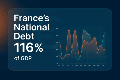
France’s debt burden has reached breaking point. Debt now stands at 116 per cent of GDP, while Germany sits at just under 64 per cent. The gap between Europe’s two largest economies has never been wider, and the bond market is beginning to make France pay for it.

Read more
The Psychology of Color in Data Visualization

Dec 5, 2024

The Psychology of Color in Data Visualization

Colors are more than aesthetic choices; they are strategic tools in data visualization. They guide attention, communicate meaning, and evoke emotions. Misusing colors can confuse viewers or misrepresent your data, while using them effectively can transform your visualizations into compelling stories. Let's dive into the psychology of color and learn how to harness it for your charts.

Read more
A Guide to Design Blind-Friendly Colors in Data Visualization

Dec 4, 2024

A Guide to Design Blind-Friendly Colors in Data Visualization

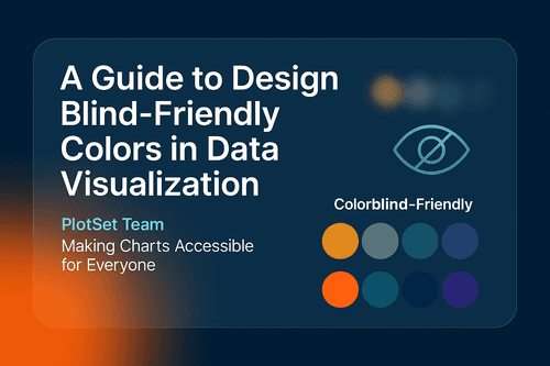
Data visualization is one of the most powerful tools for storytelling, but what happens when your carefully crafted charts become inaccessible to a significant portion of your audience? Approximately 1 in 12 men and 1 in 200 women globally have some form of color vision deficiency (CVD). Millions of people might struggle to interpret visuals if they’re not designed with accessibility in mind.

Read more
How to Use ChatGPT Prompts to Improve Your Data Visualization

Oct 21, 2023

How to Use ChatGPT Prompts to Improve Your Data Visualization

Learn how to enhance your data visualization skills using ChatGPT prompts. Improve your understanding and presentation of data.

Read more
Revolutionizing Data Visualization: The Integration of AI and Data Visualization for Enhanced Insights

Sep 26, 2023

Revolutionizing Data Visualization: The Integration of AI and Data Visualization for Enhanced Insights

Learn how AI and data visualization merge to form a powerful tool for data analysis in this informative article.

Read more
The Psychology Behind Effective Data Visualization

Sep 12, 2023

The Psychology Behind Effective Data Visualization

Discover the intricacies of effective data visualization through the lens of psychology. Join us on a journey of exploration.

Read more
Using Data Visualization to Improve Customer Experience

Sep 12, 2023

Using Data Visualization to Improve Customer Experience

Discover the significance of data visualization in gaining valuable customer insights. Enhance your business strategies with effective data representation.

Read more
The Importance of Maps in Exploring Geographic Data

Sep 12, 2023

The Importance of Maps in Exploring Geographic Data

Explore geographic data with ease using interactive maps. Discover insights and trends with our informative blog.

Read more
Breaking Barriers: Making Data Visualizations Accessible and Inclusive

Sep 12, 2023

Breaking Barriers: Making Data Visualizations Accessible and Inclusive

Discover techniques to create inclusive data visualization for individuals with disabilities. Enhance accessibility with our expert guidance.

Read more
7 Ways Data Visualization Is Transforming Education and Learning

Sep 12, 2023

7 Ways Data Visualization Is Transforming Education and Learning

Discover 7 ways data visualization has facilitated progress in education and learning.

Read more