PlotSet LogoPlotSet

How to Create a Timeline

A step by step walkthrough for turning a list of dated events into a published timeline in PlotSet, from shaping the sheet to exporting or embedding the finished chart.

约 7 分钟

This walkthrough covers how to create a timeline in PlotSet out of a sequence of dated events, each carrying a title and just enough context that a reader gets the story without pinging you for the slide deck behind it. Your own milestones go through the same click path a published PlotSet chart takes, from upload to publish, not a demo running on placeholder dates.

Seven minutes is enough once your events already have clean dates and short titles. Still deciding what precision to date things at, or pulling dates out of a spreadsheet that stored them as text, adds another five. Treat the seven minutes below as the target and the rest as buffer.

你需要的数据

Four columns, one row per event: a date, a short title, an optional note, an optional image URL. Only the date and title are required, and one header row.

示例 CSV
DateTitleNoteImage
1961-05-25Kennedy commits to the MoonKennedy tells Congress the US will land a man on the Moon before the decade is out
1966-02-03Luna 9 soft-landsFirst spacecraft to land softly on the Moon
1967-01-27Apollo 1 fireCabin fire during a launch rehearsal kills the three man crew
1968-12-21Apollo 8 launchesFirst crewed mission to leave low Earth orbit and circle the Moon
1969-07-20Apollo 11 landsArmstrong and Aldrin land in the Sea of Tranquilityhttps://example.com/images/apollo-11.jpg
1970-04-11Apollo 13 launchesOxygen tank explosion forces the crew to abort the Moon landing
1972-12-14Apollo 17 endsLast crewed Moon landing mission. Cernan is the last to walk on the Moon
备注

Keep date precision consistent across every row: all years, or all full dates. PlotSet renders whatever precision you give it, so a chart mixing "1969" with "1969-07-20" reads as sloppy rather than intentional.

Rows do not need to already be in date order before you upload. PlotSet sorts events chronologically once the date column is mapped, so paste them in whatever order your source document used.

The note column is for a sentence or two. Anything longer gets clipped inside the marker card, so put the extra detail in a linked document and use the note for the one line that actually matters.

Image URLs need to be public and stay live. A link into a personal drive folder or a private channel shows a broken image icon on the published chart instead of the picture.

操作步骤

PlotSet 中从空白模板到完成图表的具体点击路径。

  1. 01

    Open the Timeline template

    From the PlotSet dashboard, start a new project and choose the Timeline template. It loads with a handful of sample events already bound to a date, a title, a note and an image, so you can see the exact column shape before you touch your own file.

    PlotSet 的模板选择界面:左侧是图表分类列表,中间展开 Bar Charts 分类的模板网格,Bar Chart 模板卡片上显示「Select」按钮。
    每份指南都从这里开始:先选分类,再选模板,不管你要做哪种图表,用的都是同一个网格。
  2. 02

    Shape your sheet into four columns

    Date first, then a short title, then an optional note, then an optional image URL, one row per event. Only the date and title columns are required. If your source is a project doc or a wiki page, pull just those four things out rather than dragging in every field you have.

  3. 03

    Get your events into PlotSet

    Import a CSV or .xlsx file from the data panel, paste rows straight from a spreadsheet, or connect a Google Sheet if you expect to add events later without a re-upload. PlotSet reads the first row as headers automatically.

    PlotSet 编辑器的数据视图:表格中 Name、Value、Region 三列填着加拿大各省的数据,旁边的「Data」面板提供 CSV 上传、「Magic Import」和 Google Sheet 同步。
    这里的数据视图取自一个条形图项目。你可以上传 CSV、用「Magic Import」从图片里提取数字,或同步 Google Sheet,每种图表类型的面板都一样。
  4. 04

    Map the date, title, note and image columns

    Confirm which column feeds each part of the marker. This is usually automatic when your headers are named clearly, but check it manually if your sheet carries extra columns PlotSet might have guessed wrong on.

    PlotSet 数据面板中高亮的列绑定:「Label/time」对应 A 列,「Values」对应 B 列,「Filter/color」对应 C 列,下方是「Auto Binding」按钮。
    绑定决定哪一列作标签、哪一列提供数值、哪一列决定颜色。「Auto Binding」(自动绑定)会根据表头推测,所以要核对一遍,别想当然。
  5. 05

    Check the order and trim to the events that matter

    PlotSet sorts events chronologically once they are mapped, so scan the result for anything that landed in the wrong place, usually a date typed in an inconsistent format. This is also the point to cut anything that does not change the story. Five to twenty events is the range that stays readable.

  6. 06

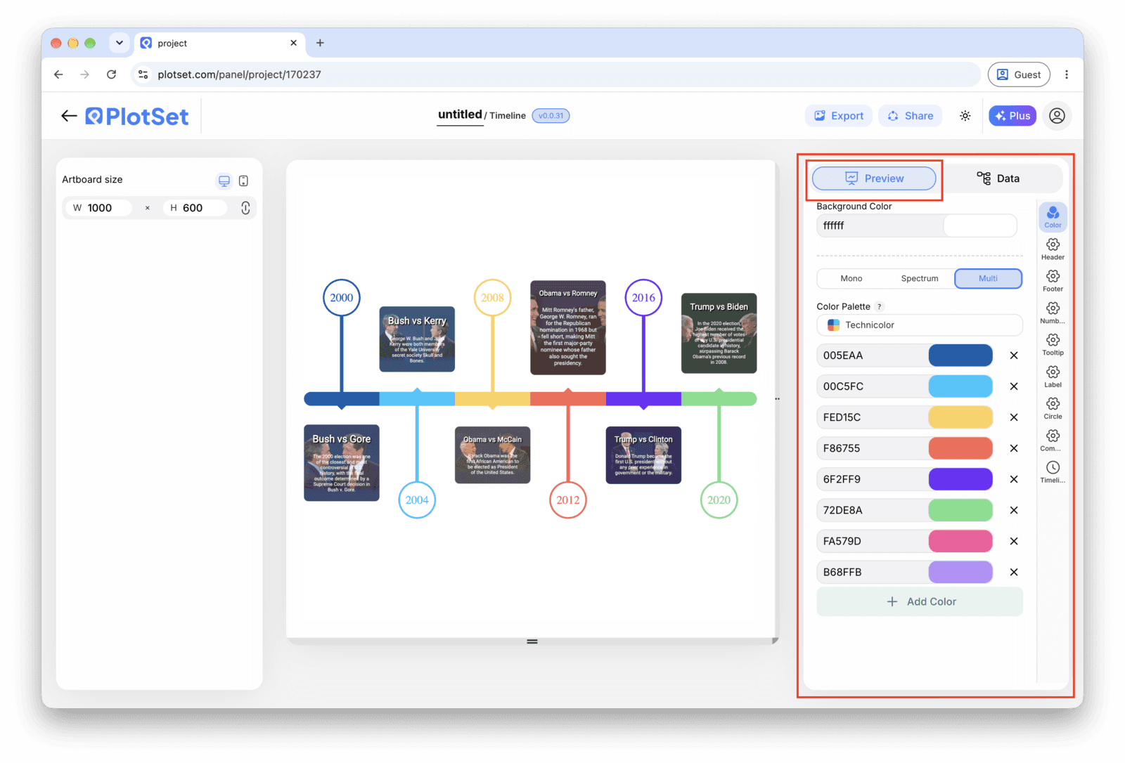
    Style the spine and markers

    Set the spine to horizontal or vertical depending on where the chart will live, then size the markers: larger for the two or three events that carry the story, default size for the rest. Leave the alternating left-right layout off unless the events are dense enough that labels start to overlap.

    PlotSet 编辑器停在「Preview」标签页:画布上是做好的 Timeline,右侧的设置面板用红框标出。
    Timeline 的「Preview」标签页。所有样式设置都在红框标出的这个面板里,每个设置各自占一个标签页:外观、标题、脚注,以及这种图表类型特有的选项。
  7. 07

    Write the titles like headlines

    Lead each title with what changed, not the date, since the date is already on the axis right next to it. Save the note for the sentence a reader would want if they stopped to read, and leave it blank on rows where there is nothing worth adding.

  8. 08

    Publish, embed or export the timeline

    Publish for a live, interactive timeline where each marker opens its note and image on click, grab the embed code to drop it into a page, or export a PNG, SVG or PDF if you need a static version for a deck or a report.

从已加载示例数据的 Timeline 模板开始,再替换成你自己的数据。

打开模板

发布、嵌入或导出

最后一段路对每种图表都一样:「Share」(分享)把图表变成一个在线的公开链接和一段嵌入代码,「Export」(导出)把它输出成静态文件。

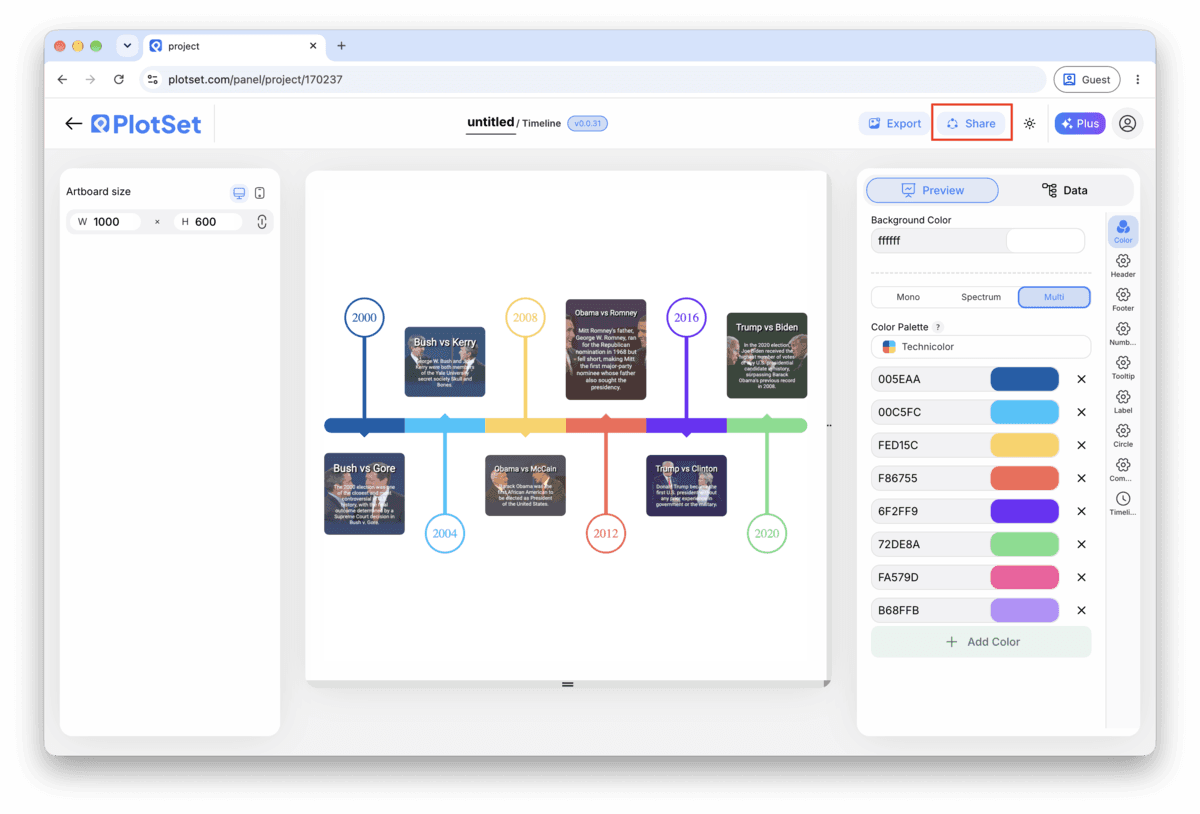
Share:公开链接与嵌入代码

打开嵌入代码和公开链接的开关,图表就发布出去了。链接可以放心发给任何人;嵌入代码以 iframe 的形式放进任意页面,悬停提示和交互效果都会保留。之后修改了图表,点「Recreate」就能把改动同步到链接和嵌入代码两边。

PlotSet 编辑器工具栏中高亮的「Share」按钮,紧挨着「Export」按钮。
点「Share」,完成的图表就会变成一个公开链接和一段嵌入代码。
PlotSet 的「Share」对话框:用于启用嵌入代码和公开链接的开关,「Link」「Embed」「Facebook」「Reddit」「Twitter」「LinkedIn」「Email」几个按钮,以及带「Copy」按钮的图表公开链接。
打开嵌入代码和公开链接的开关,然后复制链接或取用 iframe。之后再修改图表,点「Recreate」就能把改动同步给所有已拿到链接的人。

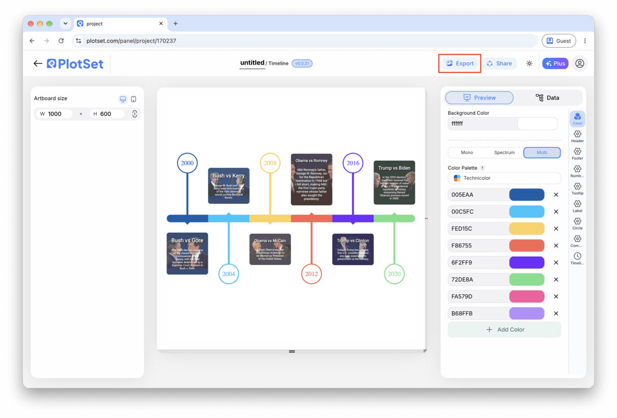
Export:SVG、PNG 或 JPG

「Export」会按你需要的尺寸输出一份静态副本。SVG 放到多大都清晰,还能在设计工具里继续编辑;幻灯片和文档用 PNG 或 JPG 最稳妥。想让图片在高分屏上够锐利,关键就是那个倍数设置。

PlotSet 编辑器工具栏中高亮的「Export」按钮。
要做成幻灯片或报告里的静态文件,就走「Export」这条路。
PlotSet 的「Export chart」对话框:倍数选择器设为 2x,宽高输入框填的是 1000 和 600,展开的格式菜单里列出 SVG、PNG 和 JPG。
SVG 放到多大都清晰,还能在设计工具里继续编辑;做幻灯片用 PNG 或 JPG 最稳妥。导出前先设好倍数,图片在高分屏上才够锐利。

Timeline 的样式提示

Keep the layout single sided under ten events

The alternating left-right layout earns its place once markers start crowding a single line, but for a short timeline it just adds movement the reader has to track. Turn it on only once labels are genuinely colliding.

Size markers by importance, not decoration

Set a larger marker for the two or three events that actually carry the story and leave the rest at the default size. A reader picks up the hierarchy before they have read a single title.

Save images for the moment they add information

An image on every marker inflates every card to the same height and turns a quick scan into a scroll. Attach one where a photo genuinely tells the reader something the title cannot (a product shot, a diagram, a screenshot) and leave the rest blank.

Match the date format to your actual precision

If your rows are years, set the chart's date format to show years only instead of defaulting to a full date. A timeline that displays a fabricated month and day for an event you only know happened sometime in 1969 is claiming a precision you do not have.

制作 Timeline 时的常见错误

Two events land on top of each other

This usually means two rows share the same date, or dates close enough together that the markers overlap and the labels collide. Check the data table for duplicate or near-duplicate dates and either merge them into one event or correct the date if the sources actually disagree.

An event goes missing from the chart

A blank cell in the date column gets skipped rather than flagged, so the row disappears with no error. Scroll through PlotSet's data table and check that every row has a date before assuming your sheet uploaded in full.

A title gets cut off mid word

This means the title is running longer than the marker card has room for, not that anything broke. Shorten it to something closer to a headline and move the rest of the sentence into the note field, which has more room to work with.

深入了解 Timeline

不确定 Timeline 是否是正确选择?查看它是什么、何时使用以及何时不使用。

关于 Timeline

Timeline:常见问题

Four columns with one header row: a date, a short title, and two optional columns, a note and an image URL. Only the date and title are required. CSV and .xlsx both work, and a pasted range from any spreadsheet tool is fine too, as long as the date column parses as an actual date rather than text.

现在制作你的 Timeline

免费开始,300+ 模板任选。无需信用卡。