
图表模板,按用途分类
15 个类别精心甄选自 PlotSet 完整的模板库,并提供动画视频版本的图表类别。
选择与您的数据相符的类别,然后打开其中任何模板(已加载示例数据,您可以在上传自己的文件前先看看效果)。
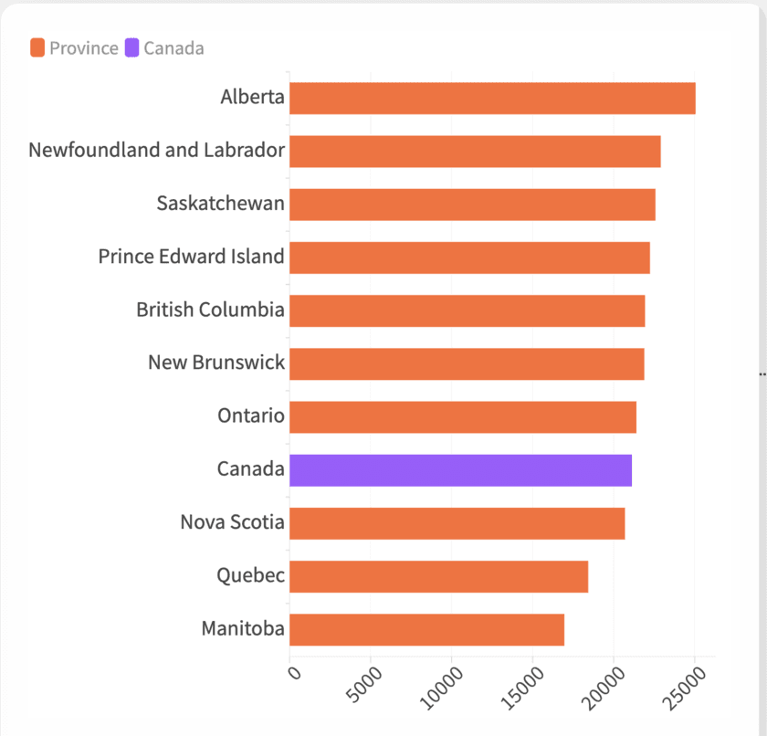
Featured Charts
Not a category in the strict sense, more a hand-picked shortlist. If you're not sure which chart type fits your data, start here and work outward.
浏览 Featured Charts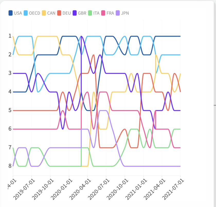
Animated Charts
Charts that move to show change over time: a rank shifting, a shape flowing, a sequence of dated events. Pick the format that fits your data, then decide whether it belongs on the page or in a video.
浏览 Animated Charts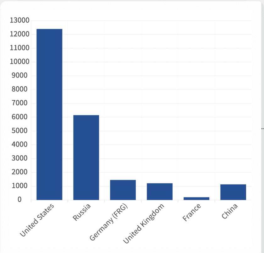
Bar Charts
Nine ways to compare values across categories, from a plain ranked bar to grouped, stacked and back-to-back layouts. Pick the one that matches your data shape and start from a working template.
浏览 Bar Charts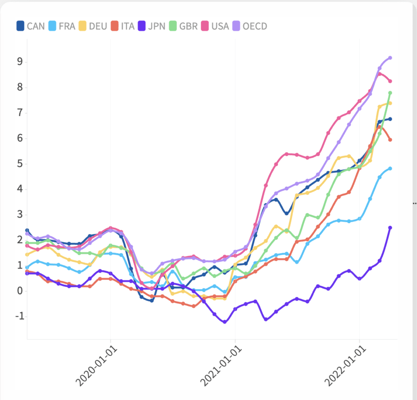
Line and Area Charts
Line, area, stream graph, bump chart: four templates for a number moving through time, distinguished mostly by what happens to the space under the line. Match the shape to what you're actually measuring, then start from a working template.
浏览 Line and Area Charts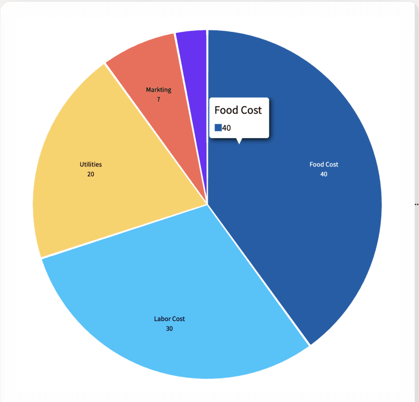
Pie Charts
Pie, donut, polar area, Marimekko: four takes on the same question, how a whole breaks into its parts, each suited to a different category count. Pick the one that fits your data and start from a working template.
浏览 Pie Charts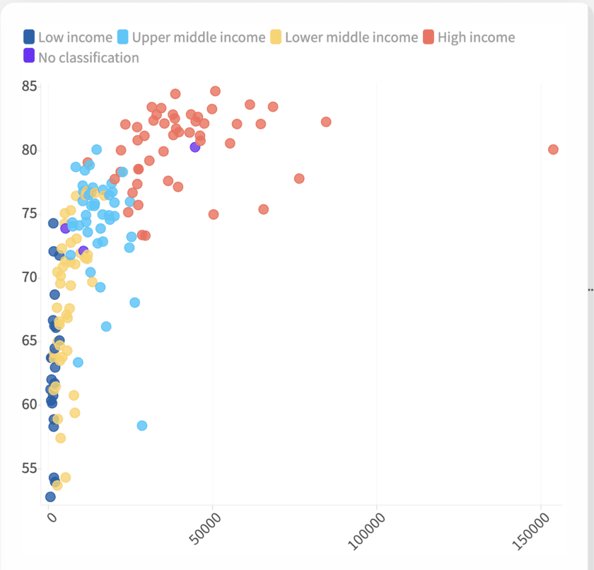
Scatter Plots
Three ways to plot two numbers against each other and see whether they move together. Start with a plain scatter, add a size dimension with a bubble chart, or add reference lines with a quadrant chart.
浏览 Scatter PlotsRacing Charts
Five animated formats for watching a ranking reshuffle over time: bars, lines, columns, pie slices and swarming dots. Every one exports as an MP4 built for social.
浏览 Racing Charts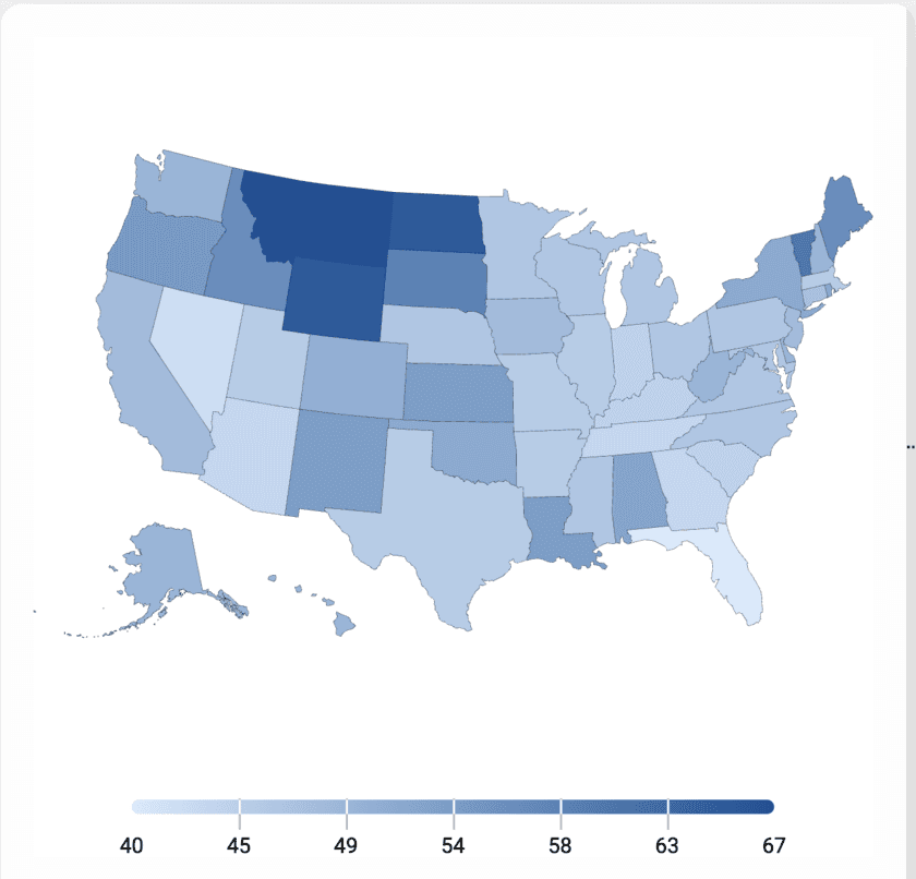
Maps
Turn location-tagged data into a shaded map people can actually read correctly. Start from a template built around countries, states or regions and skip the part where you fight a mapping library.
浏览 Maps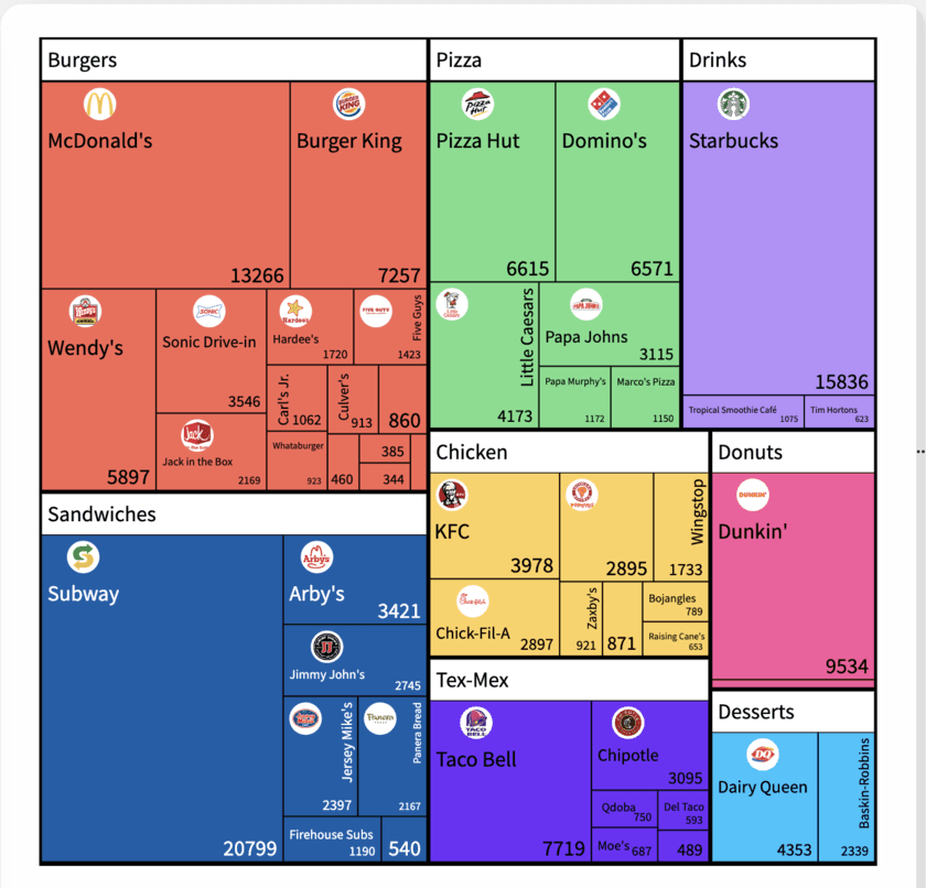
Hierarchy
Three ways to show nested part-to-whole data: treemap, sunburst and marimekko, for budgets, org spend and category trees. Pick the layout that matches how many levels you actually need to show.
浏览 Hierarchy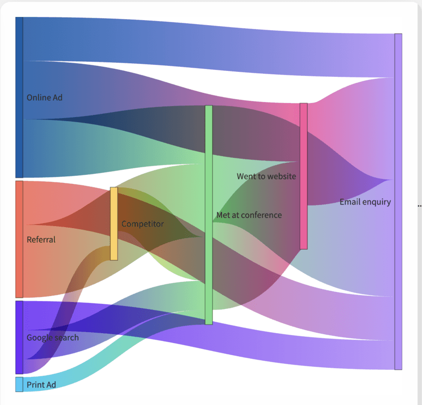
Graphs and flows
Five templates for showing movement instead of a snapshot: a quantity splitting across paths, a sequence narrowing to a result, or work and events laid out against a calendar. Pick the one that matches what's actually moving in your data.
浏览 Graphs and flows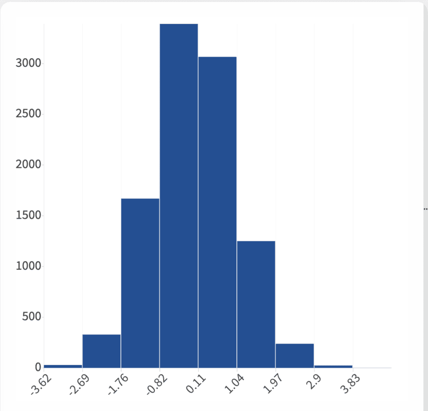
Distribution Charts
Four ways to show shape and spread instead of a single average: histogram, box plot, violin plot and population pyramid. Pick the one that matches how much detail your data, and your reader, actually needs.
浏览 Distribution Charts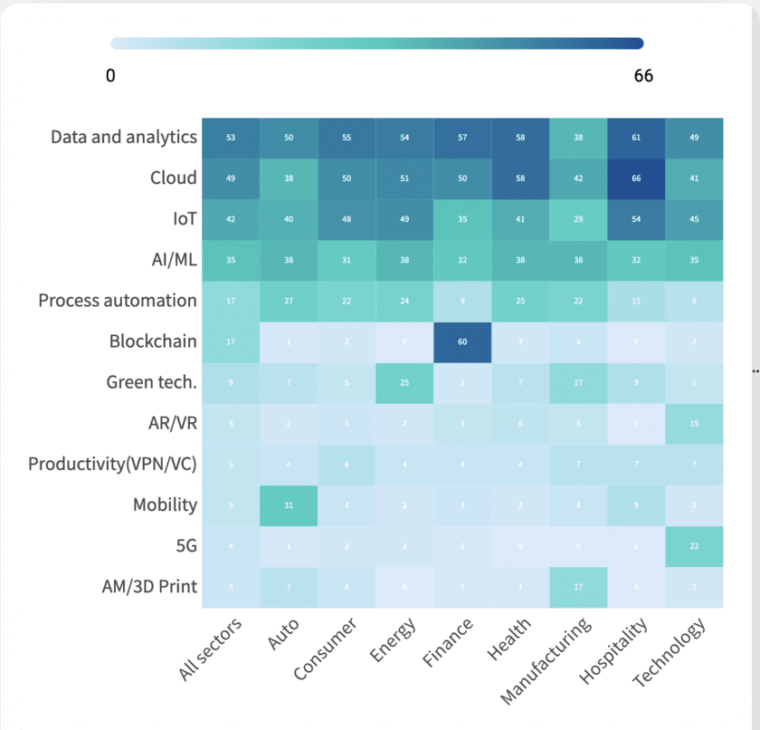
Heatmaps
Color-coded grids for spotting density across two categories at once: hour against weekday, cohort against month. Start from a working template and shape your own data into it.
浏览 Heatmaps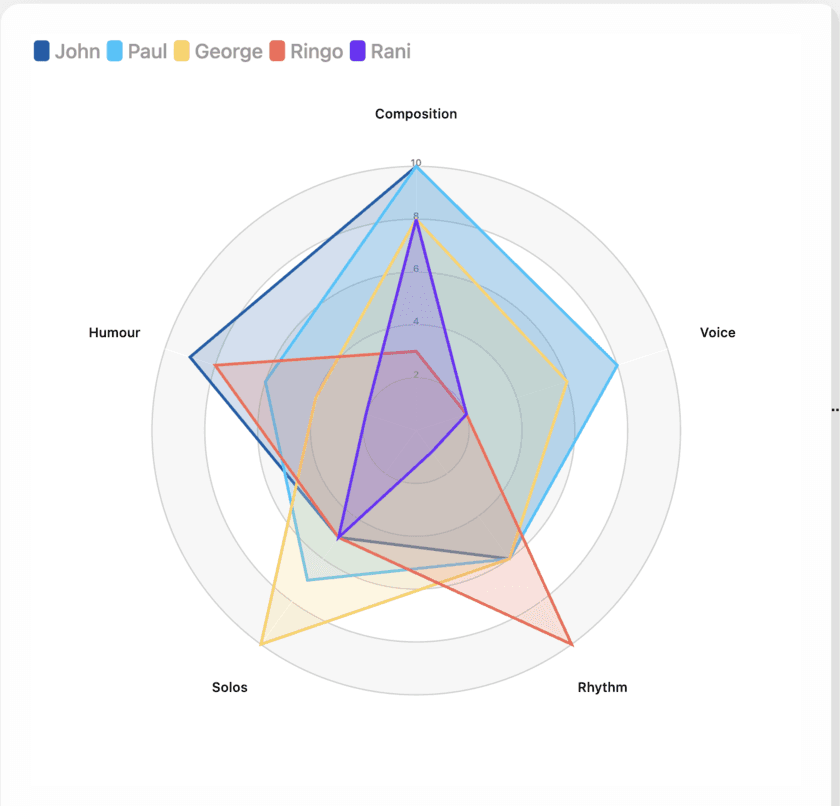
Radar Charts
Two ways to lay several attributes out around a shared center: a radar chart for comparing items across the same axes, a polar area chart for one series split into categories. Pick the one your comparison actually needs.
浏览 Radar Charts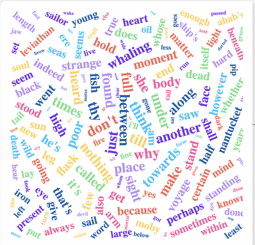
Word Clouds
Turn any block of text (survey answers, speech transcripts, support tickets) into a single image where the words people used most are the words you see first. One template, tuned for how you clean the text before it renders.
浏览 Word Clouds3D Plots
Three chart types that add a third axis: 3D scatter, 3D bar and 3D surface. Read on for when the extra dimension earns its place, and when a 2D scatter plot or heatmap will actually show your data more clearly.
浏览 3D Plots仍在寻找合适的模板?
每种图表类型都有专属的免费制作工具,或直接进入编辑器试试几个模板。