PlotSet LogoPlotSet

How to Create a Gantt Chart

A step by step walkthrough for turning a task list into a published Gantt chart in PlotSet, from shaping the sheet to exporting or embedding the finished timeline.

约 8 分钟

A task list with a start date and an end date on every row is the raw material, and how to create a Gantt chart in PlotSet from it is what this guide walks through: one bar per task, coloured by phase, finishing in a published timeline ready to embed or hand to a client. Not a demo dataset, your own project going through the same click path a real PlotSet chart takes from upload to publish.

If your task list already has clean start and end dates, this takes about eight minutes. Add another ten if you're still pulling dates out of a project management tool's export or fixing a column that stored dates as text instead of real dates. Budget the eight minutes below and treat the rest as buffer.

你需要的数据

Five columns, one row per task: task name, start date, end date, owner, and phase. Dates in ISO format (YYYY-MM-DD), one header row, no merged cells.

示例 CSV
TaskStartEndOwnerPhase
Discovery interviews2026-01-052026-01-16PriyaDiscovery
Content audit2026-01-122026-01-23MarcusDiscovery
Wireframes2026-01-192026-02-06PriyaDesign
Visual design2026-02-022026-02-20SanaDesign
Frontend build2026-02-162026-03-20DiegoBuild
CMS integration2026-03-022026-03-27MarcusBuild
QA and content freeze2026-03-232026-04-03SanaQA
Launch2026-04-062026-04-10DiegoLaunch
备注

Write dates in ISO format: 2026-01-05, not 1/5/26. PlotSet parses ISO dates the same way every time, while a locale ambiguous date can silently land on the wrong day.

Task name goes in its own column and stays short. It sits in a fixed row margin on the chart, so a long name gets cut off. Put the extra detail in a note elsewhere and let the tooltip carry it.

Owner and phase are optional but do real work: owner becomes the label written inside each bar, phase becomes the bar colour and the legend. Skip either and PlotSet just draws plain, uncoloured bars.

One row per task, no merged cells, no blank spacer rows between phases. A blank row uploads as an empty task with no dates, and PlotSet has nowhere to place it on the timeline.

操作步骤

PlotSet 中从空白模板到完成图表的具体点击路径。

  1. 01

    Open the Gantt chart template

    From the PlotSet dashboard, start a new project and choose the Gantt Chart template, listed under Timeline. It loads with a sample project already in place (five tasks with dates, owners and phases) so you can see the exact column shape before swapping in your own.

    PlotSet 的模板选择界面:左侧是图表分类列表,中间展开 Bar Charts 分类的模板网格,Bar Chart 模板卡片上显示「Select」按钮。
    每份指南都从这里开始:先选分类,再选模板,不管你要做哪种图表,用的都是同一个网格。
  2. 02

    Lay your tasks out in five columns

    Task name, start date, end date, owner, phase: one row per task. If your source is an export from a project management tool, strip out any status or ID columns you don't need. PlotSet only reads the five above.

  3. 03

    Write every date in ISO format

    Convert start and end dates to YYYY-MM-DD before you upload. If your spreadsheet still shows 04/27/2026, check what the column is actually storing: one formatted as text uploads as text, and PlotSet won't read it as a date.

  4. 04

    Upload the file or connect a sheet

    Import CSV or Excel from the data panel, paste rows directly from a spreadsheet, or connect a Google Sheet so the timeline can be refreshed later without a re-upload.

    PlotSet 编辑器的数据视图:表格中 Name、Value、Region 三列填着加拿大各省的数据,旁边的「Data」面板提供 CSV 上传、「Magic Import」和 Google Sheet 同步。
    这里的数据视图取自一个条形图项目。你可以上传 CSV、用「Magic Import」从图片里提取数字,或同步 Google Sheet,每种图表类型的面板都一样。
  5. 05

    Bind Start, End, Y axis, Labels and Category

    Start and End take the two date columns. Y axis takes the task name, which labels each row. Labels takes the text written inside the bar, usually the owner. Category takes the phase, which colours the bars and builds the legend.

    PlotSet 数据面板中高亮的列绑定:「Label/time」对应 A 列,「Values」对应 B 列,「Filter/color」对应 C 列,下方是「Auto Binding」按钮。
    绑定决定哪一列作标签、哪一列提供数值、哪一列决定颜色。「Auto Binding」(自动绑定)会根据表头推测,所以要核对一遍,别想当然。
  6. 06

    Sort tasks by start date

    Order the rows by start date, either in the source sheet or in PlotSet's data table, so the chart cascades top to bottom in the order the work actually happens. A Gantt chart sorted alphabetically hides the one thing it's good at showing.

  7. 07

    Set the axis interval to match the plan's length

    A project spanning a few months reads well with week or month ticks; a multi year roadmap wants quarters. Open the axis settings and pick the interval that fits, or the labels will crowd into each other.

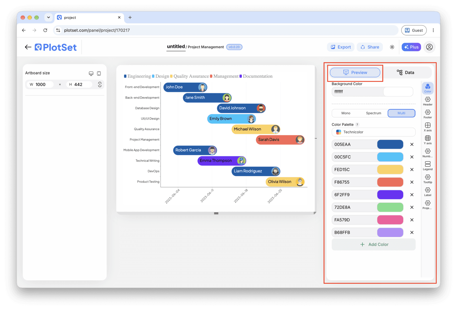
    PlotSet 编辑器停在「Preview」标签页:画布上是做好的 Gantt Chart,右侧的设置面板用红框标出。
    Gantt Chart 的「Preview」标签页。所有样式设置都在红框标出的这个面板里,每个设置各自占一个标签页:外观、标题、脚注,以及这种图表类型特有的选项。
  8. 08

    Publish, embed or export the timeline

    Publish for a live timeline with a tooltip on every bar and a shareable link, grab the embed code for a status page or wiki, or export a PNG, SVG or PDF for a deck.

从已加载示例数据的 Gantt Chart 模板开始,再替换成你自己的数据。

打开模板

发布、嵌入或导出

最后一段路对每种图表都一样:「Share」(分享)把图表变成一个在线的公开链接和一段嵌入代码,「Export」(导出)把它输出成静态文件。

Share:公开链接与嵌入代码

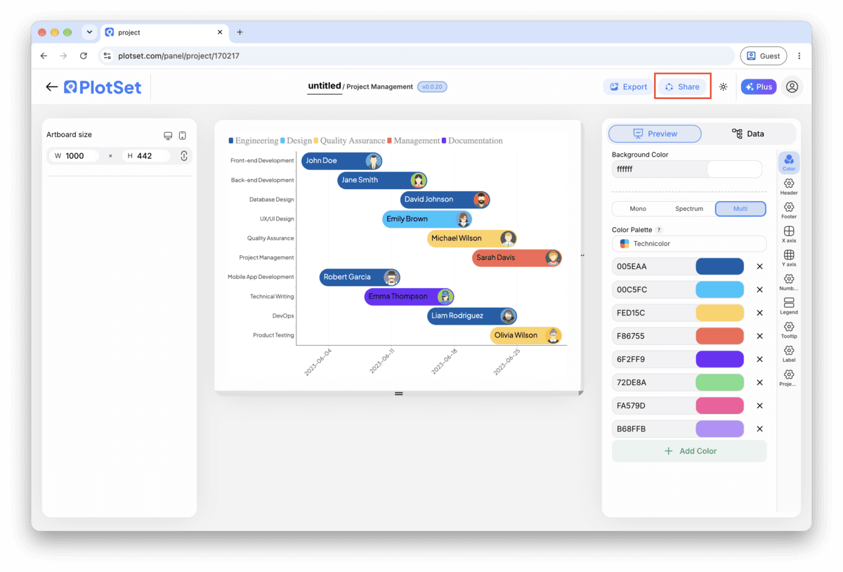
打开嵌入代码和公开链接的开关,图表就发布出去了。链接可以放心发给任何人;嵌入代码以 iframe 的形式放进任意页面,悬停提示和交互效果都会保留。之后修改了图表,点「Recreate」就能把改动同步到链接和嵌入代码两边。

PlotSet 编辑器工具栏中高亮的「Share」按钮,紧挨着「Export」按钮。
点「Share」,完成的图表就会变成一个公开链接和一段嵌入代码。
PlotSet 的「Share」对话框:用于启用嵌入代码和公开链接的开关,「Link」「Embed」「Facebook」「Reddit」「Twitter」「LinkedIn」「Email」几个按钮,以及带「Copy」按钮的图表公开链接。
打开嵌入代码和公开链接的开关,然后复制链接或取用 iframe。之后再修改图表,点「Recreate」就能把改动同步给所有已拿到链接的人。

Export:SVG、PNG 或 JPG

「Export」会按你需要的尺寸输出一份静态副本。SVG 放到多大都清晰,还能在设计工具里继续编辑;幻灯片和文档用 PNG 或 JPG 最稳妥。想让图片在高分屏上够锐利,关键就是那个倍数设置。

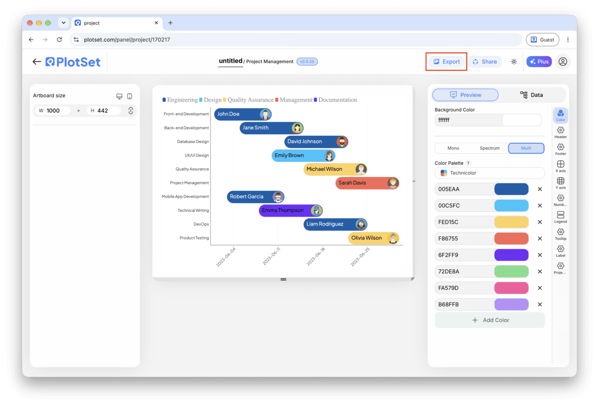
PlotSet 编辑器工具栏中高亮的「Export」按钮。
要做成幻灯片或报告里的静态文件,就走「Export」这条路。
PlotSet 的「Export chart」对话框:倍数选择器设为 2x,宽高输入框填的是 1000 和 600,展开的格式菜单里列出 SVG、PNG 和 JPG。
SVG 放到多大都清晰,还能在设计工具里继续编辑;做幻灯片用 PNG 或 JPG 最稳妥。导出前先设好倍数,图片在高分屏上才够锐利。

Gantt Chart 的样式提示

Colour by phase, not by owner

Category drives one colour scheme. Bind it to phase and everyone sees the project's structure at a glance. If owner also needs to be visible, put it in the bar label instead of fighting for a second colour dimension.

Keep task names to a few words

The row label sits in a fixed margin on the left. A short name like "Frontend build" reads fine; a full sentence gets truncated. Save the detail for the tooltip, which shows the whole row on hover.

Order rows by start date, not by phase or owner

The cascade down the chart is what makes a Gantt chart readable in two seconds. Grouping by phase or owner instead breaks that cascade and turns the chart back into a list with bars attached.

Match the axis interval to the plan's span

Day ticks on a two year roadmap are unreadable; month ticks on a three week sprint hide all the detail. Set the interval once you know how long the whole plan runs, not before.

制作 Gantt Chart 时的常见错误

All the bars start on the same day

This usually means Start and End are mapped to the same column, or the date column uploaded as text instead of a real date. Check the column bindings first, then confirm the dates are in ISO format (YYYY-MM-DD) in the source sheet.

The rows don't cascade, they look scattered

The task rows are probably still in their original spreadsheet order rather than sorted by start date. Sort the source sheet, or the data table inside PlotSet, by the start date column and check again.

Task names are cut off in the row labels

The label margin has a fixed width and doesn't wrap. Shorten the task names in the source column and move any extra detail into a separate note; the tooltip already shows the full row on hover.

深入了解 Gantt Chart

不确定 Gantt Chart 是否是正确选择?查看它是什么、何时使用以及何时不使用。

关于 Gantt Chart

Gantt Chart:常见问题

Lay your data out one task per row: task name, start date, end date, owner and phase, with dates in ISO format (YYYY-MM-DD). Upload the file, bind Start and End to the date columns and Y axis to the task name, and PlotSet draws one bar per task on a shared calendar.

现在制作你的 Gantt Chart

免费开始,300+ 模板任选。无需信用卡。