PlotSet LogoPlotSet

How to Create a Data Table

A step by step walkthrough for turning a spreadsheet into a searchable, sortable data table in PlotSet, from setting column types to publishing or embedding the finished table.

约 8 分钟

A data table only earns the name if readers can actually search and sort it, not just stare at a screenshot of a spreadsheet. Here is how to create a data table in PlotSet that does both, built straight from your own rows and columns: every column has the right type set (so a currency column sorts as a currency, not as text), the header stays put while the body scrolls, and the finished table is ready to publish, embed or export.

Eight minutes is what it takes once your sheet already has clean headers and consistent column types. Pulling columns out of a wider report, or fixing a date column that got saved as plain text somewhere along the way, adds another ten. The steps below assume a real, slightly messy source file, not a tidy demo.


你需要的数据

One row per record, one header row, and one consistent data type per column: text, number, currency, percentage or date. Mixed types in a single column are the main thing to clean up before uploading.

示例 CSV
RegionManagerRevenueGrowthLast Updated
North AmericaJordan Lee12840000.0622024-01-15
EuropePriya Shah942000-0.0142024-01-15
Asia PacificWei Zhang11030000.0812024-01-15
Latin AmericaCarla Nunez4120000.0332024-01-15
Middle East & AfricaOmar Farouk298000-0.022024-01-15
备注

Give every column a plain, short header. PlotSet uses the header row as the column label, so "Q1 Rev (USD)" becomes the label a reader sees at the top of that column.

Keep one data type per column all the way down. If a currency column has "1284000" in most rows and "$1.28M" typed into one cell by hand, that column stops sorting correctly.

Dates read best in a consistent format such as YYYY-MM-DD. A spreadsheet that silently mixes 1/15/2024 and 15-Jan-24 in the same column will not sort as dates in PlotSet either.

Leave blank cells blank rather than typing "N/A" or "-" into a numeric or date column. Text placeholders in an otherwise numeric column break sorting for that whole column.

操作步骤

PlotSet 中从空白模板到完成图表的具体点击路径。

  1. 01

    Open the Table template

    From the PlotSet dashboard, start a new project and choose the Table template. It loads with sample rows already in place so you can see how search, sort and column types behave before you touch your own file.

    PlotSet 的模板选择界面:左侧是图表分类列表,中间展开 Bar Charts 分类的模板网格,Bar Chart 模板卡片上显示「Select」按钮。
    每份指南都从这里开始:先选分类,再选模板,不管你要做哪种图表,用的都是同一个网格。
  2. 02

    Shape your sheet into clean columns

    One row per record, one header row, no merged cells and no subtotal rows mixed into the data. If your source is a pivot table or an export with a totals row at the bottom, delete that row before uploading.

  3. 03

    Import your file or connect a sheet

    Import a CSV or .xlsx file from the data panel, paste rows straight from a spreadsheet, or connect a Google Sheet if you want the table to reflect edits later without a re-upload.

    PlotSet 编辑器的数据视图:表格中 Name、Value、Region 三列填着加拿大各省的数据,旁边的「Data」面板提供 CSV 上传、「Magic Import」和 Google Sheet 同步。
    这里的数据视图取自一个条形图项目。你可以上传 CSV、用「Magic Import」从图片里提取数字,或同步 Google Sheet,每种图表类型的面板都一样。
  4. 04

    Set each column's type

    Go through the columns one at a time and confirm text, number, currency, percentage or date. This single step decides whether sorting a column does something sensible or sorts "100" ahead of "9" the way a text sort would.

    PlotSet 数据面板中高亮的列绑定:「Label/time」对应 A 列,「Values」对应 B 列,「Filter/color」对应 C 列,下方是「Auto Binding」按钮。
    绑定决定哪一列作标签、哪一列提供数值、哪一列决定颜色。「Auto Binding」(自动绑定)会根据表头推测,所以要核对一遍,别想当然。
  5. 05

    Cut the columns you do not need and pick a default sort

    Every extra column costs horizontal space on a phone, so drop anything that does not answer the question the table exists to answer. Then choose which column the table sorts by on load, usually the one a reader is most likely to rank by first.

  6. 06

    Turn on search and freeze the header

    Enable the search box so readers can jump straight to their row instead of scanning the whole table, and keep the header row frozen so column names stay visible as the body scrolls.

  7. 07

    Style the rows

    Turn on row striping or hover highlighting so the eye can track a line across a wide table, right-align numeric columns so digits line up by place value, and add an in-cell bar to one numeric column if you want a magnitude comparison without giving up the printed number.

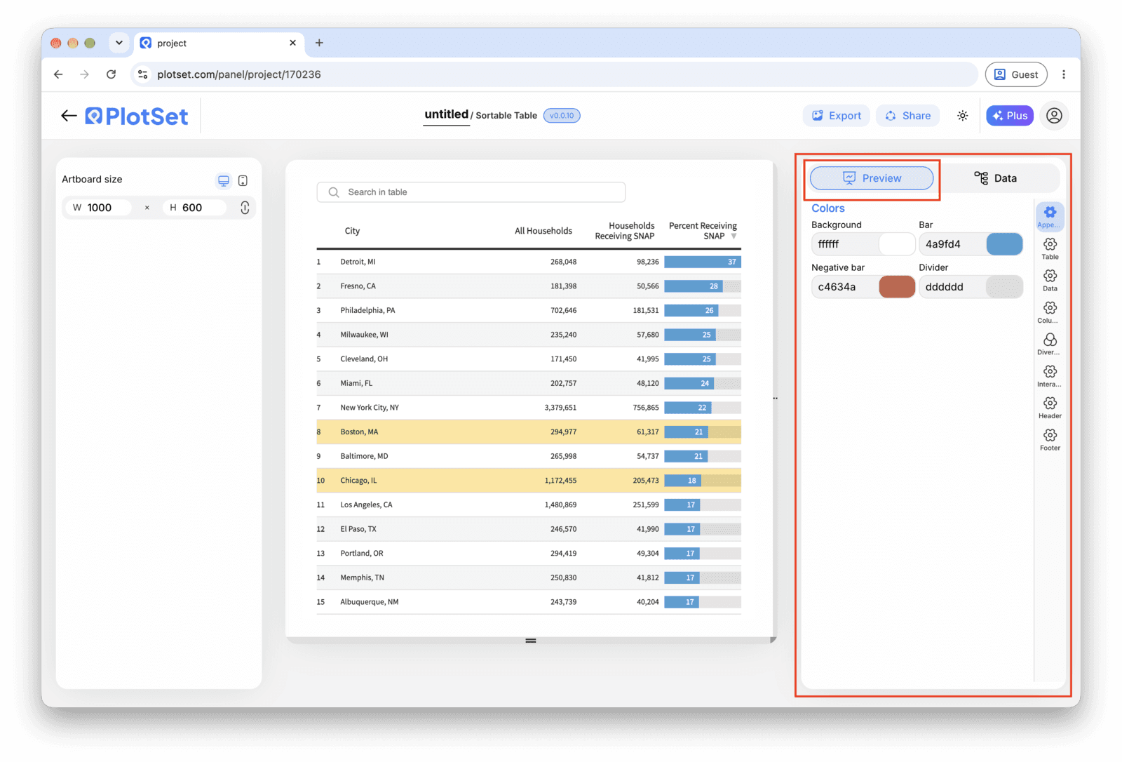
    PlotSet 编辑器停在「Preview」标签页:画布上是做好的 Table,右侧的设置面板用红框标出。
    Table 的「Preview」标签页。所有样式设置都在红框标出的这个面板里,每个设置各自占一个标签页:外观、标题、脚注,以及这种图表类型特有的选项。
  8. 08

    Make it live: publish, embed or export

    Publish for a live table with working search and sort and a shareable link, grab the embed code to drop it into a page, or export a PNG, SVG or PDF if you need a static image for a report.

从已加载示例数据的 Table 模板开始,再替换成你自己的数据。

打开模板

发布、嵌入或导出

最后一段路对每种图表都一样:「Share」(分享)把图表变成一个在线的公开链接和一段嵌入代码,「Export」(导出)把它输出成静态文件。

Share:公开链接与嵌入代码

打开嵌入代码和公开链接的开关,图表就发布出去了。链接可以放心发给任何人;嵌入代码以 iframe 的形式放进任意页面,悬停提示和交互效果都会保留。之后修改了图表,点「Recreate」就能把改动同步到链接和嵌入代码两边。

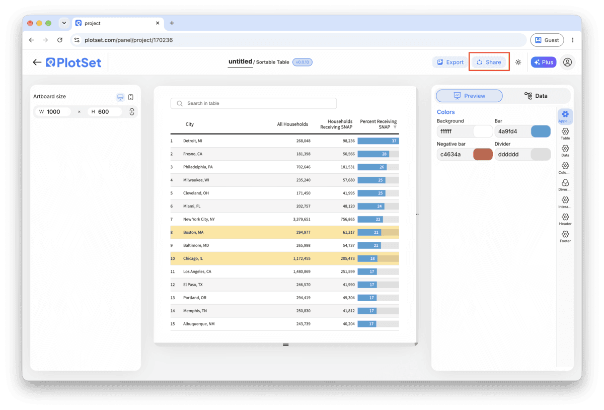
PlotSet 编辑器工具栏中高亮的「Share」按钮,紧挨着「Export」按钮。
点「Share」,完成的图表就会变成一个公开链接和一段嵌入代码。
PlotSet 的「Share」对话框:用于启用嵌入代码和公开链接的开关,「Link」「Embed」「Facebook」「Reddit」「Twitter」「LinkedIn」「Email」几个按钮,以及带「Copy」按钮的图表公开链接。
打开嵌入代码和公开链接的开关,然后复制链接或取用 iframe。之后再修改图表,点「Recreate」就能把改动同步给所有已拿到链接的人。

Export:SVG、PNG 或 JPG

「Export」会按你需要的尺寸输出一份静态副本。SVG 放到多大都清晰,还能在设计工具里继续编辑;幻灯片和文档用 PNG 或 JPG 最稳妥。想让图片在高分屏上够锐利,关键就是那个倍数设置。

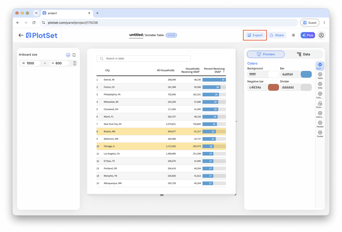
PlotSet 编辑器工具栏中高亮的「Export」按钮。
要做成幻灯片或报告里的静态文件,就走「Export」这条路。
PlotSet 的「Export chart」对话框:倍数选择器设为 2x,宽高输入框填的是 1000 和 600,展开的格式菜单里列出 SVG、PNG 和 JPG。
SVG 放到多大都清晰,还能在设计工具里继续编辑;做幻灯片用 PNG 或 JPG 最稳妥。导出前先设好倍数,图片在高分屏上才够锐利。

Table 的样式提示

Set column types before you style anything

Sorting, alignment and number formatting all follow from the column type, so fixing it after you have already styled the table means redoing that styling. Do this step first, every time.

Freeze the header on anything past about fifteen rows

Past fifteen rows a reader loses track of which column they are looking at once the header scrolls out of view. Freezing it costs nothing and fixes that immediately.

Use an in-cell bar instead of a second chart

If one numeric column is the one readers want to compare at a glance, add a bar inside that cell rather than building a separate bar chart next to the table. It keeps the exact number and the shape of the comparison in one place.

Keep the column count to what the question needs

A table with ten columns reads fine on a laptop and becomes an unreadable strip on a phone. Decide what the table is for, publish only those columns, and leave the rest in the source spreadsheet.

制作 Table 时的常见错误

A numeric column sorts alphabetically instead of by value

This means the column type is still set to text, so "100" sorts before "20" the way a dictionary would order them. Open the column settings and set that column to Number or Currency, then re-check the sort.

A date column shows a raw string instead of a formatted date

This happens when dates were typed inconsistently in the source sheet (one row as 1/15/2024, another as 15-Jan-2024), so PlotSet cannot read the whole column as one type. Standardize the format in your spreadsheet to YYYY-MM-DD and re-upload.

The table looks fine on desktop but overflows sideways on a phone

This is almost always too many columns rather than a settings problem. Go back to the column list and remove anything that is not answering the question the table exists for, rather than shrinking font size to compensate.

深入了解 Table

不确定 Table 是否是正确选择?查看它是什么、何时使用以及何时不使用。

关于 Table

Table:常见问题

One header row and one row per record, with each column holding a single consistent type: text, number, currency, percentage or date. Mixed types within one column, such as numbers and the occasional "N/A", are the most common reason a table does not sort correctly after upload.

现在制作你的 Table

免费开始,300+ 模板任选。无需信用卡。