PlotSet LogoPlotSet

How to Create a Sankey Diagram

A step by step walkthrough for turning a source, target and value spreadsheet into a published Sankey diagram in PlotSet, from shaping the sheet to exporting or embedding the finished flow.

Cerca de 9 minutos

This guide shows how to create a Sankey diagram in PlotSet starting from a plain three column spreadsheet, source, target and value, with nodes named automatically from whatever text sits in those columns and link widths sized to match. We use a budget flow as the running example, but the same three columns work just as well for a website funnel, an energy balance or a customer journey.

Set aside nine minutes if your rows are already in source, target, value shape. That climbs by five if you're reconciling a spreadsheet with a totals row mixed into the real flows, or working out how to fold a dozen small categories into one node before upload.

Os dados que você precisa

Three columns, one row per flow: where the amount comes from, where it goes, and how much. Nodes are created automatically from whatever names appear in the source and target columns, so there is no separate list of nodes to maintain.

CSV de exemplo
SourceTargetAmount
RevenueCost of Goods420000
RevenueOperating Costs260000
RevenueNet Profit180000
Cost of GoodsManufacturing300000
Cost of GoodsShipping120000
Operating CostsSalaries190000
Operating CostsMarketing70000
Anotações

Every amount is a positive number. A Sankey link has no concept of a negative flow, so a refund or a loss needs its own row and its own honestly named target, such as "Returns", rather than a minus sign.

A name that appears in both a source and a target column becomes one node with flow passing through it, which is exactly how a multi-stage diagram like the budget example above works.

Keep source and target names spelled identically everywhere they appear. "Marketing" and "marketing " with a trailing space will render as two separate nodes rather than merging into one.

If a node's inflows and outflows do not add up, PlotSet still draws it, just with a visibly lopsided shape. Reconcile the numbers in your spreadsheet before uploading rather than after.


Os passos

O caminho exato no PlotSet, de um modelo em branco até o gráfico finalizado.

  1. 01

    Open the Sankey diagram template

    From the PlotSet dashboard, start a new project and choose the Sankey template. It loads with sample data already bound, so you can see the exact three column shape (source, target, value) before you touch your own file.

    O seletor de modelos do PlotSet: as categorias de gráficos listadas à esquerda, a grade Bar Charts aberta e o card do modelo Bar Chart mostrando o botão Select.
    Todo guia começa aqui. Escolha a categoria e depois o modelo: a grade é a mesma, seja qual for o tipo de gráfico que você quer.
  2. 02

    Shape your sheet into source, target and value

    Rework your spreadsheet into one row per flow, in that column order. A pivot table or a report with running totals will not work as is: pull out the individual transitions first, one row per movement from one stage to the next.

  3. 03

    Upload the file or connect a live sheet

    Import a CSV or .xlsx file from the data panel, paste rows directly from a spreadsheet, or connect a Google Sheet if you want the diagram to refresh later without a re-upload. PlotSet reads the first row as your headers.

    A visualização de dados do editor do PlotSet: uma planilha com as colunas Name, Value e Region preenchidas com números de províncias canadenses, ao lado do painel Data, que oferece envio de CSV, Magic Import e sincronização com o Google Sheet.
    A visualização de dados, aqui em um projeto de gráfico de barras. Envie um CSV, extraia os números de uma imagem com o Magic Import ou sincronize um Google Sheet. O painel é idêntico para todos os tipos de gráfico.
  4. 04

    Map the source, target and value columns

    Confirm which column feeds each role. This is usually automatic when your headers read clearly as Source, Target and Value or similar, but check it by hand if your sheet carries extra columns PlotSet might have guessed on.

    O painel Data do PlotSet com os vínculos de colunas em destaque: Label/time apontando para a coluna A, Values para a coluna B e Filter/color para a coluna C, com o botão Auto Binding logo abaixo.
    Os vínculos definem qual coluna vira o rótulo, qual fornece os valores e qual comanda a cor. O Auto Binding tenta adivinhá-los a partir dos seus cabeçalhos, então confira o resultado em vez de dar como certo.
  5. 05

    Order the stages left to right

    PlotSet places nodes by the order flow moves through them, but if your data has a natural sequence (acquisition before conversion before retention, for instance), check the node order matches that story rather than an alphabetical default.

  6. 06

    Label the nodes and turn on link values

    Rename any node whose spreadsheet name would confuse a reader, such as an internal code, to something they would recognize. Turn on the value label so hovering, or the static label itself, shows the exact number each link carries.

  7. 07

    Set node and link colour

    Colour links by their source node by default, which is what lets a reader's eye follow one path through the crossings. Reserve a distinct colour for a terminal node you want to call out, such as a loss or a drop-off, rather than colouring every node differently.

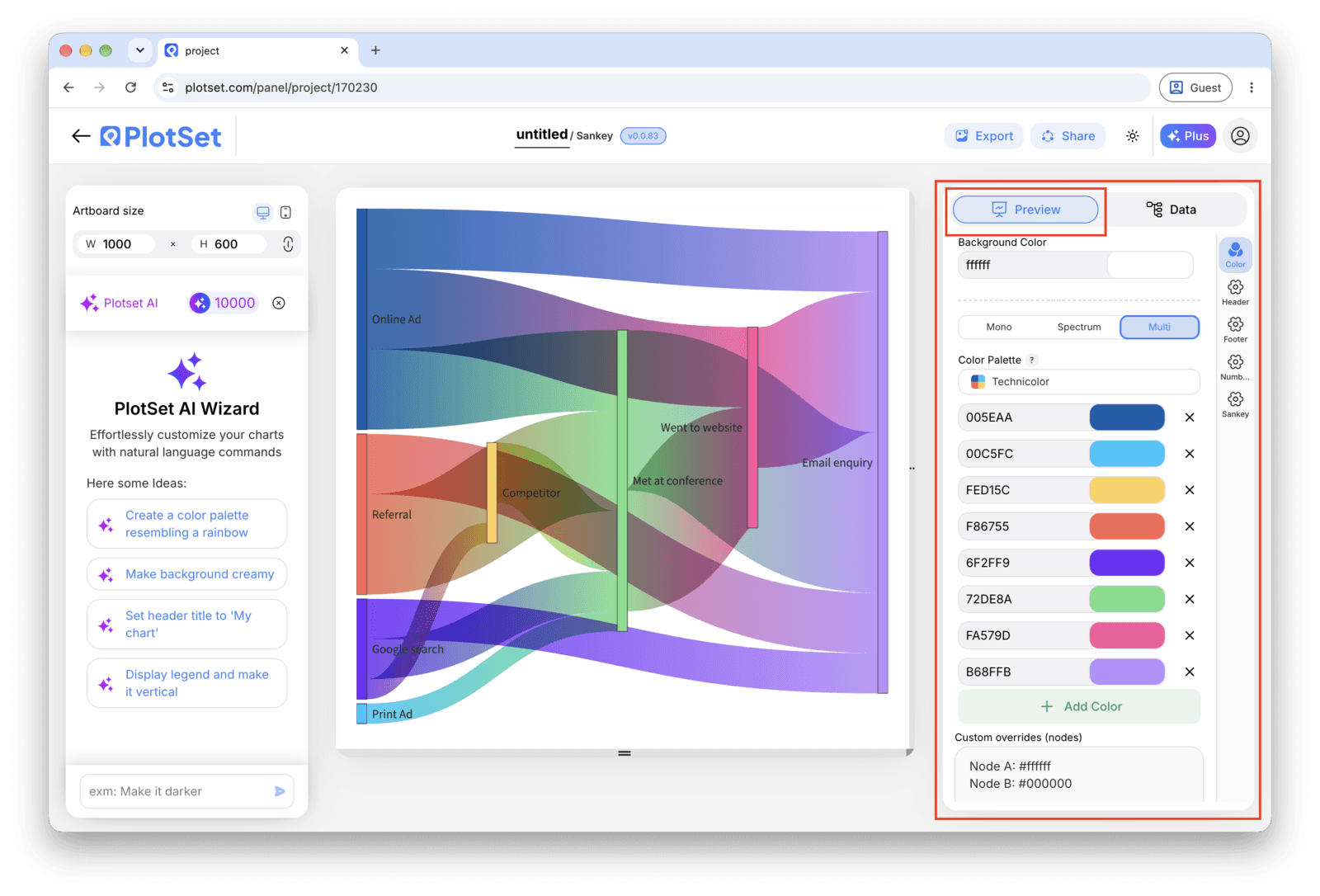
    O editor do PlotSet na aba Preview: um gráfico do tipo Sankey Diagram já finalizado na área de edição e, na lateral direita, o painel de configurações contornado em vermelho.
    A aba Preview de um gráfico do tipo Sankey Diagram. Todos os controles de estilo ficam no painel contornado em vermelho: aparência, cabeçalho, rodapé e as opções específicas desse tipo de gráfico. Cada grupo fica em sua própria aba.
  8. 08

    Publish, embed or export the diagram

    Publish for a live, interactive diagram where hovering a link shows its exact value and a shareable link, grab the embed code for a page, or export a PNG, SVG or PDF for a deck or report.

Comece pelo modelo de Sankey Diagram com dados de exemplo já carregados, depois substitua-os pelos seus.

Abrir o modelo

Publique, incorpore ou exporte

A reta final é igual para todo tipo de gráfico: o Share transforma o gráfico em um link público interativo e em um código de incorporação; o Export gera um arquivo estático.

Share: link público e código de incorporação

Ativar o código de incorporação e o link público é o que publica o gráfico. O link pode ser enviado com segurança para qualquer pessoa, e o código de incorporação entra em qualquer página como um iframe que mantém a interatividade e os tooltips ao passar o mouse. Edite o gráfico depois e clique em Recreate para levar essas mudanças aos dois.

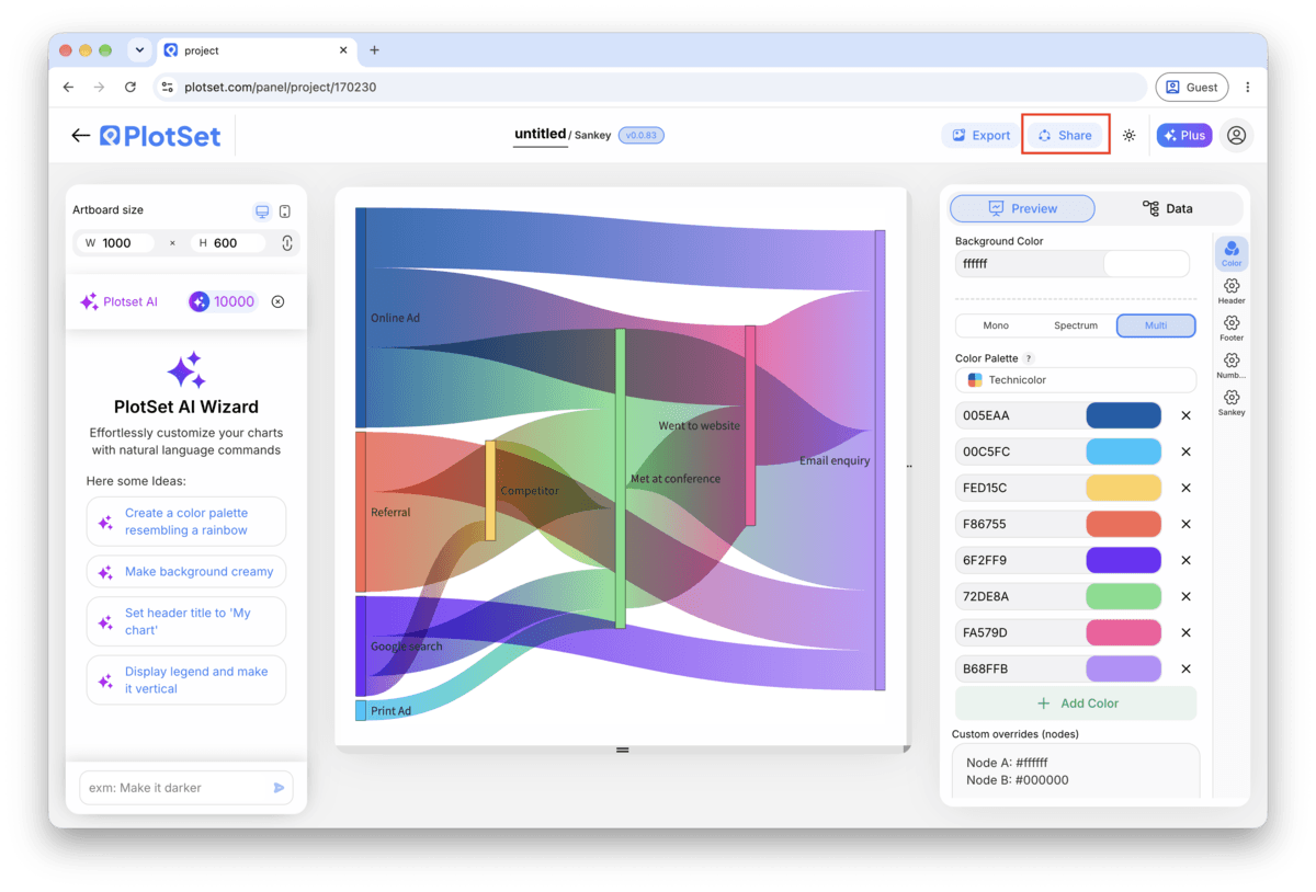
A barra de ferramentas do editor do PlotSet com o botão Share em destaque, ao lado do botão Export.
É pelo Share que um gráfico finalizado vira um link público e um código de incorporação.
A janela Share do PlotSet: a chave que ativa o código de incorporação e o link público, os botões Link, Embed, Facebook, Reddit, Twitter, LinkedIn e Email, e o link público do gráfico com um botão Copy.
Ative o código de incorporação e o link público, depois copie o link ou pegue o iframe. O Recreate leva as edições seguintes a todo mundo que já tem o link.

Export: SVG, PNG ou JPG

O Export grava uma cópia estática no tamanho que você precisar. O SVG continua nítido em qualquer escala e ainda pode ser editado em uma ferramenta de design; PNG e JPG são as escolhas seguras para slides e documentos. É o multiplicador de escala que garante uma imagem nítida em uma tela retina.

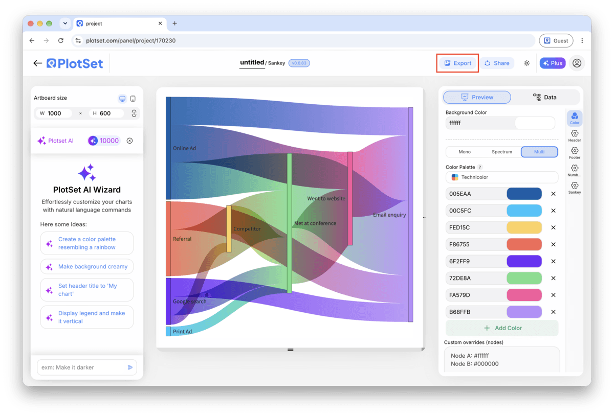
A barra de ferramentas do editor do PlotSet com o botão Export em destaque.
O Export é o caminho para gerar um arquivo estático para um slide ou um relatório.
A janela Export chart do PlotSet: um seletor de escala em 2x, campos de largura e altura definidos como 1000 por 600 e o menu de formatos aberto com SVG, PNG e JPG.
O SVG continua nítido em qualquer tamanho e editável em uma ferramenta de design; PNG e JPG são as escolhas seguras para uma apresentação. Defina a escala antes de exportar para que a imagem fique nítida em uma tela retina.

Dicas de estilo para um Sankey Diagram

Aggregate the long tail before you upload

If fifteen small categories each carry under two percent of the total, group them into one "Other" node in your spreadsheet before uploading. Ten legible links reading well beats forty threads nobody can trace, and the reader can still see what the group contains from its label.

Name terminal nodes for what actually happened

A node where flow simply stops should say so plainly: "Churned", "Unconverted", "Written off". A vague label like "Other" at the end of a diagram hides the one part most readers came to see.

Keep the stage count at two or three

Two stages show a split, three show a journey. A fourth stage is where crossings start to dominate the picture, so if your data has more steps than that, consider whether two linked diagrams tell the story more clearly than one dense one.

Let link width do the talking, skip a legend

Because width already encodes the amount, a separate legend explaining colour usually repeats information the diagram already shows. Put your effort into a title that states what is flowing and over what period instead.

Erros comuns ao fazer um Sankey Diagram

A node looks wider on one side than the other

This means the inflows and outflows for that node do not sum to the same total. Add up both sides in your spreadsheet: if quantity genuinely disappears at that step, add an explicit row sending the difference to a named node like "Loss" instead of leaving it unbalanced.

The same category shows up as two separate nodes

Check for a spelling or capitalization mismatch between the source and target columns, most often a trailing space or an inconsistent abbreviation. A TRIM and a consistent name in your spreadsheet before re-uploading fixes this in one pass.

The diagram is a tangle of thin crossing links

This happens past roughly a dozen nodes on one stage. Go back to the spreadsheet and merge the smallest categories into a single named group, then re-upload. It is much easier to fix in the source data than to untangle visually after the fact.

Saiba mais sobre o Sankey Diagram

Não tem certeza se o Sankey Diagram é a escolha certa? Veja o que é, quando usar e quando evitar.

Sobre o Sankey Diagram

Sankey Diagram: perguntas frequentes

Three columns: source, target and value, one row per flow. Nodes are created automatically from whatever names appear in the source and target columns, so there is no separate node list to build or maintain before uploading.

Crie seu Sankey Diagram agora

Grátis para começar com mais de 300 modelos. Sem cartão de crédito.