
CSV de exemplo
| Service | Monthly Spend ($) |
|---|---|
| Compute | 4200 |
| Storage | 1350 |
| Database | 980 |
| Networking | 610 |
| Support | 340 |
A step by step walkthrough for turning a spreadsheet into a published pie chart in PlotSet, from shaping the sheet and rolling up the long tail to exporting or embedding the finished chart.
Cerca de 6 minutosSwap in your own numbers instead of the sample data the template loads with, and here's how to create a pie chart in PlotSet from a label column, a value column, and a total the slices actually add up to. You will upload the sheet, roll any long tail of small categories into a named group, order the slices so the biggest lands first, and publish something you can embed or hand off as an image.
With a clean two column sheet of five or six categories, this takes about six minutes end to end. Add a few more if your source is a wider report you need to trim down first, or if you are deciding what to do with a dozen tiny categories that do not deserve their own slice.
Two columns, one row per category: the label first, the number second. The numbers should sum to one meaningful total, and there should be no more than six or seven rows by the time you upload.
| Service | Monthly Spend ($) |
|---|---|
| Compute | 4200 |
| Storage | 1350 |
| Database | 980 |
| Networking | 610 |
| Support | 340 |
The value column needs to be a plain number, not a pre-formatted percentage string like "38%". PlotSet calculates the percentage from the raw values, so let it do that math.
If your source report has fifteen or twenty rows, decide the cutoff in the spreadsheet first. Sum everything below it into one row labelled "Other" rather than uploading all of it and grouping later.
One header row only. A totals row at the bottom gets read as its own slice, usually the largest one, and it will swallow the rest of the circle.
Negative numbers and zeros do not have a sensible angle in a pie. Filter zero rows out and rethink the chart type if any value is negative.
O caminho exato no PlotSet, de um modelo em branco até o gráfico finalizado.
From the PlotSet dashboard, start a new project and choose the Pie Chart template. It loads with sample data already bound to it, so you can see the two column shape it expects before you bring in your own file.

Put the category name in the first column and its number in the second, one row per category. If the source is a pivot table or a finance export, strip out subtotal rows before you get near PlotSet.
If you are looking at more than six or seven categories, sum the smallest ones into a single row labelled "Other" in the spreadsheet itself. Doing this before upload keeps your source file honest about what the chart is actually showing.
Use the data panel to import a CSV or .xlsx file, paste rows straight from a spreadsheet, or connect a Google Sheet if the underlying numbers change on a schedule and you want the chart to pick that up.

Confirm which column feeds the slice labels and which feeds the angles. PlotSet usually gets this right when your headers are clear, but check it manually if the sheet has extra columns it might have guessed at.

Order slices largest to smallest starting at twelve o'clock, unless the categories carry their own order (age bands, survey scale). Then switch on percentage labels for every slice: angles alone are not precise enough for a reader to compare, the numbers are.
Give each slice its own distinct colour rather than shades of one hue, which read as ranked when they are not. With five slices or fewer, label each one directly on the chart and remove the legend entirely: it saves the reader a lookup.
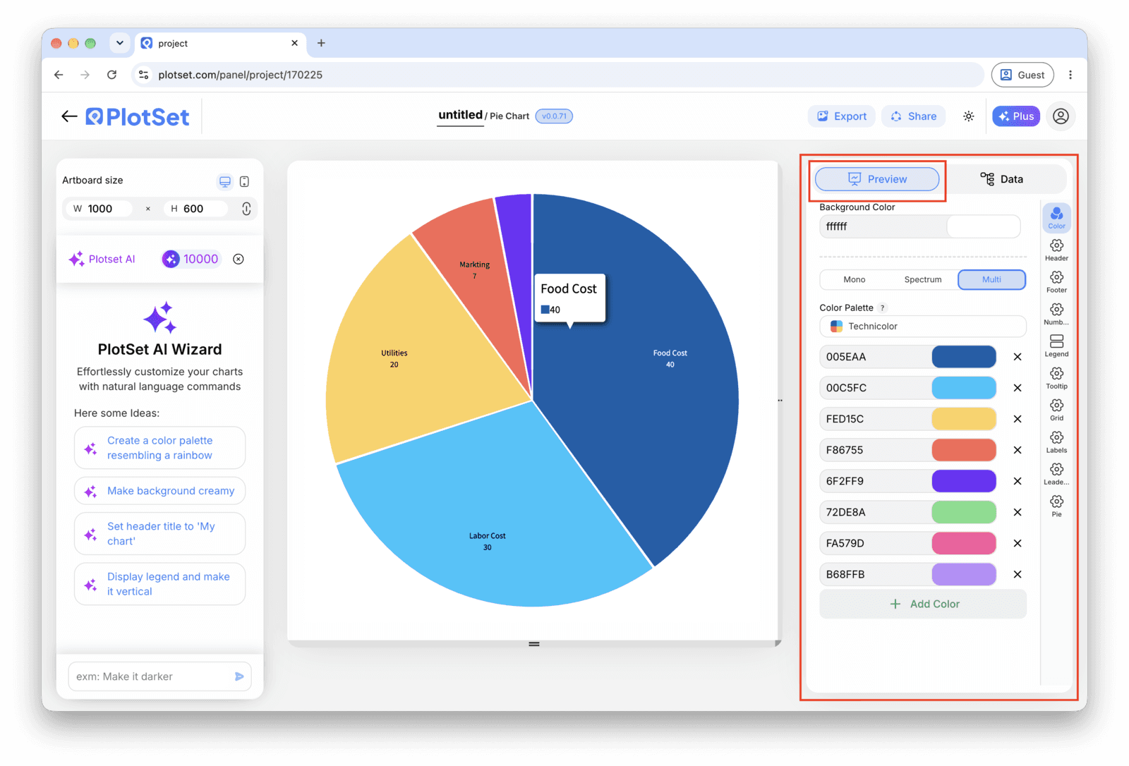
Publish for a live, interactive chart with hover tooltips and a shareable link, grab the embed code for a page, or export a PNG, SVG or PDF if you need a static image for a deck.
Comece pelo modelo de Pie Chart com dados de exemplo já carregados, depois substitua-os pelos seus.
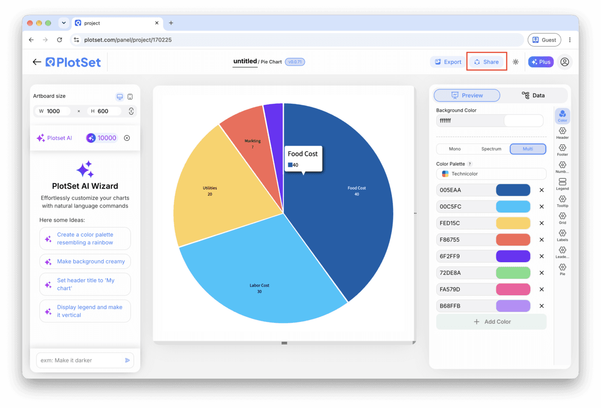
Abrir o modeloA reta final é igual para todo tipo de gráfico: o Share transforma o gráfico em um link público interativo e em um código de incorporação; o Export gera um arquivo estático.
Ativar o código de incorporação e o link público é o que publica o gráfico. O link pode ser enviado com segurança para qualquer pessoa, e o código de incorporação entra em qualquer página como um iframe que mantém a interatividade e os tooltips ao passar o mouse. Edite o gráfico depois e clique em Recreate para levar essas mudanças aos dois.

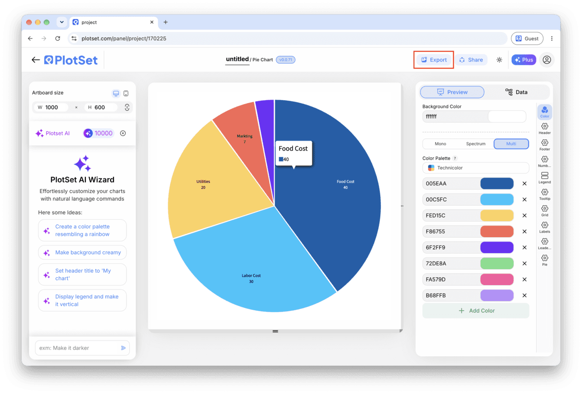
O Export grava uma cópia estática no tamanho que você precisar. O SVG continua nítido em qualquer escala e ainda pode ser editado em uma ferramenta de design; PNG e JPG são as escolhas seguras para slides e documentos. É o multiplicador de escala que garante uma imagem nítida em uma tela retina.

A legend forces the reader to look away from the circle, find a colour, then look back. Direct labels on or beside each slice remove that round trip entirely, and PlotSet fits them cleanly up to about five or six slices.
This is the reading convention people already know, so use it rather than fighting it. The moment the largest slice starts anywhere else, readers spend a second just orienting themselves before they get to the data.
"Other" on its own tells the reader nothing about what got grouped. A short caption, "Other includes eleven regions under 2% each", turns a vague catch-all into an honest summary.
A gradient or a tilted 3D slice implies an extra dimension of meaning that is not there, and it distorts the angle a flat pie relies on to be read correctly. One flat colour per slice is the whole job.
This usually means a filter or a date range excluded some rows before upload, so the circle claims completeness it does not have. Check the raw row count in PlotSet's data table against your source sheet and reconcile the difference before publishing.
If colour is assigned by row position rather than by category name, resorting the slices reshuffles the palette too. Assign colours to the category labels themselves in the style panel, not to whatever sits in row three at the time.
A raw export with twenty countries or product SKUs produces a dozen slices too thin to carry a label. Go back to the spreadsheet, not the chart settings, and collapse everything under your cutoff into one Other row.
Não tem certeza se o Pie Chart é a escolha certa? Veja o que é, quando usar e quando evitar.
Two columns and one header row: a category label in the first column, one plain number per category in the second. CSV and .xlsx both work, and the numbers should be raw values, not pre-formatted percentages, since PlotSet calculates the share itself.
Grátis para começar com mais de 300 modelos. Sem cartão de crédito.