
Shade each region
Colour intensity carries the value. The right choice for rates, shares and per-capita figures, which are already adjusted for how big or populous a region is.
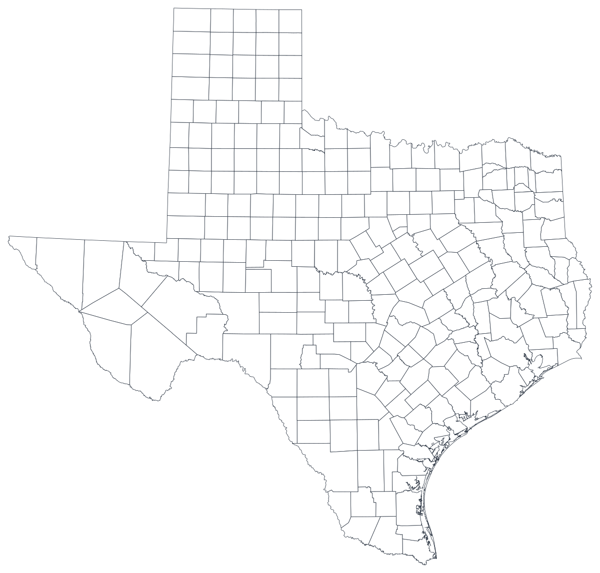
Open the templateA blank Texas county map to print, and a builder to fill it with your own data. Download the free outline of all 254 counties, or upload a spreadsheet and publish an interactive Texas map you can embed anywhere.
All 254 counties, as a clean outline. Print it, colour it in, or drop it into a document — no account and no attribution required.
Free for any use, including commercial and classroom. Generated from the same boundaries the builder uses.
Download SVGTexas divides into 254 counties — more than any other state, and more than twice the number in the next largest. That count is the whole character of the map. The eastern third is a dense mosaic of small counties laid out when a day's ride defined a county seat, while single counties out west run larger than Connecticut: Brewster alone covers over six thousand square miles. Population runs the other way. Harris, Dallas, Tarrant, Bexar and Travis hold roughly half the state between them in five small shapes near the middle of the picture, and Loving County in the far west has fewer residents than a school bus holds. Any Texas county map is therefore two maps at once — an area map that shouts about the west, and a population map that whispers there — and knowing which one you are drawing is the difference between a chart that informs and one that misleads.
Shade the regions when your number is a rate, size a marker when it is a count. Getting this backwards is the most common way a data map misleads.
Colour intensity carries the value. The right choice for rates, shares and per-capita figures, which are already adjusted for how big or populous a region is.
Open the templateOne symbol on each region, scaled by value. Use it for counts and totals, where shading the land area would just redraw the population map.
Open the templateCircles sized by value, sitting over the outline. Reads well when a few regions dominate and small ones would otherwise disappear into a shade.
Open the templateDSHS health indicators, Texas Workforce Commission labour figures, TEA school data, Secretary of State election returns and Railroad Commission production tables are all published by county.
Uninsured rate, unemployment rate, share of the vote, median household income. Rates are already adjusted for population, which is what shading a region needs.
The five big metros against 240-odd rural counties is the fundamental Texas story, and it is a geographic story. A county map makes it something the reader sees rather than something they have to be told.
Classroom exercises, territory planning, colour-by-hand sessions. The free outline above prints cleanly at any size.
Shade by a raw count and Harris County wins every time — it holds about one Texan in six inside one of the smaller shapes on the map. Use symbols or bubbles sized by the count instead.
254 names do not fit. Label the dozen counties your argument rests on, leave the tooltip to carry the rest, and let the reader hover for the ones they care about.
The Dallas–Fort Worth metroplex spans eleven counties, Houston's spans nine, and Texas school districts cross county lines freely. Squeezing any of these onto counties misplaces the thing you are describing.
Surveys with a state-level sample rarely support 254 estimates. A map with two hundred grey shapes is a worse table — rank the counties you actually have.
From a spreadsheet to a published map, step by step.
The free outline above is a plain SVG of all 254 counties — print it, or drop it into a document. To build with data, open the PlotSet Texas (counties) template, which comes with sample data already bound.
One row per county: the county name or its five-digit FIPS code in the first column, your number in the second. FIPS codes for Texas all begin 48.
Import a CSV or Excel file, paste from a spreadsheet, or connect a Google Sheet so the map can be refreshed when the source updates.
Shade the counties for a rate, or switch to symbols or bubbles for a count. Same geography, same data, different encoding — and with Texas the choice matters more than it does anywhere else.
Sequential for a low-to-high measure, diverging only when a real midpoint exists — the state average, zero change, a 50 per cent line. Four to six steps read more precisely than a smooth gradient across 254 shapes.
Publish for a live interactive map with a tooltip on every county, or export a PNG, SVG or PDF for a report or a deck.
Start from the Texas template with sample data already loaded, then swap in your own.
Open the templateWhat the place column has to look like, and where to find data that already matches.
Watch the ones that break a join: Bexar, DeWitt, Deaf Smith, Val Verde, La Salle, Jim Hogg and Jim Wells, Palo Pinto, Nacogdoches, Tom Green. Matching on FIPS avoids every one of these.
48001 is Anderson, 48507 is Zavala. Store the column as text so the leading digits survive, and note that the county part is odd-numbered rather than sequential.
Bexar County is San Antonio, Harris is Houston, Tarrant is Fort Worth and Travis is Austin. There is a Dallas County, but Dallas the city spills into Collin, Denton, Rockwall and Kaufman as well.
The Texas Department of State Health Services, the Texas Workforce Commission, the Texas Education Agency, the Texas Water Development Board and the Secretary of State all publish county tables, as does the Census Bureau's ACS.
It produces a population map every time — the five metro counties glow and the other 249 disappear. Anything that grows simply because more people live there should be a sized symbol, not a shade.
The largest shapes hold the fewest people. A single county with a hundred residents and a striking colour will dominate a map that is otherwise about millions of Texans, so say so in the caption or suppress low-count counties explicitly.
DeWitt, De Witt and Dewitt are three different strings, and a silent mismatch leaves a blank county rather than an error. Join on FIPS where you can.
A sequence of hues has no natural order, so readers cannot tell high from low without checking the legend on every one of 254 counties. Use one hue, light to dark.
Yes. The outline above is a free SVG of all 254 Texas counties — right-click to save it, print it, or drop it into a worksheet or document. No account needed.
Upload a spreadsheet and publish an interactive map in a couple of minutes — free, no credit card.