
Shade each region
Colour intensity carries the value. The right choice for rates, shares and per-capita figures, which are already adjusted for how big or populous a region is.
Open the templateA blank North Carolina county map to print, and a builder to fill it with your own data. Download the free outline of all 100 counties, or upload a spreadsheet and publish an interactive North Carolina map you can embed anywhere.
All 100 counties, as a clean outline. Print it, colour it in, or drop it into a document — no account and no attribution required.
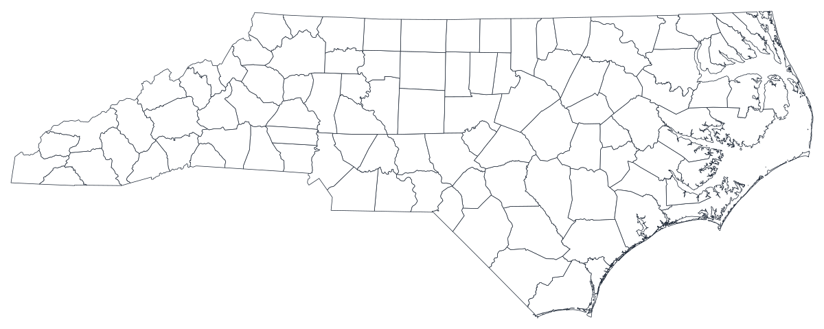
Free for any use, including commercial and classroom. Generated from the same boundaries the builder uses.
Download SVGNorth Carolina divides into 100 counties, and the state is unusually well suited to a county map because its geography is genuinely banded. The map runs west to east through three regions that behave differently on almost every measure: the mountain counties around Asheville and the Blue Ridge, the Piedmont crescent that carries Charlotte, the Triad and the Research Triangle, and the coastal plain and Outer Banks. Population sits overwhelmingly in the middle band — Mecklenburg and Wake together hold about a fifth of the state — while the eastern and western counties are smaller, older and more rural. Because those three regions are contiguous rather than scattered, a shaded county map of North Carolina tends to show clean bands rather than noise, which makes it one of the more persuasive state maps you can build.
Shade the regions when your number is a rate, size a marker when it is a count. Getting this backwards is the most common way a data map misleads.
Colour intensity carries the value. The right choice for rates, shares and per-capita figures, which are already adjusted for how big or populous a region is.
Open the templateOne symbol on each region, scaled by value. Use it for counts and totals, where shading the land area would just redraw the population map.
Open the templateCircles sized by value, sitting over the outline. Reads well when a few regions dominate and small ones would otherwise disappear into a shade.
Open the templateNC DHHS health indicators, Department of Commerce labour figures, DPI school data and State Board of Elections returns are all published by county.
Unemployment rate, uninsured share, turnout, median household income. Rates are already adjusted for population, which is what shading a region needs.
North Carolina's regions are geographic bands, so they show up on a county map as bands. This is the state where the picture usually does the arguing for you.
Classroom exercises, territory planning, colour-by-hand sessions. The free outline above prints cleanly at any size.
Shade by a raw count and Mecklenburg and Wake win every time — two urban counties holding a fifth of the state in two modest shapes. Use symbols or bubbles sized by the count instead.
The Charlotte metro reaches into South Carolina and the Triangle spans several counties. Forcing either onto county lines misplaces the thing you are describing.
Raleigh, Durham and Chapel Hill sit in three different counties that also contain a great deal of countryside. Below that level, use ZIP codes or census tracts.
Surveys sized for the state rarely support 100 county estimates. If seventy counties would be grey, rank the ones you have instead of mapping them.
From a spreadsheet to a published map, step by step.
The free outline above is a plain SVG of all 100 counties — print it, or drop it into a document. To build with data, open the PlotSet North Carolina (counties) template, which comes with sample data already bound.
One row per county: the county name or its five-digit FIPS code in the first column, your number in the second. FIPS codes for North Carolina all begin 37.
Import a CSV or Excel file, paste from a spreadsheet, or connect a Google Sheet so the map can be refreshed when the source updates.
Shade the counties for a rate, or switch to symbols or bubbles for a count. Same geography, same data, different encoding.
Sequential for a low-to-high measure, diverging only when a real midpoint exists — the state average, zero change, a 50 per cent line. Four to six steps read more precisely than a smooth gradient.
Publish for a live interactive map with a tooltip on every county, or export a PNG, SVG or PDF for a report or a deck.
Start from the North Carolina template with sample data already loaded, then swap in your own.
Open the templateWhat the place column has to look like, and where to find data that already matches.
The coastal names are where joins break: Pasquotank, Perquimans, Currituck, Chowan, Tyrrell and Bertie. Buncombe, Watauga, Transylvania and Yadkin catch people out too. Matching on FIPS avoids every one of these.
37001 is Alamance, 37199 is Yancey. Store the column as text so the leading digits survive, and note that the county part is odd-numbered rather than sequential.
Mecklenburg, Brunswick, Halifax, Northampton and Warren all exist on both sides of the border. In any multi-state table, join on FIPS or you will pull Virginia's numbers onto a North Carolina map.
NC DHHS, the Department of Commerce's LAUS tables, the Department of Public Instruction, the State Board of Elections and the Office of State Budget and Management all publish county figures, as does the Census Bureau's ACS.
It produces a population map every time — Mecklenburg and Wake light up and the other 98 counties fade. Anything that grows simply because more people live there should be a sized symbol, not a shade.
The Outer Banks counties are small in population and unusual in age and seasonality. A rate calculated on a few thousand residents swings hard, so consider suppressing or annotating the smallest ones.
A national table joined on county name alone will quietly hand Mecklenburg County, Virginia's figure to Charlotte. Join on FIPS where you can.
A sequence of hues has no natural order, so readers cannot tell high from low without checking the legend on every county. Use one hue, light to dark — it also preserves the west-to-east banding that makes this map worth drawing.
Yes. The outline above is a free SVG of all 100 North Carolina counties — right-click to save it, print it, or drop it into a worksheet or document. No account needed.
Upload a spreadsheet and publish an interactive map in a couple of minutes — free, no credit card.