
Sample CSV
| Month | Organic Search | Paid Search | Direct | Referral |
|---|---|---|---|---|
| Jan | 12400 | 3200 | 5100 | 1800 |
| Feb | 13100 | 3450 | 5300 | 1750 |
| Mar | 14200 | 3600 | 5250 | 2000 |
| Apr | 15800 | 4100 | 5400 | 2100 |
| May | 16500 | 4300 | 5600 | 2050 |
| Jun | 17900 | 4550 | 5800 | 2200 |
A walkthrough for turning a spreadsheet of values over time into a published area chart in PlotSet, from shaping the columns to styling the fill and exporting the result.
About 8 minutesThis walkthrough covers how to create an area chart in PlotSet, moving from a spreadsheet of values over time to a published, interactive chart you can embed or export. You'll finish with the fill styled on purpose (stacked, overlapping, or a single band), a baseline that actually sits at zero, and series names that mean something in the legend, not a screenshot of someone else's example.
If your data is already one time column plus one or two measure columns, this takes about eight minutes. Add a few more if you're deciding between stacked and percentage mode, or if your source export needs reshaping from long to wide first. Budget the eight minutes below and treat the rest as buffer.
One row per time point, one column per series: a date or period label first, one number per series after it. No merged cells, one header row.
| Month | Organic Search | Paid Search | Direct | Referral |
|---|---|---|---|---|
| Jan | 12400 | 3200 | 5100 | 1800 |
| Feb | 13100 | 3450 | 5300 | 1750 |
| Mar | 14200 | 3600 | 5250 | 2000 |
| Apr | 15800 | 4100 | 5400 | 2100 |
| May | 16500 | 4300 | 5600 | 2050 |
| Jun | 17900 | 4550 | 5800 | 2200 |
Keep the date column as an actual date, not text. If a spreadsheet stores "Jan" as a plain string, PlotSet spaces the points evenly instead of by the real gap between them.
This is wide format: one column per series. If your source data is long format, a category column and a value column with one row per date and series, pivot it in your spreadsheet tool first, or the series won't split into separate bands.
Blank cells in a measure column render as a gap in that band rather than being skipped. Fill them with zero or the last known value, whichever matches what actually happened during that period.
Keep header names short. They become the series names in the legend and in the hover tooltip, so a column called "Organic Search Sessions (All Devices)" will crowd both.
The exact click path in PlotSet, from a blank template to a finished chart.
From the PlotSet dashboard, start a new project and choose the Area Chart template. It loads with sample data already bound, so you can see how the time column and the measure columns map onto filled bands before you touch your own file.

One row per period, with the date or time label first and one column per series after it. If your source is long format, one row per date and category rather than one row per date, pivot it into wide format before uploading.
Use the data panel to import a CSV or .xlsx file, paste rows directly from a spreadsheet, or connect a Google Sheet if you want the chart to refresh later without a re-upload. PlotSet reads the first row as headers automatically.

Confirm which column feeds the x-axis and which numeric columns feed the bands. If the points along the axis look evenly spaced even though your periods aren't, the date column is likely being read as text rather than a date.

Stack the series when the running total matters. Switch to percentage stacking when only the changing mix matters and the total would be a distraction. Reach for overlapping only with two or three series and real transparency on the fill.
Drag the series order so the one you most want understood sits at the bottom, since only the bottom band has a flat baseline to read against. Give each series its own colour; a repeated colour from the default palette makes two bands look like one.
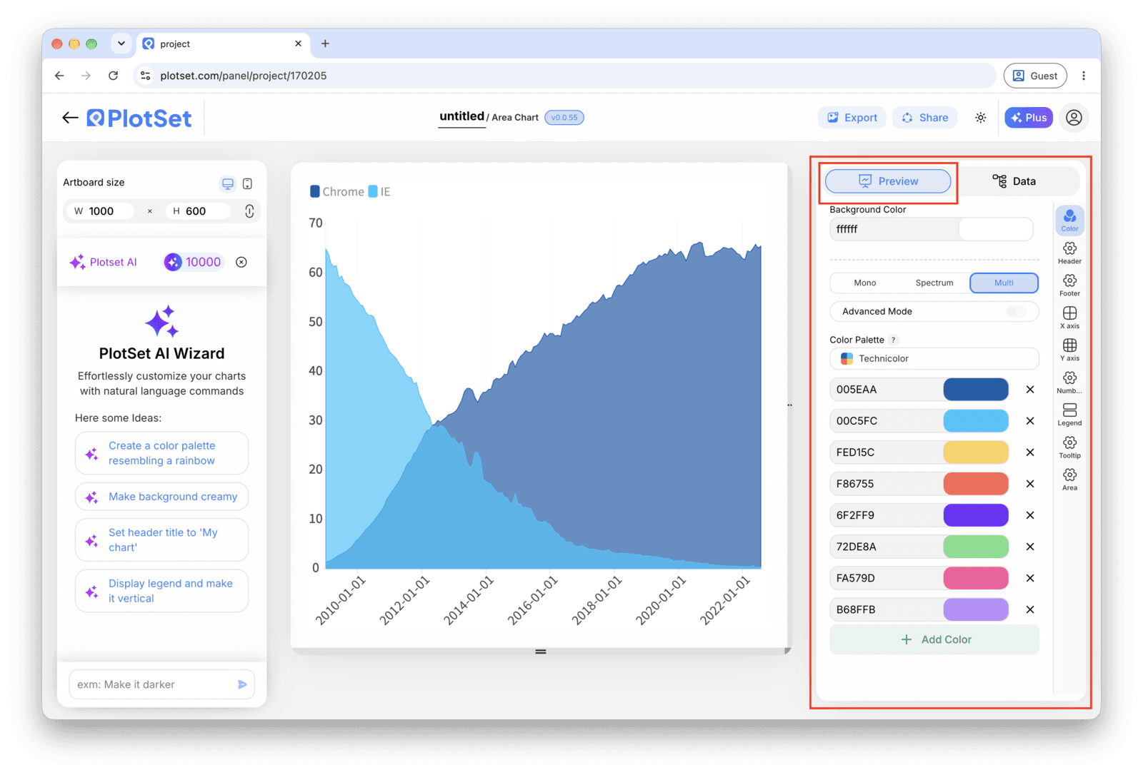
Confirm the value axis starts at zero. It should, because the fill is measured from there and a truncated axis on an area chart fills in a shape that doesn't exist. Add a title that says what's accumulating, not just the metric name.
Publish for a live, interactive chart with hover tooltips that show every series at a given date, grab the embed code to drop it into a page, or export a PNG, SVG or PDF for a deck.
Start from the Area Chart template with sample data already loaded, then swap in your own.
Open the templateThe last stretch is the same for every chart type: Share turns the chart into a live public link and an embed code, Export writes it out as a static file.
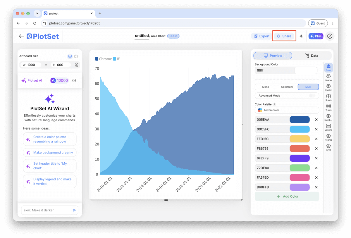
Activating the embed code and public link publishes the chart. The link is safe to send to anyone, and the embed code drops into any page as an iframe that keeps the hover tooltips and the interactivity. Edit the chart later and hit Recreate to push those changes out to both.

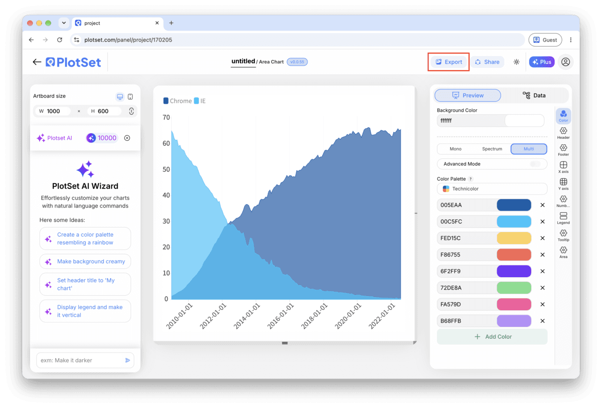
Export writes a static copy at whatever size you need. SVG stays sharp at any scale and can still be edited in a design tool; PNG and JPG are the safe choices for slides and documents. The scale multiplier is what gets you a crisp image on a retina screen.

In a stacked area chart, only the bottom band sits on a flat baseline. Every band above it is judged against a wavy line, which the eye does badly, so the bottom slot should go to the series your reader most needs to track accurately.
The filled region is measured from the baseline, so shifting it exaggerates or hides volume that isn't real. If you want to zoom in on a narrow range, turn on value labels and hover tooltips instead of touching the axis.
Past that, the bands in the middle get thin, wavy and impossible to compare. Group the smaller series into an "Other" band and name it in the legend rather than letting six or seven colours fight for space.
A 100% stacked area looks perfectly stable even if the underlying total collapsed. Label the axis and add a line in the caption noting that the chart shows mix, not magnitude.
This means the time column is being read as text rather than a date, so PlotSet is placing the labels in order rather than by calendar distance. Reformat the column as an actual date in your source sheet and re-map it.
Check two things: the chart's stacking mode may still be set to overlapping, and your data may still be in long format with one series column instead of one column per series. Switch the mode to stacked and confirm each series has its own column.
A "Total" or "Average" row left at the bottom of the sheet gets read as an extra time point, not a summary, and appears as an odd extra point past your real data. Delete it from the source file or remove the row in PlotSet's data table before publishing.
Not sure the Area Chart is the right choice? See what it is, when to use it and when not to.
Wide format, with one header row: a date or period label in the first column and one number per series in the columns after it. CSV and .xlsx both work, and a pasted range from any spreadsheet tool is fine too.
Free to start with 300+ templates. No credit card required.