PlotSet LogoPlotSet

How to Create a Marimekko Chart

A step by step walkthrough for turning a segment, subdivision and value spreadsheet into a published Marimekko chart in PlotSet, from shaping the sheet to locking the stack order and exporting.

About 8 minutes

Take a spreadsheet shaped as segment, subdivision and value, something like revenue by region and sales channel, and this guide shows how to create a Marimekko chart in PlotSet where the column widths carry as much information as the stacks inside them. You will shape the sheet, upload it, lock the column order and the stacking order, then publish, embed or export the finished chart.

If your data is already three columns, one row per block, this takes about eight minutes, and most of that goes into locking the stacking order so it reads the same in every column rather than fighting the upload. Add another five if you are unpivoting a wide report, one column per channel, into the long format PlotSet expects.


The data you need

Three columns, one row per block: the segment name, the subdivision name, then the number. No totals row, no wide pivot table, one header row.

Sample CSV
RegionChannelRevenue
North AmericaDirect420000
North AmericaReseller180000
North AmericaOnline90000
EuropeDirect260000
EuropeReseller140000
EuropeOnline70000
Asia PacificDirect150000
Asia PacificReseller110000
Asia PacificOnline95000
Notes

This is long format: one row per segment-subdivision pair, not one column per subdivision. If your report has a Direct column, a Reseller column and an Online column side by side, restack those into rows before uploading.

Spell each segment name identically on every row. "APAC" on one row and "Asia Pacific" on another reads as two separate segments and splits a total that should be one column.

Delete any totals or subtotals row before uploading. A grand total uploaded as a row becomes a segment of its own and throws off every width.

Keep the value column numeric. A revenue figure stored as text (a stray currency symbol or thousands separator that survived an export) will not sum into the segment total PlotSet uses to calculate column width.

The steps

The exact click path in PlotSet, from a blank template to a finished chart.

  1. 01

    Start a new project on the Marimekko Chart template

    From the PlotSet dashboard, start a new project and choose the Marimekko Chart template. It loads with sample data already bound to segment, subdivision and value, so you can see the exact column layout before touching your own file.

    PlotSet's template picker: chart categories listed down the left, the Bar Charts grid open, and the Bar Chart template card showing its Select button.
    Every guide starts here. Pick the category, then the template: it is the same grid whichever chart type you are after.
  2. 02

    Shape your sheet into three columns

    List one row per block: the segment name first (region), the subdivision name second (channel), and the number third (revenue). This is long format, not the wide pivot table most reporting tools export by default, where each channel gets its own column.

  3. 03

    Unpivot a wide report if that is where you are starting

    If your source is a table with one column per subdivision, say a region row with a Direct, Reseller and Online column each, stack those columns into rows instead: one row per region-channel pair, three columns total. A quick copy-paste rebuild handles this faster than it sounds.

  4. 04

    Upload your file or connect a sheet

    Use the data panel to import a CSV or .xlsx file, paste rows directly from a spreadsheet, or connect a Google Sheet so the chart can pick up later edits without a re-upload. PlotSet reads the first row as headers automatically.

    The PlotSet editor's data view: a spreadsheet grid with Name, Value and Region columns filled with Canadian province figures, beside the Data panel offering CSV upload, Magic Import and Google Sheet sync.
    The data view, shown here on a bar chart project. Upload a CSV, lift the numbers out of an image with Magic Import, or sync a Google Sheet. The panel is identical for every chart type.
  5. 05

    Map the segment, subdivision and value columns

    Confirm which column feeds the column width (segment), which feeds the stack (subdivision), and which feeds the block size (value). Column widths are calculated for you from the segment totals: you never enter a width directly.

    The PlotSet data panel with the column bindings highlighted: Label/time mapped to column A, Values to column B and Filter/color to column C, with the Auto Binding button below.
    Bindings decide which column becomes the label, which supplies the values and which drives the colour. Auto Binding guesses them from your headers, so check it rather than assume it.
  6. 06

    Order the columns and lock the stacking order

    Sort columns widest to narrowest so the biggest segment reads first, left to right. Then set the subdivision order once and keep it identical in every column: if Direct sits at the bottom in North America, it needs to sit at the bottom in Europe and Asia Pacific too, or the chart stops being comparable across columns.

  7. 07

    Turn on the top axis and value labels

    Switch on the cumulative top axis so the segment widths are readable instead of just implied by eye. Add value or percentage labels to each block; without them a reader has to estimate two dimensions at once, which is the main thing that makes a Marimekko hard to read.

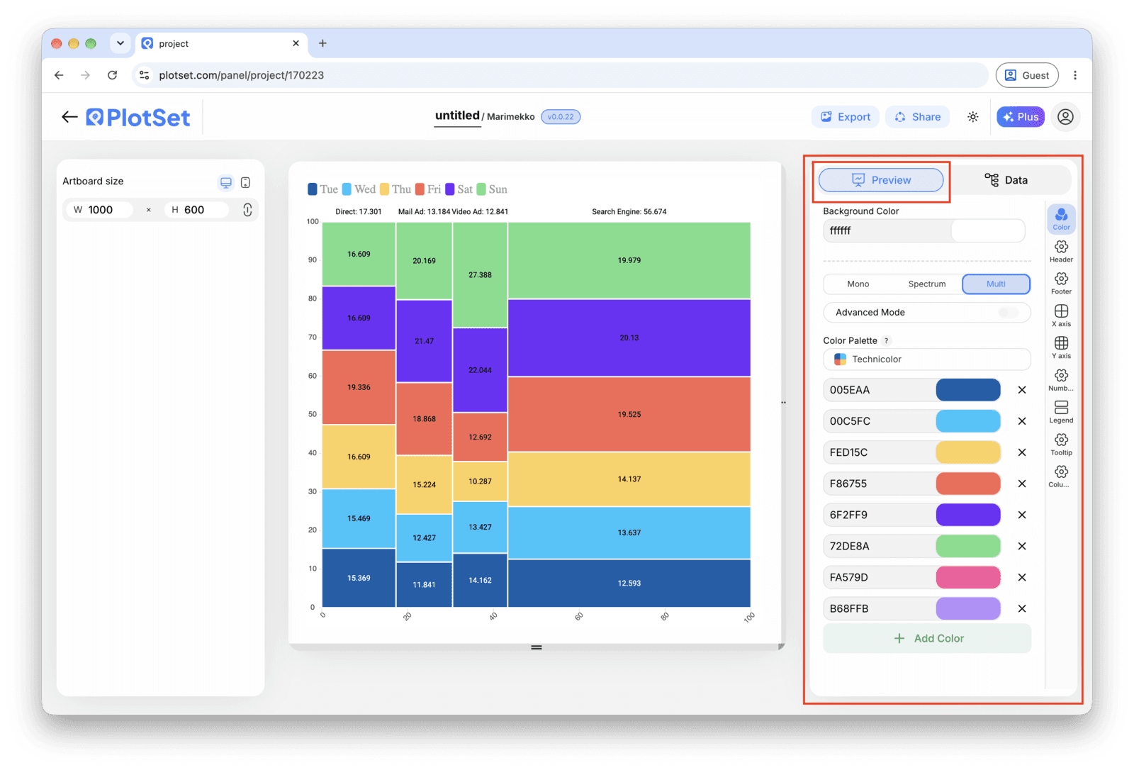
    The PlotSet editor on the Preview tab: a finished Marimekko Chart on the canvas, with the settings panel outlined in red down the right-hand side.
    The Preview tab for a Marimekko Chart. Every styling control lives in the outlined panel, each on its own tab: appearance, header, footer and the options specific to this chart type.
  8. 08

    Pick colors and publish, embed or export

    Assign one color per subdivision and keep that mapping constant across every column, the same way you kept the stacking order constant. Then publish for a live interactive chart with hover tooltips, grab the embed code for a page, or export a PNG, SVG or PDF for a deck.

Start from the Marimekko Chart template with sample data already loaded, then swap in your own.

Open the template

Publish, embed or export it

The last stretch is the same for every chart type: Share turns the chart into a live public link and an embed code, Export writes it out as a static file.

Share: public link and embed code

Activating the embed code and public link publishes the chart. The link is safe to send to anyone, and the embed code drops into any page as an iframe that keeps the hover tooltips and the interactivity. Edit the chart later and hit Recreate to push those changes out to both.

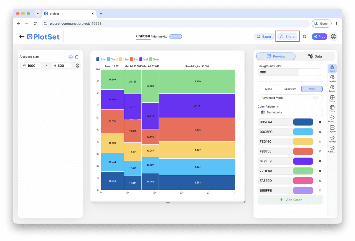
The PlotSet editor toolbar with the Share button highlighted, sitting next to the Export button.
Share is how a finished chart becomes a public link and an embed code.
PlotSet's Share dialog: the toggle activating the embed code and public link, buttons for Link, Embed, Facebook, Reddit, Twitter, LinkedIn and Email, and the public chart link with a Copy button.
Switch on the embed code and public link, then copy the link or take the iframe. Recreate pushes later edits out to everyone already holding it.

Export: SVG, PNG or JPG

Export writes a static copy at whatever size you need. SVG stays sharp at any scale and can still be edited in a design tool; PNG and JPG are the safe choices for slides and documents. The scale multiplier is what gets you a crisp image on a retina screen.

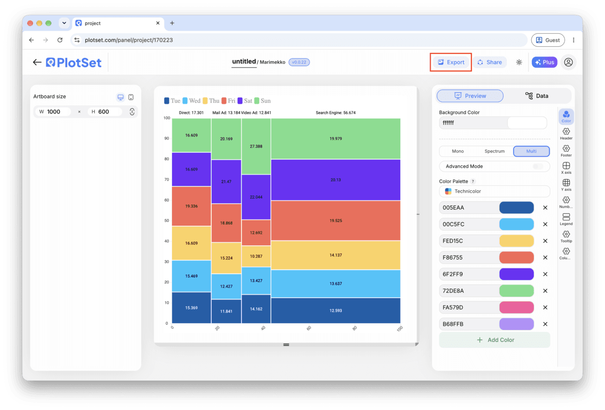
The PlotSet editor toolbar with the Export button highlighted.
Export is the route to a static file for a slide or a report.
PlotSet's Export chart dialog: a 2x scale selector, width and height fields set to 1000 by 600, and the open format menu listing SVG, PNG and JPG.
SVG stays sharp at any size and stays editable in a design tool; PNG and JPG are the safe picks for a deck. Set the scale before you export so the image is crisp on a retina screen.

Styling tips for a Marimekko Chart

Label the top axis, not just the blocks

The width of each column is half of what a Marimekko encodes, and it is the half readers miss most often. A cumulative scale along the top turns an implied comparison into one they can actually read.

Lock the subdivision order before you touch color

Set the stacking order once, confirm it holds across every column, and only then start assigning colors. Reordering after coloring means redoing the color mapping too.

Group anything under about five percent into Other

A subdivision too small to get its own labeled sliver just clutters the chart. Fold it into a named Other block per column rather than leaving a row of unreadable slivers.

Keep it to a handful of segments and stacks

Six columns and five stacks is already a lot to compare by area. Past that, filter to the segments that matter (top regions, top categories) and say so in the title or a caption.

Common mistakes when making a Marimekko Chart

Every column comes out the same width

This usually means the value column uploaded as text rather than a number, or two rows spelled the segment name differently ("APAC" versus "Asia Pacific") so PlotSet cannot sum them into one segment total. Fix the spelling or the number format in the source sheet and re-upload.

The stacking order flips between columns

Each column is sorting its subdivisions independently, usually by value, instead of using one fixed order. Set the subdivision order explicitly in the chart settings rather than leaving it on automatic, and it will hold across every column.

Blocks are too thin to label

Too many segments, too many subdivisions, or both. Filter the segments to the ones carrying the story and fold small subdivisions into an Other block before uploading again.

Learn more about the Marimekko Chart

Not sure the Marimekko Chart is the right choice? See what it is, when to use it and when not to.

About the Marimekko Chart

Marimekko Chart: common questions

Three: a segment (the column), a subdivision (the stack inside it), and a value. One row per segment-subdivision pair, in long format. PlotSet calculates each column's width from the segment totals, so you never enter a width directly.

Make your Marimekko Chart now

Free to start with 300+ templates. No credit card required.