
Sample CSV
| Quarter | New | Renewal | Expansion |
|---|---|---|---|
| Q1 2025 | 120000 | 340000 | 45000 |
| Q2 2025 | 145000 | 360000 | 52000 |
| Q3 2025 | 138000 | 375000 | 61000 |
| Q4 2025 | 162000 | 390000 | 74000 |
A step by step walkthrough for turning a spreadsheet into a published stacked column chart in PlotSet, from shaping the columns to ordering the stack and exporting the result.
About 8 minutesThis guide covers how to create a stacked column chart in PlotSet, starting from a raw spreadsheet and ending with a chart you can publish, embed or export. You will end up with columns that show both a total and the parts underneath it, stacked in an order you chose on purpose, not whatever order your spreadsheet happened to list the columns in.
Eight minutes, roughly, if your data already sits one row per period with a clean numeric column for each segment. Pulling those numbers out of a pivot table first adds a few more, and it's the step most people underestimate: flattening a wide report into the one-row-per-period shape this chart actually needs.
One row per time period or category, with the period in the first column and one numeric column per segment. Every numeric column becomes one band in the stack, in the order the columns appear.
| Quarter | New | Renewal | Expansion |
|---|---|---|---|
| Q1 2025 | 120000 | 340000 | 45000 |
| Q2 2025 | 145000 | 360000 | 52000 |
| Q3 2025 | 138000 | 375000 | 61000 |
| Q4 2025 | 162000 | 390000 | 74000 |
Keep the period column as plain text, not a date field. If a spreadsheet auto-converts "Q1 2025" into a date, PlotSet will chart whatever that date resolves to, not the label you typed.
Do not add a Total column. PlotSet sums the segment columns itself to draw the full column height, and an extra total column will get read as one more band, roughly doubling every column's apparent size.
Every segment needs its own column with a consistent header across every sheet you upload. A segment named "Renewal" in one file and "Renewals" in another counts as two different bands, not one.
A blank cell in a segment column renders as a zero-height band rather than being skipped, so a quarter with no expansion revenue still needs a 0 in that cell, not an empty one.
The exact click path in PlotSet, from a blank template to a finished chart.
From the PlotSet dashboard, start a new project and choose the Stacked Column Chart template. It loads with sample data already shaped correctly, so you can see the column layout before you touch your own file.

Put the time period or category in the first column and one numeric column per segment after it. If your source is a pivot table with the segments spread across a wider report, flatten it into this layout before you upload anything.
Use the data panel to import a CSV or .xlsx file, paste rows straight from a spreadsheet, or connect a Google Sheet if you want the chart to update later without a re-upload. PlotSet reads the first row as your segment headers.

Confirm which column feeds the horizontal axis and which columns feed the stack. This is usually correct automatically, but check it if your sheet carries extra columns, like a growth rate or a note field, that should not be charted as a band.

Drag the segments into the order you want them to appear, bottom to top. Put whichever series your reader most needs to compare across periods at the bottom, since that is the only band sitting on a shared baseline.
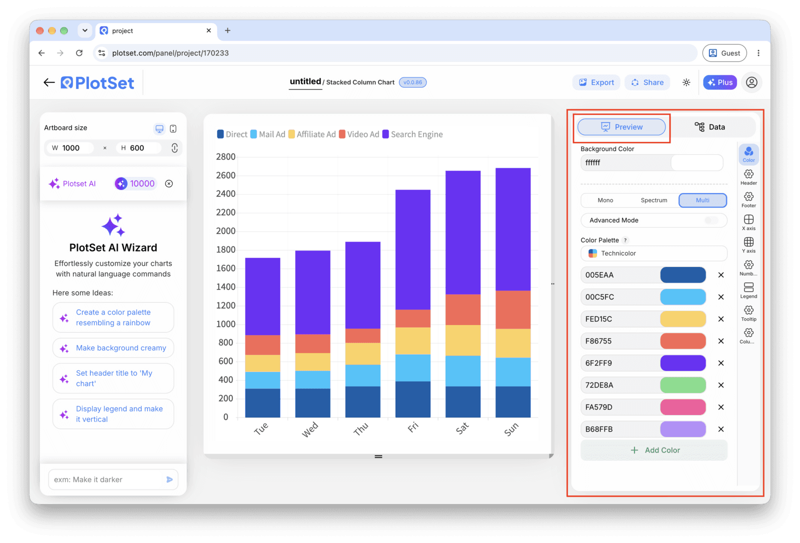
Leave the chart on raw values if the totals themselves are part of the story. Switch to the 100% stacked variant if you only care about how the share of each segment shifted, since that view normalises every column to the same height.
Give each segment a distinct colour, turn on a total label above the column if the sum is worth calling out, and confirm the value axis starts at zero. Then publish for a live embed with hover tooltips, or export a PNG, SVG or PDF.
Start from the Stacked Column Chart template with sample data already loaded, then swap in your own.
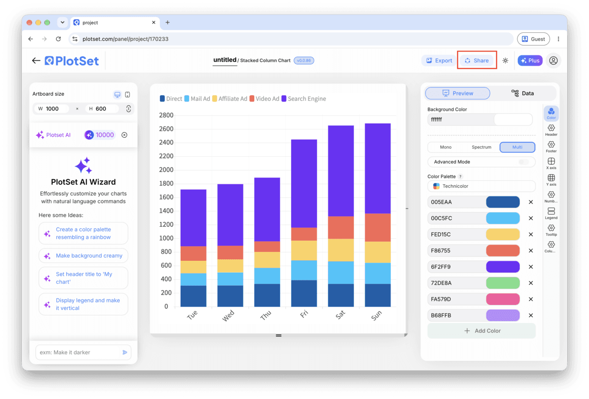
Open the templateThe last stretch is the same for every chart type: Share turns the chart into a live public link and an embed code, Export writes it out as a static file.
Activating the embed code and public link publishes the chart. The link is safe to send to anyone, and the embed code drops into any page as an iframe that keeps the hover tooltips and the interactivity. Edit the chart later and hit Recreate to push those changes out to both.

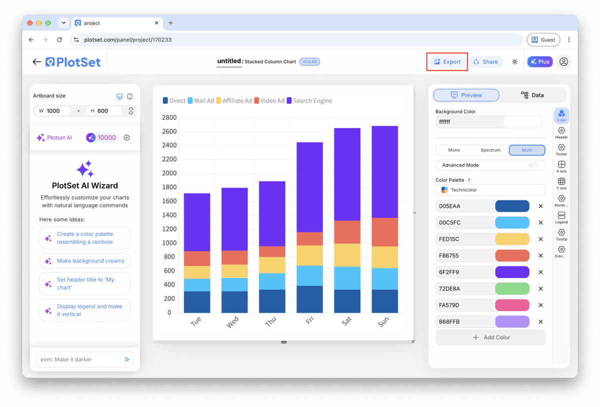
Export writes a static copy at whatever size you need. SVG stays sharp at any scale and can still be edited in a design tool; PNG and JPG are the safe choices for slides and documents. The scale multiplier is what gets you a crisp image on a retina screen.

Every band above the bottom one floats at a different starting height in each column, which makes it hard to compare by eye. If your reader needs to track one segment closely across periods, put that segment on the baseline, not the total.
Reading a stacked total off the value axis is imprecise, since it means adding up several segment heights by eye. If the total itself is news (revenue crossed a milestone, headcount hit a target) turn on the label that prints it above the column.
The percentage view hides the totals completely to make shares easy to compare. That is the right trade when a reader only cares about proportion, and the wrong one the moment someone asks "but how big was Q3 actually?"
A handful of clearly different hues works for two to five segments. Once you are past five, either merge the smallest categories into an "Other" column before upload, or the bands start blurring into a colour gradient nobody can read accurately.
This almost always means a segment column snuck in that duplicates a total, or one column is in different units than the others (dollars next to thousands of dollars). Check every segment column for a matching scale before you upload again.
PlotSet stacks columns in the order the segment columns are mapped, so this happens when a later batch of rows was pasted in with the segment columns rearranged. Open the data table and confirm every row uses the same column order and the same header spelling.
Thin bands with similar default colours are hard to see, especially past four or five segments. Either assign that segment a colour that stands apart from the ones next to it, or roll the smallest categories into an "Other" column before you upload.
Not sure the Stacked Column Chart is the right choice? See what it is, when to use it and when not to.
One row per time period or category, with the period in the first column and one numeric column per segment after it. Each of those numeric columns becomes one band in the stack, so a chart with three segments needs exactly three value columns plus the period column, and no separate total column.
Free to start with 300+ templates. No credit card required.