PlotSet LogoPlotSet

How to Create a Population Pyramid

A step by step walkthrough for turning an age and sex breakdown into a published population pyramid in PlotSet, from shaping the sheet to exporting the finished chart.

Etwa 9 Minuten

Your own age and sex breakdown, not the sample data the template ships with, is the input for how to create a population pyramid in PlotSet. You will upload your sheet, get the bands running in the right order with male and female mirrored around a shared centre line, and publish it as a live embed or export it as an image for a report.

If your data already comes as one row per age band with a count for each side, this takes about eight or nine minutes. Add a few more if you are pulling the numbers out of a census table or a statistics office spreadsheet that has extra rows and columns you do not need. The steps below assume a single point in time; if you want the shape to change year by year, that is a separate animated build.

Die Daten, die Sie brauchen

One row per age band, three columns: the band label first, then one value column for each side. No merged cells, no totals row, one header row.

Beispiel-CSV
Age GroupMaleFemale
0-423202210
5-924102290
10-1424802350
15-1925102390
20-2423902330
25-2922802260
30-3423402350
35-3925602610
40-4427902850
45-4930203110
50-5429403080
55-5926802900
60-6424102710
65-6921502540
70-7417802280
75-7912201780
80+9801890
Hinweise

Keep the age band column as text labels like "0-4" or "80+", not a number range or a date. If a spreadsheet auto-converts "0-4" into a date, PlotSet will read the converted value instead of the band you meant.

Both value columns should hold plain positive counts. Do not pre-negate one side to make it point left; PlotSet mirrors the second column itself, and a negative input just gets mirrored again.

Keep every band the same width. Mixing five-year bands with a wider "80+" bucket is fine at the very top of the pyramid, but a mix of five-year and ten-year bands anywhere else in the middle will distort the silhouette.

If you are working from percentages of the total population instead of raw counts, that is fine too: keep the same three-column shape and just say in the chart title that the axis is a share, not a headcount.


Die Schritte

Der genaue Klickpfad in PlotSet, von einer leeren Vorlage bis zum fertigen Diagramm.

  1. 01

    Open the Population Pyramid template

    From the PlotSet dashboard, start a new project and choose the Population Pyramid template. It loads with sample age and sex data already bound, so you can see the exact band, left value, right value layout before you touch your own file.

    Die Vorlagenauswahl von PlotSet: links die Liste der Diagrammkategorien, daneben das geöffnete Raster "Bar Charts" und die Vorlagenkarte "Bar Chart" mit ihrer Schaltfläche "Select".
    Jede Anleitung beginnt hier. Wählen Sie erst die Kategorie, dann die Vorlage. Das Raster ist für jeden Diagrammtyp dasselbe.
  2. 02

    Lay out the age band, male and female columns

    Put the age band in the first column, one side's count in the second, and the other side's count in the third, one row per band. Pull this straight out of a census table or statistics office export if that is your source, and drop any rows for totals or age groups you are not covering.

  3. 03

    Upload your file or connect a sheet

    Use the data panel to import a CSV or .xlsx file, paste rows directly from a spreadsheet, or connect a Google Sheet so the pyramid can be refreshed when a new year's figures come out without a full re-upload.

    Die Datenansicht im PlotSet-Editor: ein Tabellenraster mit den Spalten "Name", "Value" und "Region", gefüllt mit Zahlen zu kanadischen Provinzen, daneben der Bereich "Data" mit "Upload CSV File", "Magic Import" und der Synchronisierung über "Google Sheet".
    Die Datenansicht, hier in einem Balkendiagramm-Projekt. Laden Sie über "Upload CSV File" eine CSV-Datei hoch, holen Sie die Zahlen mit "Magic Import" aus einem Bild oder verbinden Sie ein Google Sheet. Der Bereich sieht bei jedem Diagrammtyp gleich aus.
  4. 04

    Map the band and the two side columns

    Confirm which column is the shared age axis and which two columns feed the left and right sides. PlotSet usually guesses right when your headers say "Male" and "Female" or similar, but check it manually if your sheet has extra columns it might have picked up by mistake.

    Der Datenbereich von PlotSet mit hervorgehobenen Spaltenzuordnungen: "Label/time" auf Spalte A, "Values" auf Spalte B und "Filter/color" auf Spalte C, darunter die Schaltfläche "Auto Binding".
    Die Zuordnungen legen fest, welche Spalte zur Beschriftung wird, welche die Werte liefert und welche die Farbe steuert. "Auto Binding" errät sie anhand Ihrer Spaltenüberschriften. Prüfen Sie das Ergebnis, statt sich darauf zu verlassen.
  5. 05

    Check the band order and the side assignment

    The bands should run from youngest at the bottom to oldest at the top; if your source data listed them the other way, or alphabetically, fix the sort in the chart settings rather than re-sorting the spreadsheet. Confirm which column landed on the left and which on the right, since convention puts male on the left and female on the right, and swapping them without saying so will confuse anyone who knows the form.

  6. 06

    Choose counts or percentages, and set the axis

    Decide whether the value axis shows raw counts or each band's share of the total population, then set that axis maximum manually so it is identical on both sides. An automatic axis can pick a slightly different scale for each side and make a symmetric population look lopsided.

  7. 07

    Style the bars and label the centre axis

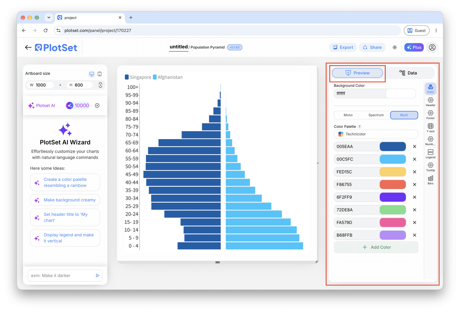
    Pick one colour per side, something distinguishable that is not the pink-and-blue default, and turn on a light gridline at every second or third band if you have more than fifteen rows, so the eye has something to track across from left to right. Add a chart title that states what the pyramid is showing, counts or percentages, and for what year.

    Der PlotSet-Editor im Tab "Preview": ein fertiges Diagramm vom Typ "Population Pyramid" auf der Arbeitsfläche und der rot umrandete Einstellungsbereich am rechten Rand.
    Der Tab "Preview" für ein Diagramm vom Typ "Population Pyramid". Alle Gestaltungsoptionen stecken im umrandeten Bereich: Aussehen, Kopfzeile, Fußzeile und die Optionen, die es speziell für diesen Diagrammtyp gibt, jeweils in einem eigenen Tab.
  8. 08

    Publish, embed or export the finished pyramid

    Publish for a live, interactive chart where hovering a band shows both values, grab the embed code to drop it into a page, or export a PNG, SVG or PDF if you need a static image for a report or a slide deck.

Starten Sie mit der Population Pyramid-Vorlage samt bereits geladenen Beispieldaten und ersetzen Sie diese durch Ihre eigenen.

Vorlage öffnen

Veröffentlichen, einbetten oder exportieren

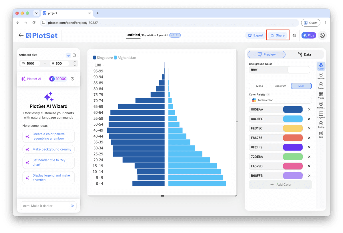
Der letzte Abschnitt ist bei jedem Diagrammtyp gleich: "Share" macht aus dem Diagramm einen öffentlichen Live-Link und einen Einbettungscode, "Export" schreibt es als statische Datei heraus.

"Share": öffentlicher Link und Einbettungscode

Aktivieren Sie den Einbettungscode und den öffentlichen Link, um das Diagramm zu veröffentlichen. Den Link können Sie bedenkenlos an alle weitergeben, und der Einbettungscode fügt sich als iframe in jede Seite ein. Die Tooltips beim Überfahren mit der Maus und die volle Interaktivität bleiben erhalten. Wenn Sie das Diagramm später bearbeiten, überträgt "Recreate" die Änderungen auf Link und Einbettung.

Die Werkzeugleiste des PlotSet-Editors mit der hervorgehobenen Schaltfläche "Share" direkt neben der Schaltfläche "Export".
Über "Share" werden aus dem fertigen Diagramm ein öffentlicher Link und ein Einbettungscode.
Der Dialog "Share" von PlotSet: der Schalter, der den Einbettungscode und den öffentlichen Link aktiviert, die Schaltflächen "Link", "Embed", "Facebook", "Reddit", "Twitter", "LinkedIn" und "Email" sowie der öffentliche Diagrammlink mit der Schaltfläche "Copy".
Aktivieren Sie den Einbettungscode und den öffentlichen Link, kopieren Sie dann den Link oder den iframe-Code. Mit "Recreate" erreichen spätere Änderungen alle, die den Link bereits haben.

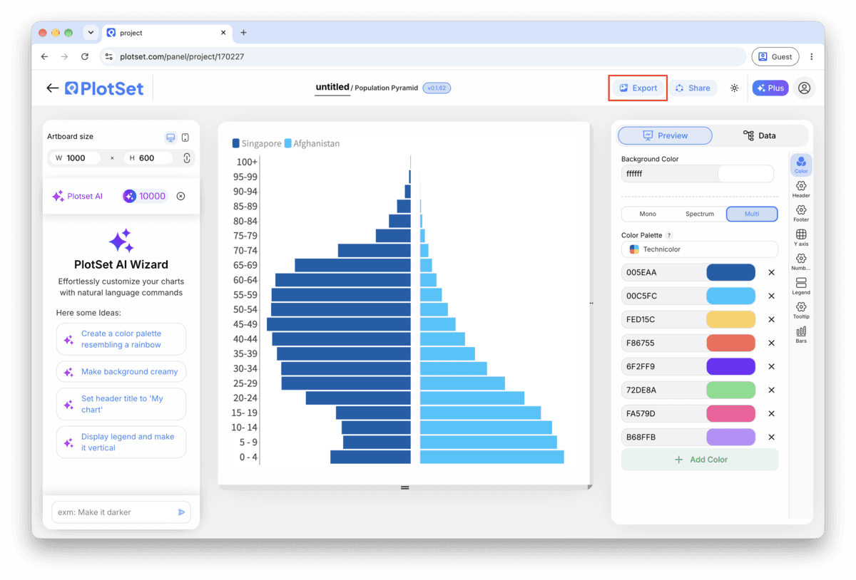
"Export": SVG, PNG oder JPG

"Export" schreibt eine statische Kopie in der Größe heraus, die Sie brauchen. SVG bleibt in jeder Skalierung scharf und lässt sich weiterhin in einem Design-Tool bearbeiten; PNG und JPG sind die sichere Wahl für Folien und Dokumente. Der Skalierungsfaktor sorgt dafür, dass das Bild auf einem Retina-Display gestochen scharf wirkt.

Die Werkzeugleiste des PlotSet-Editors mit der hervorgehobenen Schaltfläche "Export".
Über "Export" bekommen Sie eine statische Datei für eine Folie oder einen Bericht.
Der Dialog "Export chart" von PlotSet: die Skalierungsauswahl auf 2x, die Felder für Breite und Höhe mit 1000 mal 600 und das geöffnete Formatmenü mit "SVG", "PNG" und "JPG".
SVG bleibt in jeder Größe scharf und im Design-Tool bearbeitbar; PNG und JPG sind die sichere Wahl für eine Präsentation. Stellen Sie die Skalierung vor dem Export ein, damit das Bild auf einem Retina-Display gestochen scharf ist.

Styling-Tipps für Population Pyramid

Lock the band order before you style anything

If the age band column is read as text, PlotSet may default to sorting it alphabetically, which puts "5-9" ahead of "10-14". Set a manual or numeric sort on the band column first, then move on to colour and labels, so you are not restyling a chart that reorders itself underneath you.

Set one axis maximum, not two

Find the larger of your two biggest band values, round it up, and enter that as the fixed maximum for both sides in the axis settings. Typing two separate numbers, even close ones, is the most common way a symmetric pyramid ends up looking tilted.

Thin out labels once you pass fifteen bands

Value labels on every single band get cramped once you are past about fifteen rows, particularly with five-year bands running from 0 to 80+. Switch to labelling every second band, or rely on the hover tooltip in the published version and skip permanent labels altogether.

Add a total population note if you're using percentages

A percentage axis is the right call for comparing two populations, but on its own it hides how big either one actually is. Add a subtitle or caption with the total headcount each side represents, so the shape and the scale of it are both on the page.

Häufige Fehler bei Population Pyramid

Both sides come out on the same side of the centre line

This is a column mapping problem, not a data problem: the second value column got assigned to the same side as the first instead of the mirrored side. Reopen the column mapping step and confirm one value column feeds the left series and the other feeds the right.

The bands run in the wrong order, or out of sequence

If "10-14" appears before "5-9", the band column is being sorted as text rather than by age. Switch the sort on that column to manual or numeric order in the chart settings instead of trying to fix it by renaming the bands in your spreadsheet.

One side looks mirrored twice, or the bars point the wrong way

This happens when a value column was pre-negated in the spreadsheet on the assumption that a pyramid needs negative numbers to point left. PlotSet already mirrors the second series for you, so feed it plain positive counts and let the chart handle the direction.

Mehr über Population Pyramid erfahren

Nicht sicher, ob Population Pyramid die richtige Wahl ist? Erfahren Sie, was es ist, wann Sie es verwenden sollten und wann nicht.

Über Population Pyramid

Population Pyramid: häufige Fragen

Three columns and one header row: the age band in the first column, then one count column for each side, usually male and female. Keep counts as plain positive numbers; PlotSet mirrors the second column automatically, so you should not pre-negate anything.

Jetzt Population Pyramid erstellen

Kostenlos starten mit über 300 Vorlagen. Keine Kreditkarte erforderlich.