
Beispiel-CSV
| Quarter | Streaming | Hardware | Services |
|---|---|---|---|
| Q1 | 182000 | 64000 | 41000 |
| Q2 | 201000 | 58000 | 47000 |
| Q3 | 195000 | 71000 | 52000 |
| Q4 | 238000 | 89000 | 60000 |
A step by step walkthrough for turning a wide spreadsheet into a published grouped bar chart in PlotSet, from shaping the columns to publishing, embedding or exporting the finished chart.
Etwa 8 MinutenThis guide covers how to create a grouped bar chart in PlotSet: a chart with two or more bars sitting side by side inside every category, so you can compare a handful of series against each other and against the category next door in one picture. You'll end with a published chart built from your own columns, sorted on purpose, coloured consistently, and either embedded on a page or exported as an image.
If your spreadsheet already has one column per series, this takes about eight minutes, most of it spent choosing an order and locking down colours rather than fighting the upload. Add another five or ten if your data currently sits in long format, one row per category-series pair, and needs pivoting into columns first.
Wide format: one row per category, one column per series. The category name goes first, then one number column for every series you want to compare, with a single header row.
| Quarter | Streaming | Hardware | Services |
|---|---|---|---|
| Q1 | 182000 | 64000 | 41000 |
| Q2 | 201000 | 58000 | 47000 |
| Q3 | 195000 | 71000 | 52000 |
| Q4 | 238000 | 89000 | 60000 |
This is wide format, not long format. If your source data instead has three columns, category, series name, value, stacked into many rows, pivot it in your spreadsheet first so each series gets its own column.
Two to four series is the sweet spot. PlotSet will happily chart a fifth or sixth column, but a group of six bars is hard to scan and usually reads better as small multiples.
The column headers become the legend labels, so write them the way you want them to read on the chart. 'Streaming' beats 'streaming_rev' or a generic 'Series 1'.
A blank cell in a series column renders as a bar with no height rather than being skipped. Fill in the real number, or delete the row if a category has no data for one series.
Der genaue Klickpfad in PlotSet, von einer leeren Vorlage bis zum fertigen Diagramm.
From the PlotSet dashboard, start a new project and choose the Grouped Bar Chart template. It loads with sample data already bound, so you can see exactly how categories and series map onto groups before your own file goes in.

Put the category in the first column and give every series its own column after that, one row per category. If your export currently has a separate 'series' column with repeated category names, pivot it in your spreadsheet so each series becomes a column instead of a row value.
Import a CSV or .xlsx file from the data panel, paste rows directly, or connect a Google Sheet if you want the chart to refresh later without a re-upload. PlotSet reads the first row as headers and treats every column after the category as a separate series.

Confirm which column feeds the category axis and which columns feed the bars within each group. This is usually right by default when your headers are clean, but double check it if your sheet carries extra columns you don't want charted.

Sort by a series that matters, or keep a natural order such as quarters or age brackets. Alphabetical order almost never tells the right story, and getting this right does more for readability than any colour choice later.
Assign one fixed colour per series and leave it alone. The legend is the only thing telling a reader which bar in group four matches which bar in group one, so a colour that shifts partway through a report undoes that link.
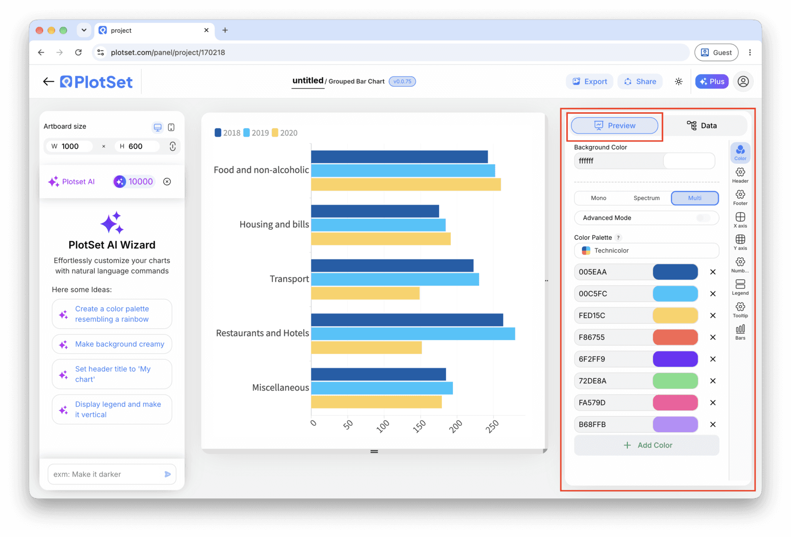
Check that the space between categories is clearly bigger than the space between bars inside a category. If PlotSet's default gap looks tight, increase it in the chart settings until each group reads as one unit rather than a continuous row of bars.
Publish for a live, interactive chart with hover tooltips and a shareable link, grab the embed code for a page, or export a PNG, SVG or PDF for a deck or report.
Starten Sie mit der Grouped Bar Chart-Vorlage samt bereits geladenen Beispieldaten und ersetzen Sie diese durch Ihre eigenen.
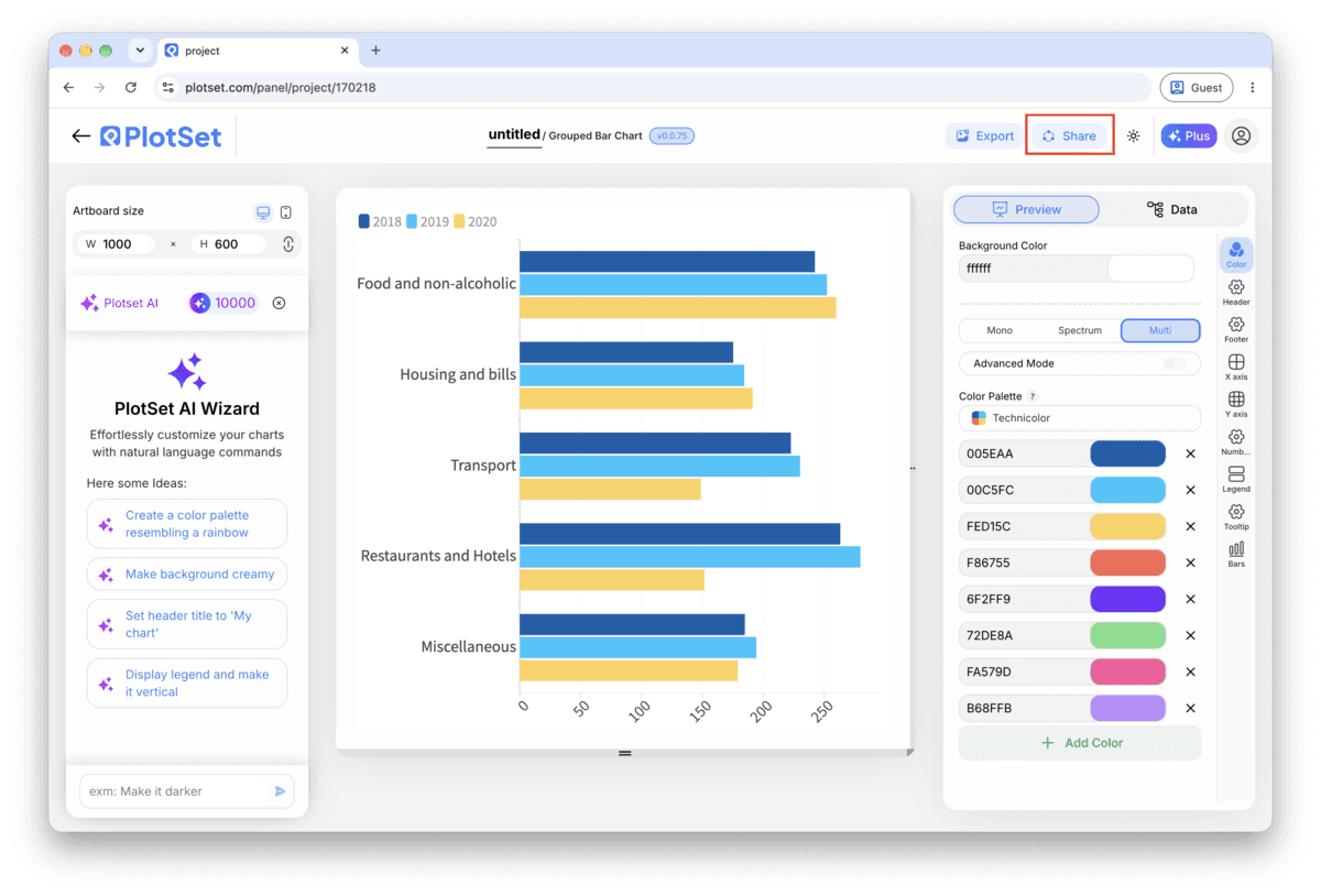
Vorlage öffnenDer letzte Abschnitt ist bei jedem Diagrammtyp gleich: "Share" macht aus dem Diagramm einen öffentlichen Live-Link und einen Einbettungscode, "Export" schreibt es als statische Datei heraus.
Aktivieren Sie den Einbettungscode und den öffentlichen Link, um das Diagramm zu veröffentlichen. Den Link können Sie bedenkenlos an alle weitergeben, und der Einbettungscode fügt sich als iframe in jede Seite ein. Die Tooltips beim Überfahren mit der Maus und die volle Interaktivität bleiben erhalten. Wenn Sie das Diagramm später bearbeiten, überträgt "Recreate" die Änderungen auf Link und Einbettung.

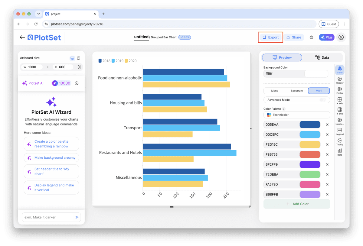
"Export" schreibt eine statische Kopie in der Größe heraus, die Sie brauchen. SVG bleibt in jeder Skalierung scharf und lässt sich weiterhin in einem Design-Tool bearbeiten; PNG und JPG sind die sichere Wahl für Folien und Dokumente. Der Skalierungsfaktor sorgt dafür, dass das Bild auf einem Retina-Display gestochen scharf wirkt.

Below three bars per group, comparisons are instant. Past four, the eye starts losing track of which colour belongs to which series across groups. If you have more, drop the series nobody asks about or split into small multiples.
Every bar's length is the thing being compared, so a truncated axis exaggerates every gap between series. If two series are close in value, add value labels instead of zooming the axis in.
If your categories are department names, product names or survey questions rather than short codes, switch the chart to horizontal. Long labels get a full line each with nothing rotated or truncated.
Set the legend to list series in the same left-to-right order they appear inside each group. It saves the reader a lookup on every single group instead of just the first one.
This usually means the sheet was still in long format, category and series stacked into extra rows, when it was uploaded. Pivot the data into one column per series in your spreadsheet, then re-upload or reconnect the sheet.
This happens when the gap between categories is set too close to the gap between bars inside a category. Open the chart's spacing controls and increase the group gap until each category is visibly separated from its neighbour.
This is almost always a manual colour override on one group that didn't get applied everywhere. Remove the one-off override and assign colour by series globally, in the legend or series settings, so the mapping stays fixed across every group.
Nicht sicher, ob Grouped Bar Chart die richtige Wahl ist? Erfahren Sie, was es ist, wann Sie es verwenden sollten und wann nicht.
Wide format: one row per category and one column per series, with the category name in the first column. A quarterly revenue sheet with columns for each product line is a typical example. CSV and .xlsx both work, and a pasted range from any spreadsheet tool is fine too.
Kostenlos starten mit über 300 Vorlagen. Keine Kreditkarte erforderlich.