
Beispiel-CSV
| TicketId | ResponseTimeMinutes |
|---|---|
| 1 | 4 |
| 2 | 7 |
| 3 | 5 |
| 4 | 12 |
| 5 | 9 |
| 6 | 6 |
| 7 | 21 |
| 8 | 8 |
| 9 | 5 |
| 10 | 14 |
| 11 | 3 |
| 12 | 10 |
A step by step walkthrough for turning a spreadsheet into a published histogram in PlotSet, from shaping your data to setting the bin width and exporting or embedding the finished chart.
Etwa 8 MinutenOne raw column of numbers is all it takes to learn how to create a histogram in PlotSet: upload it, and you end with a published, interactive chart you can embed or hand off as an image. You'll upload your own observations, not the sample data the template loads with, going through the same click path a real PlotSet chart takes from upload to publish.
Budget about eight minutes if your column is already clean: one header, one number per row, no blanks. Add a few more if you're pulling that column out of a wider export or a pivot table, since a histogram needs raw observations, not something you've already counted or bucketed by hand.
One numeric column of raw, unsummarized observations: one row per measurement, a single header row, no totals and no pre-counted buckets.
| TicketId | ResponseTimeMinutes |
|---|---|
| 1 | 4 |
| 2 | 7 |
| 3 | 5 |
| 4 | 12 |
| 5 | 9 |
| 6 | 6 |
| 7 | 21 |
| 8 | 8 |
| 9 | 5 |
| 10 | 14 |
| 11 | 3 |
| 12 | 10 |
PlotSet only bins the numeric column, so an id or ticket number sitting next to it is fine. What it can't use is a column of pre-counted totals, one row per bracket instead of one row per ticket.
This has to be raw observations: one row per response, not a count of how many tickets fell into each time bracket. If your sheet already looks like that, you've built a bar chart, not a histogram.
Strip stray units and commas before uploading. A cell that reads '12 min' or '1,200' imports as text, and PlotSet will treat it as a category instead of a number.
Blank cells are excluded from the count rather than treated as zero. That's usually what you want, but a blank caused by a stray space or a typo is easy to miss, so scan the column before you upload.
Der genaue Klickpfad in PlotSet, von einer leeren Vorlage bis zum fertigen Diagramm.
From the PlotSet dashboard, start a new project and choose the Histogram template. It loads with a sample column of numbers already in place, so you can see the shape PlotSet expects (one column, one row per observation) before you touch your own file.

Pull out the single numeric column you want the distribution of: response times, order values, exam scores, whatever you're measuring. Delete any row that isn't an individual observation, including a subtotal row or a bracket you've already counted by hand.
Use the data panel to import a CSV or .xlsx file, paste the column straight from a spreadsheet, or connect a Google Sheet if you want the chart to update later without a re-upload. PlotSet reads the first row as a header automatically.

Confirm which column PlotSet is binning. This is usually automatic when the header is clear, but check it manually if your sheet still has an id or date column sitting next to the numbers, since one of those getting picked up by mistake will wreck the bins.

This is the one setting that changes the story, so don't leave it on the automatic default without looking. Try two or three widths and watch the shape change: too wide flattens a second peak into one hump, too narrow turns ordinary noise into what looks like a feature. Land on a round number a reader can hold in their head, 5 minutes, 10 points, 1000 dollars, rather than whatever the automatic rule produces.
Turn on the frequency axis label so it's clear the bars are counts, not raw values, and state the bin width somewhere in the title or a caption, such as 'Response time, 5 minute bins.' That single line saves a reader from misreading the chart.
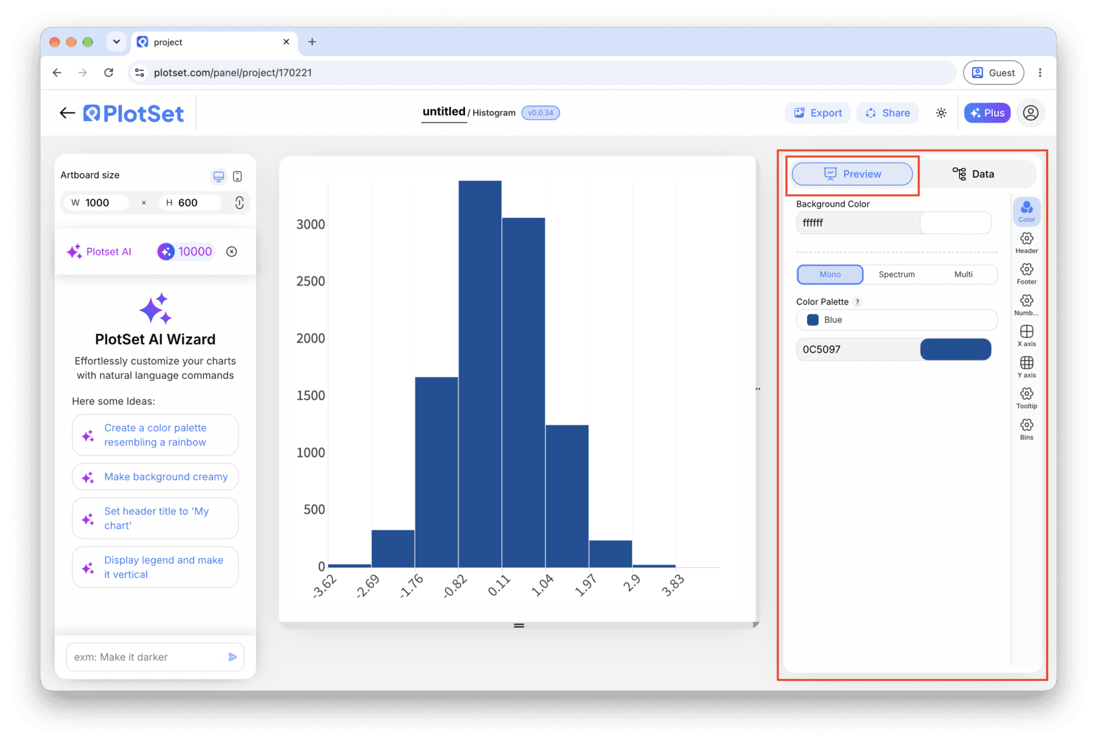
Publish for a live, interactive chart with hover counts on each bin and a shareable link, grab the embed code for a page, or export a PNG, SVG or PDF if you need a static image for a deck.
Starten Sie mit der Histogram-Vorlage samt bereits geladenen Beispieldaten und ersetzen Sie diese durch Ihre eigenen.
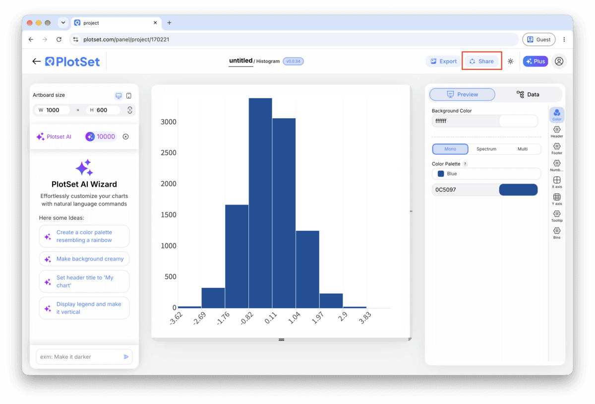
Vorlage öffnenDer letzte Abschnitt ist bei jedem Diagrammtyp gleich: "Share" macht aus dem Diagramm einen öffentlichen Live-Link und einen Einbettungscode, "Export" schreibt es als statische Datei heraus.
Aktivieren Sie den Einbettungscode und den öffentlichen Link, um das Diagramm zu veröffentlichen. Den Link können Sie bedenkenlos an alle weitergeben, und der Einbettungscode fügt sich als iframe in jede Seite ein. Die Tooltips beim Überfahren mit der Maus und die volle Interaktivität bleiben erhalten. Wenn Sie das Diagramm später bearbeiten, überträgt "Recreate" die Änderungen auf Link und Einbettung.

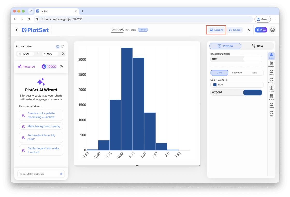
"Export" schreibt eine statische Kopie in der Größe heraus, die Sie brauchen. SVG bleibt in jeder Skalierung scharf und lässt sich weiterhin in einem Design-Tool bearbeiten; PNG und JPG sind die sichere Wahl für Folien und Dokumente. Der Skalierungsfaktor sorgt dafür, dass das Bild auf einem Retina-Display gestochen scharf wirkt.

PlotSet will suggest a bin width based on your data, and it's a reasonable starting point, not a final answer. A width of 5, 10 or 25 is far easier for a reader to interpret than 7.3, even when the automatic number technically fits the data better.
Bar height is the encoding here just as it is on a bar chart, so a truncated frequency axis exaggerates every gap between bins. If two bins look close in height, add count labels rather than zooming the axis in.
Fewer than ten bins and you lose the shape; more than thirty and every bar gets thin enough that the eye can't compare neighbours. If your data needs finer resolution than that to tell its story, a KDE curve, or a second chart split by group, usually serves better.
If the bar heights wobble no matter which width you try, add the smooth density curve instead of fighting the bins. It shows the underlying trend without depending on where an edge happens to fall, and it's one setting away from the plain histogram template.
This almost always means PlotSet is reading your numeric column as text: a stray unit ('12 min'), a thousands comma ('1,200'), or a leading character from a spreadsheet export. Clean the column down to plain numbers and remap it, and the bars should close up into a continuous scale.
Check that row for a data entry mistake before treating it as a real outlier: an extra zero, a unit typo, or a value copied from the wrong column. If it turns out to be genuine, keep it and either widen the bin width or annotate the tail, rather than deleting it to tidy the chart.
That usually means the sheet was already summarized, one row per bracket with a count column, rather than one row per observation. Go back to the raw data: a histogram needs to do its own counting, so feeding it pre-counted brackets produces a chart of your bins, not the data's actual distribution.
Nicht sicher, ob Histogram die richtige Wahl ist? Erfahren Sie, was es ist, wann Sie es verwenden sollten und wann nicht.
One column of raw numbers, one row per observation, with a single header row. PlotSet does its own counting into bins, so don't pre-summarize the data into brackets first. An id or date column next to the numbers is fine; PlotSet just ignores it when it bins the numeric column.
Kostenlos starten mit über 300 Vorlagen. Keine Kreditkarte erforderlich.