Below is a scatterplot of New York City yellow taxi trips from January 2024, fare against distance. It is real data, straight from the city's own records. I cropped the axes to trips of 0 to 20 miles and 0 to 90 dollars, which holds 2,836,835 of the month's 2,964,624 records, or 95.7 percent of them, and keeps the file's nonsense out of the frame: one trip is logged at 312,722 miles, another at minus 899 dollars. Inside that window, nothing has been done to the data but draw a dot for each trip.
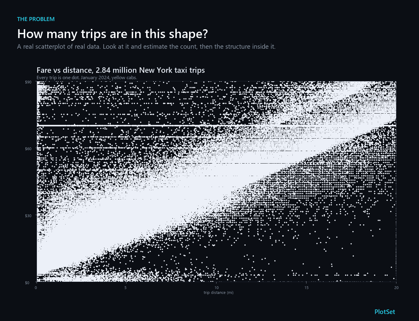
Two questions. How many trips are in that shape? And what is inside it?
You cannot answer either one, and that is not a failing on your part. The chart has 2,836,835 dots on it. I measured what happens to them: on a canvas of 900 by 600 pixels, even if every dot were shrunk to a single pixel, 97.5 percent of those trips land on a pixel that another trip already occupied. They are drawn, and then they are painted over. What you are looking at is roughly seventy thousand distinct pixels standing in for nearly three million records, inside an outline that is mostly the window I cropped to rather than anything the data is doing.
This is overplotting, and it is probably the most common way a working chart fails. It does not announce itself the way a truncated axis does. The chart looks confident. It looks like it contains a great deal of information, which is exactly the problem: it contains a great deal of information and displays almost none of it.
The arithmetic of overplotting
Overplotting has a precise mechanism, and it starts much earlier than most people expect. Hadley Wickham put the general principle plainly in his framework for visualising large data: the limiting factor is not how many observations you have, it is how many pixels the screen has. A monitor offers something like three million of them, total, for everything.
So I measured the collision rate directly on the taxi file, at a series of sample sizes, on the same 900 by 600 canvas.
Read the teal bars as the share of your data that is not separately visible. At 500 points, roughly one trip in six is already sitting on top of another. By 5,000 points it is more than half, which is where this article gets its title. By 100,000 it is 86 percent, and at the full file it is 97.5 percent. The purple bars are the other half of the story: even with all 2.8 million trips drawn, only 13 percent of the plotting area carries any ink, again on the one-pixel assumption. A saturated blob is not a chart that ran out of room. It is a chart that stacked everything into one small corner of the room and left the rest empty.
One caveat on those numbers, because it cuts in the honest direction. That measurement assumes a one-pixel dot, which is the most generous case anyone could construct. Real charting tools do not default to that. In Micallef and colleagues' optimisation study of scatterplot design, the out-of-the-box marker in both R and MATLAB is about six pixels wide and, more damagingly, fully opaque. The blob at the top of this article uses a five-pixel dot, which is why it covers far more than 13 percent of its frame, and a fatter dot is worse on both counts at once: it floods more of the canvas while burying more of the data underneath. Re-run the measurement at five pixels and half the trips are gone by a thousand points, not five thousand.
Why nobody can count a crowd
Suppose the ink were not stacking at all. Could a reader recover the count by eye? The perception literature is blunt about this, and the numbers in the chart below are old and well replicated.
Those are dots on a card, flashed for a tenth of a second, in studies collated by Woodworth and Schlosberg in 1954. Two, three, four dots: essentially everyone is right. Seven dots: 38 percent. Eight dots: 3 percent. The cliff falls between four dots and eight, and by eleven nobody is right.
Past that cliff, people switch to estimating, and estimation is proportional rather than absolute. Adults need roughly an eleven percent difference between two quantities before they get the comparison right even three times in four, the discrimination threshold Halberda and Feigenson put at a Weber fraction of about 0.11. Worse for our purposes, uncalibrated estimates of dense displays run badly low. When Izard and Dehaene flashed dot arrays at people, the display that drew the answer "thirty" actually held between 59 and 82 dots.
Two honest limits belong here. The largest of those experiments used a few hundred dots, not a few million, so none of them measures what your reader does with a scatterplot. And they were deliberately built so that area and density could not stand in for number, which is a control a real scatterplot violates constantly. What this literature gives us is the mechanism, not the measurement: human counting fails somewhere between four and eight items, and past that we fall back on a compressive sense of "a lot" that systematically underreads dense regions. Past a certain crowding, as Anobile and colleagues have shown, people stop judging number at all and start judging texture density. A blob is not a number to a reader. It is a texture.
Which means that if a reader cannot count it, they also cannot notice when it changes.
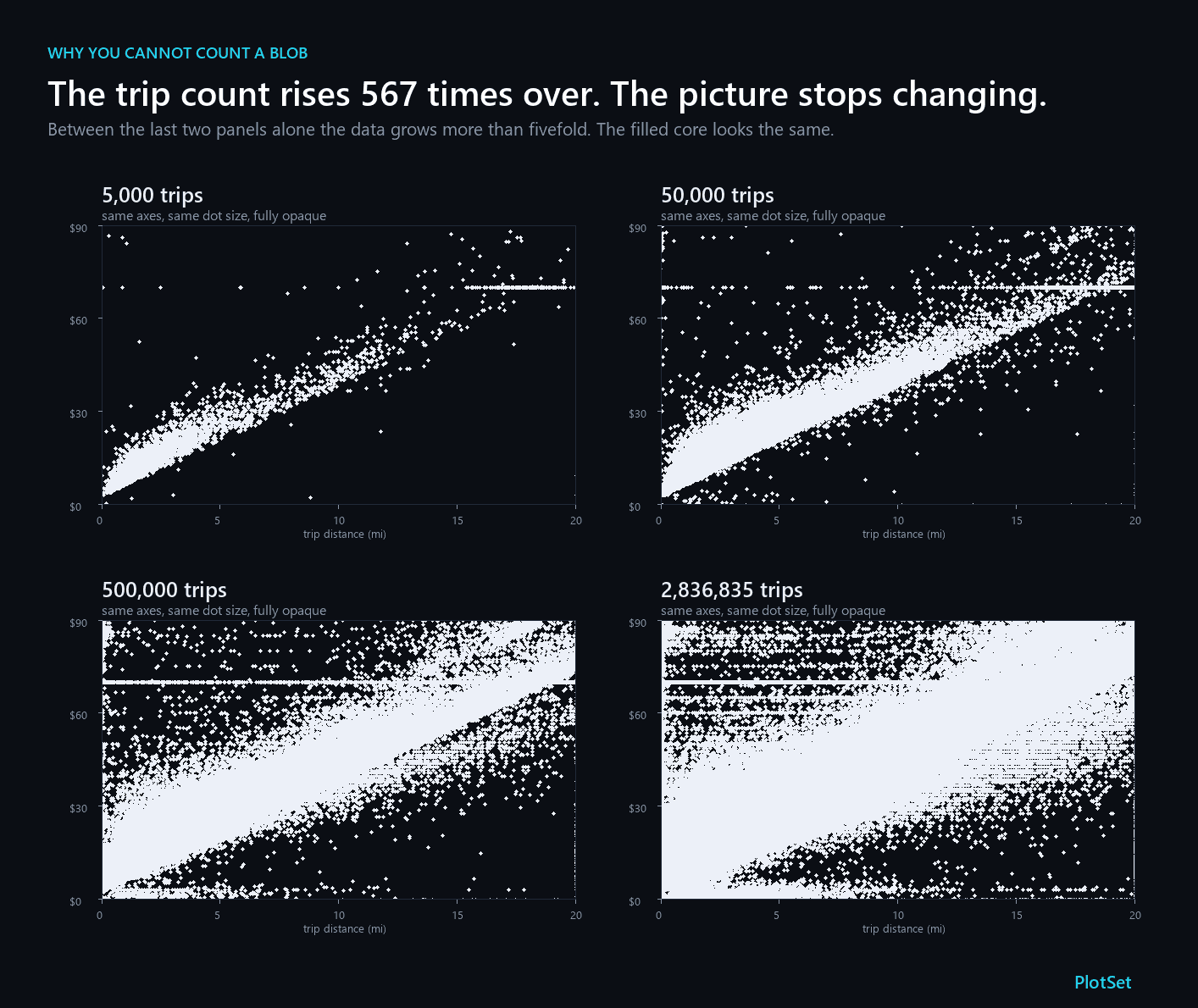
Between the last two panels the data grows more than fivefold and the core barely widens. My own measurement puts the inked area at 6 percent and then 13, so it does spread; what no reader can do is recover that ratio by eye. Nothing in the picture tells you whether you are looking at half a million trips or three million.
What the blob was hiding
Here is the part that should worry anyone who has shipped a chart like this. The first blob was concealing a specific, large, interesting fact, and it was concealing it in plain sight.
Run the identical data through six different renderings and watch what surfaces.
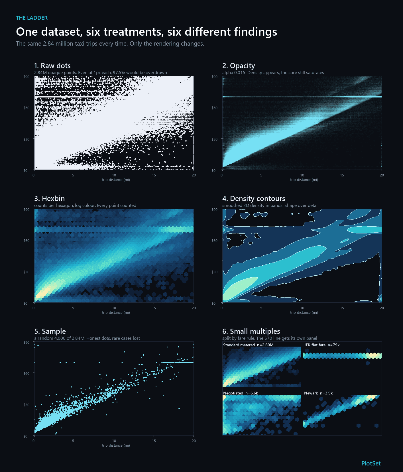
Look at the horizontal stripe that sharpens the moment opacity is turned down, and blazes in the hexbin panel. That is a flat fare. New York charges a fixed price between Manhattan and JFK airport, 70 dollars in January 2024, and 79,786 trips on this chart were billed at exactly that amount, 79,246 of them carrying the airport's own rate code.
Go back to the raw plot and you can just make out that line, but only in the thin upper region where the surround is sparse. Where the mass is dense it is gone, and even where it survives the plot tells you nothing about its weight: from that image you could not say whether the stripe holds eight hundred trips or eighty thousand. Turn the opacity down and it resolves into the single densest structure on the chart.
The other structures are real too. The bright diagonal ridge is ordinary metered fare, which climbs with distance. The hard lower edge of the cloud is the meter's floor, the least a trip of that length can cost, with the spread above it mostly time spent stopped in traffic. And the sixth panel, which splits the data by which fare rule applied, resolves most of it: standard trips make their diagonal, JFK trips make their flat line. About five percent of the trips carry no usable rate code and sit in none of those four frames.
None of that is exotic analysis. It is what the data plainly says. The first chart simply did not say it.
This is the failure that Mayorga and Gleicher named overdraw, and their description of the damage is the one worth memorising: overdraw obscures outliers, hides the distribution, and makes the relationships between subgroups hard to see. Three distinct losses, from one careless default.
The ladder, and how to pick a rung
Each fix is scored on the three things overdraw destroys, and the table arrives sorted by that score. The shape of the decision is in the ordering.
Opacity is the first thing to try, because it costs one parameter and it is the only fix on the list that changes nothing about your data. Turn alpha down until the dense regions stop clipping. Its weakness is that the headroom it buys is exactly one over alpha, and no more. Datashader's guide to these failures puts the arithmetic plainly: at an alpha of 0.1, a pixel reaches full colour once ten points have landed on it, so only the last ten points to be drawn have any effect on what you see. Set alpha low enough to survive the dense core and the sparse regions fade to nothing instead, which is the same problem wearing the opposite coat. The setting also depends on your dot size and your screen, so two alpha-blended charts cannot be compared with each other. Micallef's optimizer is instructive here. As the point count in their test data grew by a factor of 244, the tuned design shrank the marker from 27 pixels to a single pixel while holding opacity in a narrow band. When you have more data, the first thing to give up is dot size, not just ink.
Jitter is for discrete values, and its failure mode is unusually easy to miss, because a discrete axis makes overplotting invisible rather than obvious.
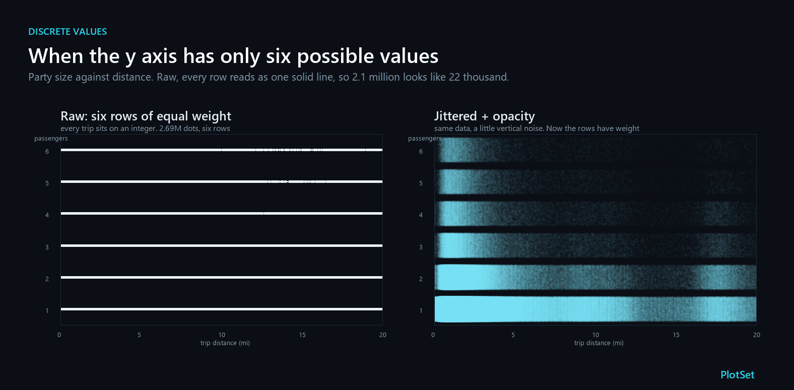
There are 2.1 million single-passenger trips on that chart and 22,000 six-passenger trips. Across the first ten miles both render as the same unbroken line, and only in the sparse tail does the top row start to break up. A nudge of random vertical noise plus a little transparency restores the proportions. Keep the nudge small: base R's default spreads points over about four percent of the data range, while ggplot2, left to itself, uses forty percent of the spacing in each direction and so fills eighty percent of the gap between your categories, which is enough to make neighbouring rows bleed together. The cost is that you have moved every point off its true value, so jitter belongs in exploration and in charts where you admit you have done it.
Hexbin and density contours count instead of drawing. Rather than one mark per record, divide the plane into bins, count what falls in each, and colour by the count, usually on a log scale, because the densest bin can hold thousands of times what a sparse one holds. This is the approach behind the modern rasterising tools, and it is how Datashader handles datasets in the hundreds of millions of records: it aggregates into a pixel grid before it renders anything, so the count of records stops competing with the count of pixels. Hexagons rather than squares because, as Carr set out in his 1990 report on binned data plots, they tile the plane, they are the closest of the tiling shapes to a circle, and their three axes are less prone to forming false lattice patterns than a square grid's two. The price is that a lone odd trip lands in a bin holding exactly one, which sits at the bottom of the colour ramp and reads as empty, which is precisely why Mayorga and Gleicher's technique draws dense regions as contours while continuing to plot isolated outliers as dots.
Sampling is the honest last resort. Four thousand random trips, drawn as plain dots, reproduce the shape of the whole file quite well, and you can still see the flat-fare line. What you lose is the rare event, and the rare event is often the entire reason for the chart.
Small multiples when the groups are the story. If, like the taxi data, your cloud is really several different populations wearing one coat, splitting the frame explains more than any amount of clever shading.
The overplotting rule: assume the chart is hiding something
There is no threshold in the research at which a scatterplot officially fails, because the answer depends on your pixels, your dot size, and how much of your data sits in one place. What there is, is a habit worth adopting: before you publish a scatterplot, ask how many points are on it, and if the answer is more than a few thousand, assume the chart is hiding something until you have proved otherwise. Turn the opacity down and see what appears. Bin it and see if a line or a cluster surfaces that you did not know was there.
The taxi chart hid eighty thousand identical fares in plain sight. Whatever is in yours, it will not tell you unless you ask.
How I measured this
Every number I call my own comes from the same file: the New York City Taxi and Limousine Commission's yellow taxi trip records for January 2024, 2,964,624 rows, downloaded as the published parquet. I kept trips inside a 0 to 20 mile, 0 to 90 dollar window, which leaves 2,836,835 of them, and drew that set onto a 900 by 600 pixel grid, the same grid every figure here uses.
A trip counts as invisible when the pixel its centre falls in already holds another trip's centre. That definition is deliberately order-independent, it is simply one minus the number of distinct occupied pixels over the number of trips, and it is the most forgiving version of the question, since it assumes a dot exactly one pixel across. The separate five-pixel figures simulate a normal marker painted in draw order, so they are not the same estimator and I have kept them labelled apart. Sample sizes below the full file are averaged over twenty random draws, because a single draw at 500 points wanders by several percentage points.
References
- Hadley Wickham. Bin-summarise-smooth: A Framework for Visualising Large Data. 2013. The binding constraint is the number of pixels on screen, not the number of observations.
- IEEE TVCG. Splatterplots: Overcoming Overdraw in Scatter Plots. Mayorga and Gleicher, 19(9):1526-1538, 2013. Names overdraw and its three costs: obscured outliers, hidden distributions, unreadable subgroup relationships.
- IEEE TVCG. Towards Perceptual Optimization of the Visual Design of Scatterplots. Micallef et al., 23(6):1588-1599, 2017. R and MATLAB default to fully opaque markers; scaling to more points shrinks the marker, not just the alpha.
- Pacific Northwest Laboratory. Looking at Large Data Sets Using Binned Data Plots. D. B. Carr, PNL-7301, 1990. Why hexagonal bins: they tile the plane, are closest to a circle, and suppress lattice artefacts.
- JASA. Scatterplot Matrix Techniques for Large N. Carr, Littlefield, Nicholson and Littlefield, 82(398):424-436, 1987. The original hexagonal binning paper.
- Developmental Psychology. Developmental Change in the Acuity of the Approximate Number System. Halberda and Feigenson, 2008. Adult Weber fraction ~0.11.
- Cognition. Calibrating the Mental Number Line. Izard and Dehaene, 2008. Displays of 59-82 dots drew the answer "thirty".
- J. Exp. Psychology: General. Subitizing: An Analysis of Its Component Processes. Mandler and Shebo, 111(1):1-22, 1982.
- Psychological Science. Separate Mechanisms for Perception of Numerosity and Density. Anobile, Cicchini and Burr, 2014. Past a crowding limit, observers judge texture, not number.
- HoloViz. Datashader: Plotting Pitfalls. Alpha buys headroom of exactly 1/alpha: at alpha 0.1 only the last ten points on a pixel affect its colour.
- NYC TLC. Taxi Fare. The $3 initial charge and the Manhattan-JFK flat fare, raised from $52 to $70 under the November 2022 rule.
- NYC TLC. TLC Trip Record Data. The January 2024 yellow taxi records, 2,964,624 rows.
- Holt. Experimental Psychology. Woodworth and Schlosberg, 1954. Enumeration accuracy falls from 100% at three dots to zero at eleven.