Most advice about data storytelling is atmospheric. Find the narrative. Take the reader on a journey. Make it flow. None of it tells you what to actually build on Monday, which is why the same three failures keep shipping: the chart post that dumps a filterable table on a reader who wanted a sentence, the dashboard nobody can summarise, and the expensive interactive that everybody praised and nobody used.
The odd thing is that the structures were catalogued a long time ago. In 2010 Edward Segel and Jeffrey Heer went through 58 published examples of what they called narrative visualization and mapped the design space. The paper is still the reference, and its central idea is a spectrum with two ends and three named shapes in between. Learn the shapes and the choice stops being a mood. It becomes a decision you can defend in a meeting.
Data storytelling has two ends and three shapes
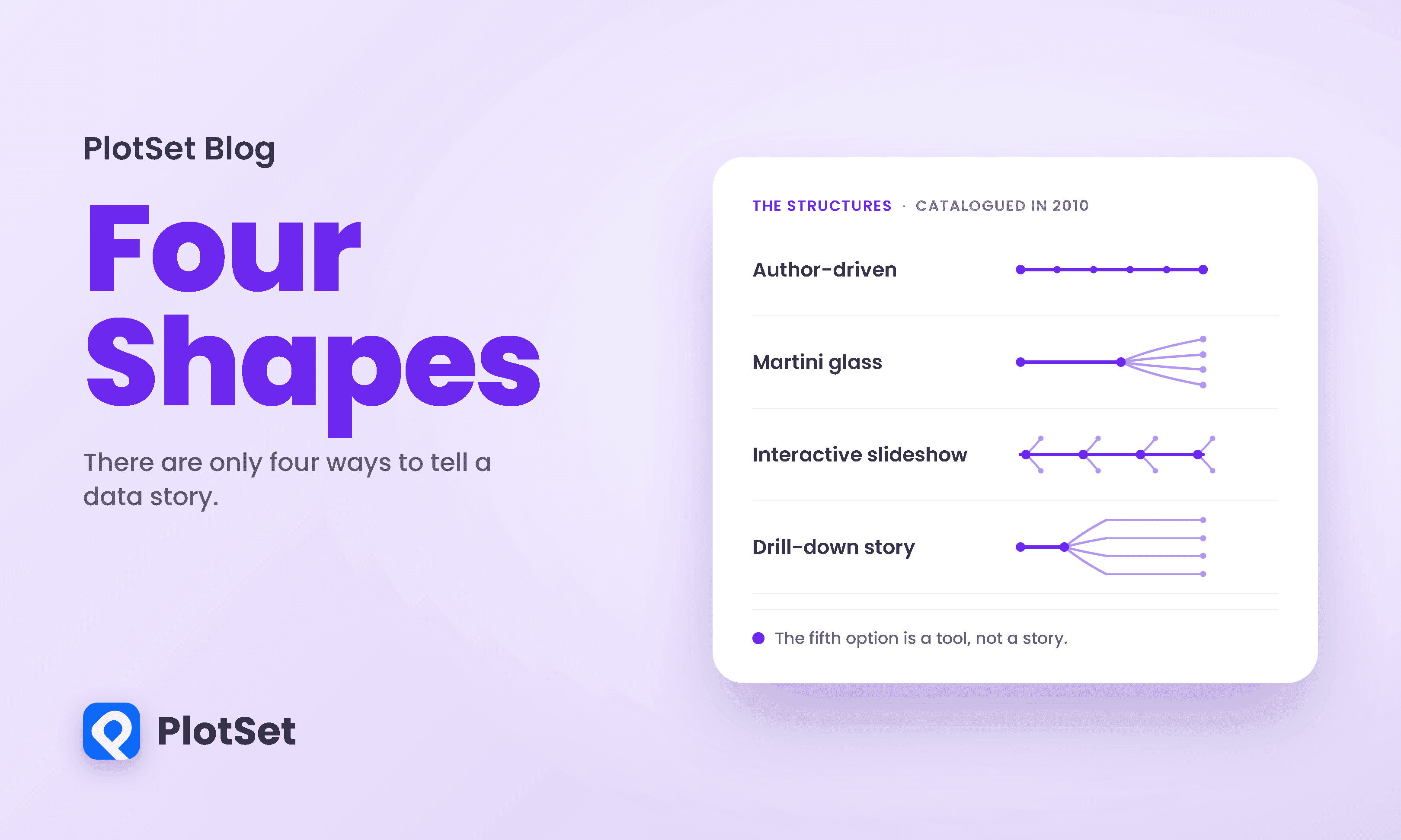
At one end sits the author-driven approach: a single path, a fixed order, no interaction, the author deciding what you see and when. At the other sits the reader-driven approach: everything available, no prescribed order, nothing said. Between them Segel and Heer named three hybrids.
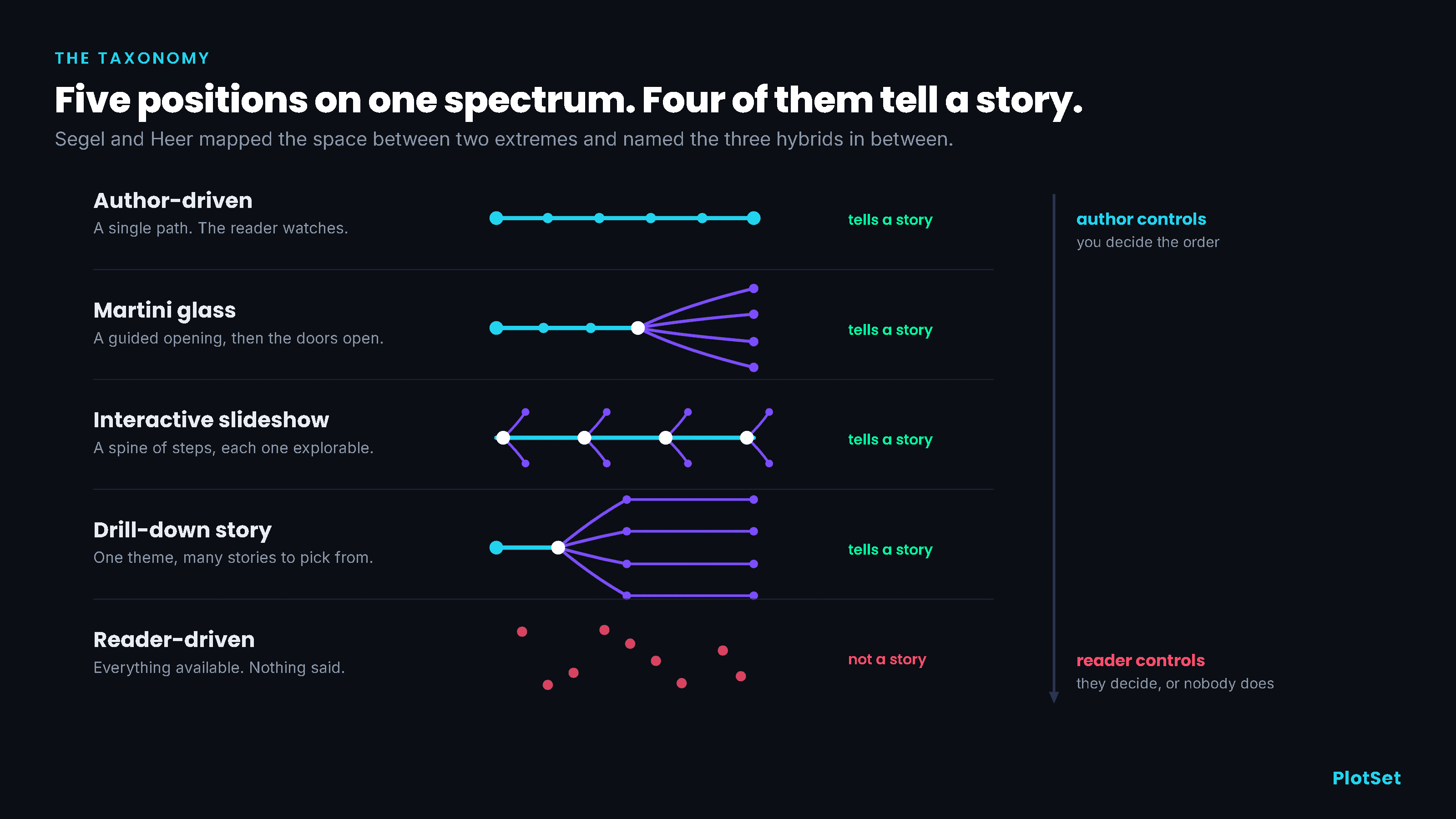
The martini glass follows "a tight narrative path early on (the stem of the glass) and then opening up later for free exploration (the body of the glass)." You say your piece, then you hand over the controls. Segel and Heer note this was the most common structure among the interactive examples they examined.
The interactive slideshow keeps a spine of steps but lets the reader poke around inside each one before advancing. In their words it "allows for interaction mid-narrative, a more balanced mix of author-driven and reader-driven approaches."
The drill-down story "presents a general theme and then allows the user to choose among particular instances of that theme to reveal additional details." One pattern, many instances, the reader picking whose story to read.
That is five positions, and here is where I depart from the paper to make a claim of my own. Four of the five tell a story. Author-driven tells one. The three hybrids tell one and then get out of the way, at different moments and to different degrees. Pure reader-driven does not tell a story at all. It is a tool, and a tool can be a fine thing to build, but if you set out to say something and shipped a filter panel, you did not make a hard structural choice. You avoided one.
Two footnotes for accuracy, because this taxonomy gets garbled in retellings. The martini glass is not Segel and Heer's invention; they borrow it, citing a journalism-training page on narrative structure, which is a nice reminder that reporters worked this out first. And there is no fourth hybrid. If you have seen a version of this list with a structure called a "drop-off," it is not in the paper.
The seven containers, and what they became
Underneath the structures the paper catalogues seven genres, meaning the formats a data story physically arrives in. The table below lists them with what each one has turned into since.
The counts are worth a moment. The paper never prints them as a tally, but its Figure 7 lists all 58 examples one per row, and counting those rows gives the distribution above. The annotated chart alone accounts for 20 of the 58, more than a third, and the three plainest formats between them, annotated chart, partitioned poster and slide show, account for 42. Most of what the field called narrative visualization was a chart with writing on it. Seven in ten of the examples came from online journalism, with business supplying a fifth and research the rest.
Read the list with fifteen years of hindsight and the striking thing is how little has been added. Scrollytelling, the dominant form of the last decade, is a slide show whose advance button is your scroll wheel. The card stack on your phone is a partitioned poster that arrives one panel at a time. The genre list held up; the technology under it changed.
There is also a small, sobering fact buried in the follow-up literature. When a later team went back to check Segel and Heer's 58 examples, twelve of them had already vanished from the URLs given, and six more sat behind a paywall. The most celebrated interactive work in the field has a shorter shelf life than the paper describing it.
What actually happens when readers arrive
Here is where the received wisdom needs auditing, because this field runs on a small number of famous statistics and most of them are misquoted. The table below traces each one back to what was actually measured.
You have probably heard that 85 percent of readers ignore interactive graphics, usually attributed to Archie Tse, then deputy graphics director at the New York Times, whose 2016 talk announced the paper was doing fewer of them. I read the deck. It is 24 slides and it contains no percentages, no analytics, no sample sizes, no measured statistic of any kind. What it contains is a rule, and the rule is good: "If you make the reader click or do anything other than scroll, something spectacular has to happen." That is editorial policy, hard won and worth following. It is not a measurement, and citing it as one does Tse no favours.
The measurement people are reaching for came from a colleague of his, Gregor Aisch, who found that roughly 15 percent of readers clicked a prominent button on a couple of Times graphics published in 2015. Aisch later wrote a piece defending interactive graphics in which he says plainly that this does not mean the other 85 percent ignored the graphic. They saw it. They just did not press the button.
So the honest version of the folk wisdom is narrower and more useful: readers reliably see what is in front of them and unreliably do anything that requires an extra action. Which raises the obvious question about the martini glass. If you lead with a story and then invite exploration, do people actually explore?
Somebody tested it.
Jeremy Boy, Francoise Detienne and Jean-Daniel Fekete ran three field experiments, publishing real visualizations in two versions, one with a narrative introduction and one that dropped readers straight into the explorable view. They put the negative result in the abstract rather than burying it: "augmenting exploratory visualizations with introductory 'stories' does not seem to increase user-engagement in exploration."
The chart above is their CO2 emissions case, measured across 2,975 sessions. The narrative version held people on the page longer, 123.8 seconds against 101.6. But look at the middle row, which is time spent in the exploration section itself. Readers who got the story first spent 54 seconds there. Readers dropped straight into the data spent 108.8, twice as long. One thing to note before that second figure trips you up: these are geometric means over different denominators, since whole-page time averages every session while explore-section time averages only the sessions that got as far as the explore section, which is how a part can outlast its whole here. The guided opening did not prime exploration. It substituted for it. Elsewhere in the same study the authors note that almost nobody used the filters at all.
Some care is needed with that finding. It is one of three cases, and the doubling is specific to that case and that audience; a third case had only 160 sessions and the authors say so themselves. The study reports estimates and confidence intervals rather than significance tests, so there is no p-value to quote. But the direction is uncomfortable and worth sitting with, because it cuts against the structure the field defaults to.
What the evidence changes
None of this says the martini glass is wrong. It says the martini glass is often a compromise dressed as a best practice, and that the exploration half is doing less work than you hope.
The useful reading is that the stem is the product. If people spend their attention on your guided opening and then leave, then the opening had better contain the finding, stated outright, rather than functioning as a trailer for the interactive underneath. Build the glass if the data genuinely rewards wandering. Build it knowing most readers will drink the stem and put the glass down.
It also explains, I think, the two failures in the brief of every data team. Dashboards drift to reader-driven not by decision but by accretion: another filter, another tab, another metric somebody asked for, until the artefact has no author and therefore no point of view. And the disappointing interactive is nearly always a reader-driven build that needed to be author-driven, made by people who mistook giving the reader freedom for giving the reader something.
Meanwhile the thing that does travel is sequence. When Hullman and colleagues coded 42 professional narrative visualizations, the most common way of moving between story states was time: 37 of the 42 used temporal transitions, more than any other transition type they coded. Their categories overlap, so that is not a claim that 37 pieces ran start to finish in date order. And 23 of the 42, more than half, were interactive slideshows. The workhorse of professional data storytelling is a spine of ordered steps, which is exactly the structure that survives contact with a reader who will scroll but will not click.
Choosing on purpose
So the decision reduces to a question about your material, not your ambition.
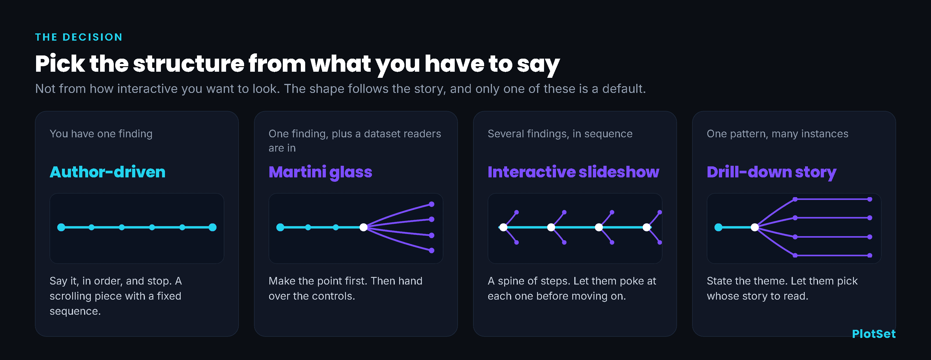
If you have one finding, go author-driven and stop. Most chart posts are this and should admit it. If you have one finding plus a dataset your readers are personally inside, meaning they will want to find their own town or their own year, the martini glass earns its keep, provided you say the thing first. If you have several findings that only make sense in order, the interactive slideshow is the format the professionals actually use. And if you have one pattern with many instances, the drill-down story lets people choose whose version to read without you having to write all of them.
The fifth position remains available and is sometimes correct. An exploratory tool for people who already know what they are looking for is a legitimate thing to build. Just call it a tool, resource it as a tool, and do not expect it to make an argument on your behalf.
That is the whole value of naming these. Not that one shape is better, but that a shape gets chosen either way. The interactive that disappointed everyone was not badly executed. It was structurally undecided, and structurally undecided work reads as reader-driven no matter what was intended, because in the absence of an author the reader is left holding the story.
Pick the shape first. The rest of the design is downstream of it.
References
- IEEE TVCG. Narrative Visualization: Telling Stories with Data. Segel and Heer, 16(6), InfoVis 2010. The 58-example design space, seven genres, the author-driven to reader-driven spectrum, and the three hybrids.
- ACM CHI 2015. Storytelling in Information Visualizations: Does it Engage Users to Explore Data? Boy, Détienne and Fekete. Narrative intros did not increase exploration; in the CO2 case, exploration time fell from 108.8 to 54 seconds.
- Malofiej 2016. Why We Are Doing Fewer Interactives. Archie Tse. The three rules. The deck contains no measured figures.
- vis4.net. In Defense of Interactive Graphics. Gregor Aisch, 2017. The ~15% button-click measurement and his rejection of the "85 percent ignore" claim.
- IEEE TVCG. A Deeper Understanding of Sequence in Narrative Visualization. Hullman et al., InfoVis 2013. Of 42 stories, 23 were interactive slideshows; 37 used temporal transitions.
- Microsoft Research. Emerging and Recurring Data-Driven Storytelling Techniques. Stolper et al., 2016. Forty-five post-2010 stories; twelve of Segel and Heer's examples had gone offline.
- Steve Buttry. The Elements and Structure of Narrative. The journalism source behind the martini glass metaphor.
- IEEE Computer. Storytelling: The Next Step for Visualization. Kosara and Mackinlay, 2013.
- CRC Press. Data-Driven Storytelling. Riche et al., 2018.
- IEEE InfoVis 2007. Animated Transitions in Statistical Data Graphics. Heer and Robertson.
- Distill. Communicating with Interactive Articles. Hohman, Conlen, Heer and Chau, 2020.
- IEEE TVCG. What Do We Talk About When We Talk About Dashboards? Sarikaya et al., 2019. Eighty-three dashboards, fifteen design factors.
- Nieman Lab. The New York Times is cutting back on interactives. March 2016.