
CSV de exemplo
| Phone | Battery | Camera | Performance | Display | Value |
|---|---|---|---|---|---|
| iPhone 15 | 7 | 9 | 9 | 8 | 6 |
| Galaxy S24 | 8 | 8 | 9 | 9 | 7 |
| Pixel 8 | 7 | 9 | 8 | 8 | 8 |
A step by step walkthrough for turning a spreadsheet of scores into a published radar chart in PlotSet, from shaping the sheet to exporting or embedding the finished polygon.
Cerca de 9 minutosBy the end of this guide you will know how to create a radar chart from your own spreadsheet in PlotSet: items plotted as polygons across five or so shared measures, coloured on purpose, and either embedded on a page or exported as an image for a deck. Same click path a real chart takes, just with your items and your scores instead of a demo dataset.
If your scores are already on the same scale, plan on about nine minutes. Add another five if you are still converting raw numbers, dollars, percentages, ratings out of five, into one shared range, since that conversion is the step a radar chart cannot skip and most spreadsheets do not do for you.
Wide format: one row per item, one column per measure. First column holds the item name, every column after it becomes one spoke, and all of those columns need to share the same scale before you upload.
| Phone | Battery | Camera | Performance | Display | Value |
|---|---|---|---|---|---|
| iPhone 15 | 7 | 9 | 9 | 8 | 6 |
| Galaxy S24 | 8 | 8 | 9 | 9 | 7 |
| Pixel 8 | 7 | 9 | 8 | 8 | 8 |
Keep every measure column on the same scale, a score out of ten works well, before you upload. A stray column in dollars or raw units next to scores out of ten will still plot, it just will not mean anything.
The order of the columns becomes the order of the spokes going clockwise from the top. Decide that order in the spreadsheet, since it is easier to fix there than after the chart is styled.
Three items is a practical ceiling for one chart. A fourth overlapping polygon usually makes the chart harder to read, not more informative, so split into small multiples instead.
A blank cell renders as zero on that spoke rather than being skipped, which can make a strong item look weak on one axis. Fill it in or drop the row.
O caminho exato no PlotSet, de um modelo em branco até o gráfico finalizado.
From the PlotSet dashboard, start a new project and choose the Radar Chart template. It loads with sample data already bound to the spokes, so you can see the wide column layout PlotSet expects before you bring in your own file.

Put the item name in the first column and one measure in each column after it, with a short header for each. If your source is a long-format export with an item, measure, value column each, pivot it into this wide shape first, PlotSet's radar template reads columns as spokes, not rows.
Convert every column to the same range, a score out of ten, a percentage, a percentile, before you upload. This is the step that decides whether the finished polygon means anything, and it has to happen in the spreadsheet: PlotSet plots whatever numbers it is given.
Use the data panel to import a CSV or .xlsx file, paste rows directly, or connect a Google Sheet if you want the chart to pick up later edits without a re-upload. PlotSet reads the first row as your spoke labels automatically.

Open the data binding panel and confirm the range extends to your last column. The template's default binding is set for its sample data, and a sheet with more measures than the sample will silently drop the extra columns if you do not widen it.

Confirm the spokes read in the order you intended, since that order came straight from your column order. Then check the radial axis starts at zero: a minimum set above zero shrinks every gap and flatters whichever item scored lowest.
Give each item its own colour and drop the fill opacity so overlapping polygons stay readable. Turn on a label for at least one grid ring so the reader has a value to anchor the shape against, not just an unmarked web of lines.
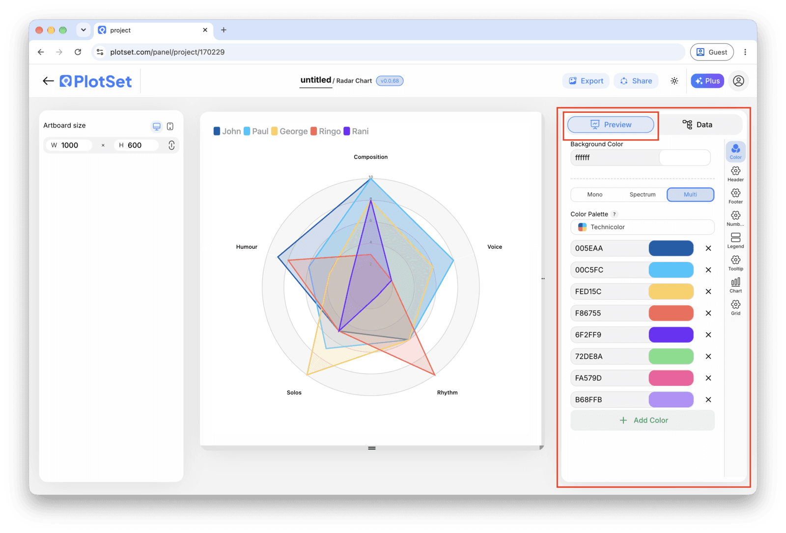
Publish for a live, interactive chart with hover tooltips and a shareable link, grab the embed code to drop it into a page, or export a PNG, SVG or PDF if you need a static image for a report.
Comece pelo modelo de Radar Chart com dados de exemplo já carregados, depois substitua-os pelos seus.
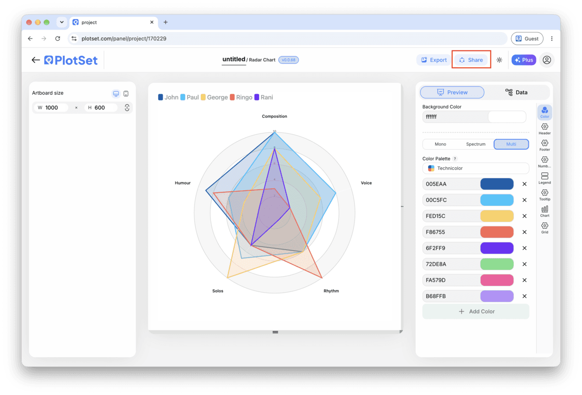
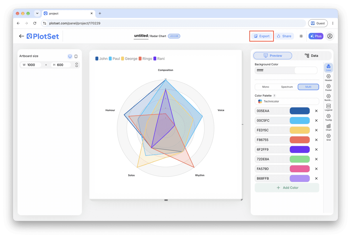
Abrir o modeloA reta final é igual para todo tipo de gráfico: o Share transforma o gráfico em um link público interativo e em um código de incorporação; o Export gera um arquivo estático.
Ativar o código de incorporação e o link público é o que publica o gráfico. O link pode ser enviado com segurança para qualquer pessoa, e o código de incorporação entra em qualquer página como um iframe que mantém a interatividade e os tooltips ao passar o mouse. Edite o gráfico depois e clique em Recreate para levar essas mudanças aos dois.

O Export grava uma cópia estática no tamanho que você precisar. O SVG continua nítido em qualquer escala e ainda pode ser editado em uma ferramenta de design; PNG e JPG são as escolhas seguras para slides e documentos. É o multiplicador de escala que garante uma imagem nítida em uma tela retina.

Two items compare cleanly and three is workable if the colours are distinct. A fourth polygon starts occluding the others no matter how translucent the fill is. Past three, build one small radar per item instead, same axes, same order, side by side.
Group related measures next to each other, cost-type measures on one side and quality-type measures on the other, for instance. The order is doing real work: it decides which parts of the silhouette sit next to each other.
Somewhere around 15 to 25 percent opacity on the fill lets overlapping shapes stay legible, while a solid outline keeps each polygon identifiable even where two fills stack on top of each other.
Spoke names alone tell a reader what is being measured, not how far out is good. Add value labels or ring labels so somebody unfamiliar with your scale can still read the chart correctly.
The column binding stopped short of your last column, so PlotSet never read that measure. Open the data binding panel and widen the range to cover every column in your sheet, then check the chart updates.
Spoke order follows column order in the source sheet exactly, not the order you had in your head. Reorder the columns in your spreadsheet and re-upload rather than trying to fix it after the chart is styled.
Almost always a column that never got normalized, dollars or raw counts sitting next to scores out of ten. Go back to the source sheet, convert that column to the same scale as the rest, and re-upload.
Não tem certeza se o Radar Chart é a escolha certa? Veja o que é, quando usar e quando evitar.
Wide format, with one row per item and one column per measure. The first column holds the item's name, and every column after it becomes one spoke, so a five-measure comparison needs six columns total, all on the same scale.
Grátis para começar com mais de 300 modelos. Sem cartão de crédito.