PlotSet LogoPlotSet

How to Create a Scatter Plot

A step by step walkthrough for plotting two numeric columns from your own spreadsheet in PlotSet, grouping the points by category, and publishing, embedding or exporting the result.

Cerca de 7 minutos

This guide covers how to create a scatter plot in PlotSet from your own numbers, not a demo dataset: two numeric columns bound to X and Y, an optional category column colouring the points into groups, and axes and labels that actually say what the numbers mean. By the end you will have gone through the same click path a published PlotSet chart takes, from a raw spreadsheet to something you can embed or drop into a deck.

Seven minutes covers it when your sheet already has two clean numeric columns, most of that spent on labelling and styling rather than wrestling the data itself. Pulling numbers out of a wider report, or cleaning up a category column for grouping, adds another five to ten.

Os dados que você precisa

One row per record, with two numeric columns for the axes plus an optional label column and an optional category column for colour grouping. Just one header row, no merged cells.

CSV de exemplo
CampaignChannelSpendRevenue
Spring LaunchPaid Search420018900
Summer SalePaid Search610024300
Back to SchoolPaid Social380011200
Holiday PushPaid Social720019800
Retargeting Q1Email12009800
Newsletter PromoEmail9006200
Influencer CollabPaid Social540015100
Display RetargetPaid Search260010400
Anotações

Both axis columns need to be numbers, not text that merely looks numeric. A currency symbol or a thousands separator left in as text will stop the column from binding to an axis, so strip formatting before uploading.

The label column (here, Campaign) is optional but worth keeping: it is what shows up in the tooltip and in any point labels you turn on later, instead of a bare coordinate.

The category column (here, Channel) is optional too. Skip it for a plain single-colour scatter plot, or keep it if you want the points grouped and coloured by that channel, region or segment.

One row per record, not per aggregate. If your source is already a pivot table of averages, decide whether you actually want the underlying rows plotted or a smaller, pre-aggregated table instead.


Os passos

O caminho exato no PlotSet, de um modelo em branco até o gráfico finalizado.

  1. 01

    Open the scatter plot template

    From the PlotSet dashboard, start a new project and choose the Scatter Plot template. It loads as a scatter plot with groups and comes with sample data already bound, so you can see the exact column layout it expects before touching your own file.

    O seletor de modelos do PlotSet: as categorias de gráficos listadas à esquerda, a grade Bar Charts aberta e o card do modelo Bar Chart mostrando o botão Select.
    Todo guia começa aqui. Escolha a categoria e depois o modelo: a grade é a mesma, seja qual for o tipo de gráfico que você quer.
  2. 02

    Shape your sheet into the right columns

    Put your two numeric measures in their own columns, add a label column if you want readable tooltips, and add a category column only if you plan to colour the points by group. Drop any subtotal or average row before uploading.

  3. 03

    Bring in your file or link a sheet

    Import a CSV or .xlsx file from the data panel, paste rows straight from a spreadsheet, or connect a Google Sheet if you want later edits to flow through without a re-upload. PlotSet reads the first row as headers automatically.

    A visualização de dados do editor do PlotSet: uma planilha com as colunas Name, Value e Region preenchidas com números de províncias canadenses, ao lado do painel Data, que oferece envio de CSV, Magic Import e sincronização com o Google Sheet.
    A visualização de dados, aqui em um projeto de gráfico de barras. Envie um CSV, extraia os números de uma imagem com o Magic Import ou sincronize um Google Sheet. O painel é idêntico para todos os tipos de gráfico.
  4. 04

    Map the X and Y columns

    Assign one numeric column to the X axis and the other to Y. PlotSet usually guesses correctly when your headers are clear, but check the mapping manually if your sheet carries extra numeric columns it might have picked the wrong one from.

    O painel Data do PlotSet com os vínculos de colunas em destaque: Label/time apontando para a coluna A, Values para a coluna B e Filter/color para a coluna C, com o botão Auto Binding logo abaixo.
    Os vínculos definem qual coluna vira o rótulo, qual fornece os valores e qual comanda a cor. O Auto Binding tenta adivinhá-los a partir dos seus cabeçalhos, então confira o resultado em vez de dar como certo.
  5. 05

    Turn on grouping by category

    If you included a category column, bind it to colour so each group gets its own shade and its own entry in the legend. Skip this step entirely for a single-series scatter plot: one colour is correct when there is nothing to group.

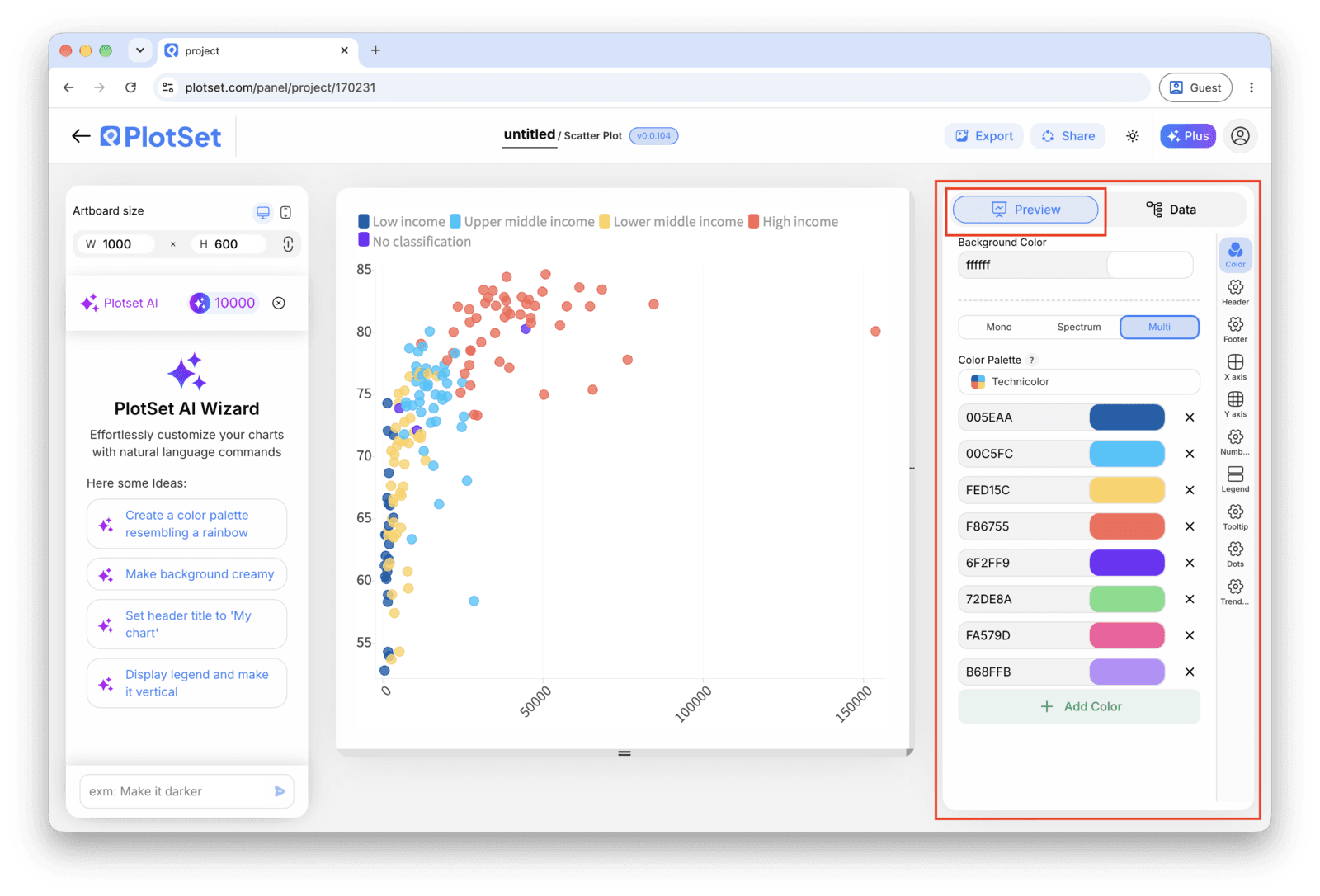
    O editor do PlotSet na aba Preview: um gráfico do tipo Scatter Plot já finalizado na área de edição e, na lateral direita, o painel de configurações contornado em vermelho.
    A aba Preview de um gráfico do tipo Scatter Plot. Todos os controles de estilo ficam no painel contornado em vermelho: aparência, cabeçalho, rodapé e as opções específicas desse tipo de gráfico. Cada grupo fica em sua própria aba.
  6. 06

    Label the axes and the outliers

    Name both axes with real units, not just the column header. Turn on point labels for the handful of records that matter, usually the outliers, and leave the rest to the hover tooltip so the chart does not turn into a wall of text.

  7. 07

    Adjust point size, opacity and the trend line

    Reduce mark size or add transparency if points are stacking into a solid blob. Only turn on the fitted trend line once you have actually looked at the shape of the cloud, since a straight line through a curved or clustered relationship reports a pattern that is not there.

  8. 08

    Publish the chart, or export it as an image

    Publish for a live interactive chart with hover tooltips and a shareable link, copy the embed code to drop it into a page, or export a PNG, SVG or PDF if you need a static image for a deck or report.

Comece pelo modelo de Scatter Plot com dados de exemplo já carregados, depois substitua-os pelos seus.

Abrir o modelo

Publique, incorpore ou exporte

A reta final é igual para todo tipo de gráfico: o Share transforma o gráfico em um link público interativo e em um código de incorporação; o Export gera um arquivo estático.

Share: link público e código de incorporação

Ativar o código de incorporação e o link público é o que publica o gráfico. O link pode ser enviado com segurança para qualquer pessoa, e o código de incorporação entra em qualquer página como um iframe que mantém a interatividade e os tooltips ao passar o mouse. Edite o gráfico depois e clique em Recreate para levar essas mudanças aos dois.

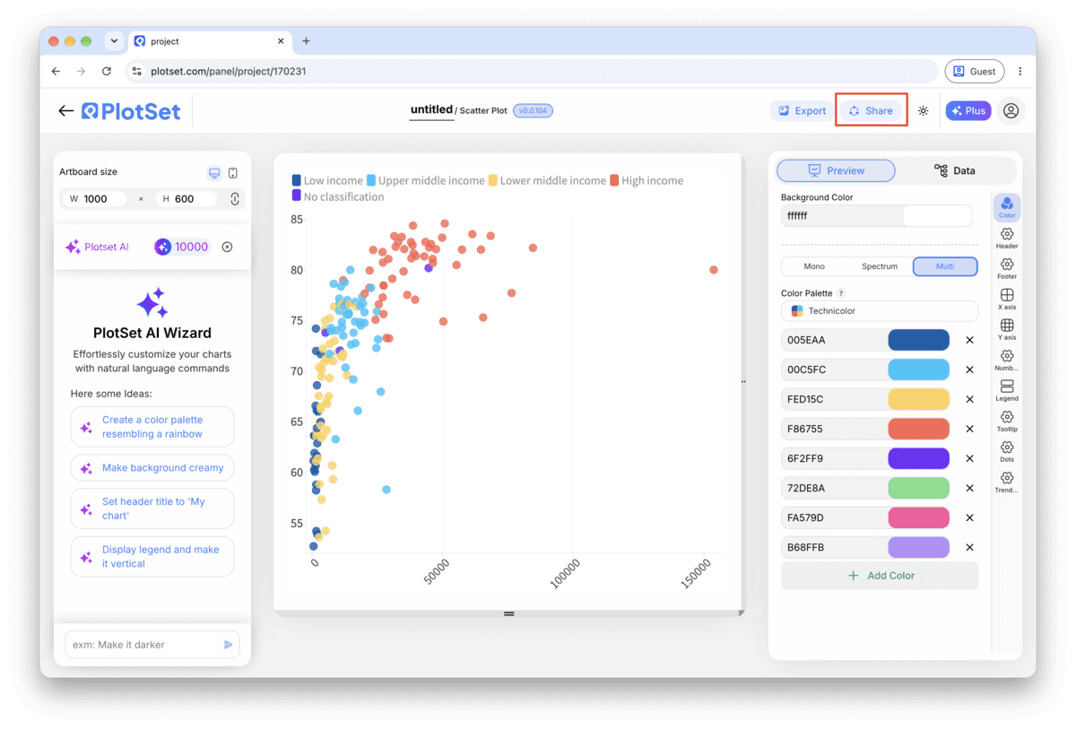
A barra de ferramentas do editor do PlotSet com o botão Share em destaque, ao lado do botão Export.
É pelo Share que um gráfico finalizado vira um link público e um código de incorporação.
A janela Share do PlotSet: a chave que ativa o código de incorporação e o link público, os botões Link, Embed, Facebook, Reddit, Twitter, LinkedIn e Email, e o link público do gráfico com um botão Copy.
Ative o código de incorporação e o link público, depois copie o link ou pegue o iframe. O Recreate leva as edições seguintes a todo mundo que já tem o link.

Export: SVG, PNG ou JPG

O Export grava uma cópia estática no tamanho que você precisar. O SVG continua nítido em qualquer escala e ainda pode ser editado em uma ferramenta de design; PNG e JPG são as escolhas seguras para slides e documentos. É o multiplicador de escala que garante uma imagem nítida em uma tela retina.

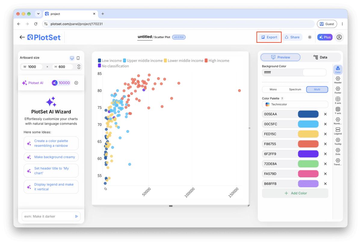
A barra de ferramentas do editor do PlotSet com o botão Export em destaque.
O Export é o caminho para gerar um arquivo estático para um slide ou um relatório.
A janela Export chart do PlotSet: um seletor de escala em 2x, campos de largura e altura definidos como 1000 por 600 e o menu de formatos aberto com SVG, PNG e JPG.
O SVG continua nítido em qualquer tamanho e editável em uma ferramenta de design; PNG e JPG são as escolhas seguras para uma apresentação. Defina a escala antes de exportar para que a imagem fique nítida em uma tela retina.

Dicas de estilo para um Scatter Plot

Cap grouping at six or seven colours

Past that, the legend and the eye both lose track of which shade is which. If your category column has more groups than that, filter to the ones that matter for the story or fall back to a single colour and call out one group with a label instead.

Fight overplotting before you fight the layout

If the cloud reads as one dark shape, the fix is almost never a bigger chart. Drop the mark opacity to around 50 to 70 percent, or shrink the point size, so overlapping records show up as darker patches instead of one flat blob.

Let the axis range reflect the real spread

Do not zoom the axis in to make a weak relationship look tighter. Start from the full range of your data and only narrow it if you are explicitly calling out a subset, with a caption saying so.

Label outliers by hand, not by category

The point worth a label is usually the one that breaks the pattern, not every point in a given group. Turn on manual point labels and pick the two or three records that carry the story, leaving the rest to the tooltip.

Erros comuns ao fazer um Scatter Plot

Every point comes out the same colour despite mapping a category

This usually means the category column was read as a number rather than text, so PlotSet tried to bind it to size or a colour scale instead of discrete groups. Check the column type in the data panel and force it to text if a category name looks like a code or an ID.

The chart is a solid blob with no visible pattern

This is overplotting: too many points landing on top of each other at the resolution you are viewing. Lower the mark opacity, shrink the point size, or filter to a date range or subset before assuming the two variables have no relationship at all.

The trend line does not match what the cloud actually looks like

A linear trend line forces a straight line through data that might be curved, clustered into two groups, or dominated by one outlier. Turn the trend line off, look at the raw shape of the points, and only re-enable it if a straight line is genuinely the right summary.

Saiba mais sobre o Scatter Plot

Não tem certeza se o Scatter Plot é a escolha certa? Veja o que é, quando usar e quando evitar.

Sobre o Scatter Plot

Scatter Plot: perguntas frequentes

Two numeric columns, one per axis, with one header row. A label column and a category column are optional additions that drive the tooltip text and the colour grouping. CSV and .xlsx both work, and a pasted range from any spreadsheet tool is fine too.

Crie seu Scatter Plot agora

Grátis para começar com mais de 300 modelos. Sem cartão de crédito.