
CSV de exemplo
| Quarter | Hardware | Software | Services |
|---|---|---|---|
| Q1 2024 | 42000 | 68000 | 21000 |
| Q2 2024 | 45500 | 71000 | 23500 |
| Q3 2024 | 51000 | 76500 | 26000 |
| Q4 2024 | 58500 | 84000 | 29500 |
A step by step walkthrough for turning a spreadsheet with two to four series into a published grouped column chart in PlotSet, from shaping the sheet to exporting or embedding it.
Cerca de 8 minutosHere's how to create a grouped column chart in PlotSet, starting from a spreadsheet with one row per category and one column per series, and ending with something you can embed or export. You will upload something like quarterly revenue split by product line or headcount split by department, confirm PlotSet mapped every series column, then fix the group order and colors before publishing.
If your sheet is already wide (one category column, then a column per series), this takes about eight minutes. Add five more if you are reshaping a long format export first: pivoting a date/series/value table into one row per period, or renaming headers so the legend reads cleanly.
Wide format, one row per category and one column per series. The category (quarter, region, channel) goes first; every column after it is a series, and its header becomes the legend label.
| Quarter | Hardware | Software | Services |
|---|---|---|---|
| Q1 2024 | 42000 | 68000 | 21000 |
| Q2 2024 | 45500 | 71000 | 23500 |
| Q3 2024 | 51000 | 76500 | 26000 |
| Q4 2024 | 58500 | 84000 | 29500 |
This is wide format, not long format. If your export instead has three columns (period, series name, value) with one row per combination, pivot it in your spreadsheet tool first so each series gets its own column.
The header of each series column becomes its legend label and its name in the hover tooltip, so write it the way you want readers to see it: "Software" not "software_rev".
Two series is comfortable and four is about the ceiling before columns get too thin to read. A fifth series is usually a sign the data wants a small multiple instead.
A blank cell in a series column renders as a missing column in that group, not zero. Decide on purpose whether a gap should read as zero or as no data, and fill or leave it accordingly.
O caminho exato no PlotSet, de um modelo em branco até o gráfico finalizado.
From the PlotSet dashboard, start a new project and choose the Grouped Column Chart template. It loads with sample data already bound, so you can see exactly how the first column becomes the category axis and the rest become series before you touch your own file.

Put the category in the first column and one series per remaining column, with the series name as the header. If your source is a long format export with a series column and a value column, pivot it in your spreadsheet first: this chart needs series side by side, not stacked as rows.
Use the data panel to import a CSV or .xlsx file, paste rows directly from a spreadsheet, or connect a Google Sheet if you want the chart to refresh when the source changes. PlotSet reads the first row as headers automatically.

The category slot takes the first column; the value slot takes a range, not a single column, for example B through D for three series. If a series is missing from the chart, this range is the first place to check, it is the most common reason a column just does not show up.

Sort chronologically if your categories are periods, or by whatever series matters most otherwise. Alphabetical order is rarely the right read for a grouped column chart, and PlotSet will not reorder categories for you once they are mapped.
The space between categories needs to look clearly wider than the space between columns inside one category, or the groups stop reading as groups. If every column looks evenly spaced, open the layout settings and widen the group gap.
Assign one color per series and keep that assignment if you reuse the same series elsewhere in your report. Turn on value labels if the exact numbers matter more than the shape, and keep the value axis starting at zero either way.
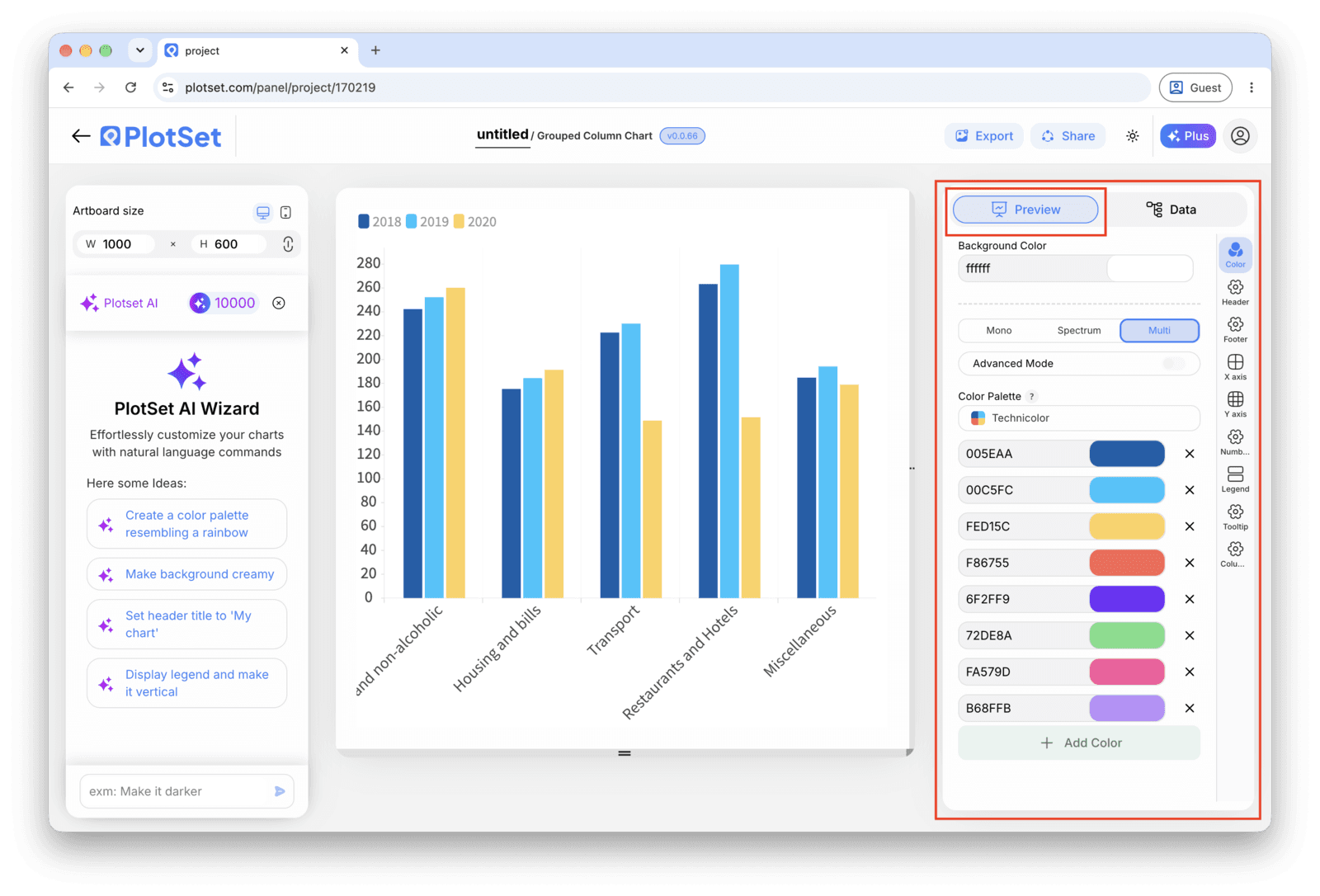
Publish for a live, interactive chart with hover tooltips and a shareable link, grab the embed code to drop it into a page, or export a PNG, SVG or PDF if you need a static image for a deck or a report.
Comece pelo modelo de Grouped Column Chart com dados de exemplo já carregados, depois substitua-os pelos seus.
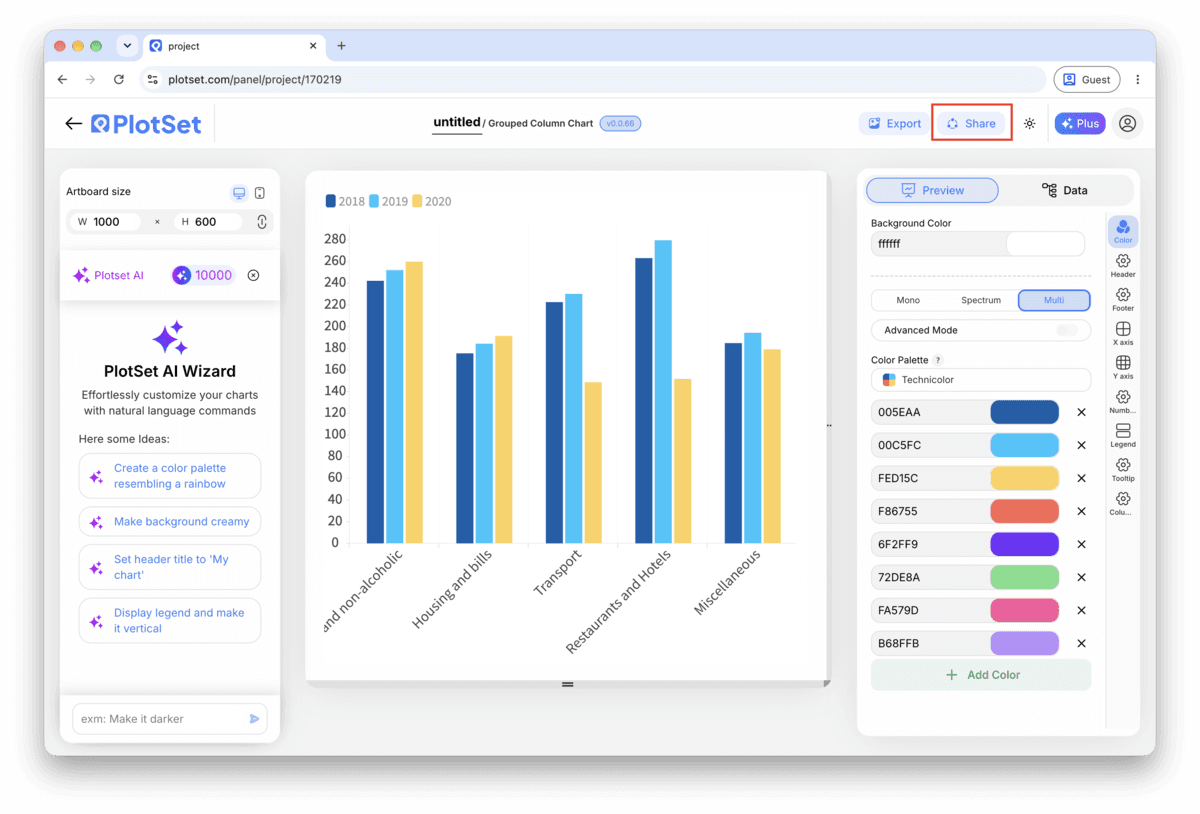
Abrir o modeloA reta final é igual para todo tipo de gráfico: o Share transforma o gráfico em um link público interativo e em um código de incorporação; o Export gera um arquivo estático.
Ativar o código de incorporação e o link público é o que publica o gráfico. O link pode ser enviado com segurança para qualquer pessoa, e o código de incorporação entra em qualquer página como um iframe que mantém a interatividade e os tooltips ao passar o mouse. Edite o gráfico depois e clique em Recreate para levar essas mudanças aos dois.

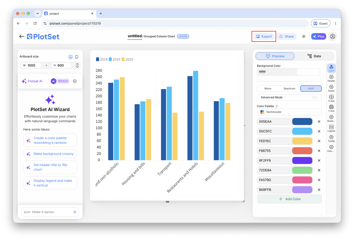
O Export grava uma cópia estática no tamanho que você precisar. O SVG continua nítido em qualquer escala e ainda pode ser editado em uma ferramenta de design; PNG e JPG são as escolhas seguras para slides e documentos. É o multiplicador de escala que garante uma imagem nítida em uma tela retina.

Two series is the easy case and three is fine. At four, columns are already narrow; a fifth pushes each group into a picket fence nobody can compare accurately. Split into small multiples (one panel per series, shared axis) instead of adding a fifth color.
If "Software" is teal in Q1, keep it teal in every quarter and in every other chart in the same report. Readers learn the color once and reuse that memory; changing it mid-report forces them to check the legend every time.
Time periods sort chronologically. Anything else (regions, channels, products) should sort by the series that matters most for the story, largest to smallest, not alphabetically. Alphabetical order is a default, not a decision.
Column height is the encoding here, the same as a single-series column chart. A truncated axis exaggerates every gap between series, which matters more in a grouped chart because readers are already comparing several bars against each other at once.
This almost always means the value binding is a single column instead of a range. Open the data mapping, check that the range covers every series column (B through D for three series, not just B), and re-check after adding a new series later.
The group gap and the column gap are set to roughly the same width, so the eye cannot tell where one category ends and the next begins. Widen the group gap in the layout settings until there is a clear visual break between categories.
This happens when column order in the source sheet does not match between an old upload and a new one, so PlotSet assigns colors by position rather than by the header you expect. Re-check the column order in your spreadsheet matches the series legend, then reassign colors if needed.
Não tem certeza se o Grouped Column Chart é a escolha certa? Veja o que é, quando usar e quando evitar.
Same data, different orientation. Grouped columns stand vertically and suit short category labels or a time axis; grouped bars lie horizontally and suit long category names or many categories. Build the sheet the same way for either one.
Grátis para começar com mais de 300 modelos. Sem cartão de crédito.