
Shade each region
Colour intensity carries the value. The right choice for rates, shares and per-capita figures, which are already adjusted for how big or populous a region is.
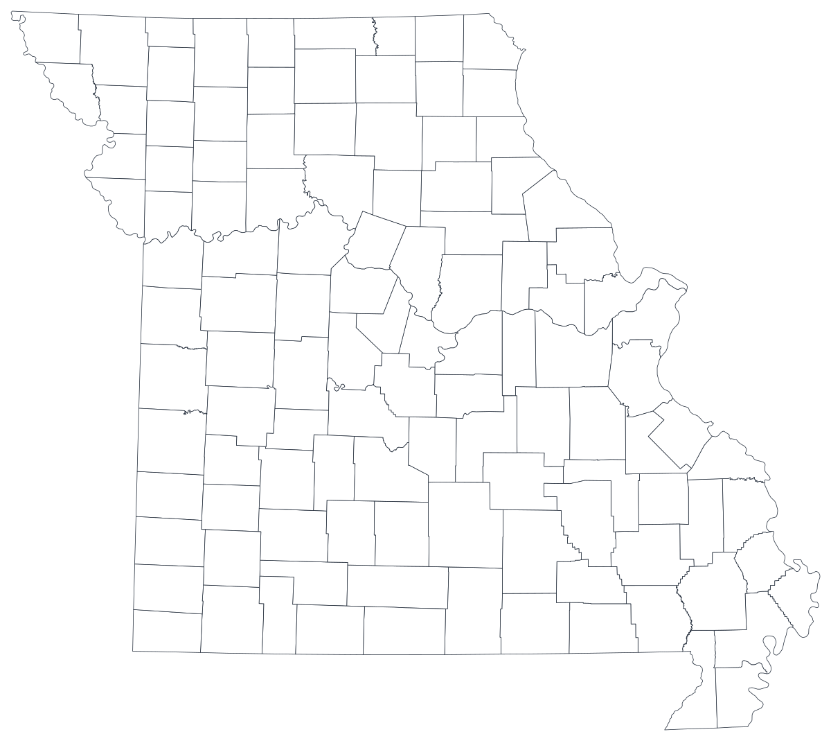
Open the templateA blank Missouri county map to print, and a builder to fill it with your own data. Download the free outline of all 114 counties, or upload a spreadsheet and publish an interactive Missouri map you can embed anywhere.
All 114 counties, as a clean outline. Print it, colour it in, or drop it into a document — no account and no attribution required.
Free for any use, including commercial and classroom. Generated from the same boundaries the builder uses.
Download SVGMissouri divides into 114 counties plus the independent City of St. Louis, which sits outside any county and is the single most common thing to get wrong on a map of the state. The counties themselves are numerous and mostly small, which makes Missouri unusually good to map: the two metros at opposite corners, the university counties, the Ozark interior and the Bootheel in the far south-east all separate cleanly at county resolution, and none of them is visible in a statewide figure. Almost everything the state publishes — labour statistics, health indicators, school data, election returns — is released by county, so the join is usually already done for you.
Shade the regions when your number is a rate, size a marker when it is a count. Getting this backwards is the most common way a data map misleads.
Colour intensity carries the value. The right choice for rates, shares and per-capita figures, which are already adjusted for how big or populous a region is.
Open the templateOne symbol on each region, scaled by value. Use it for counts and totals, where shading the land area would just redraw the population map.
Open the templateCircles sized by value, sitting over the outline. Reads well when a few regions dominate and small ones would otherwise disappear into a shade.
Open the templateDHSS health indicators, MERIC labour figures, DESE school data and Secretary of State election returns are all published by county.
Unemployment rate, uninsured share, share of votes, median household income. Rates are already adjusted for population, which is what shading a region needs.
Missouri's clearest patterns run between the St. Louis and Kansas City metros and the rural interior. A county map makes that divide something a reader can see rather than a claim they have to accept.
Classroom exercises, territory planning, colour-by-hand sessions. The free outline above prints cleanly at any size.
Shade by a raw count and the two metro corners win every time. Anything that grows simply because more people live there should be a sized symbol, not a shade.
Kansas City spreads across Jackson, Clay, Platte and Cass counties and over the state line into Kansas; St. Louis spreads across several counties and into Illinois. Metro-level numbers do not belong on a county map of one state.
A map with ninety grey shapes and twenty coloured ones is a worse bar chart. If coverage is patchy, rank the counties you do have.
If the point is how Missouri sits against its eight neighbours, use the US county map so the reader can see across the border.
From a spreadsheet to a published map, step by step.
The free outline above is a plain SVG of all 114 counties — print it, or drop it into a document. To build with data, open the PlotSet Missouri (counties) template, which comes with sample data already bound.
One row per county: the five-digit FIPS code or the county name in the first column, your number in the second. Missouri FIPS codes all begin 29.
The independent city is not drawn as a separate shape on this map. Either fold its figure into St. Louis County and say so in the caption, or leave it out and say that instead — but decide before you publish, not after someone asks.
Import a CSV or Excel file, paste from a spreadsheet, or connect a Google Sheet so the map can be refreshed when the source updates.
Shade the counties for a rate, or switch to symbols or bubbles for a count. Sequential colour for a low-to-high measure, diverging only when a real midpoint exists — the state average, zero change, a 50 per cent line.
Publish for a live interactive map with a tooltip on every county, or export a PNG, SVG or PDF for a report or a deck.
Start from the Missouri template with sample data already loaded, then swap in your own.
Open the templateWhat the place column has to look like, and where to find data that already matches.
It is an independent city, FIPS 29510, separate from St. Louis County (29189). The template draws the 114 counties and does not carry a shape for the city, so a row keyed 29510 will not find anywhere to land.
Sainte Genevieve, not Ste. Genevieve — and Saint Charles, Saint Clair, Saint Francois and Saint Louis rather than the St. forms most tables use. A name join drops every one of them silently; FIPS does not.
29001 is Adair, 29229 is Wright. Store the column as text so the codes keep their shape, and remember the county part is odd-numbered rather than sequential.
The Missouri Department of Health and Senior Services, MERIC, the Department of Elementary and Secondary Education, the Secretary of State and the Missouri Census Data Center all publish county tables, as does the Census Bureau's ACS.
They are separate jurisdictions with separate statistics, and quietly adding them together changes rates for around a million people. If you merge them, put it in the caption.
It produces a population map with two bright corners every time. Use a sized symbol for counts and keep shading for rates and shares.
Sainte Genevieve, Saint Charles, Saint Clair, Saint Francois and Saint Louis all fail against abbreviated tables, and a mismatch leaves a blank county rather than an error. Join on FIPS where you can.
A sequence of hues has no natural order, so readers cannot tell high from low without checking the legend on every county. Use one hue, light to dark.
Yes. The outline above is a free SVG of all 114 Missouri counties — right-click to save it, print it, or drop it into a worksheet or document. No account needed.
Upload a spreadsheet and publish an interactive map in a couple of minutes — free, no credit card.