PlotSet LogoPlotSet

How to Create a Population Pyramid

A step by step walkthrough for turning an age and sex breakdown into a published population pyramid in PlotSet, from shaping the sheet to exporting the finished chart.

About 9 minutes

Your own age and sex breakdown, not the sample data the template ships with, is the input for how to create a population pyramid in PlotSet. You will upload your sheet, get the bands running in the right order with male and female mirrored around a shared centre line, and publish it as a live embed or export it as an image for a report.

If your data already comes as one row per age band with a count for each side, this takes about eight or nine minutes. Add a few more if you are pulling the numbers out of a census table or a statistics office spreadsheet that has extra rows and columns you do not need. The steps below assume a single point in time; if you want the shape to change year by year, that is a separate animated build.

The data you need

One row per age band, three columns: the band label first, then one value column for each side. No merged cells, no totals row, one header row.

Sample CSV
Age GroupMaleFemale
0-423202210
5-924102290
10-1424802350
15-1925102390
20-2423902330
25-2922802260
30-3423402350
35-3925602610
40-4427902850
45-4930203110
50-5429403080
55-5926802900
60-6424102710
65-6921502540
70-7417802280
75-7912201780
80+9801890
Notes

Keep the age band column as text labels like "0-4" or "80+", not a number range or a date. If a spreadsheet auto-converts "0-4" into a date, PlotSet will read the converted value instead of the band you meant.

Both value columns should hold plain positive counts. Do not pre-negate one side to make it point left; PlotSet mirrors the second column itself, and a negative input just gets mirrored again.

Keep every band the same width. Mixing five-year bands with a wider "80+" bucket is fine at the very top of the pyramid, but a mix of five-year and ten-year bands anywhere else in the middle will distort the silhouette.

If you are working from percentages of the total population instead of raw counts, that is fine too: keep the same three-column shape and just say in the chart title that the axis is a share, not a headcount.


The steps

The exact click path in PlotSet, from a blank template to a finished chart.

  1. 01

    Open the Population Pyramid template

    From the PlotSet dashboard, start a new project and choose the Population Pyramid template. It loads with sample age and sex data already bound, so you can see the exact band, left value, right value layout before you touch your own file.

    PlotSet's template picker: chart categories listed down the left, the Bar Charts grid open, and the Bar Chart template card showing its Select button.
    Every guide starts here. Pick the category, then the template: it is the same grid whichever chart type you are after.
  2. 02

    Lay out the age band, male and female columns

    Put the age band in the first column, one side's count in the second, and the other side's count in the third, one row per band. Pull this straight out of a census table or statistics office export if that is your source, and drop any rows for totals or age groups you are not covering.

  3. 03

    Upload your file or connect a sheet

    Use the data panel to import a CSV or .xlsx file, paste rows directly from a spreadsheet, or connect a Google Sheet so the pyramid can be refreshed when a new year's figures come out without a full re-upload.

    The PlotSet editor's data view: a spreadsheet grid with Name, Value and Region columns filled with Canadian province figures, beside the Data panel offering CSV upload, Magic Import and Google Sheet sync.
    The data view, shown here on a bar chart project. Upload a CSV, lift the numbers out of an image with Magic Import, or sync a Google Sheet. The panel is identical for every chart type.
  4. 04

    Map the band and the two side columns

    Confirm which column is the shared age axis and which two columns feed the left and right sides. PlotSet usually guesses right when your headers say "Male" and "Female" or similar, but check it manually if your sheet has extra columns it might have picked up by mistake.

    The PlotSet data panel with the column bindings highlighted: Label/time mapped to column A, Values to column B and Filter/color to column C, with the Auto Binding button below.
    Bindings decide which column becomes the label, which supplies the values and which drives the colour. Auto Binding guesses them from your headers, so check it rather than assume it.
  5. 05

    Check the band order and the side assignment

    The bands should run from youngest at the bottom to oldest at the top; if your source data listed them the other way, or alphabetically, fix the sort in the chart settings rather than re-sorting the spreadsheet. Confirm which column landed on the left and which on the right, since convention puts male on the left and female on the right, and swapping them without saying so will confuse anyone who knows the form.

  6. 06

    Choose counts or percentages, and set the axis

    Decide whether the value axis shows raw counts or each band's share of the total population, then set that axis maximum manually so it is identical on both sides. An automatic axis can pick a slightly different scale for each side and make a symmetric population look lopsided.

  7. 07

    Style the bars and label the centre axis

    Pick one colour per side, something distinguishable that is not the pink-and-blue default, and turn on a light gridline at every second or third band if you have more than fifteen rows, so the eye has something to track across from left to right. Add a chart title that states what the pyramid is showing, counts or percentages, and for what year.

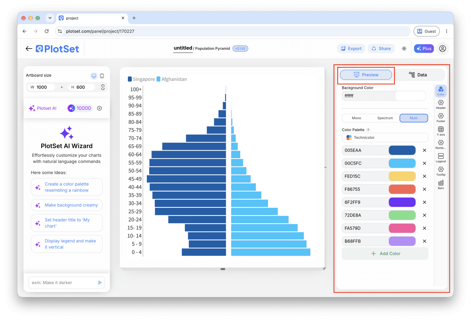
    The PlotSet editor on the Preview tab: a finished Population Pyramid on the canvas, with the settings panel outlined in red down the right-hand side.
    The Preview tab for a Population Pyramid. Every styling control lives in the outlined panel, each on its own tab: appearance, header, footer and the options specific to this chart type.
  8. 08

    Publish, embed or export the finished pyramid

    Publish for a live, interactive chart where hovering a band shows both values, grab the embed code to drop it into a page, or export a PNG, SVG or PDF if you need a static image for a report or a slide deck.

Start from the Population Pyramid template with sample data already loaded, then swap in your own.

Open the template

Publish, embed or export it

The last stretch is the same for every chart type: Share turns the chart into a live public link and an embed code, Export writes it out as a static file.

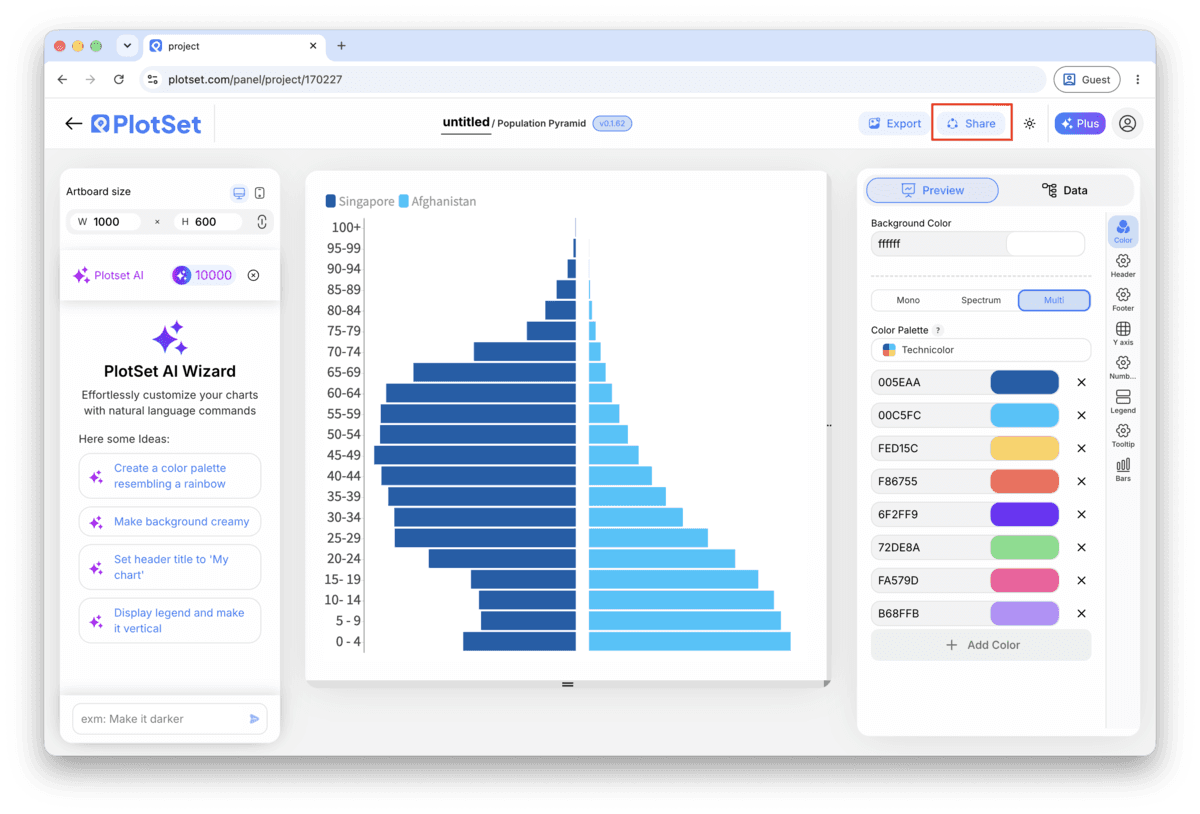
Share: public link and embed code

Activating the embed code and public link publishes the chart. The link is safe to send to anyone, and the embed code drops into any page as an iframe that keeps the hover tooltips and the interactivity. Edit the chart later and hit Recreate to push those changes out to both.

The PlotSet editor toolbar with the Share button highlighted, sitting next to the Export button.
Share is how a finished chart becomes a public link and an embed code.
PlotSet's Share dialog: the toggle activating the embed code and public link, buttons for Link, Embed, Facebook, Reddit, Twitter, LinkedIn and Email, and the public chart link with a Copy button.
Switch on the embed code and public link, then copy the link or take the iframe. Recreate pushes later edits out to everyone already holding it.

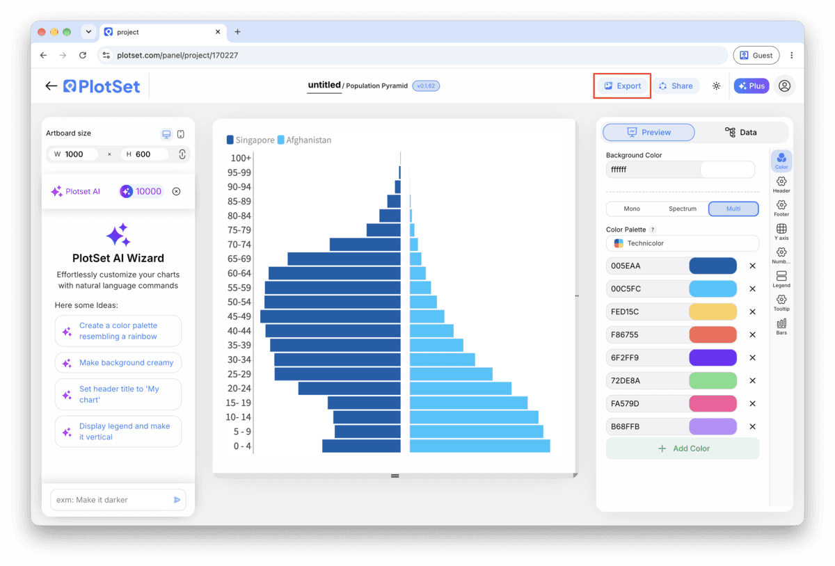
Export: SVG, PNG or JPG

Export writes a static copy at whatever size you need. SVG stays sharp at any scale and can still be edited in a design tool; PNG and JPG are the safe choices for slides and documents. The scale multiplier is what gets you a crisp image on a retina screen.

The PlotSet editor toolbar with the Export button highlighted.
Export is the route to a static file for a slide or a report.
PlotSet's Export chart dialog: a 2x scale selector, width and height fields set to 1000 by 600, and the open format menu listing SVG, PNG and JPG.
SVG stays sharp at any size and stays editable in a design tool; PNG and JPG are the safe picks for a deck. Set the scale before you export so the image is crisp on a retina screen.

Styling tips for a Population Pyramid

Lock the band order before you style anything

If the age band column is read as text, PlotSet may default to sorting it alphabetically, which puts "5-9" ahead of "10-14". Set a manual or numeric sort on the band column first, then move on to colour and labels, so you are not restyling a chart that reorders itself underneath you.

Set one axis maximum, not two

Find the larger of your two biggest band values, round it up, and enter that as the fixed maximum for both sides in the axis settings. Typing two separate numbers, even close ones, is the most common way a symmetric pyramid ends up looking tilted.

Thin out labels once you pass fifteen bands

Value labels on every single band get cramped once you are past about fifteen rows, particularly with five-year bands running from 0 to 80+. Switch to labelling every second band, or rely on the hover tooltip in the published version and skip permanent labels altogether.

Add a total population note if you're using percentages

A percentage axis is the right call for comparing two populations, but on its own it hides how big either one actually is. Add a subtitle or caption with the total headcount each side represents, so the shape and the scale of it are both on the page.

Common mistakes when making a Population Pyramid

Both sides come out on the same side of the centre line

This is a column mapping problem, not a data problem: the second value column got assigned to the same side as the first instead of the mirrored side. Reopen the column mapping step and confirm one value column feeds the left series and the other feeds the right.

The bands run in the wrong order, or out of sequence

If "10-14" appears before "5-9", the band column is being sorted as text rather than by age. Switch the sort on that column to manual or numeric order in the chart settings instead of trying to fix it by renaming the bands in your spreadsheet.

One side looks mirrored twice, or the bars point the wrong way

This happens when a value column was pre-negated in the spreadsheet on the assumption that a pyramid needs negative numbers to point left. PlotSet already mirrors the second series for you, so feed it plain positive counts and let the chart handle the direction.

Learn more about the Population Pyramid

Not sure the Population Pyramid is the right choice? See what it is, when to use it and when not to.

About the Population Pyramid

Population Pyramid: common questions

Three columns and one header row: the age band in the first column, then one count column for each side, usually male and female. Keep counts as plain positive numbers; PlotSet mirrors the second column automatically, so you should not pre-negate anything.

Make your Population Pyramid now

Free to start with 300+ templates. No credit card required.