There are two confident positions on animated charts and both are wrong. One says animation is decoration, a gimmick for people who cannot make a point with a static image. The other treats motion as self-evidently engaging and reaches for it by default. Neither camp seems to have read the research, which is unusual in being specific enough to settle the argument, and specific enough to embarrass both sides.
The short version: animation is very good at one narrow job and measurably bad at another, the difference between them is not a matter of taste, and the mechanism that makes it work has a name.
Watch the mechanism first
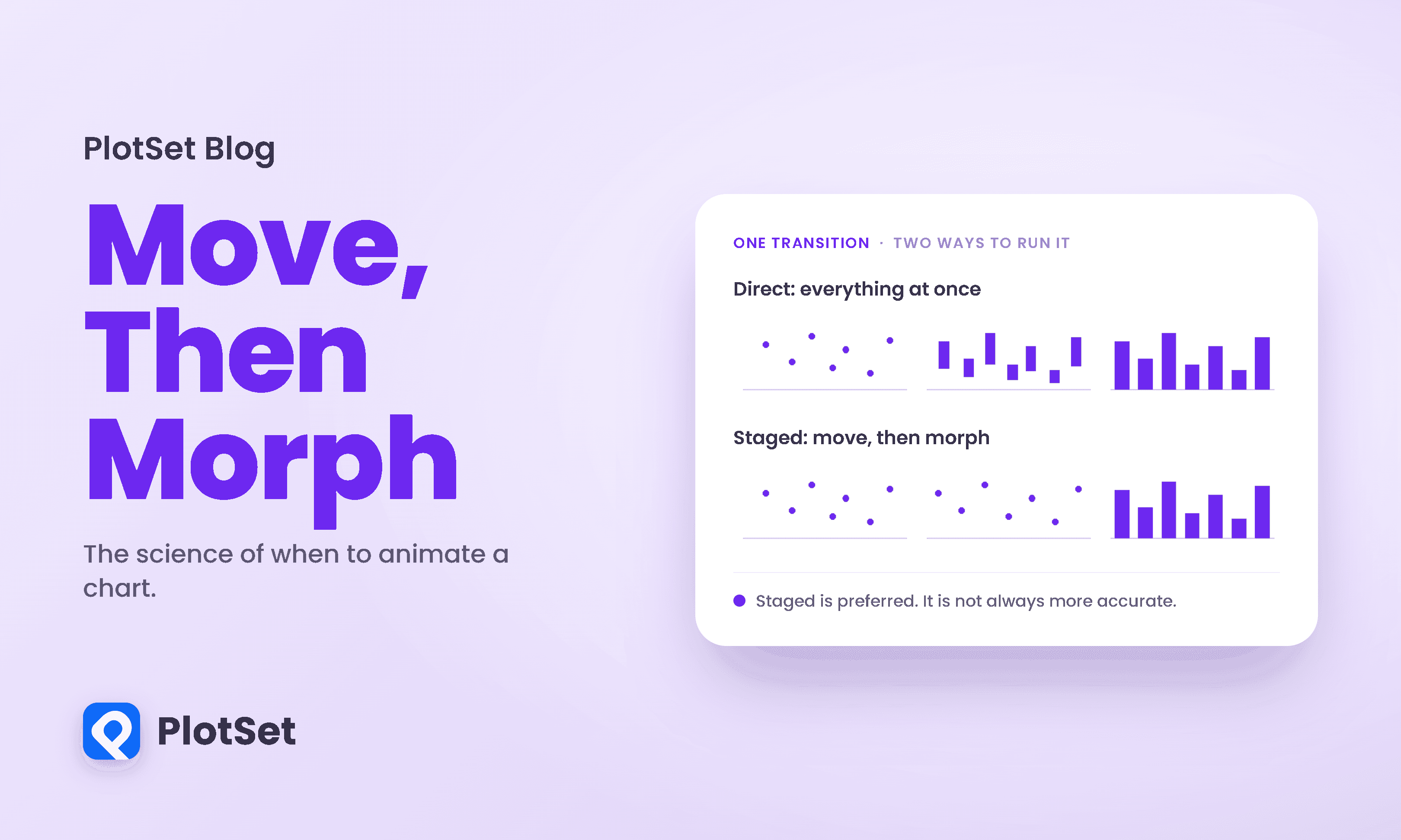
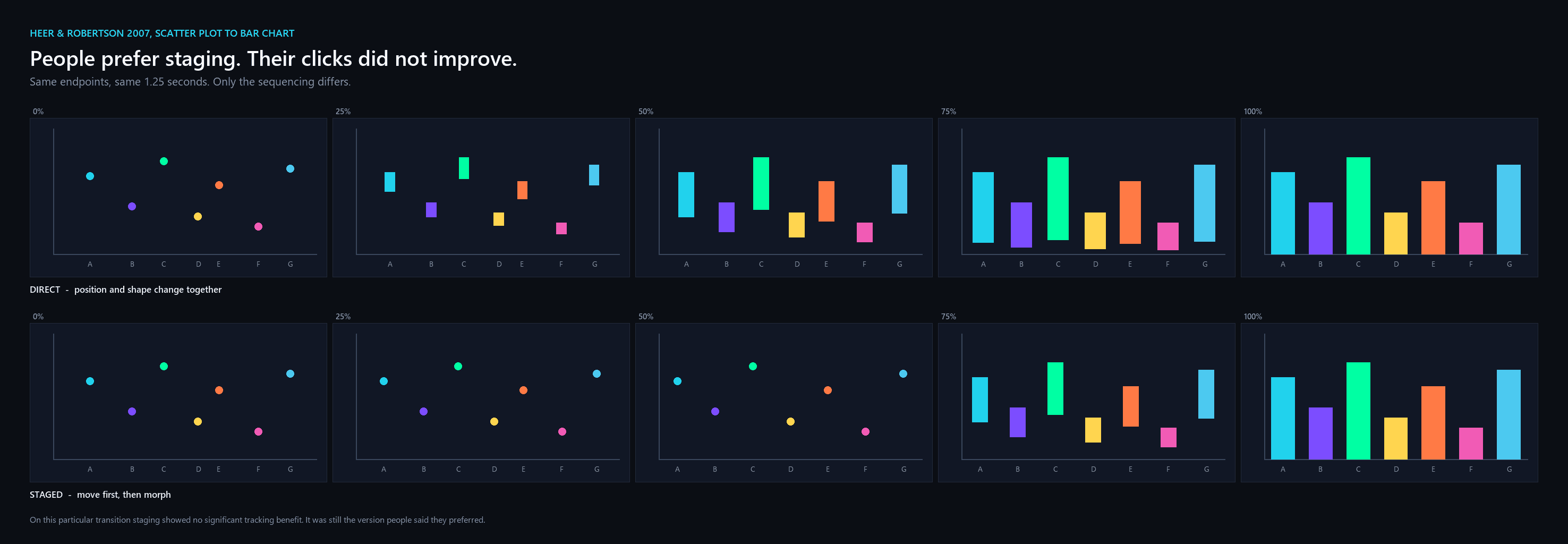
In 2007 Jeffrey Heer and George Robertson ran two controlled experiments on animated transitions between statistical graphics. Their central design idea was staging: instead of interpolating straight from one chart to the next, break the change into phases. The transition they describe for turning a scatter plot into a bar chart goes in two steps, first the points slide horizontally into their categories, then they morph into bars.
Take the direct version first, everything changing at once.
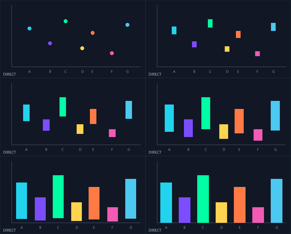
Now the staged version, same duration, same endpoints.
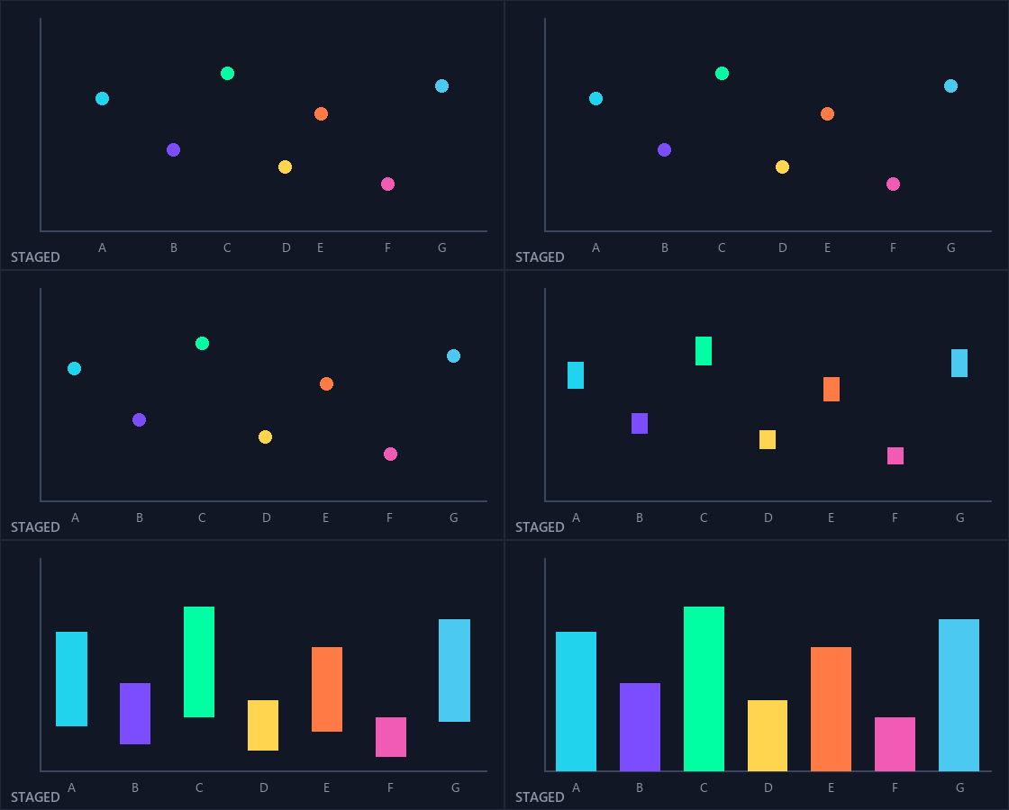
Most people find the staged version easier to follow, and the proposed reason is mechanical rather than aesthetic. In the direct version a dot is doing two things simultaneously and your eye has to decompose the motion to work out which dot became which bar. In the staged version each phase is one kind of change, and one kind of change is something a visual system tracks well.
Hold on to that word "proposed." This exact transition, scatter plot to bar chart, is one of the conditions Heer and Robertson tested, and staging did not significantly improve tracking accuracy on it. People preferred it. Their clicks did not get better. That gap between what feels legible and what measurably is legible turns out to be the whole story, and the rest of this piece is about how wide it gets.
Frozen, for anyone who cannot see the animations or would rather not have motion on the page:
What animation reliably does
Heer and Robertson tested this with 24 people, screened for familiarity with data graphics, on transitions lasting 1.25 seconds. The first experiment measured object tracking: follow two highlighted objects through the change and click where they ended up. Error was the distance in pixels between the click and the truth.
Animation beat a static cut in every single condition tested. The omnibus test across static, animated and staged ran at F(2,286) of at least 22.03 with p below .001 in every condition, and the post-hoc contrasts put animation ahead of static throughout. That result is about as clean as this literature gets, and it holds even for transitions the authors describe as highly predictable. If your reader needs to know that this bar is that bar after the sort, motion does something a jump cut cannot.
The second experiment asked people to estimate how much a value had changed, and lengthened the transitions to 2 seconds to fit the longer multi-stage sequences. Animation helped there too for most chart types. Notably it did not help for stacked bars, where the difference between static, animated and staged was not significant at all.
That result deserves its weight because of what came before it. In 2002 Barbara Tversky and colleagues reviewed the animation literature and found the case largely unproven, and their sharpest objection was methodological. It came in two parts. The animated conditions in these studies often carried more content than the static ones they beat: static versions showed the coarse steps of a process while animations showed the fine ones too, so the winner had extra information rather than extra motion. And the animated conditions often carried different procedures as well, adding interactivity, or prediction, or letting people keep the graphic during the test. Either way the comparison was never clean.
Two things about that review get lost in the retelling. It was about learning complex systems rather than reading charts, and it reports no statistics of its own. And it is not the blanket dismissal it is usually made into: the same paper names conveying changes in time and space as animation's most promising use, which is very nearly the animated-transition case. Its lasting contribution is a standard rather than a verdict, which is that animation must be compared against a static graphic carrying identical information. That is the bar Heer and Robertson clear, and it is why their result counts: their static, animated and staged conditions carried the same information and differed only in how the change was rendered.
Where the "staging is better" story gets complicated Here is where the practitioner version of this research usually goes wrong. The famous sentence is that "staged animation was significantly preferred to direct animation in most cases," which is quoted accurately and then quietly upgraded into a claim about accuracy. The preference finding is real. The accuracy picture is messier.
Staging won clearly once, at p equals .026, when zooming and filtering a scatter plot. Twice more it had lower error, at p equals .051 and p equals .071, which is to say it fell short of the .05 line and should be counted as suggestive rather than shown. It made no measurable difference in two further transitions. And in one condition, stepping a scatter plot through time, staging was significantly worse than plain animation, at p equals .002. The authors' own explanation is that the staged version packed two changes, a rescale and then a movement, into a short window, compounding the opportunity for error.
The preference result has a matching asterisk. Staged animation was preferred at the .05 level for every transition except the two the authors describe as using an extreme form of staging, the ones they later call heavy staging in the discussion. Stage a transition and people like it more, until you stage it too much.
The change-estimation experiment adds a second warning, and this is the part practitioner summaries almost always drop. For the scatter plot and the grouped bars, staged animation had the lowest average error but no post-hoc difference between the animated conditions reached significance. For the donut chart the result went the other way outright: plain animation was significantly more accurate than staged animation, at p equals .024. That is the second time in one paper that staging lost, and it lost on the chart type built out of the heaviest staging of all.
The authors join these threads up themselves, and it is worth quoting because almost nobody passes it on. Heavily staged animation, they write, resulted in increased error. And those same conditions "were also the only cases in which preference ratings for staged animation were not significantly higher." Read that twice. The two transitions where elaborate staging hurt accuracy are the two where people also stopped preferring it. Taste and performance came apart everywhere else in this paper, but at the extreme they agreed, which is the closest thing here to a usable warning light: when a staged sequence stops feeling good, it has probably also stopped working.
So the honest summary is narrower than the folklore. Animation beats a cut, and it does so consistently. Staging beats direct animation in what people prefer, helps object tracking in some transitions, does not reliably improve value estimation, and when piled up hurts both accuracy and preference at once.
The hard boundary
None of the above tells you whether to animate the chart in front of you, because it is all measured on a single transition between two states. The question that matters is what happens when someone has to work with the thing. A year later, Robertson and colleagues answered it, and the answer is the most useful result in this literature.
They took Gapminder-style animated bubble charts of UN development data and compared three ways of showing the same trends: the animation, a static chart with traces drawn behind each bubble, and small multiples. Then they ran two separate groups of eighteen people, one told to analyse the data and one watching a presentation.
For analysis, animation took 83.1 seconds against 45.7 for small multiples, roughly 82 percent slower, and it was significantly less accurate as well. For presentation the order inverts: animation finished in 15.8 seconds against 25.3 for small multiples and 27.8 for traces.
Animation goes from slowest to fastest; small multiples and traces swap places behind it. That reversal is the finding. The identical technique is the worst option and the best option depending only on what the person in front of it is trying to do.
Two caveats belong here, and the authors supply both. The presentation speed advantage is confounded, because in that condition people could not replay the animation and only ever saw its final state. More importantly, animation being fast in presentation did not make it accurate: the hypothesis that animation would improve presentation accuracy was explicitly not supported, and the paper says plainly that animation leads to many participant errors. Overall accuracy across the whole study averaged 65 percent, a study-wide figure rather than a presentation-specific one, which tells you these were hard tasks in every condition.
There is an apparent contradiction between the two papers, and resolving it gives you the actual rule. Heer and Robertson found that animation is excellent at object tracking. Robertson and colleagues found that object tracking is exactly what broke. Their most telling diagnostic item, "I lost track of some data points as they moved," averaged 4.8 out of 6. So which is it?
The difference is how many things are moving and whether each one has somewhere specific to go. In the 2007 experiments a highlighted dot became one identifiable bar: one object, one destination, a clean correspondence for your eye to hold. In a Gapminder-style bubble chart, dozens of bubbles drift at once, some reverse direction, none of them are one-to-one with anything, and the tracking system that carried the first result is simply overrun. Animation did not stop working because the task changed from presenting to analysing. It stopped working because you asked the visual system to track more than it can track.
The same paper has the detail that clinches it. Animation won on stated preference in three of four cells, and the one where it lost was presentation of the large dataset, which is precisely the case Gapminder is famous for. As the number of moving objects grew, people stopped preferring the motion too.
So the boundary is not "animation is good for presenting." It is that animation is fast and well liked for presenting, never established as more accurate anywhere, catastrophically slow the moment someone needs to compare values themselves, and degrading in proportion to how many things you set in motion at once.
How long, and how much staging
Everyone repeats that transitions should last about a second. That number is real, and it is weaker than its reputation. It is not from the chart experiments at all. Heer and Robertson cite it, and say so, from earlier work on navigating intersecting organisational hierarchies, five small studies with 49 people between them, where the task was answering questions about an org chart. Their design principle reads: "The results of Robertson et al recommend transition times around 1 second, though transitions with minimal movement can likely be performed faster." Go back to the study being cited and it is narrower still, in a way the citation does not carry. What that work found was that simple transitions of about a second gave the best performance, translation rather than rotation, and that user preferences varied. So the famous number is scoped to the easiest kind of movement, in a task that was not reading a chart, and its own authors flagged the variance. Read the five studies underneath it and it gets shakier still. The speed people preferred most was 0.8 seconds rather than one. Going up to 2 seconds did measurably hurt. And in one of the studies, no animation at all was statistically indistinguishable from the animated conditions on task time, which makes the honest reading a ceiling on what you can spend rather than a target to hit. Heer and Robertson's own chart experiments did not settle on one number either. The first ran at 1.25 seconds; the second lengthened transitions to 2 seconds, in their words to comfortably accommodate the multi-staged animations. When Kim, Correll and Heer animated aggregation operations a decade later they built everything around 2 seconds, and stated it as a design target rather than a measured optimum.
But Heer and Robertson do leave one concrete recommendation, and it is the most practically useful sentence in the paper because it is scaled to stages rather than to the whole transition. Their subjects said the 1.25-second version felt rushed and that they preferred slower animations, so the authors endorse staged animation for scatter plots while recommending you time each stage at around a full second rather than around half a second. Read that as the real rule of thumb: a second per stage, not a second per transition. A two-stage transition wants about two seconds, which is exactly where the 2019 work independently landed.
So there is no measured optimum for charts, only a ceiling borrowed from a different task and a per-stage recommendation from the chart work itself. There is a working range, roughly one second per stage, and a principle that survives all of it: make the transition as long as it needs to be and no longer, because a slow animation costs the viewer time and a fast one costs them the change.
That later work is worth knowing for a second reason. Kim, Correll and Heer animated eight different aggregations, count, sum, maximum, minimum, mean, median, standard deviation and interquartile range, and found that carefully staged transitions helped people identify which operation had been performed. Their analysis is Bayesian and reports credible intervals rather than p-values, and the response-time cost is narrower than their own abstract implies. But the direction is consistent with everything above: staging communicates what changed, which is a different achievement from helping someone read a number.
The rule for animated charts
Animate when your job is to explain a change to someone who is watching. Sorting a bar chart, switching an encoding, moving through years while you talk: these are cases where the reader's task is to follow, and following is what motion supports. Stage the transition into phases, give each phase about a second, and stop adding stages the moment the sequence stops being obvious.
Go static and side by side when your job is to let someone find things themselves. If the reader needs to compare 1990 with 2010, or check whether this country crossed that one, small multiples were 45 percent faster and significantly more accurate in the study that measured it directly. Put the other way round, the animation took 82 percent longer to get to the same answer. Anything you animate in that situation, you are asking them to hold in memory, and memory is the resource you are supposed to be saving.
Which brings us to the racing bar chart, and to a gap worth being honest about. Exactly one controlled study of racing bars exists, by Datong Wei and colleagues in 2023, and it is not the study you would want. It compares ways of animating the rank swap against each other, not the racing bar chart against a static alternative. Nobody, as far as I can find, has ever tested a racing bar chart against a line chart or a set of small multiples on the same task. So the question practitioners actually argue about has not been answered, and anything anyone tells you about it, including me, is an inference from adjacent research rather than a measurement.
What Wei and colleagues did test, though, is the same boundary this whole piece is about, and they found it again without looking for it. They ran two experiments on the same format. In the first, 92 participants watched a one-minute racing bar video and wrote down what they remembered: decomposing each rank swap into stages produced recall close to the smooth baseline, while swapping ranks instantly cut what people recalled by more than half. Staging held the story together.
Then they ran the second experiment, where people watched a single transition and had to reconstruct the exact ranking afterwards. There, staged decomposition was significantly worse than the plain baseline. Same format, same staging technique, opposite result, and the thing that changed was the reader's job. Watching and remembering: staging helps. Reading off an exact answer: staging gets in the way. That is Heer and Robertson's donut result and Robertson's analysis result arriving a third time from a completely different direction, which is about as much replication as this small literature offers. Their statistics are thin, reported as p below .05 with no effect sizes, and the samples were self-selected online, so hold the numbers loosely and the pattern firmly.
The defensible position, then, is this. A racing bar chart is a presentation format, and the evidence that presentation formats are fast and well liked is good, while the evidence that they support accurate reading is poor. It is a fine way to make an audience feel a change over time. It is not a way for anyone to answer a question about 2004, and no amount of easing will make it one. Publish it next to a static small multiple and you have covered both jobs. Publish it alone and you have chosen one.
That is the whole science, and it is more permissive than the sceptics claim and much narrower than the enthusiasts assume. Motion is not decoration. It is a tool with a documented job description, one clean result behind it, one hard boundary, and two cases on record where trying to be clever made it worse.
Heer and Robertson land in the same place, and their own summary is more careful than the one that gets quoted from them. Staging works, they say, and the claim is "strongly backed by subject preferences and consistently (though at times marginally) supported by error measures." Marginally. Then the line that should have been the headline all along: their results "further discourage the use of complex multi-stage transitions, favoring simple staging over aggressive 'do one thing at a time' staging." The paper everybody cites to justify elaborate animation ends by telling you to animate less than you want to.
Building animated charts to this spec
Strip out the citations and what is left is a short build specification, which is more useful than any of the individual results because it tells you what to hold your tools to.
Animate the transition, not the trend, when someone is watching you explain. Break that transition into stages and give each stage about a second. Stop at two stages unless the third is genuinely obvious. Keep a static version of the same data for the moment a reader stops watching and starts asking, and publish the two together rather than choosing. Ship a still frame for anyone whose system asks for reduced motion, which is the accessibility floor and also, conveniently, the version that gets screenshotted.
If you are building these in PlotSet, that is the specification to configure against. Reach for an animated template when the chart is headed into a talk, a video or a feed, where you control the pacing and the reader's job is to follow. Set the duration by counting stages rather than by picking the number that looks smooth: one stage, about a second; two stages, about two. Then publish the static counterpart beside it for the page where readers arrive with questions of their own, because those are two different jobs and the research is unusually clear that no single view does both.
What we are not going to tell you is that an animated chart is more accurate than a static one. Nobody has run the study that would let anyone say that, and this piece has spent three thousand words on why the claims people do make tend to fall apart against the papers they cite. What the evidence supports is narrower and more useful: animation is the right instrument for a specific job, it has a documented set of settings, and most animated charts fail because they were built to look impressive rather than to that spec.
References
- Heer & Robertson, Animated Transitions in Statistical Data Graphics, IEEE TVCG 13(6), InfoVis 2007 — https://idl.cs.washington.edu/files/2007-AnimatedTransitions-InfoVis.pdf
- Robertson, Fernandez, Fisher, Lee & Stasko, Effectiveness of Animation in Trend Visualization, IEEE TVCG 14(6), InfoVis 2008 — https://www.microsoft.com/en-us/research/wp-content/uploads/2016/02/tvcg2008-trend.pdf
- Kim, Correll & Heer, Designing Animated Transitions to Convey Aggregate Operations, CGF (EuroVis) 2019 — https://idl.cs.washington.edu/files/2019-AnimatedAggregates-EuroVis.pdf
- Tversky, Morrison & Betrancourt, Animation: Can It Facilitate?, IJHCS 57(4):247-262, 2002 — https://www.sciencedirect.com/science/article/pii/S1071581903000459
- Chevalier, Dragicevic & Franconeri, The Not-so-Staggering Effect of Staggered Animated Transitions, IEEE TVCG 20(12), 2014 — https://hal.science/hal-01023890/document
- Robertson, Cameron, Czerwinski & Robbins, Animated Visualization of Multiple Intersecting Hierarchies, Information Visualization 1(1):50-65, 2002 — https://journals.sagepub.com/doi/10.1057/palgrave.ivs.9500002
- Stanford Vis Group, DynaVis / animated transitions project page — http://vis.stanford.edu/papers/animated-transitions
- Bederson & Boltman, Does Animation Help Users Build Mental Maps of Spatial Information?, IEEE InfoVis 1999 — https://www.cs.umd.edu/hcil/trs/98-13/98-13.html
- Gapminder World — https://www.gapminder.org/tools/
- Fisher, Animation for Visualization: Opportunities and Drawbacks, in Beautiful Visualization, O'Reilly 2010 — https://www.oreilly.com/library/view/beautiful-visualization/9781449383411/ch19.html
- Munzner, Visualization Analysis and Design, CRC Press 2014 — https://www.oreilly.com/library/view/visualization-analysis-and/9781466508910/
- Shanmugasundaram, Irani & Gutwin, Can Smooth View Transitions Facilitate Perceptual Constancy in Node-Link Diagrams?, GI 2007 — https://dl.acm.org/doi/10.5555/1268517.1268531
- Heer & Shneiderman, Interactive Dynamics for Visual Analysis, ACM Queue 10(2), 2012 — https://queue.acm.org/detail.cfm?id=2146416
- Wei, Liu, Zhang & Yuan, Understanding transitions in animated bar charts, Visual Intelligence 1:13, 2023 — https://doi.org/10.1007/s44267-023-00015-w