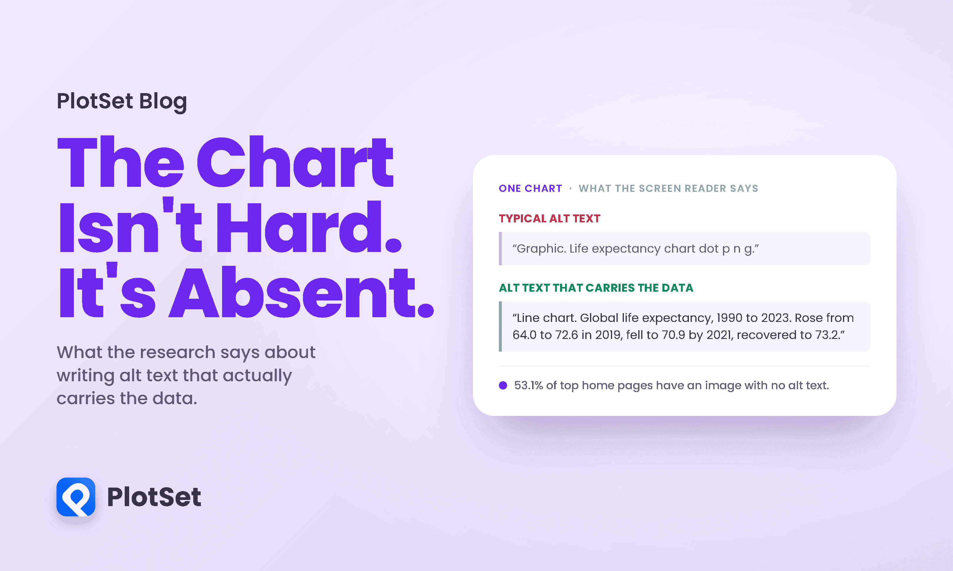
Most advice about charts assumes a reader who can see the chart. Contrast, layout, colour, labelling: all of it is about making a visible thing easier to interpret. For a blind reader using a screen reader, none of that applies, because the chart is not difficult. It is missing. Where you see a line and a downturn and a recovery, they get a filename read aloud, or silence.
Building accessible charts is the least glamorous accessibility problem and the most fixable. The research on it is unusually specific, it disagrees with the advice that gets repeated, and the fix takes about four sentences once you know what belongs in them.
Start with the number, because the number is usually wrong
You will see it claimed that over 80 percent of web pages fail to include alt text. That figure is not what it appears to be, and the chain is traceable.
It comes from a sentence in a 2023 paper on accessible charts, which reports that "a survey found that more than 80% of websites are not developed following standards (e.g., W3C standards, WCAG) and do not always provide the alt text." Read that carefully and the 80 percent attaches to websites not following accessibility standards in general. Alt text is one item in a trailing clause. Somewhere between that sentence and the blog posts, a general figure became an alt-text figure.
The number you actually want comes from the WebAIM Million, an annual automated analysis of the top one million home pages. Its 2026 edition, from data collected in February 2026, lists the most common failures like this:
Missing alternative text sits at 53.1 percent of home pages, not 80. The 83.9 percent in that table belongs to low contrast text, one row above. Whether that proximity has fed the confusion I cannot say, and I am not going to assert a causal story I have not established.
That number is still bad enough to make the point without help, provided it is stated precisely. On 53.1 percent of the top one million home pages, at least one image was missing alternative text. Note both halves of that: WebAIM samples one home page per site, so interior pages are entirely unmeasured and are plausibly worse, and a page with two hundred images and one missing attribute counts in the 53.1 percent. It is a measure of how widespread the problem is, not of how thoroughly any given page fails. Measured per image rather than per page, 16.2 percent of the 66.6 million images in the sample had none, and a further 10.8 percent of the images that did have alt text carried what WebAIM calls "questionable or repetitive" text, meaning alt="image", alt="graphic", a filename, or a duplicate of the text next to it. Their summary: "more than one in four images on popular home pages have missing, questionable, or repetitive alternative text."
One thing the doom version of this story leaves out. On this specific measure it is improving. Missing alt text fell from 18.5 percent of images the previous year, and WebAIM notes the proportion of problematic images "is steadily decreasing over time."
The wider picture in the same report is worse, though, and quoting only the encouraging half would be selective. Detected WCAG failures rose to 95.9 percent of home pages from 94.8, which WebAIM describes as reversing a trend of small improvements across the previous six years. Alt text is getting better. Web accessibility overall, on this measure, is not.
One more caveat about that 53.1 percent, since this article is partly about people repeating undated statistics. It moves. It was 55.5 percent in 2025 and 68 percent in 2019. Cite it with a year attached.
There is a starker number still, from a study that went looking specifically at chart alt text in the news. Researchers sampled 30 visualizations from the New York Times, the Washington Post and FiveThirtyEight, outlets that publish charts constantly and take craft seriously. They found no alt text on any of them. Not thin alt text. None.
What a blind reader actually receives
Here is a real chart, and here is what the same chart is when you cannot see it.
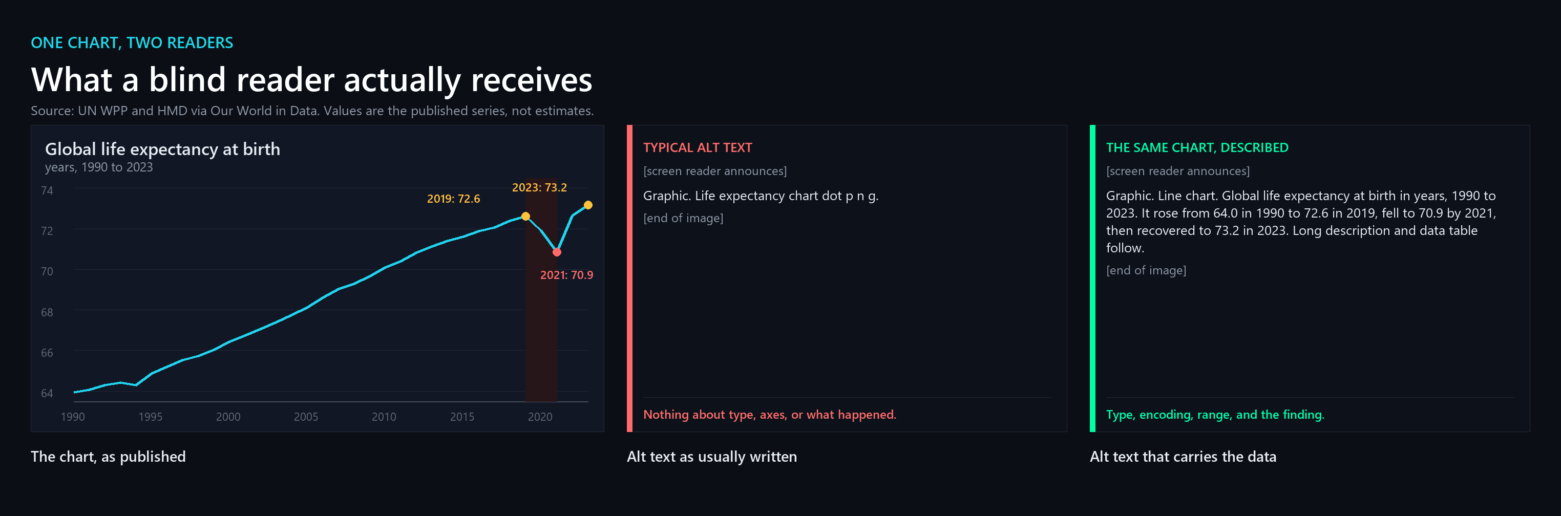
The middle panel is not a strawman. It is the documented failure mode: a filename, or a generic noun, announced and then finished. A reader who receives it knows an image was there and nothing else. They do not know it is a line chart, that the axis is years, that the units are years of life, or that the single most consequential thing in the picture is a two-year hole in the middle of it.
That hole is worth naming, because it is a good test of whether a description is doing its job. Global life expectancy at birth rose more or less continuously from 64.0 years in 1990 to 72.6 in 2019. Then it fell to 71.9 in 2020 and 70.9 in 2021, a drop of 1.74 years from the peak. The last time it had fallen at all was 1994. By 2023 it had recovered to 73.2, above where it started. Any description that omits that sequence has described the wrong chart.
The four levels, and the one that surprises people
The most useful framework here comes from Alan Lundgard and Arvind Satyanarayan at MIT, who sorted the content of chart descriptions into four levels of semantic content:
-
Construction properties. What kind of chart it is, its title, its axes, its encodings and colours.
-
Statistical concepts and relations. Extrema, correlations, the actual numbers.
-
Perceptual and cognitive phenomena. Complex trends and patterns, the shape of the thing.
-
Domain-specific insights. Social and political context, what it means, the author's interpretation.
They then had 30 blind readers and 90 sighted readers rank descriptions written at each level, producing 3,600 rankings. The two groups disagreed, and they disagreed in a direction almost nobody guesses.
Sighted readers ranked Levels 3 and 4 most useful, and Levels 1 and 2 least useful. They wanted the interpretation. Blind readers ranked Levels 2 and 3 most useful, and Levels 1 and 4 least useful. They wanted the statistics and the trends, and they did not want the editorialising.
This was not a marginal preference. In the authors' words, "a majority of blind readers (63%, n=19) were emphatic that descriptions should not contain an author's subjective interpretations, contextual information, or editorializing about the visualized data."
Sit with that, because it inverts the most common piece of alt-text advice. "Don't describe the chart, describe what it means" is well-intentioned and, for this audience, wrong. What blind readers in this study wanted was the data: the extrema, the correlations, the trend. What they rejected was being told what to conclude from it, which is precisely the part sighted readers rated highest.
Two caveats belong here and the authors would insist on both. This measures ranked usefulness, not comprehension, so nobody has shown that Level 2 descriptions produce better understanding, only that readers prefer them. And their own conclusion is that "access to meaningful information is strongly reader-specific," which is a caution against turning any of this into a rigid rule.
Even the people who study this get it half right
There is a corpus study that puts a number on the gap, and its sample is the friendliest one available.
Sanjana Chintalapati, Jonathan Bragg and Lucy Lu Wang collected author-written alt text for graphs and charts from academic publications and coded it against the four-level model. They deliberately sampled HCI and accessibility venues, and they explain why in one blunt clause: "due to the lack of alt text in papers published outside of these disciplines." Elsewhere there was not enough alt text to study.
Within that best case, they found that only 50 percent of chart alt texts contained information about extrema or outliers, and only 31 percent contained information about major trends or comparisons. Their own summary is that the capacity of author-written alt text to meet blind and low-vision needs is "mixed."
Read those two numbers against the previous section and the failure has a precise shape. Level 2 content, the statistics, appears in half of these descriptions. Level 3 content, the trends, appears in under a third. Those are the exact two levels blind readers ranked most useful. The content people write least is the content this audience wants most, and that is true even among researchers who work on accessibility for a living.
The formula
Put the pieces together and the recipe is short. A description that works carries four things:
-
What kind of chart it is. Line chart, grouped bar chart, choropleth. This is the orienting fact and it costs three words.
-
What is being measured, and in what units. The axes and the legend, stated as meaning rather than as labels: "life expectancy at birth, in years, from 1990 to 2023," not "x axis year, y axis value."
-
The numbers that matter. Extrema, endpoints, crossings, the outlier. This is the level most often missing.
-
The shape. The trend, the reversal, the pattern. Rose, fell, recovered.
One apparent contradiction is worth clearing up before it bites. Item 1 is Level 1 content, and I have just said blind readers ranked Level 1 among the least useful. The same study resolves it: Level 1 rankings were bimodal rather than uniformly low, and 40 percent of blind readers said the most useful descriptions combine levels. One put it directly, that Level 1 "combined with the [Level 2 or Level 3], that'd make for a great description." Chart type alone is close to useless. Chart type as the opening clause of a sentence that then delivers the numbers is orientation, and the numbers are hard to interpret without it.
Then stop. Note what is not on the list: what it means, why it happened, what you conclude from it. That is Level 4, and it is the content 63 percent of blind readers in the MIT study explicitly did not want in a description. Put your interpretation in the surrounding prose where every reader gets it, not smuggled into the alternative text where it displaces the data.
The structural half of this is a two-part pattern, and W3C's tutorial on complex images sets it out precisely. It opens by defining the category: "Complex images contain substantial information, more than can be conveyed in a short phrase or sentence." A chart is a complex image by that definition, which means a single alt sentence was never going to be enough. The prescription follows: "a two-part text alternative is required. The first part is the short description to identify the image and, where appropriate, indicate the location of the long description. The second part is the long description, a textual representation of the essential information conveyed by the image."
Worth being accurate about one detail, since this article is partly about people repeating guidance they have not read. W3C does not mandate a data table. It requires a long description carrying the essential information, and a table is one way to supply it, used in its own worked examples. For a chart with a modest number of data points a table is usually the best way, because it is the form a screen reader can navigate rather than merely play back.
This is why the life expectancy table earlier in this article is a real HTML table rather than a picture of one. A screen reader can enter it, move by row and column, hear the header for each cell, and leave. That is not a courtesy. It is the only route by which the actual numbers reach that reader at all.
The formula for accessible charts, applied
Abstract rules are easy to nod at, so here is the formula run on a second real chart from the same dataset.
Short description, the part that goes in the alt attribute: "Grouped bar chart. Change in life expectancy against each region's 2019 level, for five world regions, in 2021 and again in 2023. All five fell by 2021 and all five had recovered by 2023. The Americas fell furthest."
Long description, the part that goes in the page: a grouped bar chart with five regions on the horizontal axis and years on the vertical, showing two bars per region, both measured against that region's own 2019 level. By 2021 the Americas were down 2.98 years, Europe 1.72, Asia 1.68, Africa 0.66 and Oceania 0.11. By 2023 all five stood above 2019: Africa by 1.39 years, Oceania by 0.58, Asia by 0.52, the Americas by 0.44 and Europe by 0.30. The Americas fell furthest and still recovered to above where they started.
One honest note about that chart, because getting this wrong is the sort of thing this article exists to complain about. An earlier version measured each region from its peak to its trough and reported that the Americas lost about 26 times what Oceania did. That ratio was an artifact of the baseline. Oceania's life expectancy actually peaked in 2020 rather than 2019 and reached its low in 2022 rather than 2021, so a 2019-to-2021 window understates its fall by a factor of about seven and inflates the ratio accordingly. Measuring every region against one stated year is defensible. Quoting a ratio built on an unstated and inconsistent baseline is not.
That is chart type, then axes and units, then the numbers, then the shape. What it deliberately does not say is why the Americas fared worst, which is a real and interesting question and belongs in the article text where every reader can weigh it, not in a description where it would take the place of the data.
The better answer is not a longer paragraph
Everything above still treats the description as a block of text to be read at you. The most interesting recent work argues that is the wrong shape entirely.
A team at MIT, working through an iterative co-design process that included blind researchers as collaborators rather than as test subjects, built screen-reader experiences for charts and identified three design dimensions:
-
Structure, meaning "how chart entities should be organized for a screen reader to traverse."
-
Navigation, meaning "the structural, spatial, and targeted operations a user might perform to step through the structure."
-
Description, meaning "the semantic content, composition, and verbosity of the screen reader's narration."
Notice that description, the thing everyone means when they say alt text, is one of three. The other two are about giving the reader somewhere to go and a way to get there. A sighted reader does not consume a chart linearly; they glance, zoom in on an anomaly, compare two regions, come back out. Structure and navigation are what make that possible without eyes.
They evaluated a subset of the prototypes with 13 blind and visually impaired screen reader users, and found the designs helped people "conceptualize data spatially, selectively attend to data of interest at different levels of granularity, and experience control and agency over their data analysis process."
That last phrase is the point. The difference between a paragraph and a navigable structure is the difference between being told about a chart and reading one.
Now the part that a lazier version of this article would leave out, because it cuts against the frontier framing I have just spent four paragraphs building.
The study's single statistically significant result went the other way. A Friedman test on ease-of-use ratings came out at chi-square 15.05 with 13 participants, p below .01 and a large effect size, and the follow-up tests showed the rich multi-view prototype was significantly harder to use than the plain accessible data table. Every one of the 13 participants named tables as their primary route into data.
So the humble thing wins on the only measure that reached significance here. That is worth taking seriously rather than explaining away. The authors call the study exploratory, and it was not a controlled comparison against well-written alt text, so it does not show that structure beats description either. What it does show is that a richer interaction is buildable, that readers valued the control, and that elaborate navigation is not free: it has a learning cost that a table does not.
The practical reading is the boring one. Ship the table. It is the format this audience already knows how to drive, and it is the one thing in this literature with a significant result behind it. Treat richer structure as a genuine frontier rather than as a solved upgrade.
On letting a model write it
The obvious question in 2026 is whether a model can just generate all this, and the honest answer is that it can generate a first draft and that the draft needs a human who can see the chart.
The failure mode is specific and it is worse here than elsewhere. A generated description that is fluent, plausible, correctly formatted, and wrong about a number is undetectable by the person relying on it. Every other reader of your page can glance at the chart and catch the error. The reader the description exists for cannot. Fluency is not evidence of accuracy, and for this audience the usual safety net is exactly the thing that is missing.
There is now measurement behind that worry, and its shape is instructive. A two-week diary study followed 20 blind and low-vision people using a multimodal model in daily life. First-pass descriptions came out well, averaging 2.9 out of 3 for accuracy. The trouble started when participants asked follow-up questions: 122 of 549 answers, 22.2 percent, contained false information. And in the category closest to reading a chart, pulling out text and graphical detail, 54 of 156 answers contained at least one hallucination.
Be careful with those numbers, because they are easy to garble in exactly the way this article keeps complaining about. The 22.2 percent is a share of follow-up answers, not of image descriptions. The headline is not that these models describe images badly. It is that they describe images fairly well and then answer questions about them unreliably, which is the more dangerous shape of failure, because interrogating the description is precisely what a reader does when the first pass leaves them with a question.
Which is not an argument against using models for this. Generating a Level 1 and Level 2 draft from the underlying data, rather than from a picture of the chart, is a genuinely good use of the technology, and the data is something you already have. It is an argument for the check being non-optional, and for generating from the numbers rather than from the rendered image wherever you can.
What this article did
An article making these arguments should be checkable against them, so here is what was actually done and where it falls short.
Every figure carries a short alt attribute naming the chart type, the variables and the finding. The life expectancy data is present as a real HTML table with header cells and a caption, not as a picture of a table, so the numbers are reachable rather than merely depicted. The live charts sit in labelled frames. Nothing in the argument exists only in colour: the reversal is named in the text, given as numbers, and listed in the table.
The shortfall is worth naming too. The composite figure near the top is a rasterised image, so its internal structure is unavailable no matter how good the alt text is. A reader cannot traverse it, only receive a summary I wrote. By the standard of the section above, that is description without structure or navigation, which is the weakest of the three. The honest position is that this article demonstrates the formula and not the frontier.
Building charts that reach everyone
If you take one thing from the research, make it this: the description is not a caption and it is not a summary of your conclusion. It is the data, delivered in the only form this reader can receive it.
If you are building charts in PlotSet, that means treating the description as part of the chart rather than as a field to fill in afterwards. Write the short description to orient the reader: chart type, what is measured, over what range. Put the numbers themselves within reach, as a table or as a text alternative carrying the extrema and the trend. Keep your interpretation in the surrounding prose, where it is available to every reader without displacing the data for the one who needs it most.
What we are not going to claim is that any tool makes your charts accessible on its own. Alt text is authored, not produced by picking a template, and the research above is largely a record of what happens when people treat it as an afterthought. What a tool can do is make the right thing easy, by keeping the underlying numbers beside the picture so the description can be written from the data rather than reconstructed from a rendering.
The reader this article is about is not asking for a special version. They are asking for the numbers you already have, written down. That is a low bar, and more than half the web still does not clear it.
References
- WebAIM. The WebAIM Million (2026 edition) — https://webaim.org/projects/million/
- IEEE TVCG. Accessible Visualization via Natural Language Descriptions. Lundgard & Satyanarayan, IEEE VIS 2021 — https://vis.csail.mit.edu/pubs/vis-text-model/
- Computer Graphics Forum (EuroVis). Rich Screen Reader Experiences for Accessible Data Visualization. Zong, Lee, Lundgard, Jang, Hajas & Satyanarayan, 2022 — https://vis.csail.mit.edu/pubs/rich-screen-reader-vis-experiences/
- ASSETS. A Dataset of Alt Texts from HCI Publications. Chintalapati, Bragg & Wang, 2022 — https://arxiv.org/abs/2209.13718
- W3C WAI. Complex Images — https://www.w3.org/WAI/tutorials/images/complex/
- W3C. WCAG 2.2 SC 1.1.1, Non-text Content — https://www.w3.org/WAI/WCAG22/Understanding/non-text-content.html
- W3C WAI. Images Tutorial — https://www.w3.org/WAI/tutorials/images/
- W3C. WAI-ARIA Authoring Practices — https://www.w3.org/WAI/ARIA/apg/
- WebAIM. Screen Reader User Survey — https://webaim.org/projects/screenreadersurvey10/
- World Health Organization. World Report on Vision — https://www.who.int/publications/i/item/9789241516570
- Our World in Data. Life Expectancy — https://ourworldindata.org/life-expectancy
- Computer Graphics Forum (EuroVis STAR). Accessible Visualization: Design Space, Opportunities, and Challenges. Kim, Joyner, Riegelhuth & Kim, 2021 — https://onlinelibrary.wiley.com/doi/10.1111/cgf.14298
- ASSETS. Understanding Screen-Reader Users' Experiences with Online Data Visualizations. Sharif, Chintalapati, Wobbrock & Reinecke, 2021 — https://dl.acm.org/doi/10.1145/3441852.3471202
- Computer Graphics Forum (EuroVis). How Accessible is My Visualization? Chartability. Elavsky, Bennett & Moritz, 2022 — https://arxiv.org/abs/2205.04917
- IEEE TVCG. Communicating Visualizations without Visuals. Jung, Mehta, Kulkarni, Zhao & Kim, IEEE VIS 2021 — https://arxiv.org/abs/2108.03657
- ACM IUI. SeeChart: Enabling Accessible Visualizations Through Interactive Natural Language Interface. Alam, Islam & Hoque, 2023 — https://dl.acm.org/doi/10.1145/3581641.3584099
- ACM CHI. How Multimodal Large Language Models Support Blind and Low Vision Users in Daily Life. Gonzalez Penuela, Jung, Lin, Hu & Azenkot, 2026