Open a spreadsheet, delete one cell in the middle of a column, and chart what is left. Something still gets drawn. The line breaks, or it stretches straight across the hole, or the bar disappears, or a zero appears where no measurement exists. Whatever happens, a decision was made about how to represent an absence, and you did not make it. Your tool did, silently, before you looked.
That decision is not cosmetic. It changes the numbers on the page by an amount you can measure, and it changes what readers believe by an amount researchers have measured. The two effects do not point the same way, which is the part almost nobody writes about.
Your tools disagree about this
There is no convention. Seven widely used tools document at least four different behaviours for a single missing value.
Excel leaves a gap in a line chart, and offers you Gaps, Zero, or Connect data points with line in a dialog most people never open. Google Charts breaks the line: interpolateNulls defaults to false. Vega-Lite breaks it too, and in a bar chart removes the category from the scale entirely. matplotlib breaks. D3 is the odd one out and the most dangerous default of the set: its defined accessor returns true for every point unless you change it, so D3 does not skip a missing value, it tries to draw it, and a NaN corrupts the path. Breaking the line in D3 is something you opt into.
Power BI does the opposite. On a continuous axis it connects straight across the hole, and in its own words, when a measure is blank Power BI "omits rows and columns that have blank measure values", so the category simply goes away.
ggplot2 is the one to watch if you write R. Its documentation is explicit that when an NA falls in the middle of a line, it breaks the line and no warning is shown, regardless of how you set na.rm. A warning fires only if the missing value sits at the start or the end. Several of the seven do not document the bar-chart case at all, which is itself worth knowing: you are relying on observed behaviour, not a promise.
So the same CSV, opened in two tools, produces two different pictures of the same month. Neither tells the reader which one they are looking at.
Sort those behaviours by how dangerous they are and the ranking is not the obvious one. Connecting across a gap is the default people complain about, but a connected line at least draws something in the space where data is absent. Dropping the point is worse, because a category that was never rendered leaves no trace at all, and a reader cannot miss what was never drawn.
Tableau documents that asymmetry outright. A null value gets an indicator in the corner of the view, with options to filter it or place it at a default position. A missing header, meaning a date or bin with no row behind it, gets nothing: "By default, missing header values in a date range or numeric bins are not shown," and "in a viz, there is a null indicator only for nulls, not for gaps due to missing header values." The software warns you about the absence it can see, and stays silent about the absence that never arrived.
What the choice costs, in parts per million
Abstract disagreement is easy to shrug off, so here is the cost on real data.
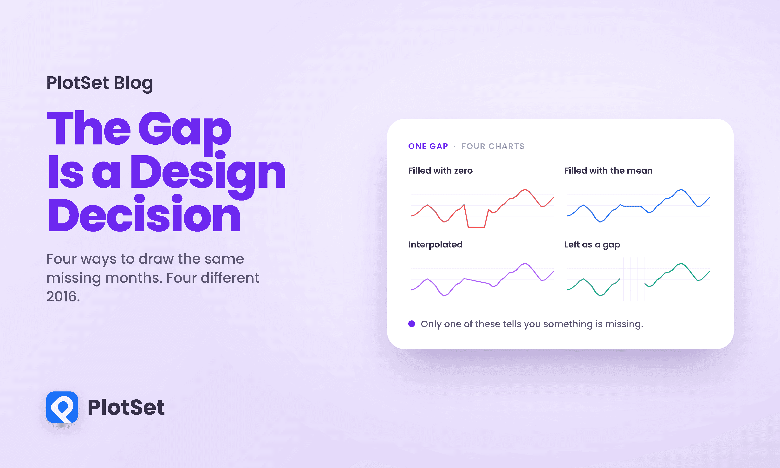
The Mauna Loa CO2 record is the most reproduced time series in climate science: monthly mean atmospheric CO2, running since 1958, with the interruptions any six-decade instrument record accumulates. I took a fully observed 36-month window, hid five consecutive months spanning the 2016 seasonal peak, filled the hole three ways, and compared each fill against the real values I had hidden. The errors below are therefore real errors, not estimates.
Start with the fill that looks most obviously wrong, because it is also the most common accident.
Zero-filling is the one everybody recognises as a bug, and it is the least dangerous for exactly that reason. Nobody reads that crater as a real collapse in atmospheric CO2. It announces itself.
The dangerous fills are the ones that look fine.
The real series rises to 407.90 ppm in May 2016. Across the five filled months, the mean-filled version tops out at 403.68 and the interpolated version at 403.95. The peak does not appear in either. It is not attenuated or smoothed; it is simply absent, and nothing on the chart indicates that anything was ever there. Both versions still show the 2017 peak at 409.89, which is the point: the chart looks entirely healthy, and one of its two peaks has been deleted.
Two honest caveats about my own numbers. First, this window was chosen to be hard: the gap deliberately spans a seasonal turning point, which is where interpolation is weakest. Over a large sample of ordinary gaps, interpolation wins comfortably; across thousands of four-week hold-out windows in the weekly Mauna Loa record it lands under half a part per million, against several hundred for zero-filling. Second, an error in parts per million is a statement about the fill, not about the reader. A numerically excellent fill can still mislead, and that distinction runs through everything below.
The bar chart problem
Line charts at least break. Bar charts have a worse property, and it is the single most useful thing in this literature for anyone who publishes charts.
A month with genuinely zero sales and a month where the till was broken produce the same picture: no bar. Hayeong Song and Danielle Albers Szafir state it in the related-work section of their study, as part of the reason they tested bar charts at all: removing missing data from bar charts "is indistinguishable from zero values."
Be clear about the status of that sentence, because I nearly overstated it. It is the rationale for a study design, not a measured result, and the authors attach no statistic to it. What it describes, though, is not really an empirical question. Absence of a bar is already spoken for as a value of zero, so there is no encoding left in the bar itself to carry the difference. If the distinction matters, it has to live somewhere other than the bar.
What the research actually found
Song and Szafir ran two crowdsourced experiments, on line graphs and bar charts, crossing three imputation methods with seven visual encodings per chart type and four levels of missingness, across four participant groups totalling 303 people. It is the most direct evidence available, and its headline is not the one usually quoted.
Showing missingness reliably changed how good the data felt. Visualization design significantly affected perceived data quality in all four sub-studies. The amount of missing data affected it enormously: F values from 1,185 to 2,927, all at p below .0001.
It mostly did not change how accurately people read the chart. Across the same four sub-studies, design significantly affected objective accuracy in exactly one, bar-chart averaging. The amount of data missing did not significantly affect accuracy in any of the four, with one exception the authors flag: for line-graph averaging, when imputed values were excluded from the analysis, missingness did hurt accuracy, F(1,62) = 23.81, p below .0001.
Then there is the result that should stop anyone reaching for a tidy recommendation. In bar-chart trend detection, zero-filling produced the lowest perceived data quality of the three methods, at 4.14 out of 7, and the highest accuracy, at 64.33 percent. Linear interpolation, the method that felt best at 4.72, produced the worst accuracy at 59.57 percent, F(2,71) = 5.66, p below .0035. The authors call it a surprising countereffect. The method that looked least trustworthy was the one people read most accurately.
That result does not generalise, and it is worth showing why, because it is the kind of finding that gets quoted loose. In bar-chart averaging, the same three methods reverse: linear interpolation reads best at 80.51 percent, marginal means 80.25, and zero-filling worst at 75.14, F(2,77) = 9.14, p below .0001. One task, one ordering; a different task, the opposite ordering. Neither is a rule about imputation.
And on the question the article actually cares about, which is whether marking the gap helps, the same averaging study is the one place encoding significantly moved accuracy, F(6,73) = 3.91, p below .0007. There, the design that highlighted missing values in colour scored highest at 83.23 percent, while simply removing the data scored 76.37 and a dashed outline scored lowest at 75.35. The single clear measurement about marking points toward marking.
A later study by Song with Yu Fu, Bahador Saket and John Stasko watched 18 people explore data with and without missing values shown, and found that surfacing missingness led participants to reason about data quality and to work more consistently, coded qualitatively with high inter-rater agreement. That is a finding about process, not correctness. It is a good reason to show holes. It is not evidence that readers get more answers right.
There is one more result often cited here, from Rebecca Andreasson and Maria Riveiro, and it is routinely overstated, including in the brief that sent me looking. The full text is paywalled with no open copy, so only the abstract is verifiable. That abstract supports exactly one comparison: showing an empty gap with an explanation produced significantly higher decision confidence than rendering the missing region as fuzziness. It does not claim the gap beat plain emptiness, and the word "preferred" does not appear in it at all; that framing comes from a later survey paraphrasing the paper, and I am not going to pass a paraphrase off as the source. What the abstract does add is worth the caution: the same condition also produced the highest number of risky choices. Confidence went up. So did risk-taking. Correctness is not reported.
The most famous curve has a hole in it
One more thing about that CO2 record, because it shows how invisible this gets in practice.
NOAA's own data file states: "Missing months have been interpolated, for NOAA data indicated by negative stdev and uncertainty." So the file does tell you. It tells you in a column called sdev, by putting a negative number in it, in a file most people never open because they use the published chart.
Across the NOAA era of the record, from May 1974 to June 2026, that flag fires for exactly two months out of 626: December 1975 and April 1984. April 1984 carries a day count of 2, so the published monthly mean rests on two days of measurement. December 1975 carries a day count of -1, meaning the file has no day count for it either.
I nearly published "exactly one" here. My first pass filtered to rows with a non-negative day count before looking for the flag, which quietly dropped December 1975, and I did not notice because the answer looked clean. NOAA's rule is the negative standard deviation on its own. A filter you forget you applied is the same class of mistake as a fill you forget you accepted, which is the entire subject of this article.
For the Scripps era before 1974, NOAA states it has no such information at all, so for the first sixteen years of the most reproduced curve in climate science, the file cannot tell you which months were interpolated.
This is a well-run dataset, carefully documented by careful people, and the missingness is still one negative number in a column nobody loads. Now consider a sales dashboard.
What to do
The evidence supports a narrower set of recommendations than the enthusiasm around this topic suggests.
Never let a fill enter the chart unmarked. This is the one recommendation everything supports. Whatever you impute, the imputed region must be visually distinct from measured data. The research does not agree on which encoding is best; it agrees that readers reason about quality when they can see the difference, and cannot when they cannot.
In bar charts, do not rely on the bar. A missing category and a zero category are the same picture. If the distinction matters, carry it somewhere else: a hatched placeholder, an explicit label, an annotation, a note.
Know what breaking the line costs. It is the honest default and it has a failure mode: a single surviving observation between two gaps has no neighbours to connect to, so in a line-only chart it can render as nothing at all. Both Vega-Lite and D3 document this. If your gaps are frequent, draw the points as well as the line.
Choose the fill for the question, not for the look. A gap spanning a turning point defeats interpolation, as the 2016 peak above shows. A gap in a slow-moving series barely matters. Both were "linear interpolation."
Do not assume that showing the hole makes readers more accurate. It reliably lowers perceived quality, which is often correct and honest. It changes how people reason. On accuracy the evidence is thin, task-dependent, and in one measured case it runs backwards.
Say why it is missing when you can. The instrument failed, the survey was not run, the shop was closed. Readers cannot infer this and no encoding conveys it.
Building this in PlotSet
Every chart above is a live PlotSet embed, and the sequence is the argument: a sortable table for the tool disagreement, two line charts for the two kinds of fill error, a bar chart for the measured cost, and a grouped bar chart for the ambiguity that has no visual fix.
The practical point for anyone building charts is that this decision gets made whether or not you attend to it. The value of a chart tool here is not that it solves missing data, because nothing does. It is that the gap treatment should be visible and deliberate at the moment you build the chart, rather than a default buried in a dialog you will never open, and that switching between showing a break, showing a fill and showing a marked fill should be cheap enough that you actually look at all three before deciding.
What we are not going to tell you is that any tool makes missing data safe. The bar-chart collision is not a rendering bug that better software fixes; it is two facts contending for one visual state. And on whether marking a gap makes readers more accurate, the honest answer is that the evidence is thin rather than damning: encoding moved accuracy in one sub-study out of four, and in that one it moved in favour of marking. What a good tool can do is make the decision yours, and make it visible on the page.
References
- IEEE TVCG. Where's My Data? Evaluating Visualizations with Missing Data. Song & Szafir, 25(1):914-924, 2019 — https://cmci.colorado.edu/visualab/papers/song_VIS_2018.pdf
- IEEE VIS. Understanding the Effects of Visualizing Missing Values on Visual Data Exploration. Song, Fu, Saket & Stasko, 2021 — https://arxiv.org/abs/2109.08723
- IEEE Information Visualisation. Effects of Visualizing Missing Data. Andreasson & Riveiro, 2014, 132-138 — https://doi.org/10.1109/IV.2014.77
- arXiv. Visualization of Missing Data: A State-of-the-Art Survey. Alsufyani, Forshaw & Johansson Fernstad, 2024 — https://arxiv.org/abs/2410.03712
- NOAA Global Monitoring Laboratory. Trends in Atmospheric Carbon Dioxide, Mauna Loa — https://gml.noaa.gov/ccgg/trends/
- Microsoft. Display empty cells, null values, and hidden worksheet data in a chart — https://support.microsoft.com/en-us/office/display-empty-cells-null-n-a-values-and-hidden-worksheet-data-in-a-chart-a1ee6f0c-192f-4248-abeb-9ca49cb92274
- Microsoft Learn. Line charts in Power BI — https://learn.microsoft.com/en-us/power-bi/visuals/power-bi-line-chart
- Microsoft Learn. Show items with no data in Power BI — https://learn.microsoft.com/en-us/power-bi/create-reports/desktop-show-items-no-data
- Google Charts. Line Chart configuration options — https://developers.google.com/chart/interactive/docs/gallery/linechart
- Vega-Lite. Invalid Data — https://vega.github.io/vega-lite/docs/invalid-data.html
- ggplot2. geom_path and geom_line reference — https://ggplot2.tidyverse.org/reference/geom_path.html
- Matplotlib. Plotting masked and NaN values — https://matplotlib.org/stable/gallery/lines_bars_and_markers/masked_demo.html
- D3. d3-shape, line.defined — https://d3js.org/d3-shape/line
- Tableau. Show or Hide Missing Values or Empty Rows and Columns — https://help.tableau.com/current/pro/desktop/en-us/missing_values.htm
- Tableau. Handling Null and Other Special Values — https://help.tableau.com/current/pro/desktop/en-us/datafields_specialvalues.htm