Responsive design arrived in data visualization as a layout problem. Squeeze the axes, rotate the labels, drop a legend, ship it. The chart got smaller, the content stayed the same, and the job was a media query.
That framing is wrong, and you can prove it to yourself in about thirty seconds with a chart you have already published. Shrinking a chart does not carry its meaning down intact. It changes which facts stay practically reachable, and somebody decided which ones those were, even if that somebody was a breakpoint nobody revisited.
Watch it happen
Here is real data: electricity generation in the European Union by source, from 2000 to 2025, from Ember, via Our World in Data. Six sources, twenty-six years. There is a genuine story in it. Wind generation passed coal for the first time in 2020, fell back behind it in 2021 when the gas crisis pushed coal back onto the grid, and moved permanently ahead from 2023. Coal fell from 800 terawatt-hours to 257 across the period, while wind climbed from 21 to 479. Solar, which was a rounding error in 2000 at well under one terawatt-hour, passed coal in 2024.
Now watch what a width change does to it.
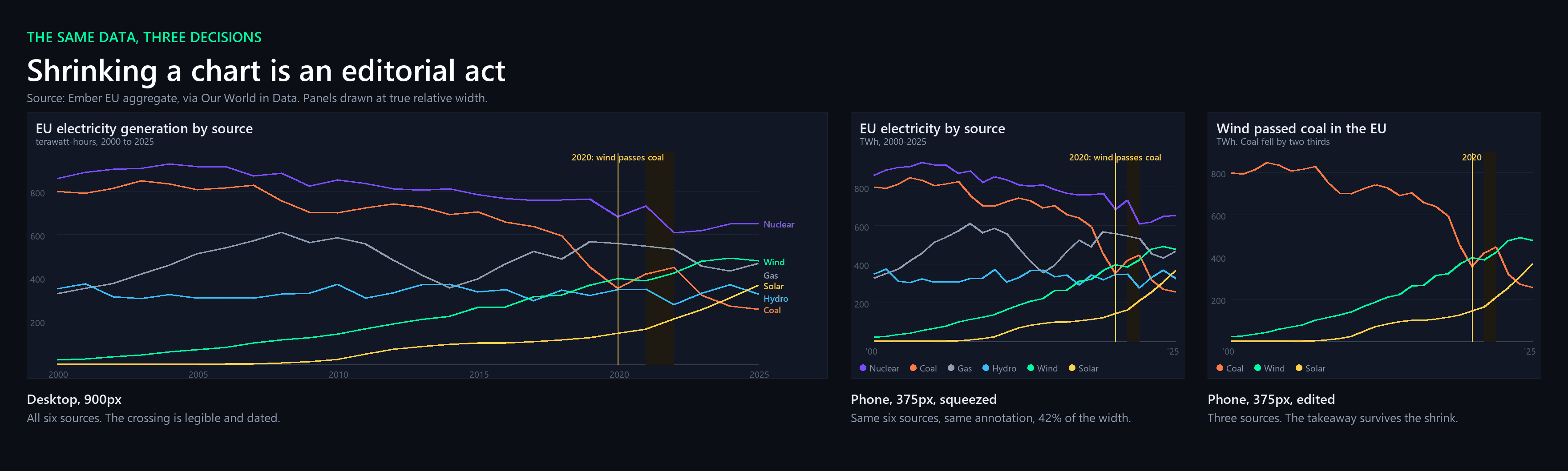
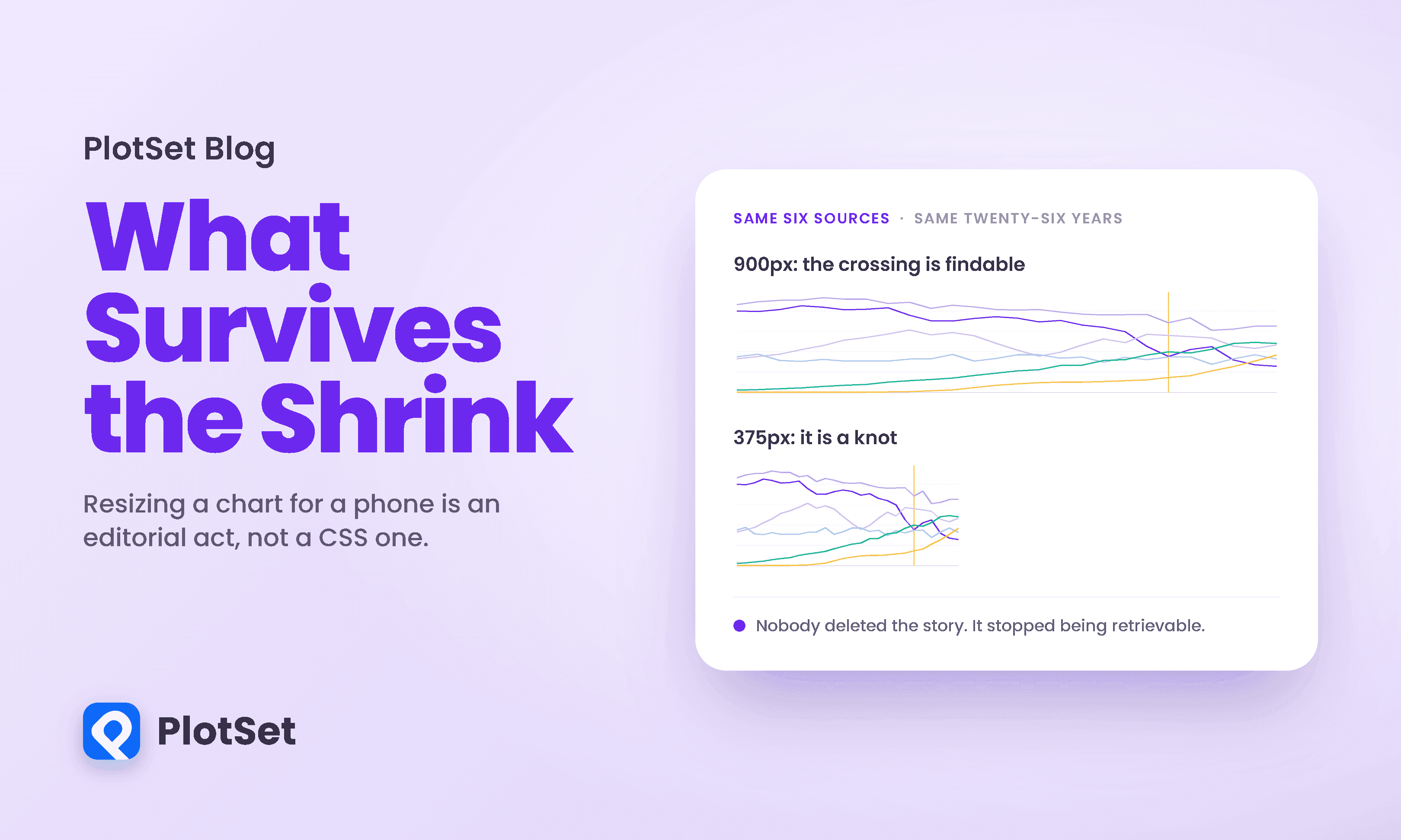
The left panel is the chart at 900 pixels. You can see the crossing, you can date it, and the labels sit beside the lines they belong to.
The middle panel is the identical chart at 375 pixels, which is the width of a common phone in portrait. Nothing has been removed. Every series is still there, every year is still plotted, the annotation still points at 2020, and the data is untouched. Width is the only thing that changed. For practical purposes, though, it has become a different chart. The region where the six series converge between 2018 and 2023 holds seven separate crossings, and at this width they collapse into a knot about a centimetre across. The inline labels no longer fit, so they have become a legend, which means the reader has to look up each colour instead of reading the line. The year axis has lost most of its ticks.
Nobody removed the story. The story simply stopped being retrievable.
The third panel is what an editorial decision looks like. It keeps three series instead of six, states the finding in the title rather than leaving it to be discovered, and marks the year. It answers one question well instead of six questions badly. It also, unavoidably, throws away the gas and nuclear trends, which is exactly the point: someone chose.
Here is the full six-series version as a live chart rather than a screenshot, which lets you run the experiment on yourself.
That caption is not a joke at the chart's expense. It is the same chart, honestly rendered, and on a narrow screen it is genuinely hard to use for the one question it was built to answer. I left it in rather than quietly swapping in a simplified version, because a piece arguing that responsive adaptation is a decision should show you the version where the decision has not been made.
The arithmetic of the squeeze
It is worth being precise about what a phone actually costs you, because the loss is narrower and more specific than "things get small."
Take that twenty-five-interval series and hold the axis gutter at a constant 40 pixels, which is what every number below assumes. At 900 pixels of chart width you get 34.4 pixels per year. At 375 pixels you get 13.4. That is 39 percent of the horizontal resolution, and horizontal resolution is where a time series keeps its detail.
The vertical dimension, meanwhile, barely changes, because chart height is not usually what a media query attacks. Holding height constant, the gap between the wind and coal lines at the 2020 crossing goes from 11.1 pixels to 9.9. So the honest version of the complaint is not that everything gets crushed. It is that time gets crushed while value does not, and every chart whose meaning lives along the time axis pays for that asymmetrically.
The label budget tells the same story. A four-digit year plus enough space to not collide needs roughly 40 pixels. At 900 pixels of chart width you can fit 21 year labels. At 375 you can fit 8. To label all twenty-six years you would need about 1,080 pixels, which is not a phone.
One fingertip is three years wide
The interaction cost is worse than the display cost, and it is the part most responsive workflows never measure.
Apple's Human Interface Guidelines put it plainly: "As a general rule, a button needs a hit region of at least 44x44 pt ... to ensure that people can select it easily." WCAG 2.2 sets the same 44 by 44 figure as its enhanced Level AAA criterion, and a more forgiving 24 by 24 CSS pixels at Level AA. Whichever number you pick, it is a constraint on the reader's hand rather than on the screen, so it does not shrink when the chart does. The smaller the chart, the more data sits underneath a single tap.
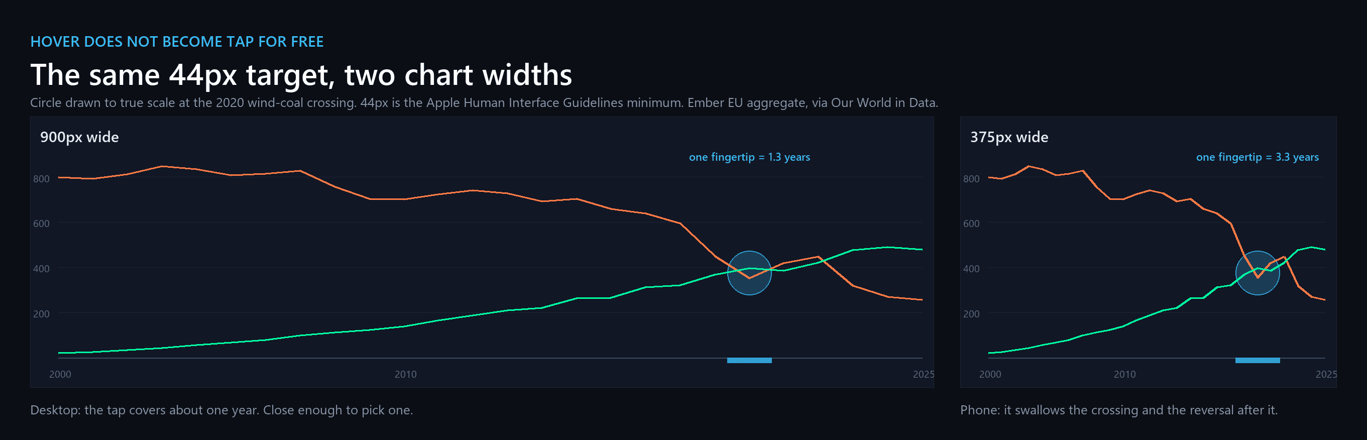
On this series a 44-pixel target covers about 1.3 years at 900 pixels wide. At 375 pixels it covers 3.3. The tap that would have selected 2020 on a laptop now selects 2019 through 2022 on a phone, which is to say it selects the crossing, the reversal, and the recovery as a single undifferentiated blob. The reader cannot ask the chart the question the chart exists to answer.
The chart above crosses 1.0 at about 1,140 pixels of chart width. Below that, the reader's finger is wider than the thing it is aiming at. Good hit-testing still resolves which year they meant, by snapping to the nearest datum or by dividing the plot into bands, so the tap is not unanswerable. What degrades is aim: the reader cannot see which year they are about to select, cannot correct a near miss, and gets no feedback proportionate to the precision the chart is implying. Hold me to the friendlier standard and the conclusion survives: at WCAG's Level AA target of 24 pixels, a 375-pixel chart still puts 1.8 years under each tap, and you still need about 640 pixels before a tap means one year. The phone is on the wrong side of both numbers. The usual advice, replace hover with tap because hover belongs to desktop, is correct as far as it goes. It just stops one step too early. Swapping the event is the easy half. The hard half is that the thing being pointed at has to be big enough to point at, and on a phone that means fewer data points, not the same data points with a different listener.
The record says it is subtraction
If shrinking a chart were a layout operation, the mobile versions in the wild would mostly be the desktop versions at a smaller scale. They are not.
Jane Hoffswell, Wilmot Li and Zhicheng Liu assembled a corpus of 231 responsive visualizations from 53 news articles across 12 outlets, including the New York Times, FiveThirtyEight, Bloomberg, Reuters Graphics and The Guardian, and compared each one across screen sizes. In the portrait phone versions, 87 of the 231, or 37.7 percent, removed elements. Only 26, or 11.3 percent, added anything. Adaptation runs one way.
The five journalists they interviewed described the process in exactly those terms. One put it as a ranking problem: "There's a hierarchy of information, right? So as you go down in the artboard size you make the decision about what information can be cut first." Another described the failure case with a specificity anyone who has shipped a map will recognise: "US map is a nightmare for responsiveness, you can have a very beautiful, detailed US map on the desktop but when you shrink it down to the phone you can barely see like 5 cities named in it." The authors summarise the dominant workflow as starting "with the full desktop visualization and to select what content could be removed."
Two honest caveats about that corpus, because they matter. The corpus is a purposive sample of award-adjacent graphics rather than a random one, and the paper runs no statistical tests of any kind. What it offers is a careful description of what a set of professionals did, not a measurement of an effect. And the subtraction is not universal: 69 of the 231 changed nothing at all in landscape. The claim that survives is narrower: removal is the single most common edit and it outnumbers addition better than three to one, but it is not what happens to most charts. Of the 225 portrait versions that changed at all, 87 removed something. Hoffswell and colleagues put it as it was "more common to remove or reposition content, than to add new content."
There is also a process detail worth sitting with. A separate survey of 19 responsive-visualization authors found 11 of them, 58 percent, build the small-screen version after the desktop one. The mobile chart is typically not designed. It is derived, under time pressure, from something that was designed.
Five ways a message dies
The most useful thing in this literature is not a finding but a taxonomy. Hyeok Kim, Dominik Moritz and Jessica Hullman coded 378 pairs of large-screen and small-screen visualizations, 756 views in total, and catalogued 76 distinct transformation strategies. Their framing is the one the folklore keeps reaching for and getting wrong: authors face "key trade-offs related to authors' need to maintain graphical density, referring to the amount of information per pixel, while also maintaining the 'message' or intended takeaways for users of a visualization."
Out of that corpus they name five distinct ways a chart can lose its message. This is the checklist that actually has teeth, because each item is a different failure with a different fix.
-
Loss of information. Records, fields, panels or annotations are removed, or the data is aggregated so a distribution can no longer be recovered. This is the obvious one and the least dangerous, because it is visible.
-
Loss of interaction. A feature is dropped, or explorable states are frozen into a couple of static panels, so the other states become unreachable. Hoffswell's corpus found that many visualizations "removed the interactivity completely from the mobile version rather than redesigning the interactive capabilities."
-
Reduced discoverability. Nothing is deleted. It is moved behind a toggle, a tab or an accordion. The information is technically present and practically gone.
-
Reduced concurrency. Elements get serialized past a single scroll height. Transposing a chart to fit portrait can make it so tall that two things a reader needs to compare can never be on screen at once. Comparison dies even though every mark survives.
-
Changes in graphical perception. The subtlest and the worst. Rescaling disproportionately, widening bins, transposing axes or serializing labels "is likely to prompt different impressions among readers." Nothing was removed and the chart now says something else.
My squeezed middle panel is item five, with a side of item four. Every data point is present. The aspect ratio changed, the bins of visual attention widened, and a crossing became a smudge.
The same authors are candid about why this is hard to police, and the sentence deserves quoting because it undercuts a lot of confident advice, including some of mine: "what constitutes a message is often nebulous and rarely rigorously defined by an author." You cannot verify that the takeaway survived if nobody wrote the takeaway down.
That is a problem of method rather than of care, and the same survey makes the distinction. Asked what matters when adapting a chart, those 19 authors ranked maintaining takeaways and maintaining information at the top. They are not indifferent to the message. They are working without a way to check it.
They also found that "different authors use different strategies to resolve seemingly similar problems, implying that a single 'best' solution may not exist for many situations." Which is the strongest available evidence that this is editing rather than engineering. Engineering converges. This does not.
What the small screen actually rewards
Two controlled experiments give some usable direction on what to keep. The first ran on participants' own phones; the second, which pushes the same logic further, ran on a smartwatch.
Matthew Brehmer, Bongshin Lee, Petra Isenberg and Eun Kyoung Choe tested charts of ranges over time with 87 crowd workers, comparing a conventional linear layout against a radial one that wraps time into a circle. Linear was faster, but not everywhere, and the pattern is more useful than the headline. The gap was clearest on reading a value off the chart and on locating a minimum or maximum. Their analysis is estimation-based rather than significance-testing, so the numbers come as intervals: radial was slower on reading a value by somewhere between 20 and 42 percent, and on locating a minimum or maximum by 13 to 30 percent, those being the bounds of the 95 percent confidence intervals rather than a single measured effect. On comparing an observed range against an average, the two layouts came out level: in the authors' words, "participants performed similarly with both layouts in tasks that involved comparing superimposed observed and average ranges." Their recommendation is correspondingly specific: "If the use case involves reliably Locating Min / Max values, we recommend against the use of a Radial layout."
Note what did not differ much. In their words, "there were few differences in terms of error rate between layout conditions." That gloss is doing some work: in the sleep-data group radial actually produced 1 to 8 percent fewer errors when locating a date, and 11 to 20 percent more when locating a minimum or maximum. The fair summary is that radial cost time reliably and accuracy only sometimes. The advantage is real, task-specific, and narrower than "linear beats radial."
One caution on a detail that gets repeated: the paper's introduction says participants "universally preferred" linear, but its own Figure 4 does not support that word. A minority preferred radial at every granularity, and the sleep-data group split roughly evenly at the yearly view. The authors also warn that their findings "should not be used to inform the design of charts depicting ranges over time on devices other than mobile phones."
The smartwatch work makes the same point far more brutally, on a much smaller screen. Tanja Blascheck and colleagues measured how long people needed to compare values on a Sony SmartWatch 3, a viewing area of under 29 millimetres square. With 7 values, a bar chart needed 168 milliseconds and a radial bar chart 286. With 24 values, the bar chart went to 360 milliseconds and the radial bar chart to 3,593 milliseconds, a tenfold gap. A donut chart, meanwhile, barely moved at all, going from 157 to 162, because a donut only ever asks you to compare a couple of arcs. Two caveats keep this in proportion. Their studies used 18 participants each, mostly researchers and students, on a researcher-supplied watch mounted on a stand rather than a device in the hand, so this does not transfer directly to a phone. And their staircase procedure aimed at roughly 91 percent accuracy but only landed in that band for four of nine conditions; the rest ran at 16 to 25 percent error, which means some of those times were bought with mistakes. What the study does show is that the penalty for a fancy layout is not linear in screen size. It accelerates.
The thing nobody has measured
Here is where an honest version of this argument has to stop short, because the obvious study does not exist.
Nobody has taken one chart, rendered it at desktop and phone widths, shown both to ordinary readers, and measured whether the phone group came away knowing less. I looked for it. The near misses are instructive about why it is missing. The automated work on insight loss operationalises identification, comparison and trend loss as functions computed on rendered charts, and its human component is nine visualization experts, five of them the paper's own authors, ranking design alternatives by preference. The animation-versus-small-multiples experiment ran 96 people on their own phones but had no desktop control. The work on bar-chart arrangement is the closest thing to a demonstration that layout rewrites conclusions, and it varied arrangement at desktop scale rather than screen size. It is also more equivocal than it is usually made to sound: the authors state that "visual arrangement in general does not affect how many bars people compare in a chart," and report no arrangement effect on the two most common takeaway types.
So the strong claim, that readers understand less on phones, is unproven. What is documented is that responsive adaptation removes content, that its own practitioners describe it as deciding what to cut, and that different authors facing the same chart cut differently. That is enough to justify treating the mobile version as an editorial decision. It is not enough to tell you what your readers lost. If you want that number, you would have to test it, and essentially nobody does.
I should be equally clear about my own figures. The panels above are a demonstration built from real data, not an experiment. They show that the crossing becomes hard to see and hard to tap. They do not show that any particular reader failed to find it.
Which means the title of this piece is a claim about the artifact, not a measured claim about readers. Shrinking a chart changes what it says in the sense that it changes what the chart makes available: which years are labelled, which comparisons sit on one screen, which points can be selected. Whether that changes what a given reader walks away with is the experiment nobody has run. I think the answer is obvious. Obvious is not the same as demonstrated, and this field has a habit of confusing the two.
The checklist
Everything above collapses into six decisions, and the first one is the only one that is genuinely non-negotiable.
Write the takeaway down before you touch the CSS. One sentence. "Wind passed coal in 2020 and stayed ahead after 2023." You cannot check whether the small version preserves the message if the message was never stated, and the researchers who study this say authors routinely never state it.
Drop series rather than shrink them. Six lines at 375 pixels is not a chart of six things, it is a texture. Three lines is a chart. The desktop version can keep all six.
Check the crossings, not the extremes. This one is my own rule of thumb rather than a finding, but it follows from the arithmetic above: a narrower x-axis compresses horizontal distance, so the places that suffer are the places where lines are already close together. Look there first.
Count what fits on the axis before you rotate anything. Rotated labels are a symptom. If only 8 of your 26 labels fit, the answer is fewer ticks and a stated finding, not diagonal text.
Size the target, then swap the event. Tap instead of hover is table stakes. The real question is how many data points fall under 44 pixels, and if the answer is more than one, either reduce the points or give the reader a different way in, such as a stepper or a direct-labelled highlight.
Assume sunlight and a thumb. Also practitioner lore rather than something I can cite a study for, so weigh it accordingly: low contrast that survives a colour-calibrated monitor tends not to survive a phone outdoors, and the far corners of a tall chart are awkward for a thumb holding the device one-handed.
Six checks, and five of them are about content rather than layout. That ratio is the whole argument.
Building responsive charts that keep their message
The practical consequence of all this is that a responsive chart needs two things a media query cannot give it: a stated takeaway, and a small-screen version that was designed rather than derived.
If you are building these in PlotSet, that is the part to spend your time on. Decide the one sentence the chart exists to deliver, then treat the phone layout as a separate composition that has to deliver it, rather than as the desktop chart with less room. In practice that usually means a shorter series list, a title that states the finding instead of naming the variables, and direct labels on the two or three marks that carry the point. Check the result at the width your readers actually use, not at the width your browser window happens to be, and check it on the crossings rather than the peaks.
What we are not going to tell you is that a chart built in any particular tool comprehends better on a phone. As far as I can establish, nobody has run the experiment that would let anyone say that about any tool, and this piece has spent several thousand words on why claims in this area tend to be repeated rather than checked. What the evidence does support is narrower and more actionable: adaptation is subtraction, subtraction is a choice, and the choice is currently being made by whoever wrote the breakpoint. Making it on purpose is free. Making it by accident costs you the story.
References
- ACM CHI. Techniques for Flexible Responsive Visualization Design. Hoffswell, Li & Liu, CHI 2020 — https://jhoffswell.github.io/website/resources/papers/2020-ResponsiveVisualization-CHI.pdf
- Computer Graphics Forum (EuroVis). Design Patterns and Trade-Offs in Responsive Visualization for Communication. Kim, Moritz & Hullman, 40(3), 2021 — https://arxiv.org/abs/2104.07724
- IEEE TVCG. Visualizing Ranges over Time on Mobile Phones. Brehmer, Lee, Isenberg & Choe, 25(1):619-629, InfoVis 2018 — https://petra.isenberg.cc/publications/papers/Brehmer_2019_VRO.pdf
- IEEE TVCG. A Comparative Evaluation of Animation and Small Multiples for Trend Visualization on Mobile Phones. Brehmer, Lee, Isenberg & Choe, 26(1):364-374, 2020 — https://arxiv.org/abs/1907.03919
- IEEE TVCG. Glanceable Visualization: Studies of Data Comparison Performance on Smartwatches. Blascheck, Besançon, Bezerianos, Lee & Isenberg, 25(1):630-640, 2018 — https://www.microsoft.com/en-us/research/wp-content/uploads/2018/08/GlanceableVis-InfoVis2018.pdf
- ACM CHI Extended Abstracts. Data Visualization on Mobile Devices. Lee, Brehmer, Isenberg, Choe, Langner & Dachselt, 2018 — https://mobilevis.github.io/assets/abstract.pdf
- IEEE TVCG. An Automated Approach to Reasoning About Task-Oriented Insights in Responsive Visualization. Kim, Rossi, Sarma, Moritz & Hullman, 2021 — https://arxiv.org/abs/2107.08141
- IEEE TVCG. Visual Arrangements of Bar Charts Influence Comparisons in Viewer Takeaways. Xiong, Setlur, Bach, Koh, Lin & Franconeri, 28(1):955-965, 2022 — https://arxiv.org/abs/2108.06370
- IEEE TVCG. Dupo: A Mixed-Initiative Authoring Tool for Responsive Visualization. Kim, Rossi, Hullman & Hoffswell, 30(1):934-943, 2023 — https://mucollective.northwestern.edu/files/2023-Dupo.pdf
- EuroVis Short Papers. Interaction Techniques for Exploratory Data Visualization on Mobile Devices. Snyder, Rossi, Koh, Heer & Hoffswell, 2024 — https://arxiv.org/abs/2404.11602
- W3C. CSS Media Queries Level 4 — https://www.w3.org/TR/mediaqueries-4/
- W3C. WCAG 2.2 SC 2.5.8, Target Size (Minimum), Level AA — https://www.w3.org/WAI/WCAG22/Understanding/target-size-minimum.html
- W3C. WCAG 2.2 SC 2.5.5, Target Size (Enhanced), Level AAA — https://www.w3.org/WAI/WCAG22/Understanding/target-size-enhanced.html
- Apple. Human Interface Guidelines: Buttons — https://developer.apple.com/design/human-interface-guidelines/buttons
- Our World in Data. Electricity production by source (Ember) — https://ourworldindata.org/grapher/electricity-prod-source-stacked