Say you run twelve stores. Here is a year of monthly revenue, one line each. One of them is in freefall, down more than three quarters on the year. Before you read another word, try to find it.
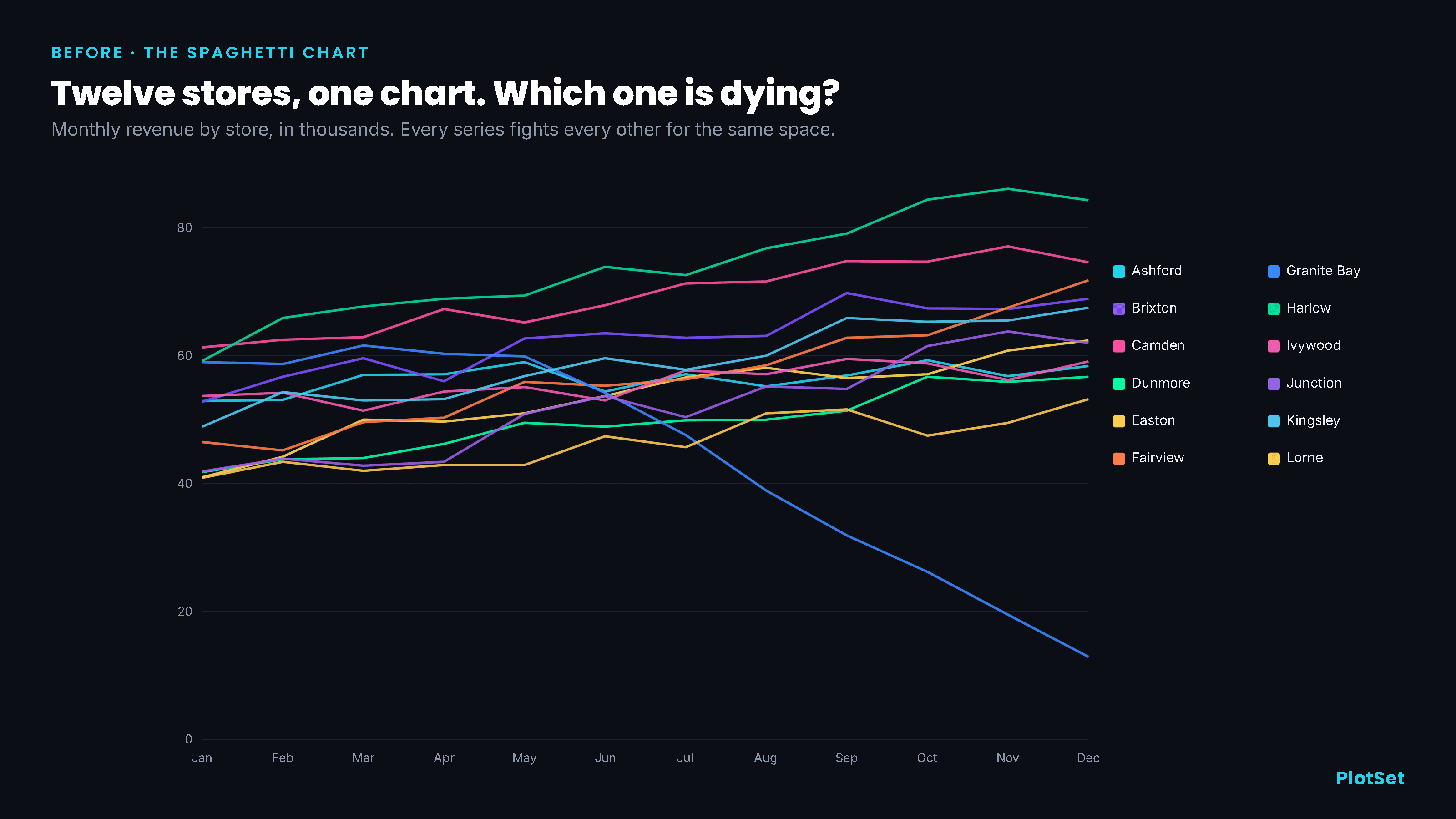
You probably found a line diving toward the bottom. Now name the store. To do that you have to fix its color, carry that color to a legend of twelve near-identical swatches, match it, and carry the name back, all while eleven other lines cross the one you care about. By the time you are sure it is Granite Bay, you have done more work than the chart saved you. This is the most common way a real chart fails, and it has nothing to do with the famous sins of deception. Nobody truncated an axis or inverted a scale here. The data is honest. The chart is simply overloaded, and overload is its own kind of lie: it presents information while quietly making that information impossible to read.
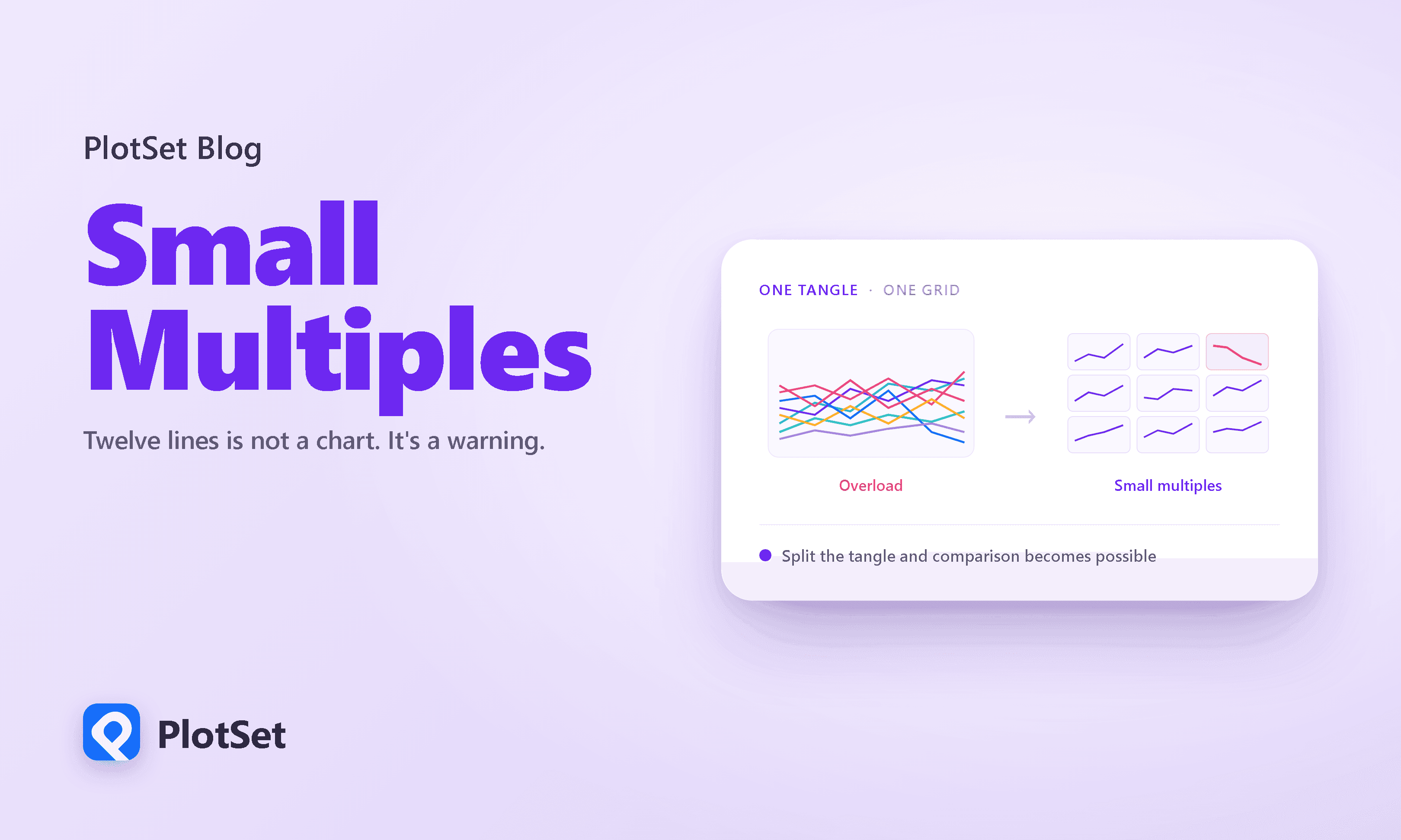
The fix is old, well tested, and almost never shown as a before and after. It is called small multiples, and the rest of this piece is about when to reach for it, why it works, and the two cousins it travels with.
A tangle is unreadable for reasons you can measure
The spaghetti chart, a name the practitioner Cole Nussbaumer Knaflic popularized, does not fail because your reader is lazy. It fails because it asks the eye to do three things it is bad at.
The first is simply telling the lines apart. Give a line chart its due: it puts every value at a position on a shared scale, and position is the channel we read most precisely, as the ranking below makes plain.
Cleveland and McGill measured how accurately people read a magnitude off each visual channel, from position on a common scale at the top down to shading and color saturation at the bottom. They left hue out of the ordering on purpose, because hue has no high-to-low order; it is for labeling categories, not sizes. A line chart honors this ranking for its numbers, which ride on position. The trouble is the job it hands to color. With a dozen lines crowded into one frame, the only thing marking which store is which is its color, so every reading turns into a lookup: fix a hue, find it among twelve legend swatches, carry the name back. Color tells apart a handful of series comfortably. At twelve it is a serial errand you run once per line, and small multiples exist to end it, by turning each series' identity back into a position, its own labeled panel.
The second is that you run out of colors before you run out of lines. Twelve legible, mutually distinguishable colors is more than the eye comfortably handles, and most careful guidance stops well short of it.
Datawrapper tells authors to avoid more than seven categorical colors. Most of ColorBrewer's qualitative palettes top out at eight or nine, and the two that stretch to twelve get there with a workaround rather than twelve independent hues: Paired is six colors in light and dark versions, and Set3 is twelve pale pastels the eye still struggles to keep apart. Even the generous ceiling, around a dozen for a viewer with normal color vision, is a limit, not a working budget. A twelve-series chart demands twelve; the honest supply is closer to seven or eight. Past that, two of your lines will be shades of blue the reader cannot tell apart.
The third is the crossings themselves. Every place two lines meet is a place the eye can lose the thread and follow the wrong segment out the other side. In studies of tangled node-and-link diagrams, crossings are the single biggest source of tracing errors, and the fixes that help most work by pulling the crossing paths apart. A flat chart cannot separate them in depth, but it can do something better: give each line its own space so the crossings never happen at all.
It is the number of lines, not the chart type
The tempting response is to reach for a fancier chart. Resist it, because the most careful study of the problem found that the fancy chart is not where the trouble lives.
In a controlled experiment on reading multiple time series, Javed and colleagues pitted overlaid line graphs against small multiples, horizon graphs, and braided graphs across a set of comparison tasks. When they measured what drove reading time, one factor swamped everything else: the number of series on the chart. Its statistical effect on completion time dwarfed the effect of which technique you used and pushed the effect of chart size below significance, an F of roughly 859 for the count of series against 20 for the technique and a size effect too small to register. Put plainly, adding lines slows a reader down far more than any clever choice of chart type can win back. And here is the part that should end the argument about which exotic layout to reach for: the technique barely touched accuracy at all. People were about as correct with one layout as another. What the layout changed was speed, and only speed.
So the problem was never that you drew a line chart instead of something fancier. It was that you asked one frame to hold twelve stories at once. The fix is to stop asking, and to draw more than one chart.
Small multiples: the fix Tufte named
Split the tangle into a grid of small panels, one series each, every panel on the same scale. Edward Tufte named this small multiples in the 1980s, and the statistician's term for the same idea, from Becker and Cleveland, is a trellis display. Here are the same twelve stores again.
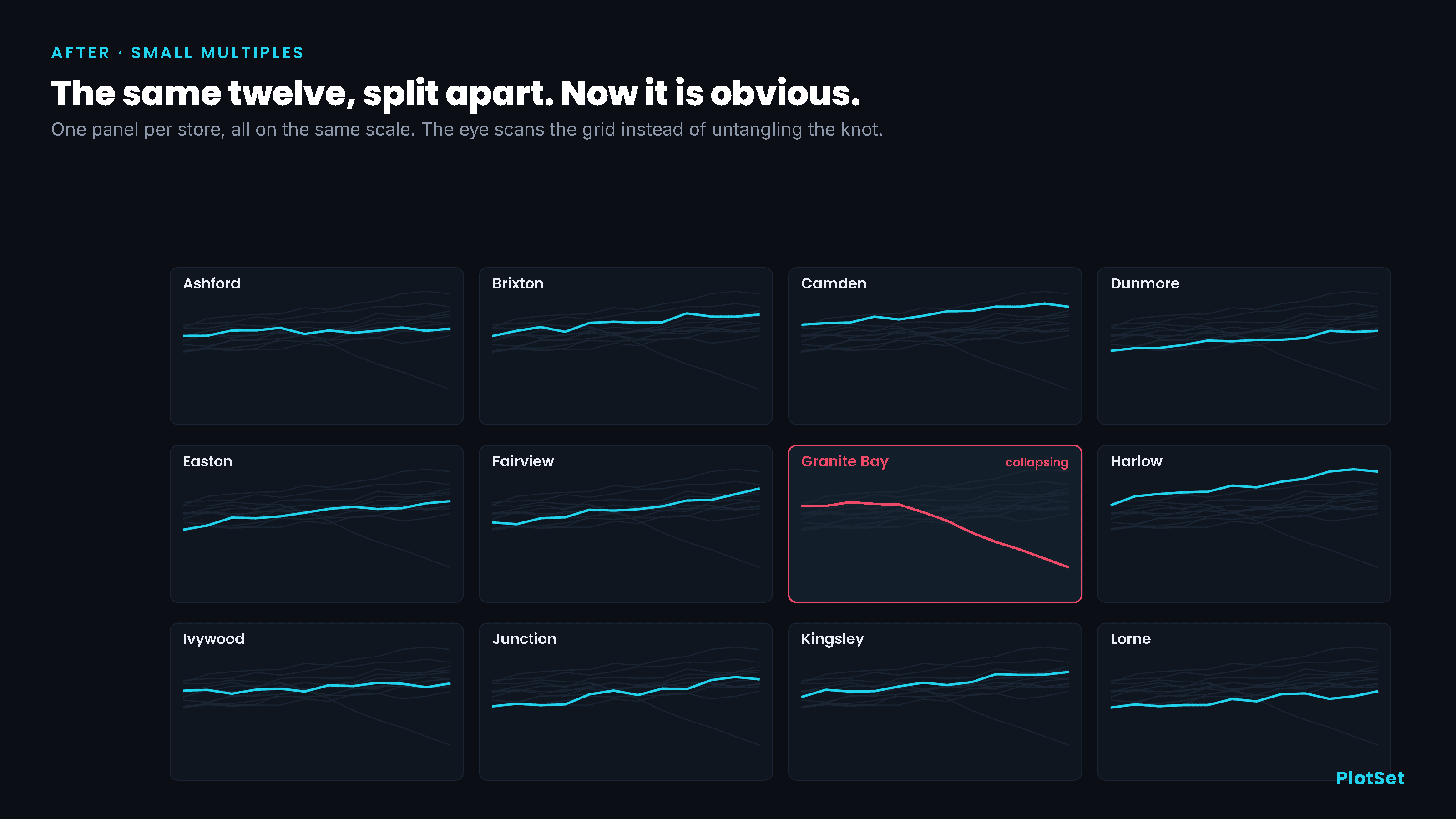
Nothing about the data changed. What changed is the work the reader does. Each series is now read by its position inside its own bounded box, the channel we read most accurately, instead of by a color pulled from a crowded legend. The eye no longer traces; it scans a family of similar shapes and stops on the one that breaks the pattern. Tufte put the reason cleanly: small multiples answer the question at the heart of every chart, compared to what, by enforcing local comparisons within, in his phrase, our eyespan. Once a reader decodes one panel, every other panel is free, because they are all built the same way, so attention flows to the differences in the data rather than the design.
There is an obvious objection: twelve panels sound like they need a wall. They do not. When Heer and colleagues shrank time-series panels to find where reading a value off them breaks down, accuracy held steady all the way to about twenty-four pixels of height per panel, small enough that a dozen of them still fit inside a single glance. Far from expensive, small multiples are one of the most space-efficient things you can do with a comparison.
One tangle, three fixes
Small multiples are the right answer to one specific question, not to every crowded chart. The useful move is to decide what the chart is actually for before you draw it, and the decision comes down to three cases.
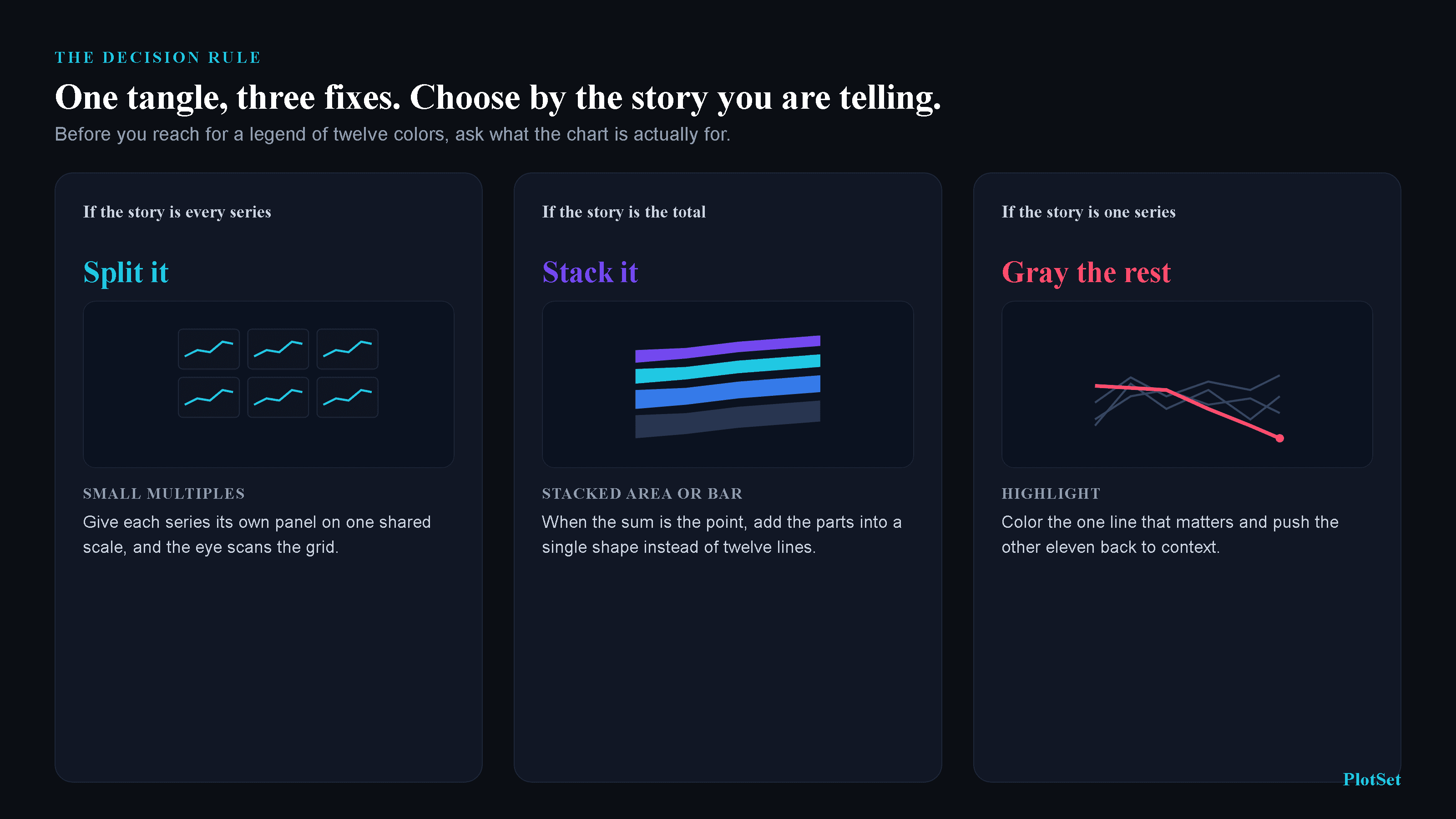
If the story is every series, split it. That is the small-multiples case, and it is the one the research backs most directly: the same study that found series count dominates reading time also found that split-space layouts pull ahead precisely for the dispersed, across-the-whole-width comparisons that get harder as series multiply. Overlaid lines keep an edge only for one narrow job, reading a single point at a single moment, where everything you need is in one place.
If the story is the total, stack it, and then be careful, because the total is a mask. Sum our twelve stores and watch what the year looked like from the boardroom.
Revenue up twenty-two percent, a clean line climbing all year. Granite Bay lost more than three quarters of its business inside that same total and the aggregate never flinched, because eleven rising stores more than covered one falling one. Summing to a single line is the most aggregated view there is, and it hides the most; a stacked area at least keeps each store's band in view. Either is the right chart when the sum is genuinely the point, and the wrong one when a per-series story is hiding inside it, which is why you keep the small multiples on hand even when the headline is the total.
If the story is one series, gray the other eleven. You do not always need a grid; sometimes you need a spotlight. Color the one line that carries your point and push the rest back to a quiet gray, and you have turned a hunt into a glance.
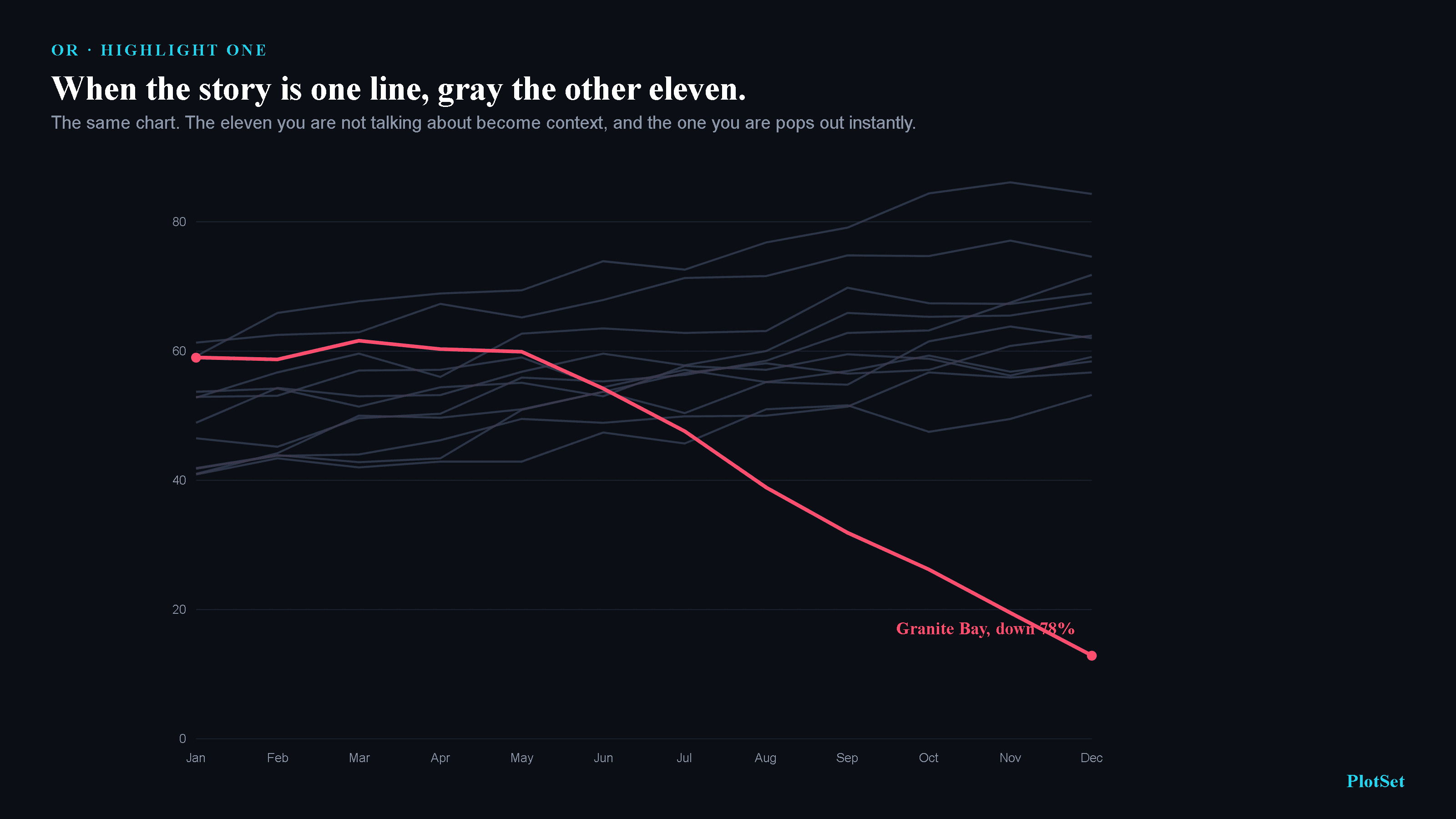
The eleven gray lines still do their job as context, the band your one story lives inside. The red line, meanwhile, is now a unique feature in a field of sameness, and that is the exact condition under which the eye finds a target without hunting for it. A uniquely marked line pops out in near-constant time however many others surround it; a line that looks like its neighbors has to be checked one at a time. By one estimate each added line costs more than ten times as much to search when the lines resemble each other as when one stands clearly apart. Graying the eleven is the standard move in Knaflic's work on decluttering, and it is the cheapest of the three fixes, one color change, no new layout at all.
What twelve lines is really telling you
None of this argues against many series. The argument is against pretending a single overloaded frame has settled a question it has not settled. A chart with twelve lines fighting in one space is not finished; it is a note to yourself that you have not yet decided what the chart is for. Answer that question, whether the story is the spread of all of them, the sum of all of them, or the fate of one of them, and the right form falls out of the answer. Split it, stack it, or gray it.
The technique is a generation old and the perception research under it is older still. What stays scarce is the discipline to stop at the tangle, notice the warning, and ask the one question that untangles it. Twelve lines is not a chart. It is a chart asking to be finished.
References
- JASA. Graphical Perception: Theory, Experimentation, and Application. Cleveland & McGill, 1984. Encoding accuracy ranking: position highest, color saturation lowest (hue excluded).
- IEEE TVCG. Graphical Perception of Multiple Time Series. Javed, McDonnel, Elmqvist, 2010. Number of series dominates reading time (F=858.92) over technique (20.49) and size (n.s.); split-space wins dispersed comparisons; technique didn't affect accuracy.
- Graphics Press. Small multiples: overview and quotations. Tufte, VDQI (1983) & Envisioning Information (1990). "Compared to what?"; comparisons "within our eyespan."
- JCGS. The Visual Design and Control of Trellis Display. Becker, Cleveland, Shyu, 1996. The formal framework for small multiples.
- ACM CHI 2009. Sizing the Horizon. Heer, Kong, Agrawala. Value-reading accuracy holds as panels shrink to ~24px.
- IEEE TVCG. Attention and Visual Memory in Visualization and Computer Graphics. Healey & Enns, 2012. Feature search near-constant time; a similar target costs ~10× more per distractor (4.5 vs 54.5 ms/item).
- Morgan Kaufmann. Information Visualization: Perception for Design. Ware. Path crossings are the dominant source of tracing errors.
- ACM CHI 2010. Crowdsourcing Graphical Perception. Heer & Bostock. Crowd replication of the Cleveland-McGill ranking.
- Storytelling with Data. Avoiding the Spaghetti Graph. Knaflic, 2013. Separate into small multiples, or highlight one and gray the rest.
- Datawrapper. Choosing Colors for Data Visualization. Muth. Avoid more than seven categorical colors.
- CRC Press. Visualization Analysis and Design, Ch.12: Facet into Multiple Views. Munzner, 2014. Superimpose for local, partition into small multiples for global.
- Analytics Press. Show Me the Numbers. Few. Small multiples for many categories in one eyespan; ~8-hue palette ceiling.
- ColorBrewer. ColorBrewer.org. Harrower & Brewer. Qualitative maxima of 8–12; the 12-class "Paired" is six light/dark pairs.