Here is a question with a number attached. You are in Midtown Manhattan and you need to be on the Upper East Side. How long does the taxi take?
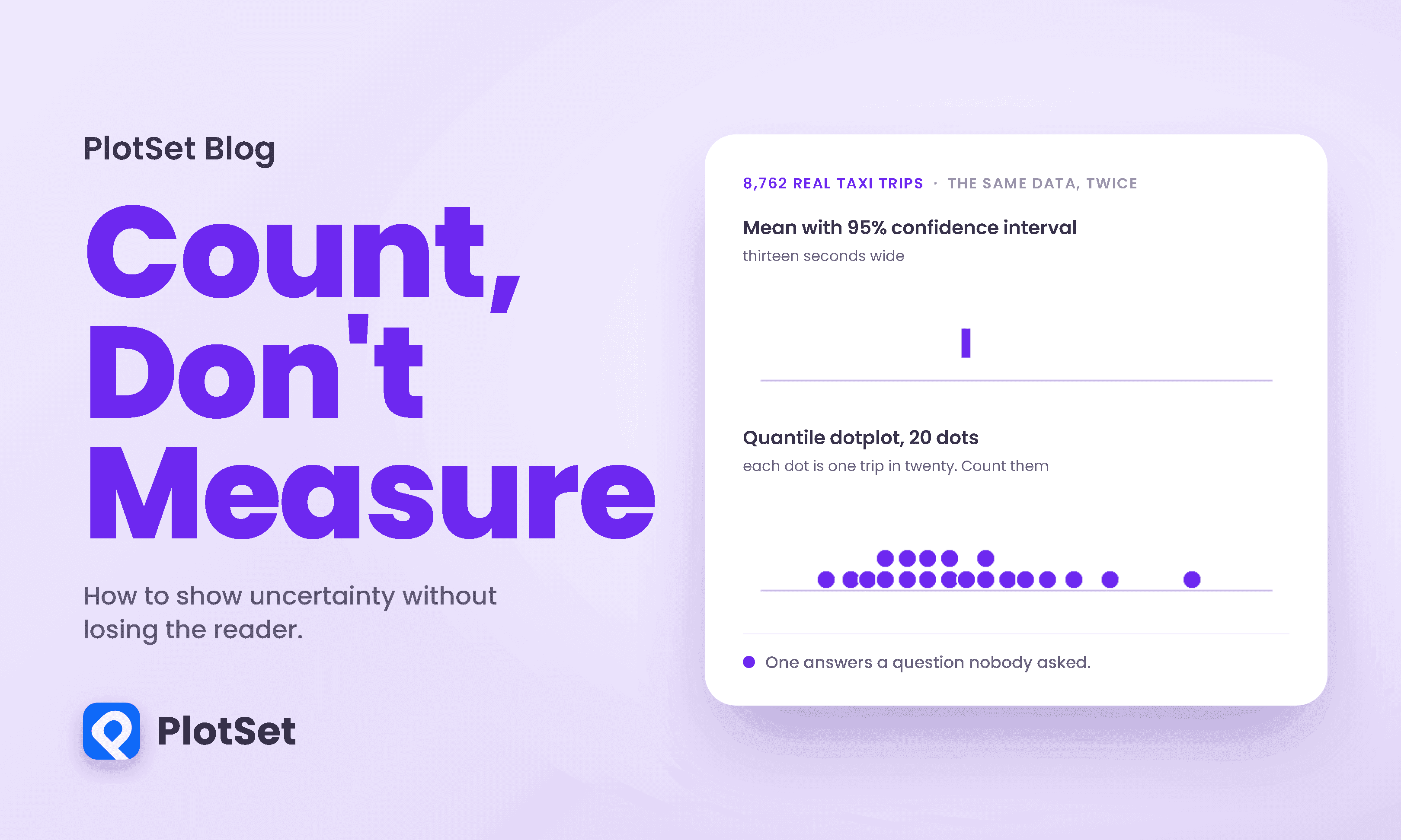
I have the answer, from 8,762 real trips between those two zones in January 2024. The average is 13.2 minutes. If I follow the convention of my field and put an error bar on that average, using the 95% confidence interval the way thousands of published charts do, here is what I am telling you.
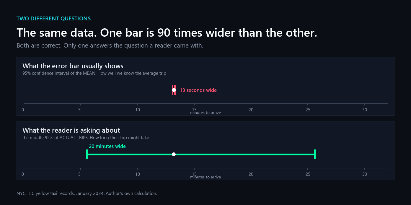
The confidence interval runs from 13.11 to 13.33 minutes. It is thirteen seconds wide. It is a perfectly correct answer to a question nobody asked, which is "how precisely do we know the average of these 8,762 trips?" The question you asked was how long your trip will take, and the honest answer to that spans from 5.6 to 25.6 minutes. On this data the thing you wanted is ninety times wider than the thing the error bar showed you.
That ninety is not a quirk of this route. The width of a confidence interval on a mean shrinks with the square root of the sample size, while the spread of outcomes does not shrink at all, so the gap between the two is roughly the square root of n by construction. Here that is the square root of 8,762, about 94. The uncomfortable corollary is that this failure gets worse the more data you collect. With a hundred observations the two bars differ by a factor of ten. With a hundred thousand, by a factor of over three hundred. Diligence in gathering data makes the wrong bar more wrong.
This is the first and largest failure of uncertainty visualization, and it is not a drawing problem. It is a choosing problem. The bar was accurate and irrelevant.
Three ways uncertainty visualization goes wrong
Even when the bar encodes the right quantity, the encoding itself works against the reader. Michael Correll and Michael Gleicher catalogued the problems in a paper whose title says most of it, "Error Bars Considered Harmful," and their three named failures are worth memorising because you can spot all of them in your own charts.
The first is the within-the-bar bias. A bar is a big solid object, and objects contain things, so values inside it read as more likely than values just outside. The bar is a probability statement pretending to be a box. George Newman and Brian Scholl demonstrated the effect across six experiments and more than twelve hundred participants: shown a value inside the bar and an equally distant value outside it, people rate the inside one as more likely to belong. The detail that matters here is that two of those experiments drew error bars on the graph precisely to signal that values extend past the bar's top, and the bias appeared anyway.
The second is binary interpretation. A value is inside the interval or outside it, full stop, with no gradation. Real uncertainty has no such edge. Nothing happens at 18.5 minutes on my taxi route; the probability just keeps sliding.
The third is ambiguity of referent. An error bar can be a range, a standard deviation, a standard error, a 95% interval, an 80% interval, or an interquartile fence, and it is very often unlabelled. The reader cannot tell, and neither, frequently, can the author.
That last one is not a hypothetical. In 2005 Sarah Belia and colleagues emailed the authors of papers in leading psychology, neuroscience and medicine journals and asked them to do one task: drag one mean until the two means were just significantly different. These were people who publish charts with error bars for a living.
Across both bar types, 22 percent got it right, and the band counted as right was generous: anything from p equals .025 to .10. The chart shows the field-by-field picture, which is stranger than the pooled figure. Behavioural neuroscientists did markedly better than anyone else when shown standard error bars, 41 percent, and no better than anyone else when shown confidence intervals, 20 percent. Nobody was good at both. Two details make it worse. The errors ran in opposite directions depending on the bar: shown confidence intervals, researchers were too strict, placing the means at a separation corresponding to p equals .009; shown standard error bars, too lax, at p equals .109. And 31.5 percent, 99 of the 314, slid the means until the bars just touched, at almost the same rate whichever bar they had been given: 33.6 percent of those shown confidence intervals, 29.9 percent of those shown standard errors.
Touching bars feel like the boundary of significance. They are not. If two 95% confidence intervals just touch, p is about .006. If two standard error bars just touch, p is about .16. Both figures are Cumming and Finch's rules of thumb and carry fine print that is almost never repeated: groups of at least ten, intervals of comparable width. The two pictures look nearly identical, the same gesture means wildly different things in each, and the .05 the reader thinks they are marking is in neither place. When asked to explain their reasoning, 59 percent of participants wrote a comment, and 61 percent of those comments contained a statement that was statistically wrong. Years of experience made no difference at all.
Before you conclude this is a problem for scientists rather than for you: these were the most statistically trained readers available, and a self-selected 15 percent of those invited at that. It would be surprising if a general audience did better.
Give the reader something to count
The alternative that keeps winning is not a cleverer interval. It is a switch from showing a range to showing a frequency, from a bar you measure to marks you count.
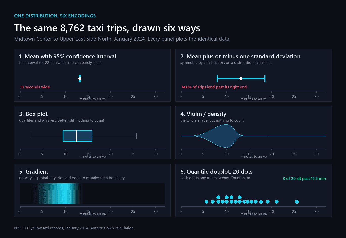
Panel two is the one to sit with. Mean plus or minus one standard deviation is symmetric by construction, and taxi journeys are not symmetric: they cannot take less than a few minutes but they can take an hour. That bar runs to 18.5 minutes on its right side, and 14.6 percent of trips finish after it ends. Drawn as twenty dots, that is three dots sitting past the end of the bar, which a reader can see and count. Drawn as a bar, it is nothing at all.
Panels four and five are Correll and Gleicher's own answer. What performed best in their tests were encodings with no hard edge and a shape symmetric about the mean, which is the generalisable lesson rather than any single chart type: if there is no boundary drawn, there is no boundary to mistake for a rule.
Panel six is the quantile dotplot, introduced by Matthew Kay and colleagues in 2016 for exactly this kind of question. The construction is simple and worth knowing: rather than sampling randomly, you place your dots at evenly spaced quantiles of the distribution, so the picture is stable and each dot is one outcome in however many you drew. Their worked example is the payoff. With fifty dots, a reader willing to be late three times in fifty counts three dots in from the edge and has just built themselves a one-sided 94 percent prediction interval, without a word of statistics. Ninety-four times in a hundred, they are not late.
The number of dots matters, and more is not better.
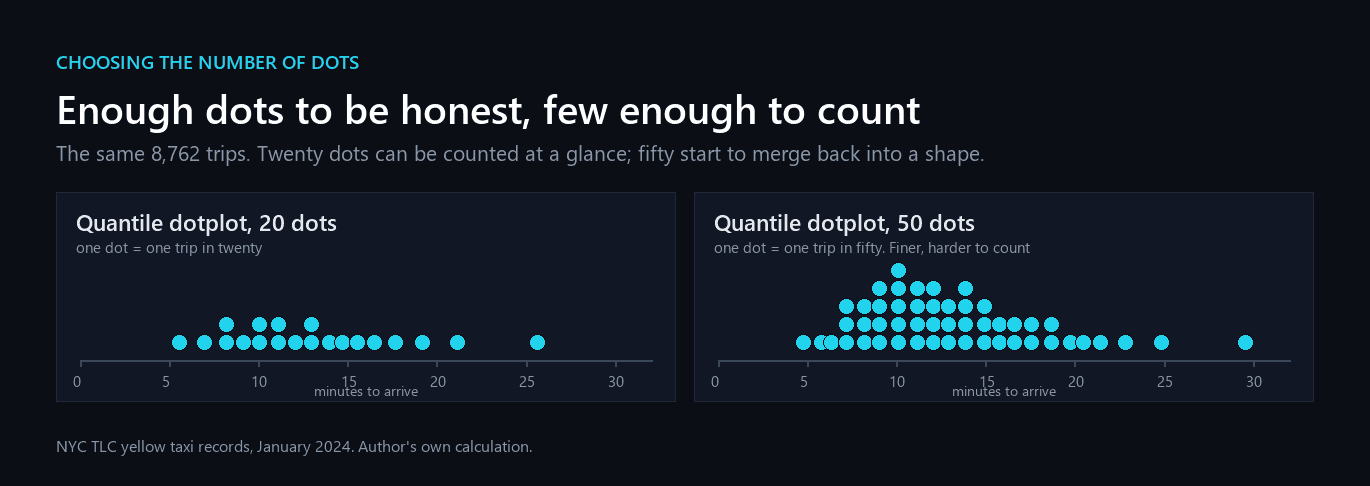
In Kay's study the twenty-dot version produced the most precise probability estimates of the four displays tested, and readers rated their confidence in it highest, at 81 out of 100. One honest caveat, since this claim is often stretched: that experiment compared dotplots against density plots and strip plots. It did not test error bars. Its advantage over the density plot was real but modest: readers' probability estimates varied about 1.15 times less, measured as the standard deviation of those estimates (95% credibility interval 1.04 to 1.26).
Does any of this change a decision?
That is the question that matters, and it has been tested directly. In 2018 Michael Fernandes, with Kay, Hullman and others, put 408 people through 40 rounds of a bus-catching game with money attached. Each round showed a predictive arrival distribution in one of ten formats, the participant chose when to arrive at the stop, and the bus was then drawn at random from the true distribution. Arrive too early and you waste your morning; too late and you miss it.
Measured as the payoff achieved against the best possible payoff, the fifty-dot quantile dotplot reached 97 percent of optimal, about five percentage points better than showing no uncertainty at all, and it made people more consistent, cutting the variation in their own decisions by four percentage points. Those are estimates for the final round, after the participants had seen forty outcomes, so they describe an informed reader rather than a first impression.
And now the finding that should keep anyone honest about this. The twenty-dot dotplot and a plain sentence stating a 99 percent arrival time came out level, a difference of one tenth of a percentage point with a confidence interval straddling zero. A well-chosen sentence matched the chart.
Animation is the other family worth knowing. A hypothetical outcome plot replaces the static summary with a sequence of frames, each showing one random draw from the distribution, so the reader watches the uncertainty instead of reading it. Tested head to head against a bar chart with error bars on a trend-judgement task, animated draws let people reach the same reliability threshold on weaker evidence, a shift of about two thirds of a unit on the study's scale with a confidence interval that stays clear of zero. The costs are real: animation is awkward in print, unusable for some readers, and the effect was not a uniform lift across every participant.
That is not an argument against dotplots. It is an argument against assuming the picture is doing the work. What both formats share is that they answer the reader's question in the reader's units: how late might this be, and how often. What the error bar shares with neither is anything a person can act on.
The thing nobody has shown
There is a claim in the air that showing uncertainty well protects your credibility when the unlikely outcome arrives, that the reader who saw the tail coming forgives you for it. It is an appealing idea and I wanted it to be true. It has now been tested, and it does not hold up.
Yang and colleagues put 498 people through ten simulated election cycles, each with a forecast and an outcome, with two of the ten forecasts wrong by design. They measured trust behaviourally, by which forecaster people chose to return to. What moved trust was whether the forecast turned out correct and whose side the reader was on. The display barely registered. Two deliberate fixes, including widening the shown distribution to counteract overconfidence, both failed to protect trust after a miss.
One detail from that study belongs with everything else here: on their behavioural measure, the plain text forecast was chosen more often than the dotplot. That is the second time in this piece the sentence has beaten the picture.
So show uncertainty because it helps people decide, which is measured and real. Do not promise yourself it will buy forgiveness later, because nobody has demonstrated that.
The decision, in the reader's units
Which brings us back to the taxi. The reader's real question was never "what is the average." It was "when should I leave."
Allow fourteen minutes and you make it 63 percent of the time, which is to say you are late to better than one meeting in three. Twenty minutes buys you 90 percent. Twenty-four buys 96. Nothing in that sentence required the word confidence, and none of it was visible in a thirteen-second bar.
What to do on Monday
Five rules, in the order they will save you the most trouble.
Decide which uncertainty you mean, and say it in the caption. Uncertainty about an average and uncertainty about an outcome are different quantities that differ, on ordinary data, by an order of magnitude or two. If your reader is asking about their own case, plot the spread of cases.
Never ship an unlabelled bar. If the chart does not say what the bar is, a large minority of even expert readers will guess wrong, and they will guess in different directions depending on what you actually used.
Stop inviting overlap comparisons. Readers will judge significance by whether bars touch no matter how many times you tell them not to. If the comparison matters, plot the difference and its interval directly, and let the reader see whether that crosses zero.
Where the reader must act, give them something to count. Twenty dots, each one outcome in twenty, is a format people read without training and read consistently.
Then try writing the sentence. The best-tested formats in the transit study included a plain textual interval, and it held its own against the chart. If one sentence answers the question, the chart is optional. If the chart cannot be summarised in one sentence, you probably have not decided what it is for.
The point of showing uncertainty is not to look rigorous. It is to leave the reader able to make a decision they would not have made otherwise. A thirteen-second bar cannot do that. Three dots past the end of the line can.
How I measured this
Every figure of my own comes from the New York City Taxi and Limousine Commission's yellow taxi records for January 2024. I took trips from taxi zone 161, Midtown Center, to zone 236, Upper East Side North, and kept those lasting between 2 and 180 minutes, which leaves 8,762 trips. The confidence interval is the ordinary 95% interval on the mean; the outcome range is the 2.5th to 97.5th percentile of the trips themselves; the dotplots place their dots at evenly spaced quantiles of that same distribution. No modelling and no smoothing were applied anywhere.
References
- Psychological Methods. Researchers Misunderstand Confidence Intervals and Standard Error Bars. Belia, Fidler, Williams and Cumming, 10(4):389-396, 2005. Only 22% of published researchers placed two means at the just-significant separation; 31.5% used a "just touching" rule.
- IEEE TVCG. Error Bars Considered Harmful. Correll and Gleicher, 20(12):2142-2151, 2014. Within-the-bar bias, binary interpretation, ambiguity of referent; encodings symmetric about the mean and visually continuous performed better.
- ACM CHI 2016. When (ish) is My Bus? Kay, Kola, Hullman and Munson. Introduces the quantile dotplot and its counting semantics. Error bars were not among the tested conditions.
- ACM CHI 2018. Uncertainty Displays Using Quantile Dotplots or CDFs Improve Transit Decision-Making. Fernandes, Walls, Munson, Hullman and Kay. 408 participants; the 50-dot dotplot reached 97% of optimal, and the 20-dot version tied with a plain textual interval.
- American Psychologist. Inference by Eye. Cumming and Finch, 60(2):170-180, 2005. The overlap rules of thumb and their conditions.
- ACM CHI 2020. How Visualizing Inferential Uncertainty Can Mislead Readers. Hofman, Goldstein and Hullman.
- PLOS ONE. Hypothetical Outcome Plots Outperform Error Bars and Violin Plots. Hullman, Resnick and Adar, 2015.
- IEEE TVCG. Hypothetical Outcome Plots Help Untrained Observers Judge Trends. Kale, Nguyen, Kay and Hullman, 25(1), 2019. HOPs beat error bars head-to-head (p = 0.02).
- Psychonomic Bulletin and Review. The Within-the-Bar Bias. Newman and Scholl, 19(4):601-607, 2012. Six experiments, 1,203 participants; the bias appeared even with error bars drawn.
- Wiley StatsRef. Uncertainty Visualization. Padilla, Kay and Hullman, 2021.
- Psychological Review. Frequency Formats. Gigerenzer and Hoffrage, 102(4):684-704, 1995.
- Risk Analysis. Graphical Communication of Uncertain Quantities to Nontechnical People. Ibrekk and Morgan, 7(4):519-529, 1987.
- NYC Taxi and Limousine Commission. TLC Trip Record Data. The January 2024 yellow taxi records behind every calculation of my own.