PlotSet LogoPlotSet

How to Create an Arc Map

A step by step walkthrough for turning a sheet of origins and destinations into a published arc map in PlotSet, from placing coordinates to filtering, publishing and embedding.

Etwa 8 Minuten

One curved line per route, drawn across a world map from your own origins and destinations: that is how to create an arc map from a spreadsheet, with thickness showing volume, colour showing a category, and a filter so viewers can isolate one group. It runs through the same click path any published PlotSet chart takes, with your own routes rather than placeholder rows.

If your sheet already has latitude and longitude for both ends of every route, it takes about eight minutes. Allow longer if you only have place names, since the template needs coordinates and looking them up is the one chore an arc map adds.

Die Daten, die Sie brauchen

One row per route with six required columns: origin name, origin latitude, origin longitude, destination name, destination latitude, destination longitude. Optional columns add arc size, a colour category and a filter group.

Beispiel-CSV
OriginOrigin latOrigin lngDestinationDestination latDestination lngPassengers (000s)Region
London51.5074-0.1278New York40.7128-74.0060620Transatlantic
London51.5074-0.1278Dubai25.204855.2708550Europe-Middle East
London51.5074-0.1278Singapore1.3521103.8198480Europe-Asia
Tokyo35.6762139.6503Los Angeles34.0522-118.2437410Transpacific
Hinweise

Use decimal degrees. Latitude runs from -90 to 90 and longitude from -180 to 180; southern and western places are negative.

Do not swap the columns. If a route lands in the ocean or on the wrong continent, latitude and longitude are almost always reversed.

Keep coordinates as plain numbers with no degree symbols or N/S suffixes, or the row cannot be placed.

The size column should be numeric. The colour and filter columns are text categories, so keep the spelling consistent or one group will split in two.

Die Schritte

Der genaue Klickpfad in PlotSet, von einer leeren Vorlage bis zum fertigen Diagramm.

  1. 01

    Open the Arc Map template

    From the PlotSet dashboard, start a new project and choose Arc Map, listed under Maps. It loads with sample world air routes already bound, so you can see the column layout before using your own file.

    Die Vorlagenauswahl von PlotSet: links die Liste der Diagrammkategorien, daneben das geöffnete Raster "Bar Charts" und die Vorlagenkarte "Bar Chart" mit ihrer Schaltfläche "Select".
    Jede Anleitung beginnt hier. Wählen Sie erst die Kategorie, dann die Vorlage. Das Raster ist für jeden Diagrammtyp dasselbe.
  2. 02

    Arrange one route per row

    Put the origin and destination names and coordinates on the same row. If you only have city names, look up their coordinates first and add them as columns.

  3. 03

    Upload the file, or connect it live

    Import a CSV or .xlsx file from the data panel, paste rows from a spreadsheet, or connect a Google Sheet so the map can be refreshed later. The first row is read as the column headers.

    Die Datenansicht im PlotSet-Editor: ein Tabellenraster mit den Spalten "Name", "Value" und "Region", gefüllt mit Zahlen zu kanadischen Provinzen, daneben der Bereich "Data" mit "Upload CSV File", "Magic Import" und der Synchronisierung über "Google Sheet".
    Die Datenansicht, hier in einem Balkendiagramm-Projekt. Laden Sie über "Upload CSV File" eine CSV-Datei hoch, holen Sie die Zahlen mit "Magic Import" aus einem Bild oder verbinden Sie ein Google Sheet. Der Bereich sieht bei jedem Diagrammtyp gleich aus.
  4. 04

    Bind the columns

    Confirm which columns are the origin, destination and coordinates. Then bind the optional size column to arc thickness, the category column to colour, and a filter column if you want viewers to isolate a group.

    Der Datenbereich von PlotSet mit hervorgehobenen Spaltenzuordnungen: "Label/time" auf Spalte A, "Values" auf Spalte B und "Filter/color" auf Spalte C, darunter die Schaltfläche "Auto Binding".
    Die Zuordnungen legen fest, welche Spalte zur Beschriftung wird, welche die Werte liefert und welche die Farbe steuert. "Auto Binding" errät sie anhand Ihrer Spaltenüberschriften. Prüfen Sie das Ergebnis, statt sich darauf zu verlassen.
  5. 05

    Pick a projection and base map

    Open the Map tab to choose a flat Mercator view or a rotatable globe, and a light, dark or muted base map. A quiet base makes the arcs stand out.

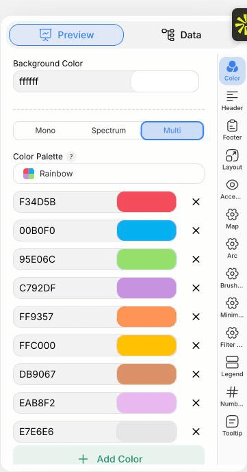
    Der PlotSet-Editor im Tab "Preview": ein fertiges Diagramm vom Typ "Arc Map" auf der Arbeitsfläche und der rot umrandete Einstellungsbereich am rechten Rand.
    Der Tab "Preview" für ein Diagramm vom Typ "Arc Map". Alle Gestaltungsoptionen stecken im umrandeten Bereich: Aussehen, Kopfzeile, Fußzeile und die Optionen, die es speziell für diesen Diagrammtyp gibt, jeweils in einem eigenen Tab.
  6. 06

    Style the arcs

    In the Arc tab set how curved the routes are, how thickness scales with your size column, and whether colour comes from a category or a gradient. Turn on arrowheads if direction matters.

  7. 07

    Add the filter and legend

    Enable the filter control to show a dropdown or buttons, and place the legend so the colour categories are explained.

  8. 08

    Publish it, embed it, or export it

    Publish for a live, zoomable map where hovering an endpoint highlights its routes, copy the embed code for your page, or export a PNG, SVG or PDF for a static image.

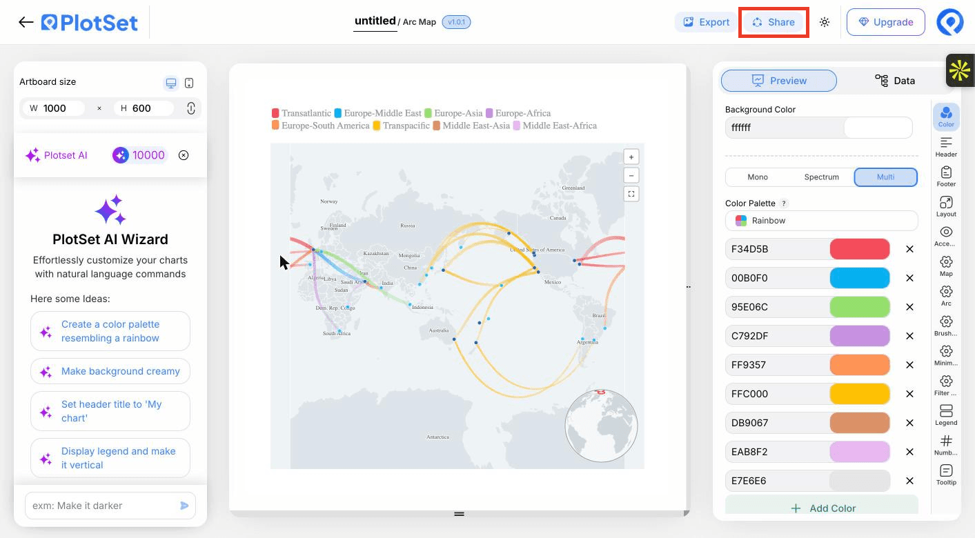
    Die Werkzeugleiste des PlotSet-Editors mit der hervorgehobenen Schaltfläche "Share" direkt neben der Schaltfläche "Export".
    Über "Share" werden aus dem fertigen Diagramm ein öffentlicher Link und ein Einbettungscode.

Starten Sie mit der Arc Map-Vorlage samt bereits geladenen Beispieldaten und ersetzen Sie diese durch Ihre eigenen.

Vorlage öffnen

Veröffentlichen, einbetten oder exportieren

Der letzte Abschnitt ist bei jedem Diagrammtyp gleich: "Share" macht aus dem Diagramm einen öffentlichen Live-Link und einen Einbettungscode, "Export" schreibt es als statische Datei heraus.

"Share": öffentlicher Link und Einbettungscode

Aktivieren Sie den Einbettungscode und den öffentlichen Link, um das Diagramm zu veröffentlichen. Den Link können Sie bedenkenlos an alle weitergeben, und der Einbettungscode fügt sich als iframe in jede Seite ein. Die Tooltips beim Überfahren mit der Maus und die volle Interaktivität bleiben erhalten. Wenn Sie das Diagramm später bearbeiten, überträgt "Recreate" die Änderungen auf Link und Einbettung.

Die Werkzeugleiste des PlotSet-Editors mit der hervorgehobenen Schaltfläche "Share" direkt neben der Schaltfläche "Export".
Über "Share" werden aus dem fertigen Diagramm ein öffentlicher Link und ein Einbettungscode.
Der Dialog "Share" von PlotSet: der Schalter, der den Einbettungscode und den öffentlichen Link aktiviert, die Schaltflächen "Link", "Embed", "Facebook", "Reddit", "Twitter", "LinkedIn" und "Email" sowie der öffentliche Diagrammlink mit der Schaltfläche "Copy".
Aktivieren Sie den Einbettungscode und den öffentlichen Link, kopieren Sie dann den Link oder den iframe-Code. Mit "Recreate" erreichen spätere Änderungen alle, die den Link bereits haben.

"Export": SVG, PNG oder JPG

"Export" schreibt eine statische Kopie in der Größe heraus, die Sie brauchen. SVG bleibt in jeder Skalierung scharf und lässt sich weiterhin in einem Design-Tool bearbeiten; PNG und JPG sind die sichere Wahl für Folien und Dokumente. Der Skalierungsfaktor sorgt dafür, dass das Bild auf einem Retina-Display gestochen scharf wirkt.

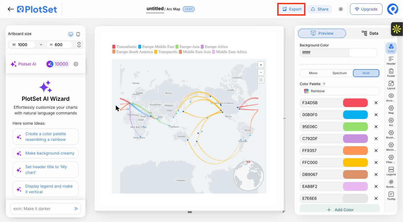
Die Werkzeugleiste des PlotSet-Editors mit der hervorgehobenen Schaltfläche "Export".
Über "Export" bekommen Sie eine statische Datei für eine Folie oder einen Bericht.
Der Dialog "Export chart" von PlotSet: die Skalierungsauswahl auf 2x, die Felder für Breite und Höhe mit 1000 mal 600 und das geöffnete Formatmenü mit "SVG", "PNG" und "JPG".
SVG bleibt in jeder Größe scharf und im Design-Tool bearbeitbar; PNG und JPG sind die sichere Wahl für eine Präsentation. Stellen Sie die Skalierung vor dem Export ein, damit das Bild auf einem Retina-Display gestochen scharf ist.

Styling-Tipps für Arc Map

Let thickness carry the value

Scaling arc width by passengers or tonnes shows which routes matter. Choose a square-root or log scale when a few routes dwarf the rest.

Use a muted base map

A pale, low-contrast base keeps attention on the routes. Save dark bases for light arcs.

Filter instead of thinning the data

Rather than dropping routes, give them a group column and let viewers switch between them.

Say what thickness means

Add a line to the header or legend, such as thickness shows passengers in thousands, so nobody reads width as distance.

Häufige Fehler bei Arc Map

Routes end up in the ocean

Latitude and longitude are probably swapped. Latitude is the north to south number and must stay between -90 and 90.

Some rows are missing from the map

A coordinate was probably read as text, often from a degree symbol or a stray space. Clean the cell to a plain number and re-upload.

The map is an unreadable tangle

Too many routes at equal weight. Bind a size column, add a filter group, or aggregate to region pairs.

Mehr über Arc Map erfahren

Nicht sicher, ob Arc Map die richtige Wahl ist? Erfahren Sie, was es ist, wann Sie es verwenden sollten und wann nicht.

Über Arc Map

Arc Map: häufige Fragen

Origin name, origin latitude and longitude, destination name, and destination latitude and longitude, one route per row. Size, colour and filter columns are optional.

Jetzt Arc Map erstellen

Kostenlos starten mit über 300 Vorlagen. Keine Kreditkarte erforderlich.